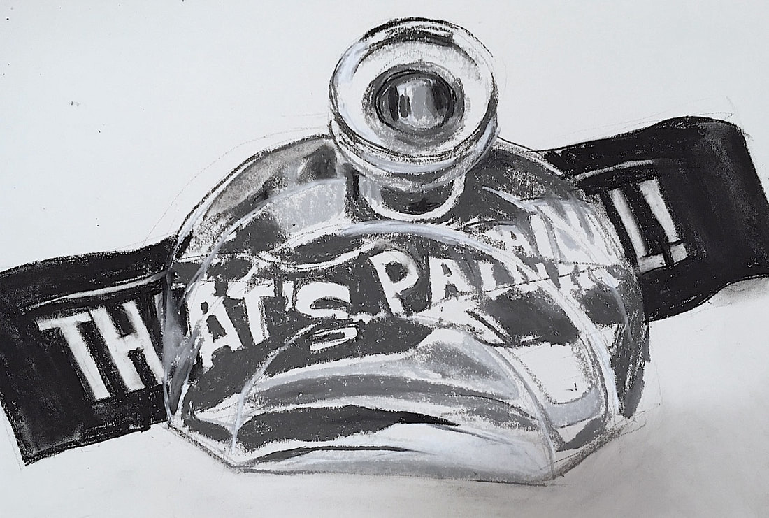
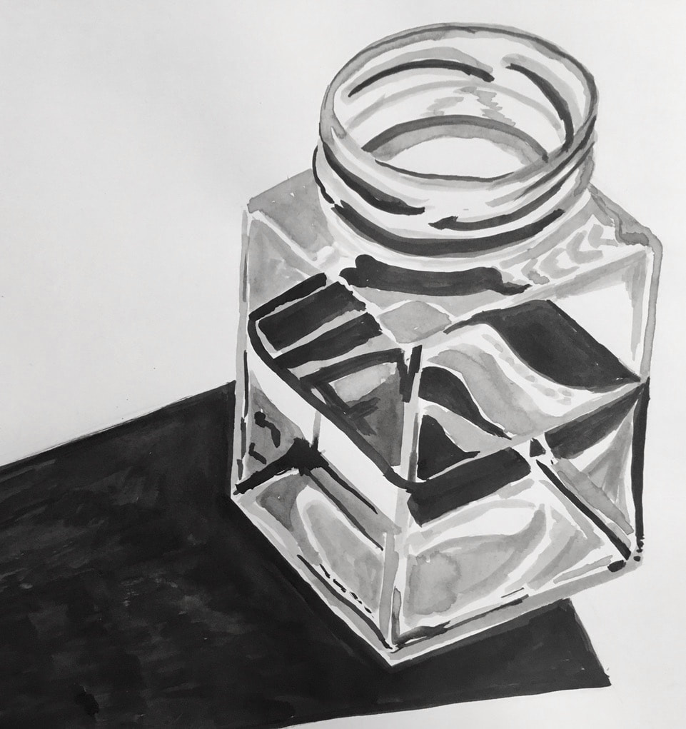
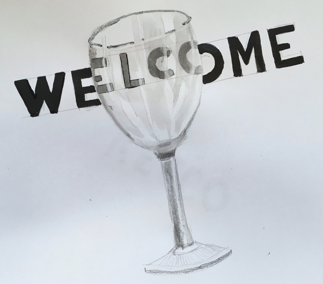
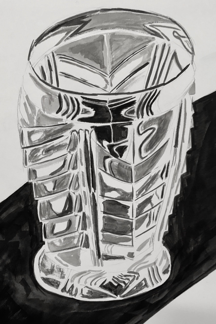
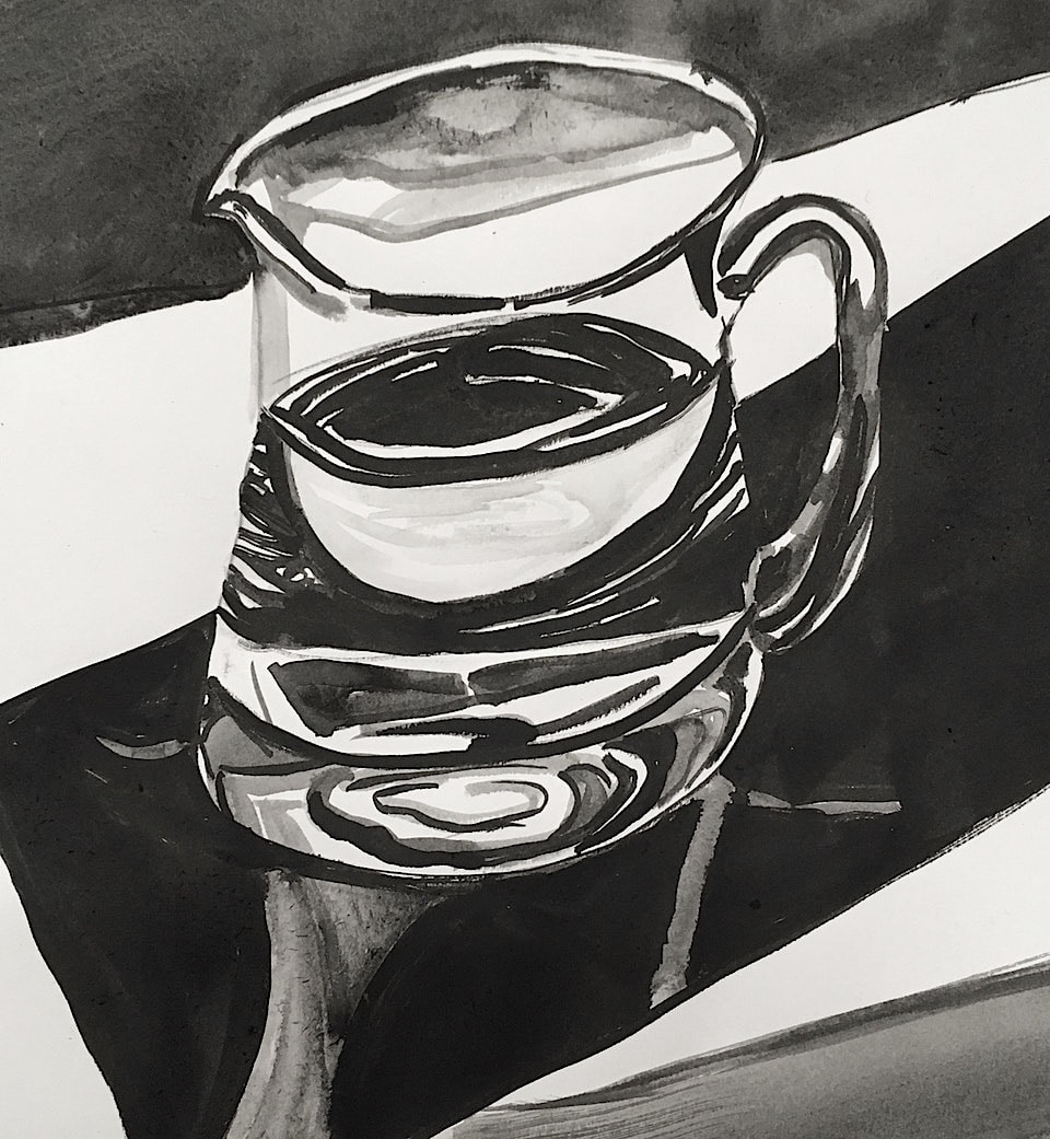
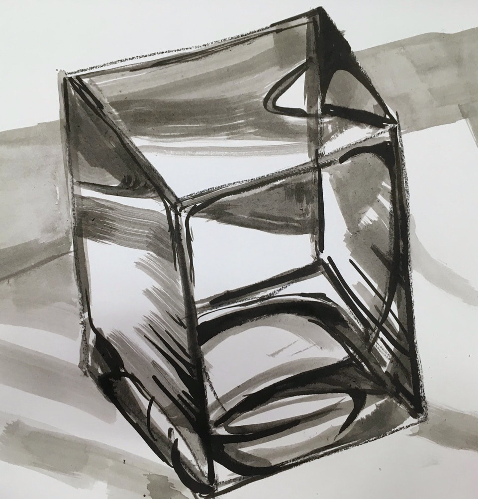
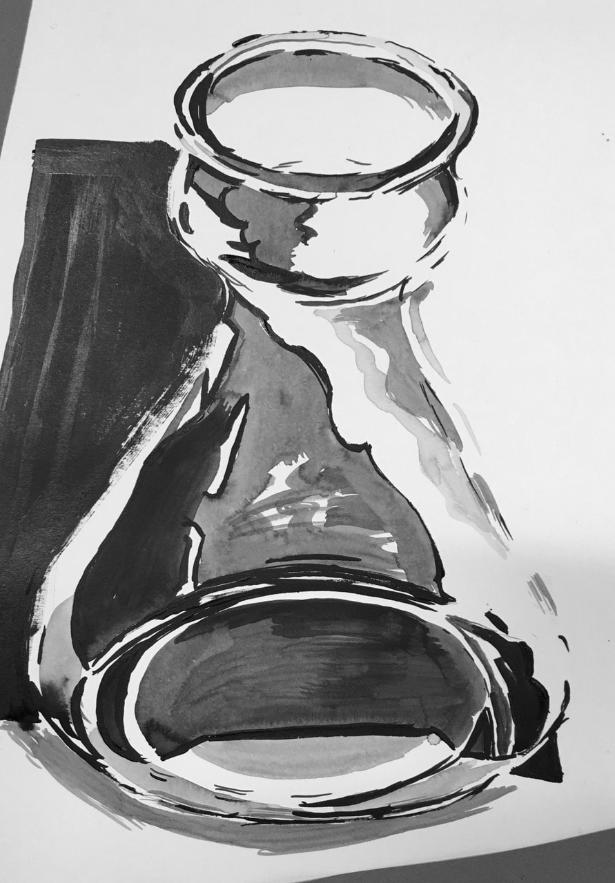
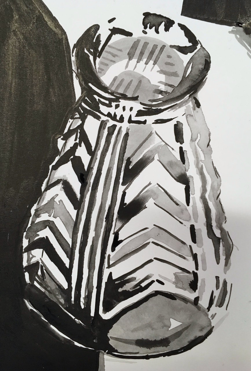
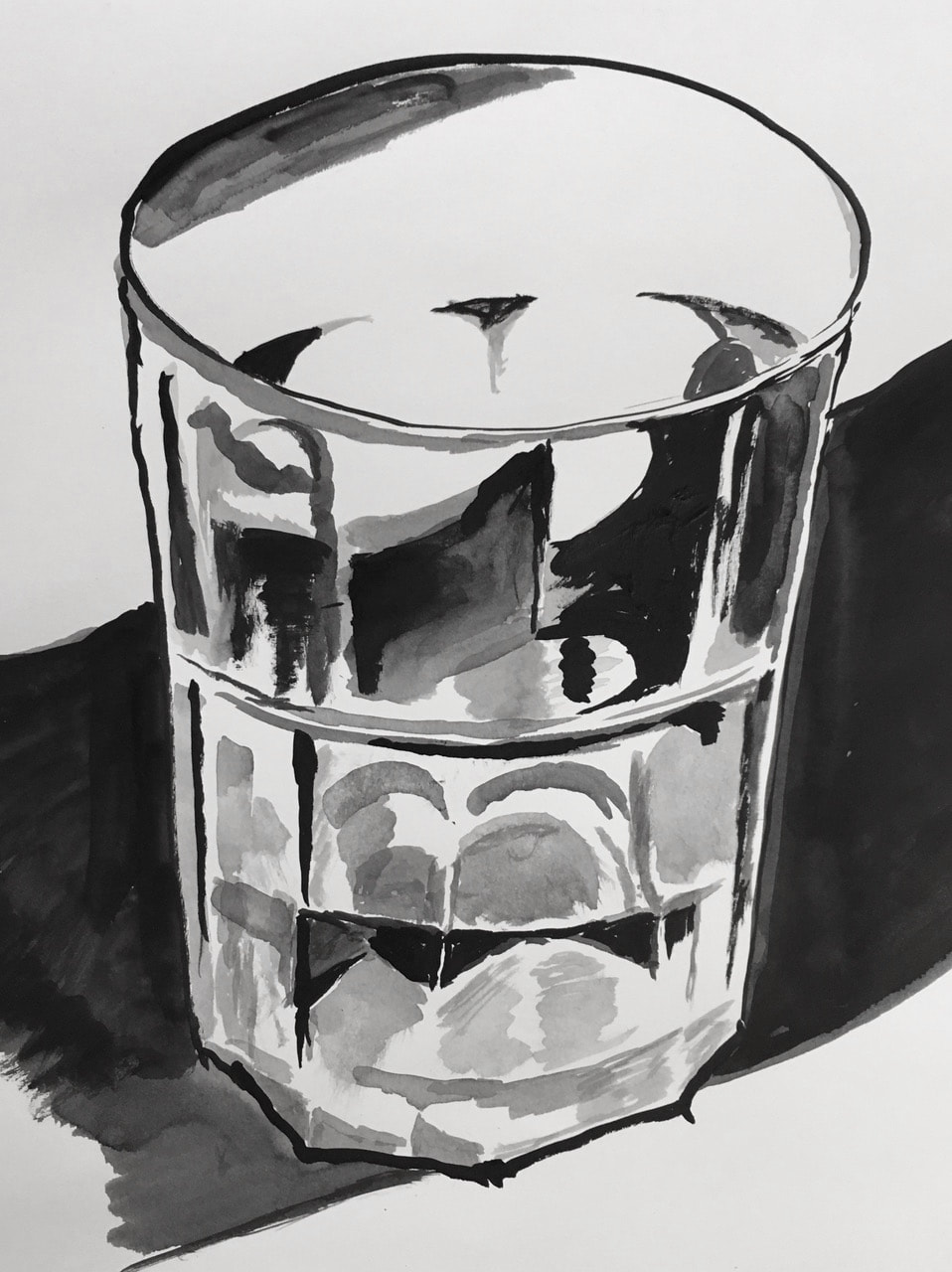
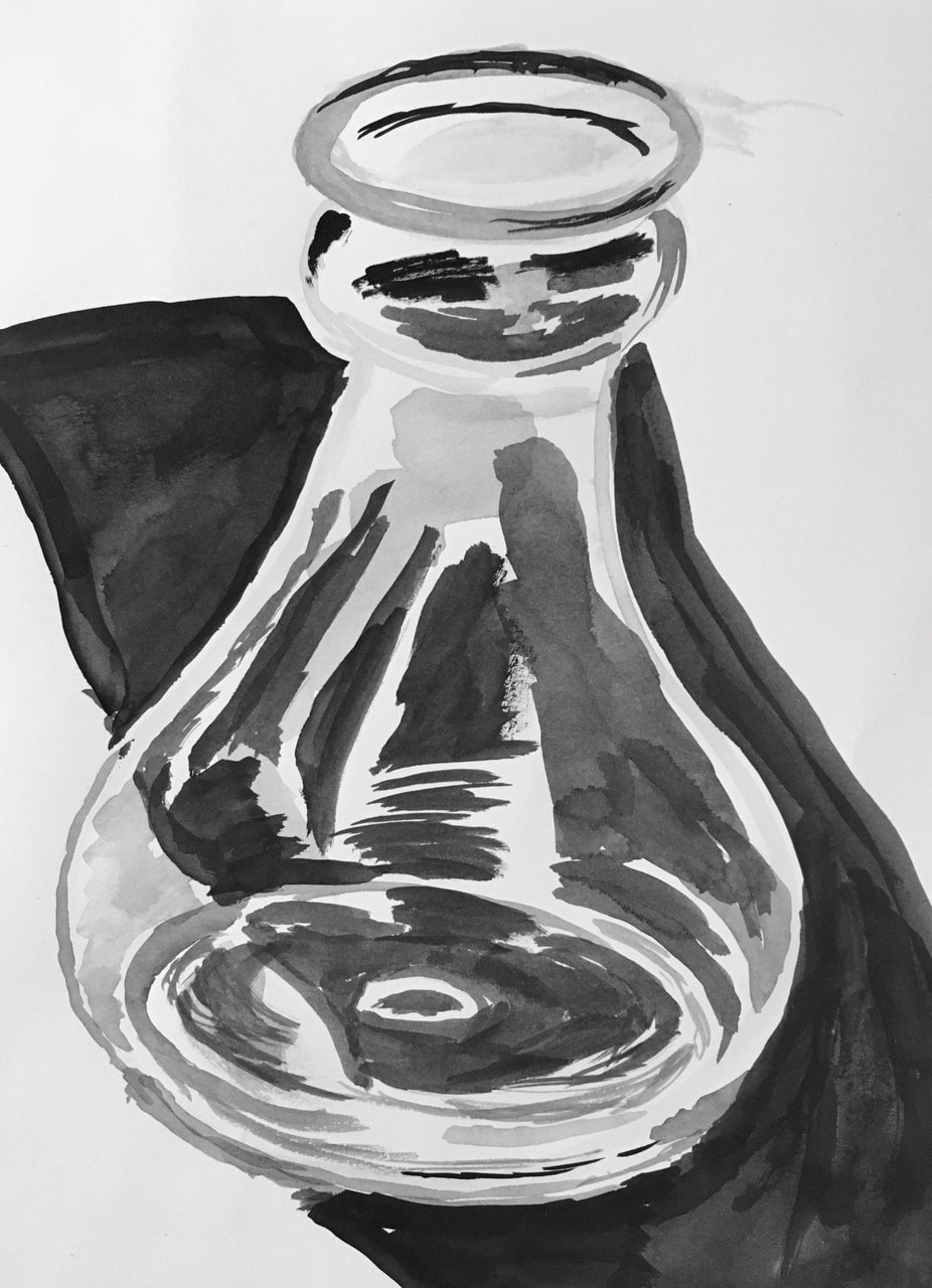
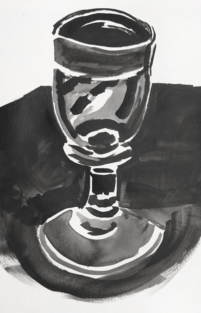
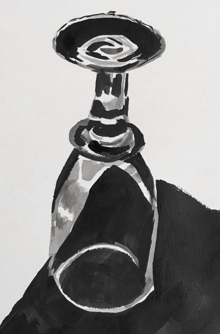
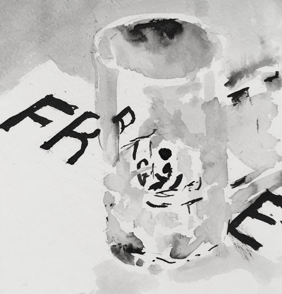
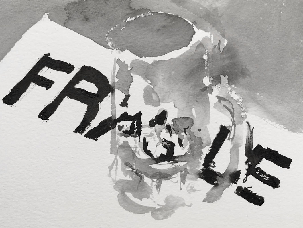
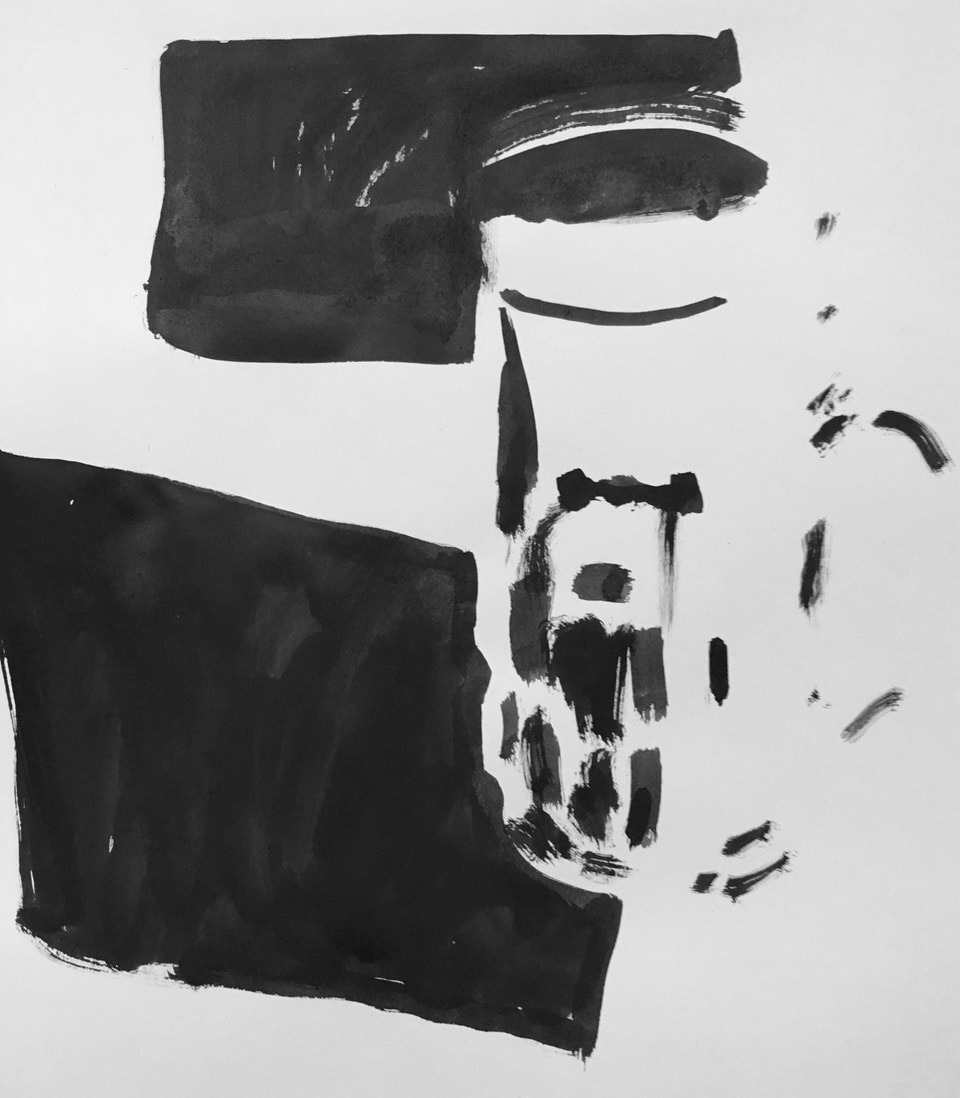
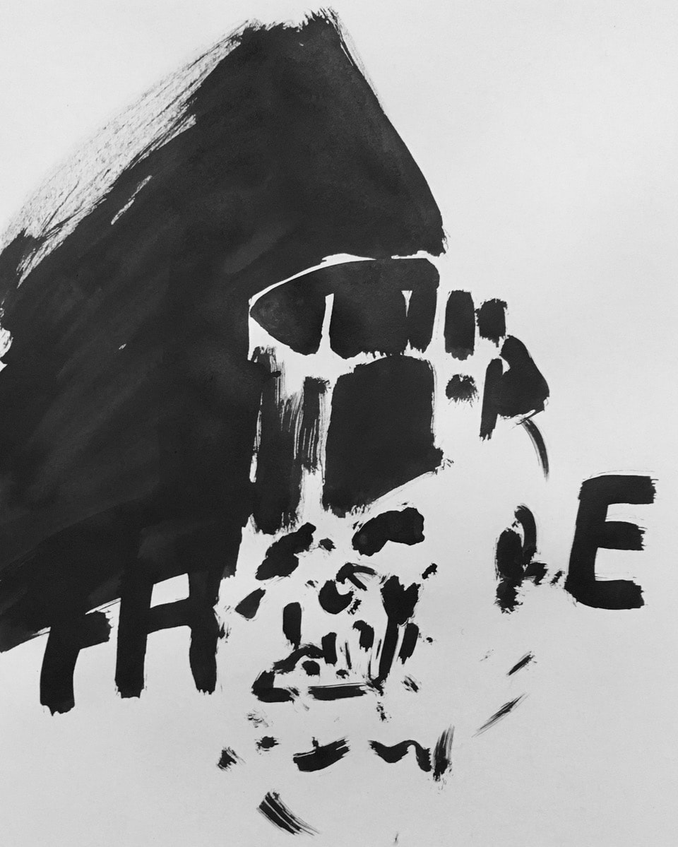
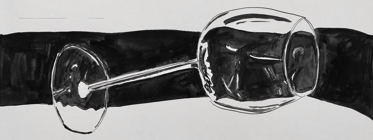
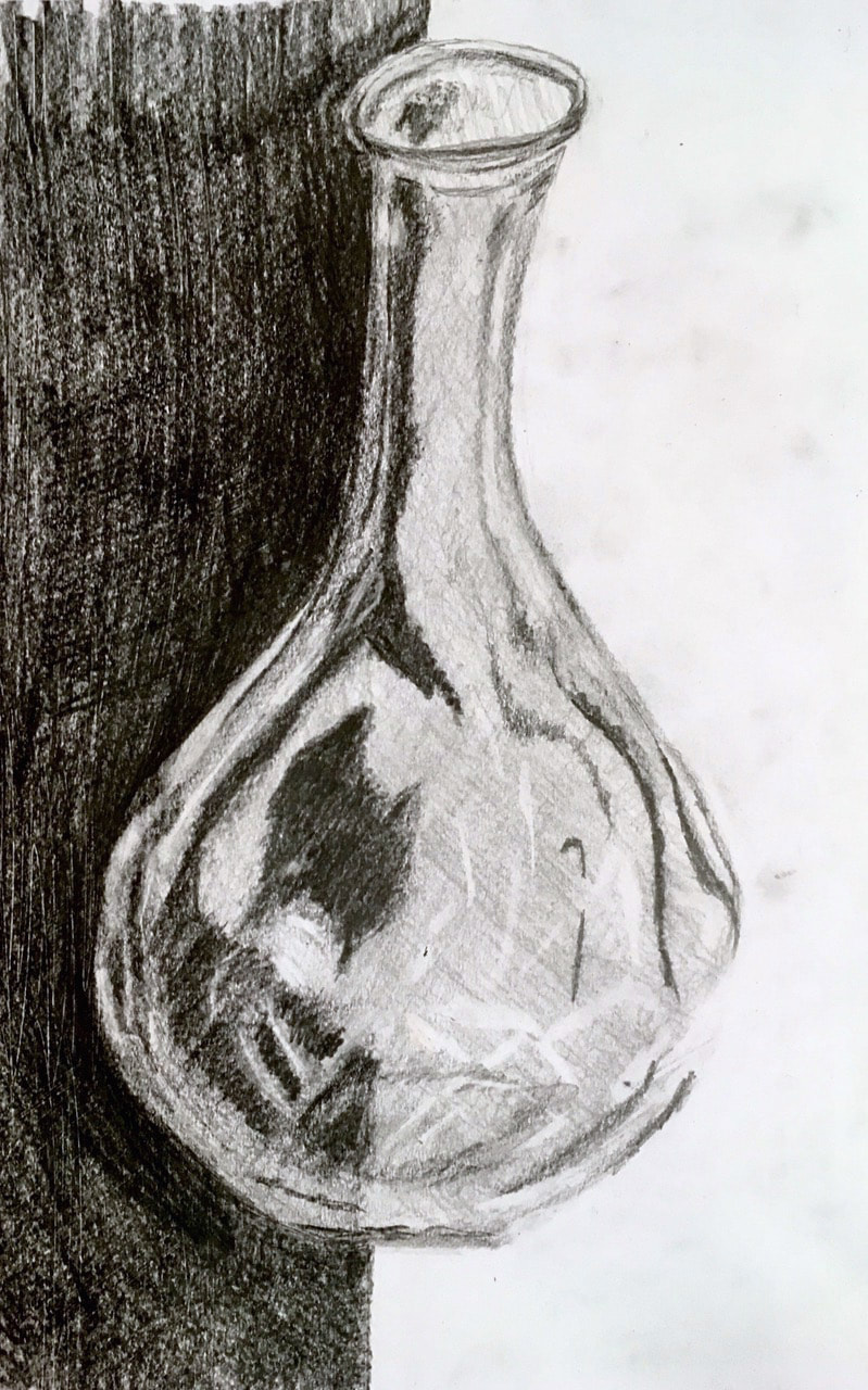
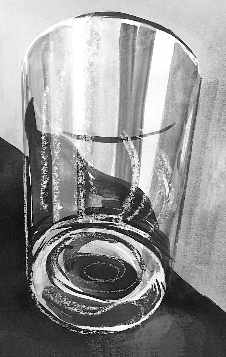
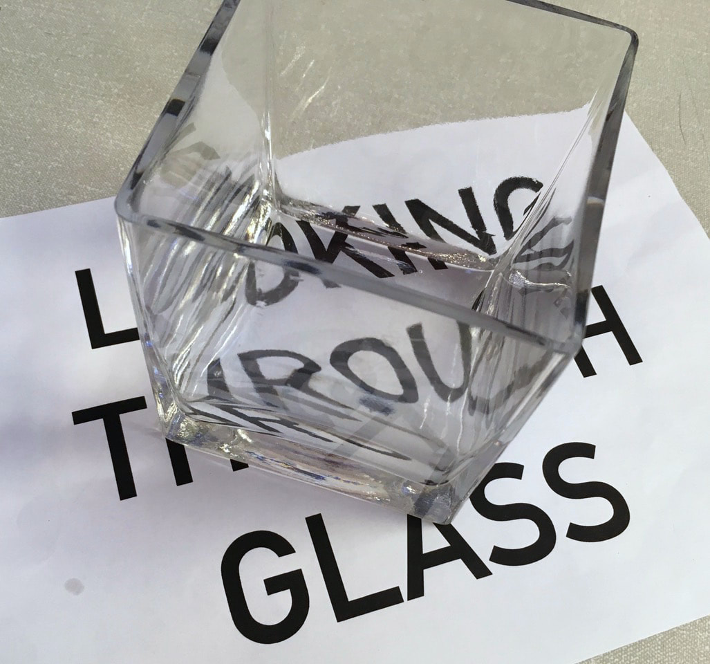
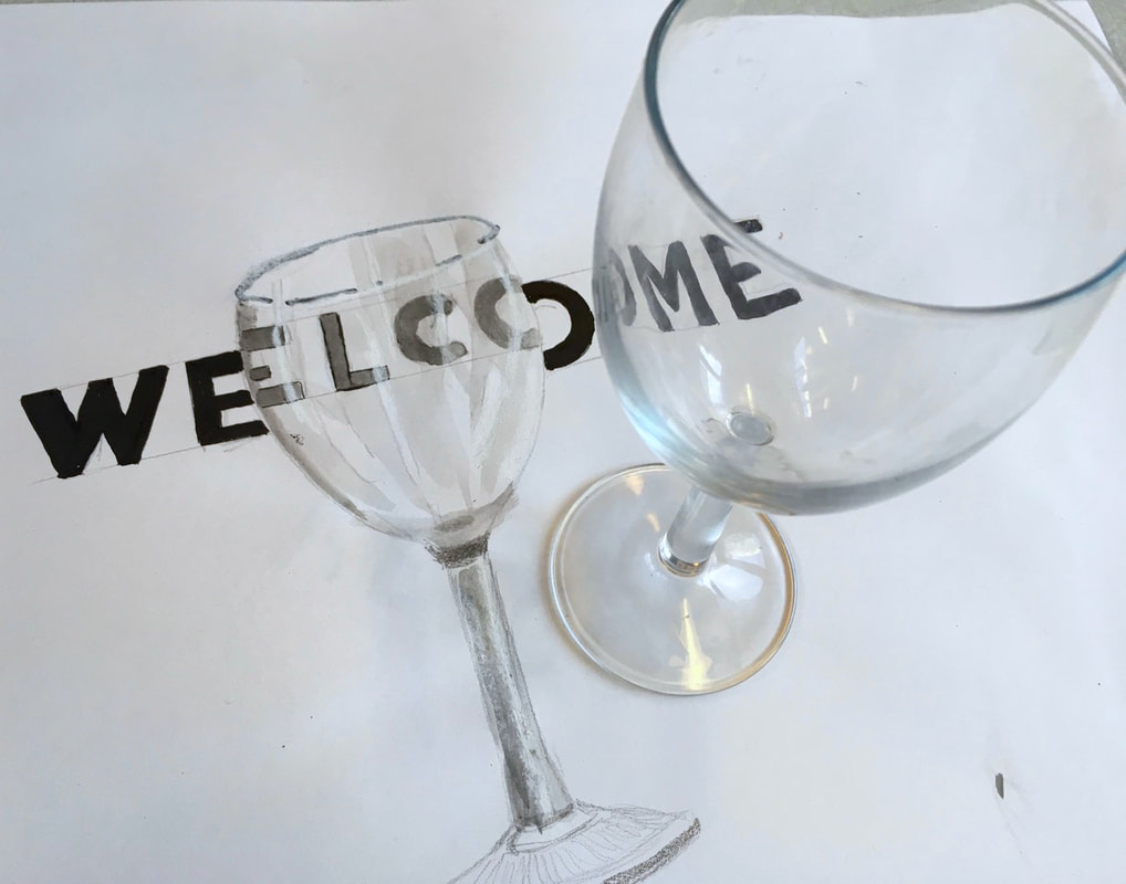
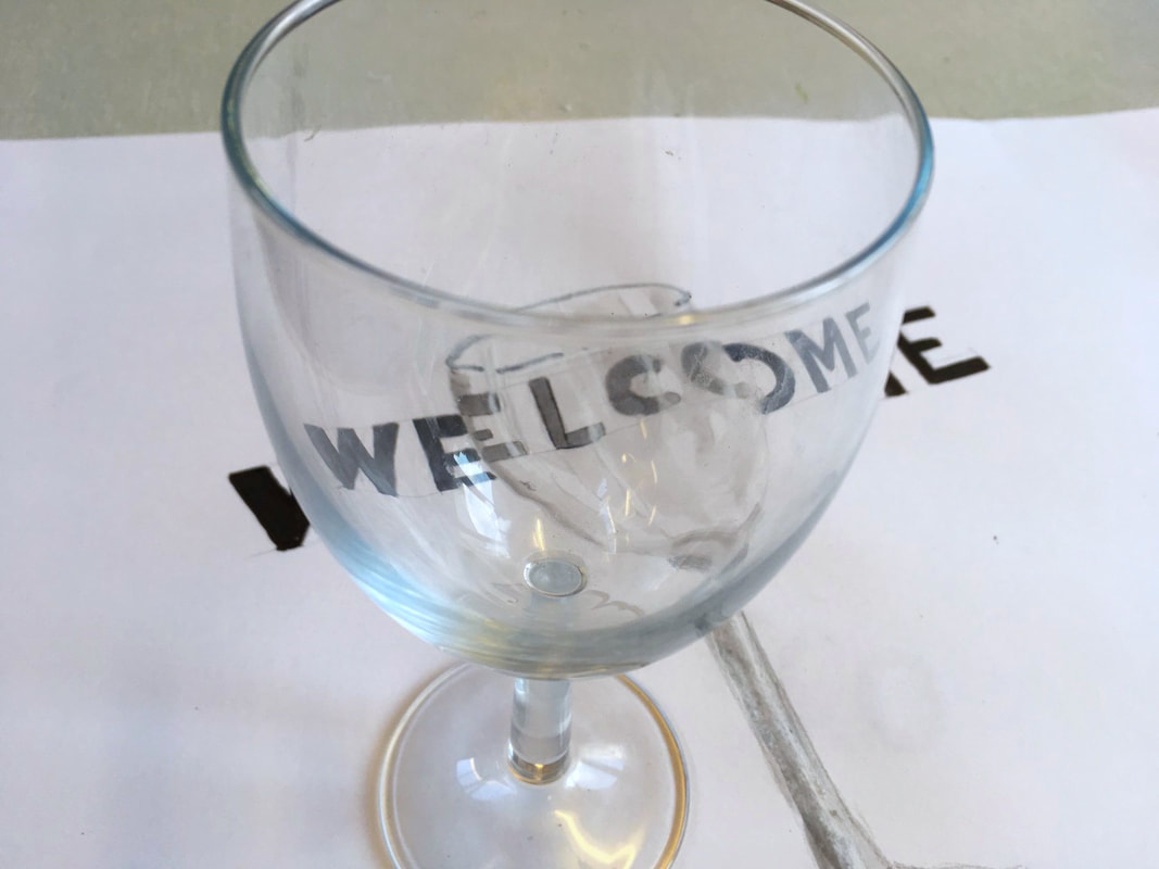
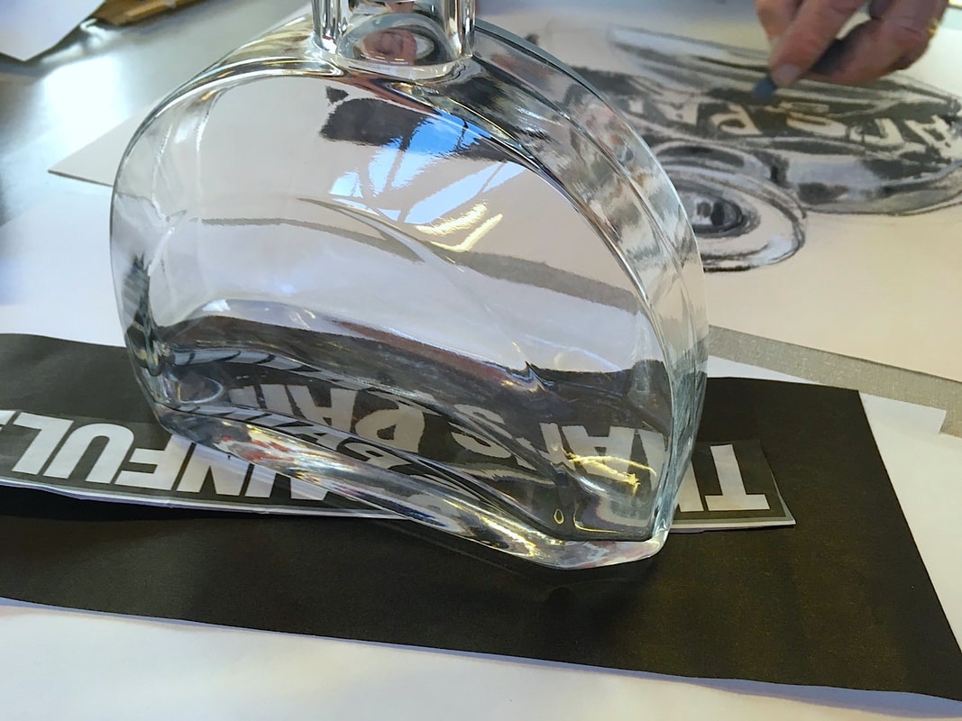
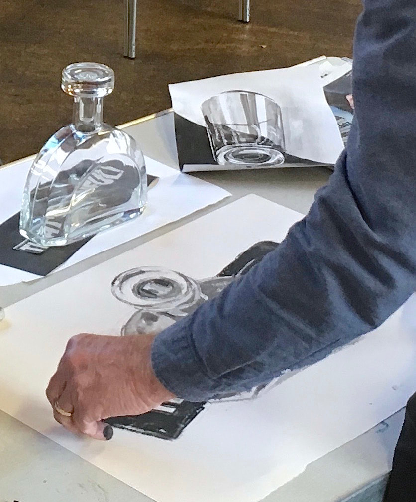
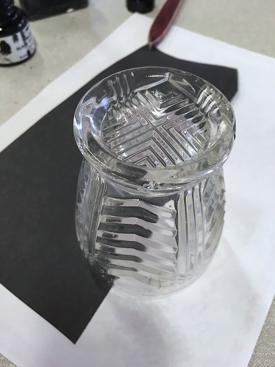
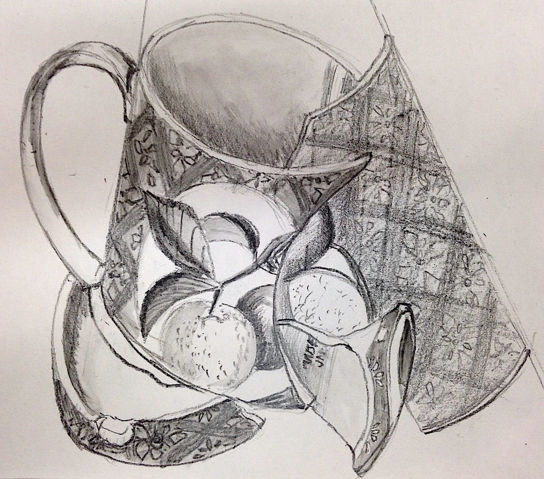
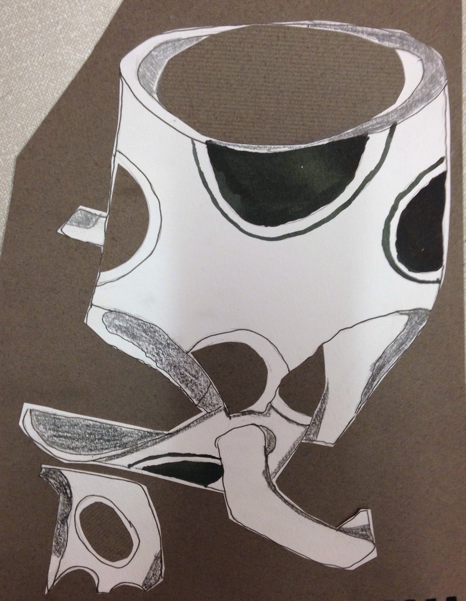
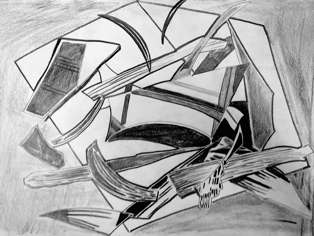
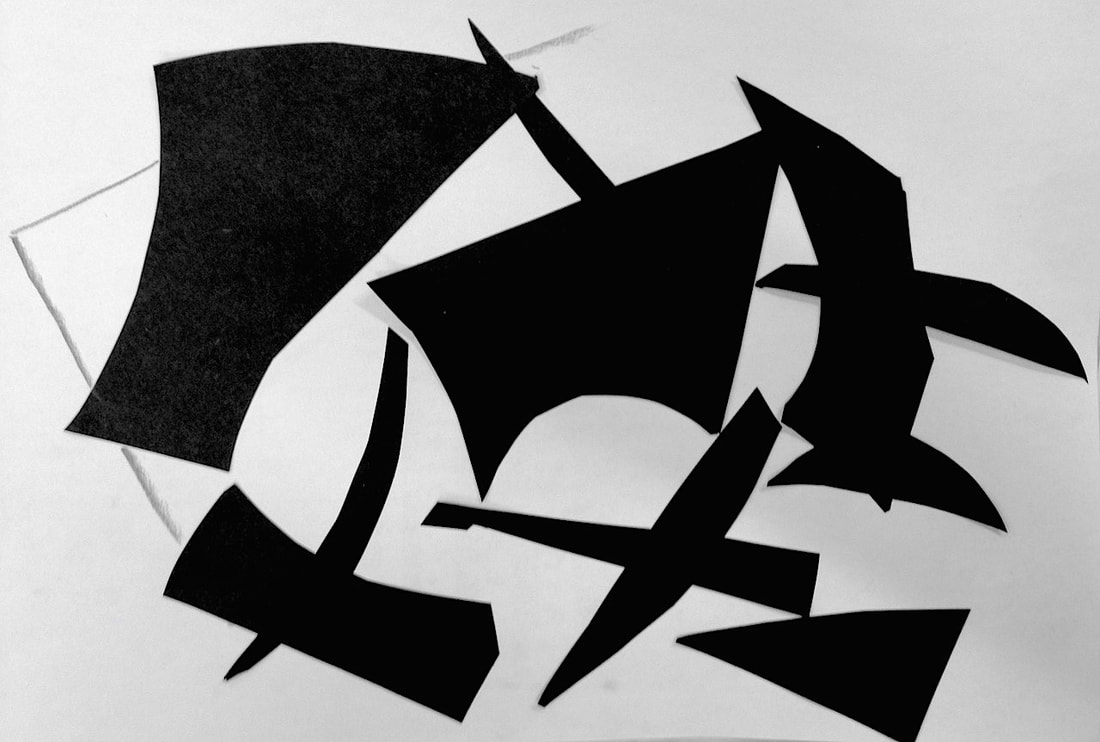
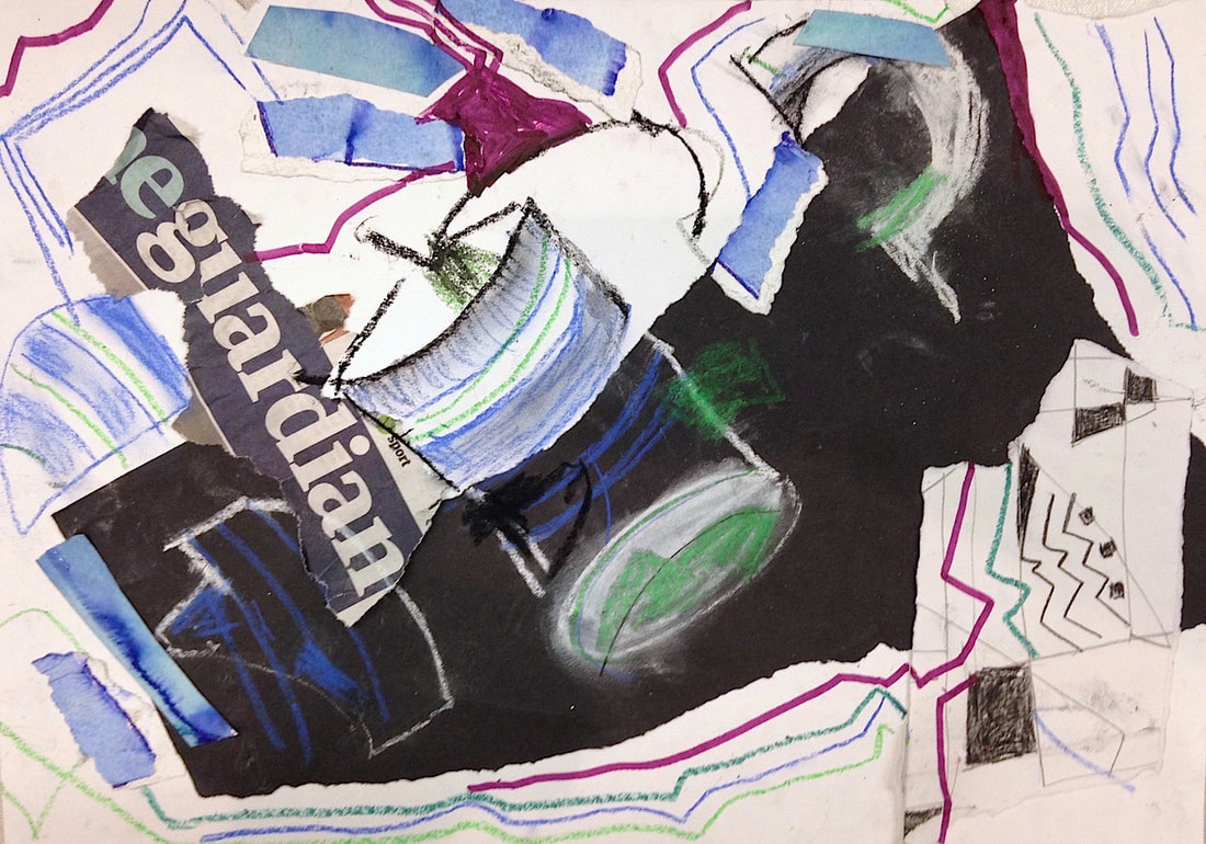
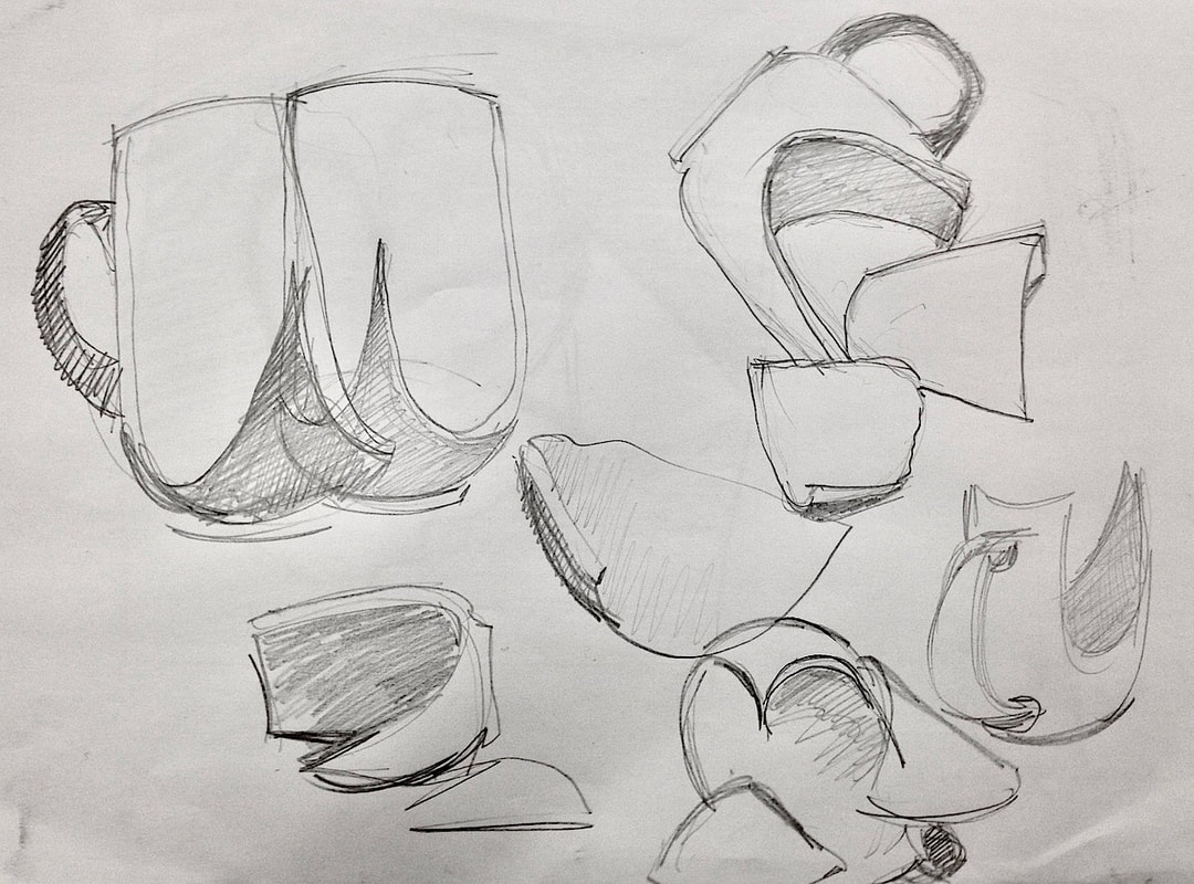
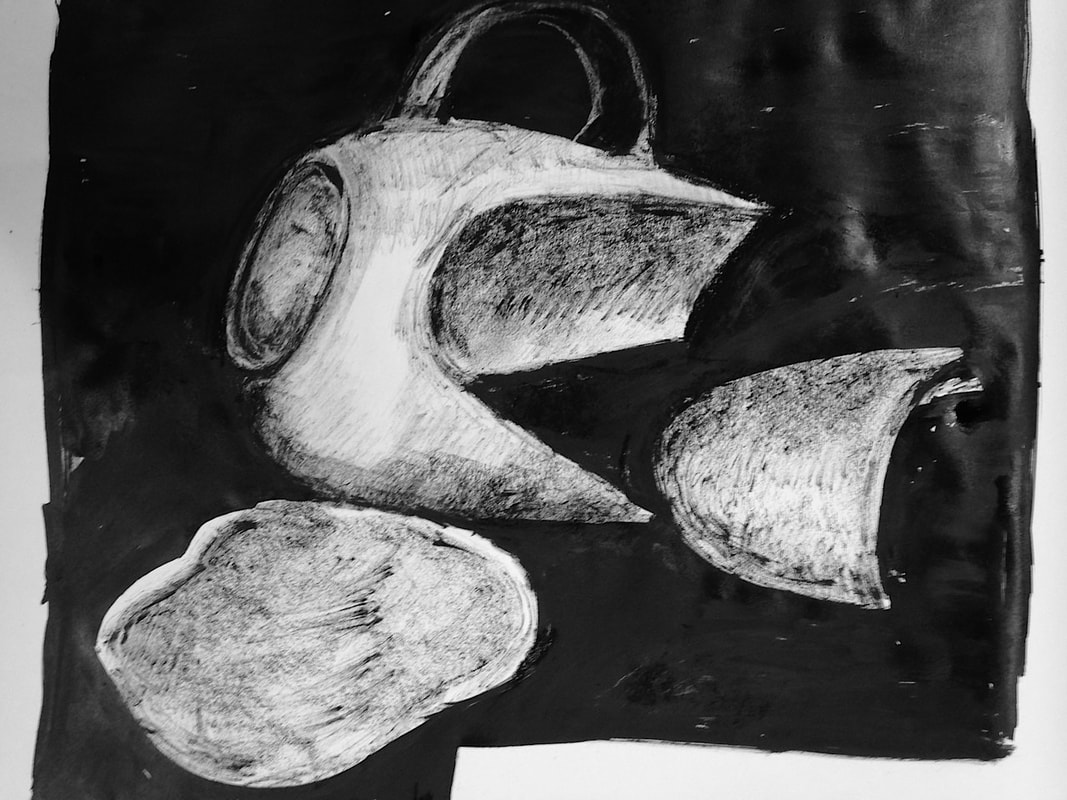
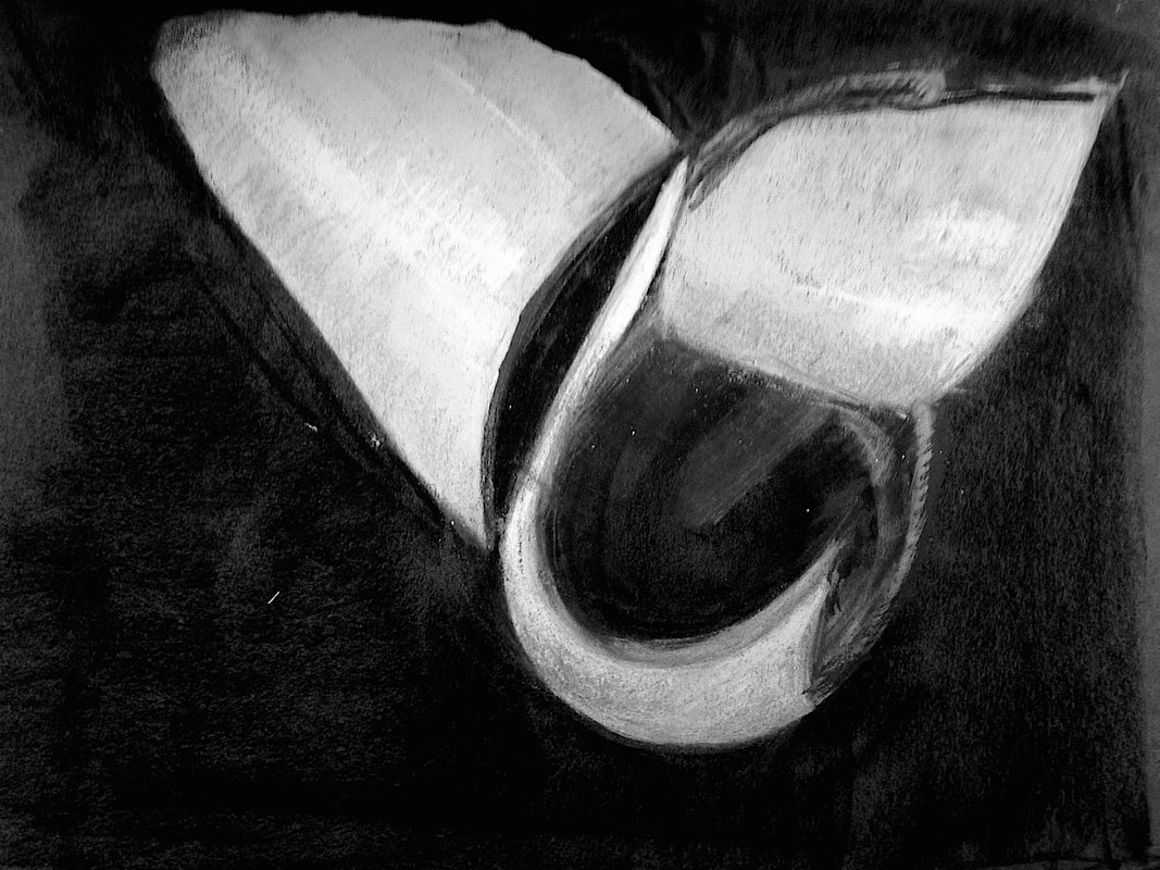
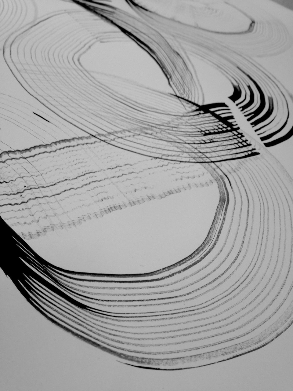
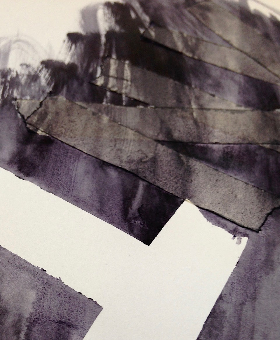
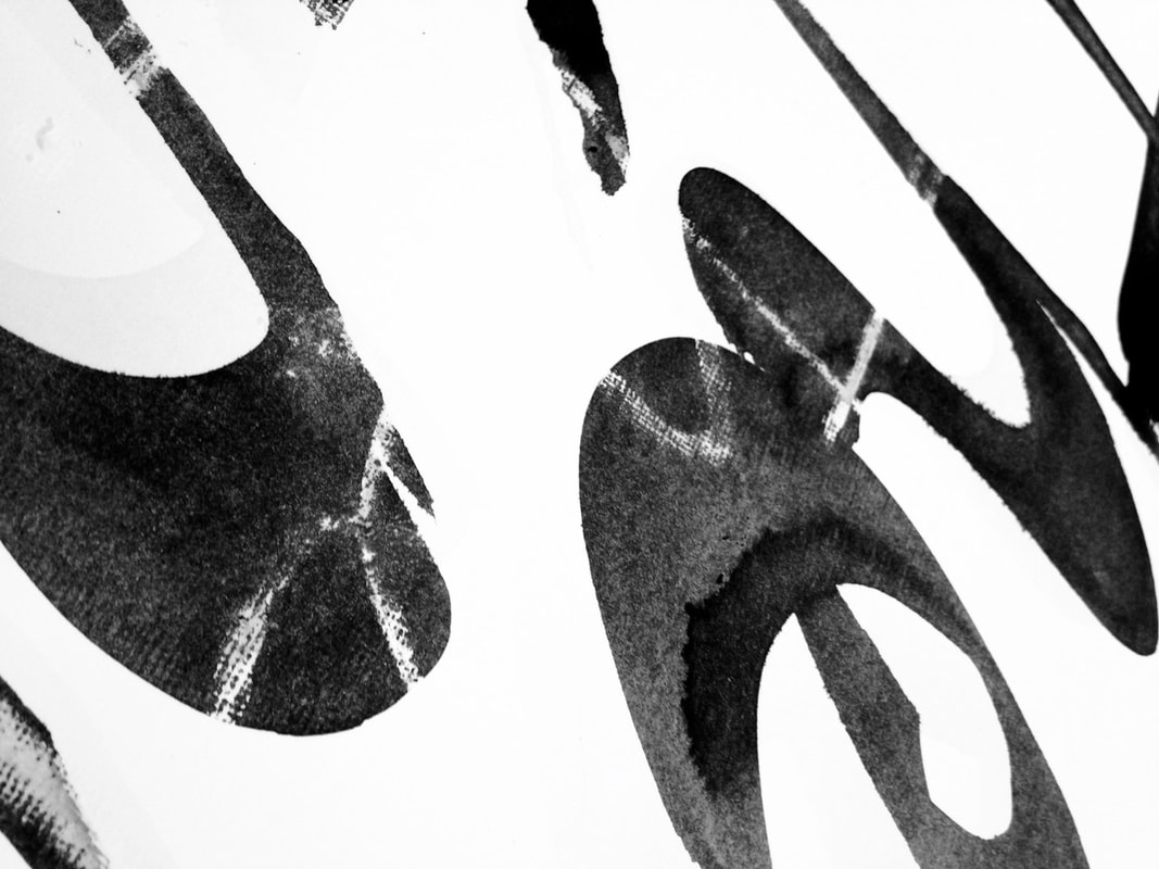
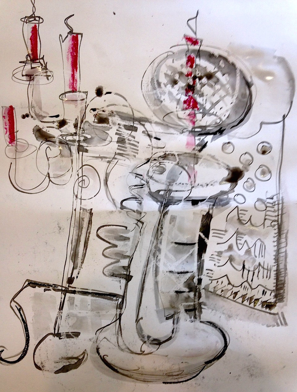
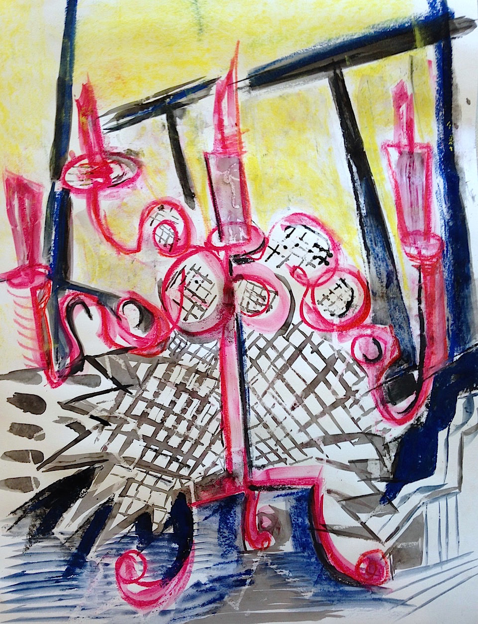
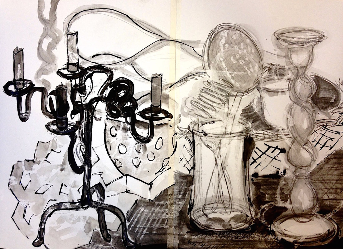
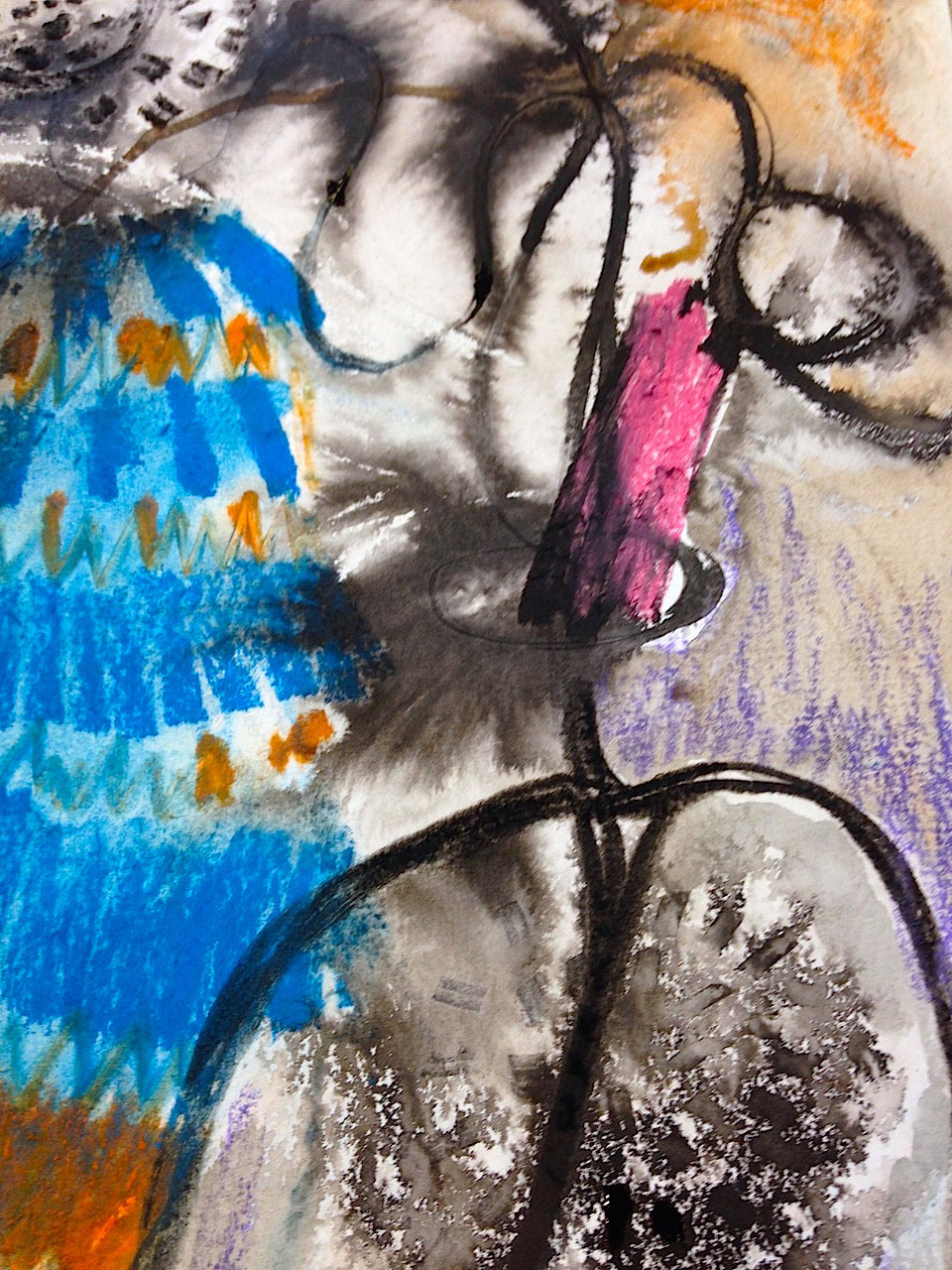
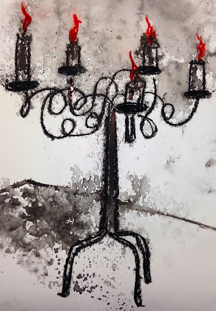
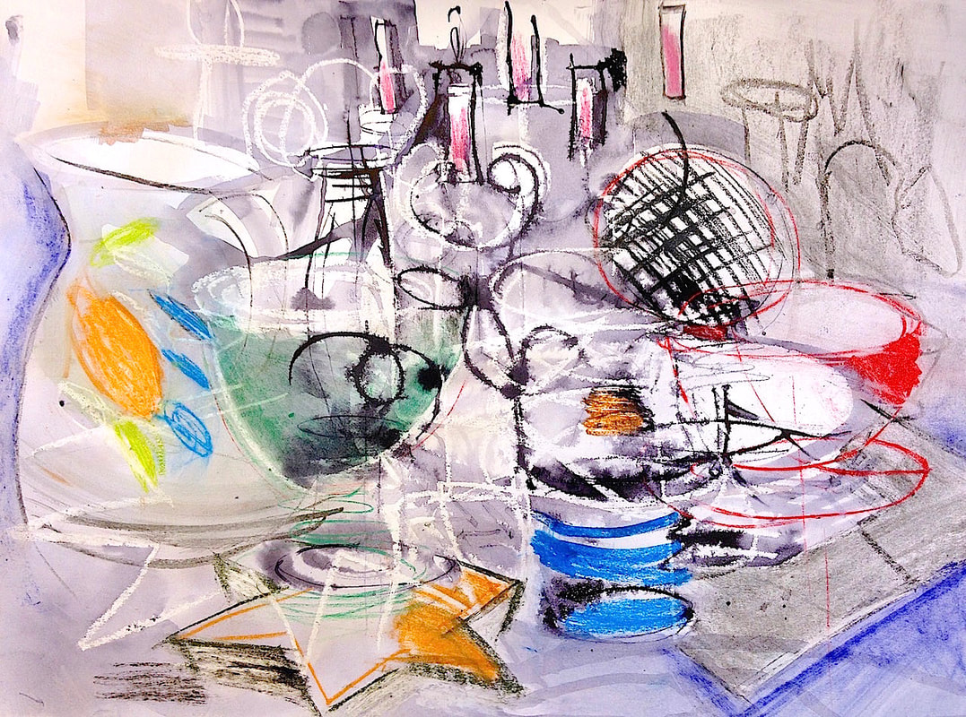
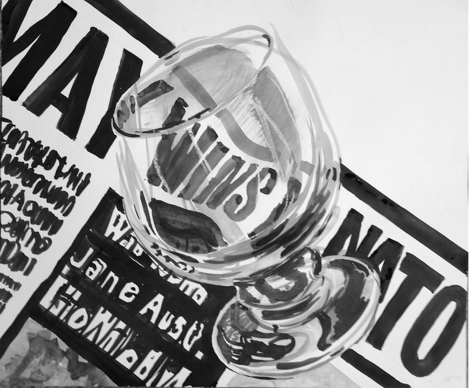
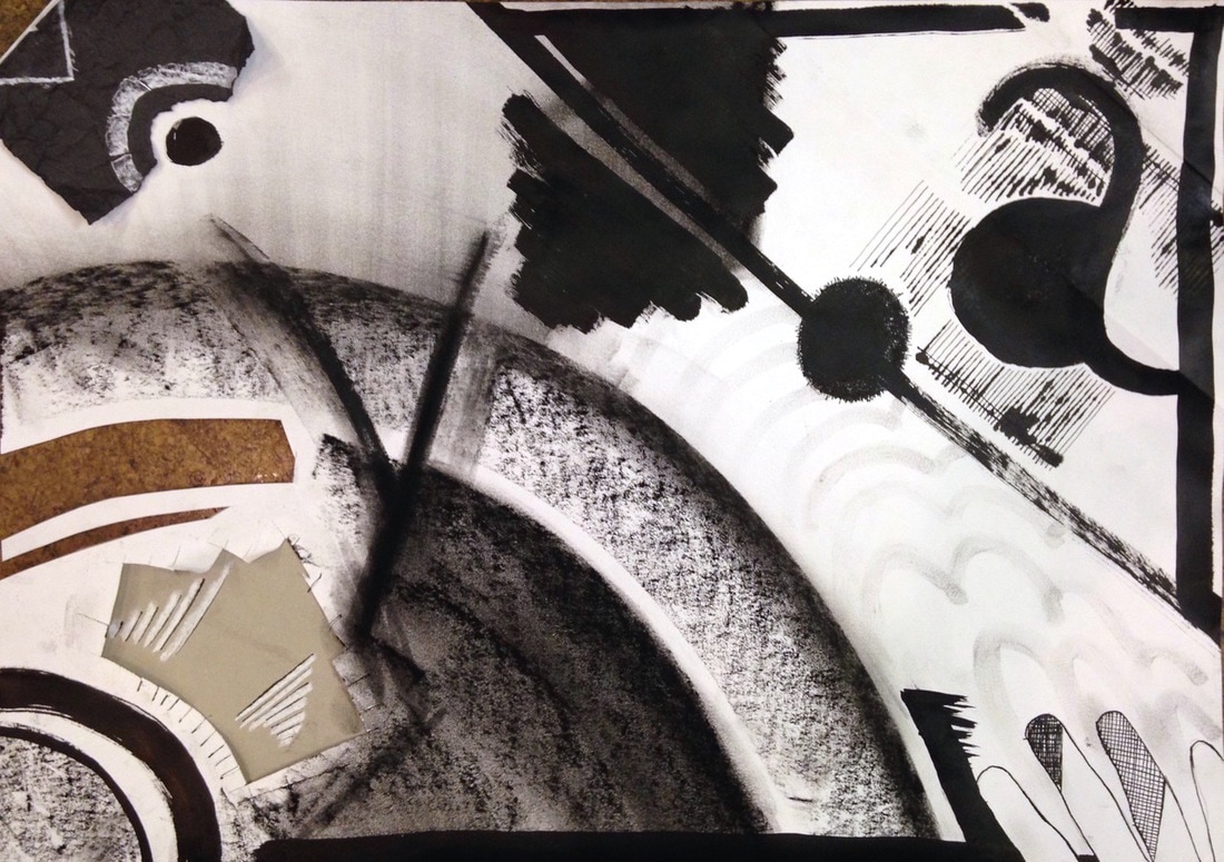
We simplified drawing glass by looking at distortion of background, highlights, patches of tone etc. Most of the glass was drawn against a piece of black paper or a line of large text and sometimes the glass was half full of water. And abstract shapes of tone became just as important as illusion.
|
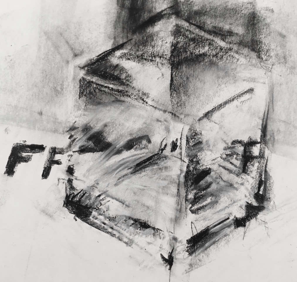
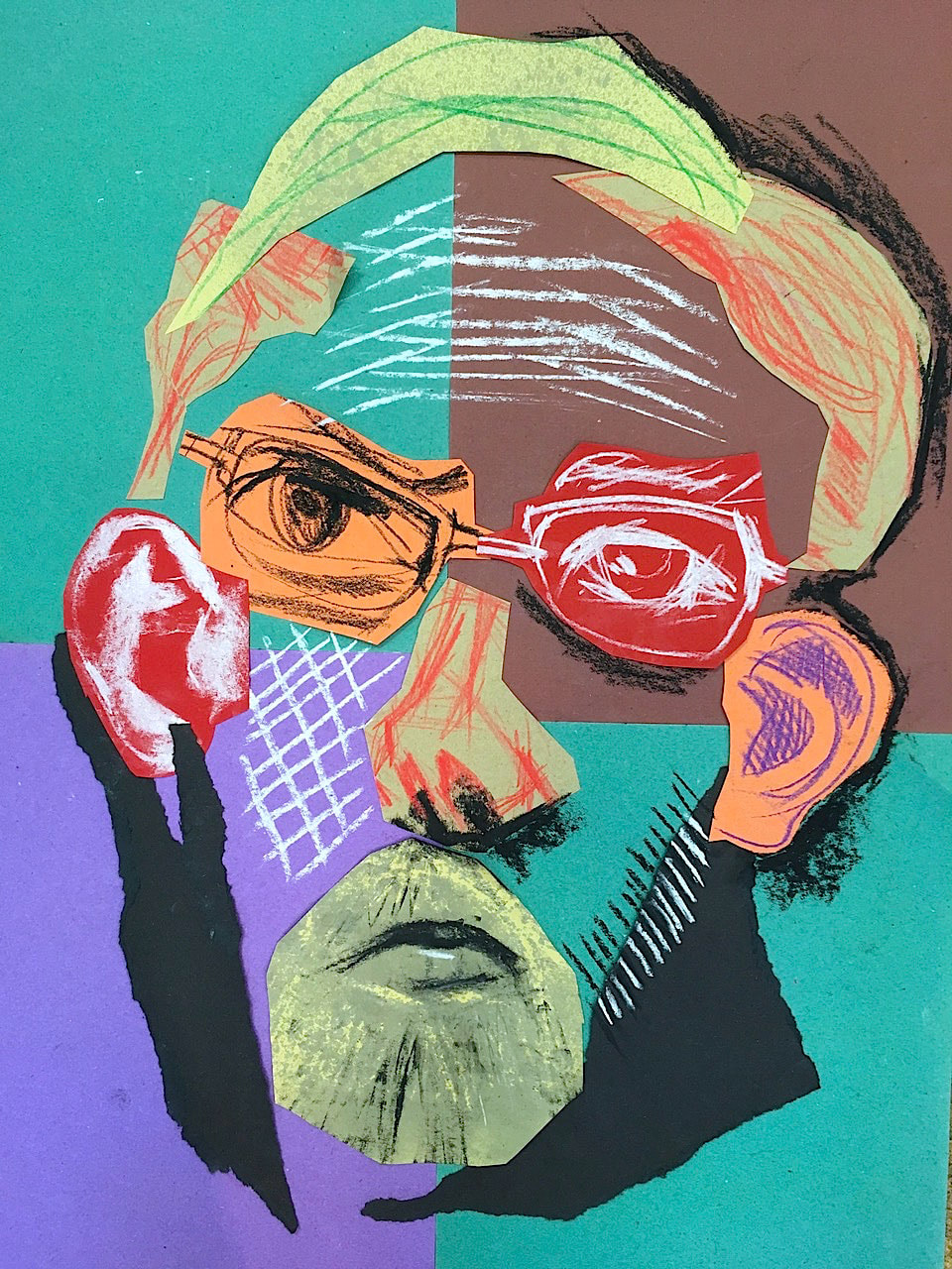
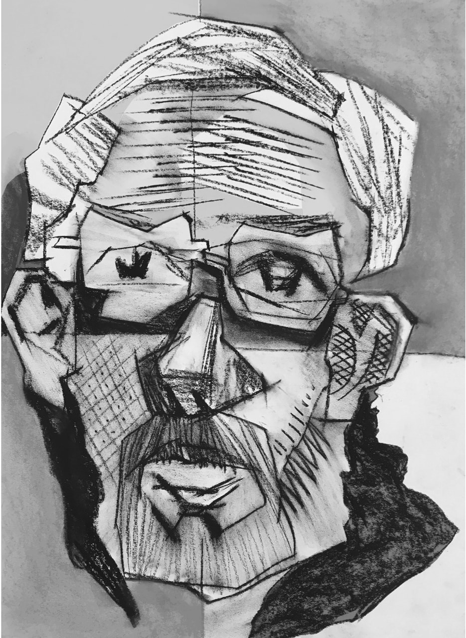
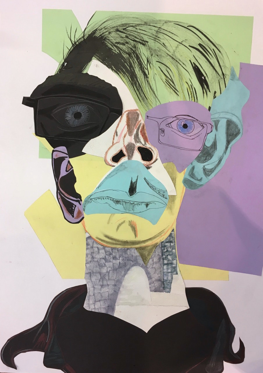
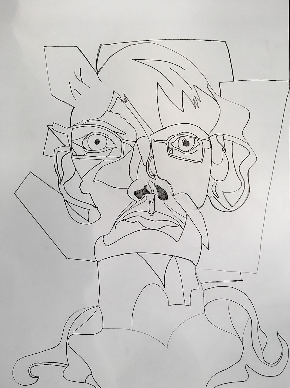
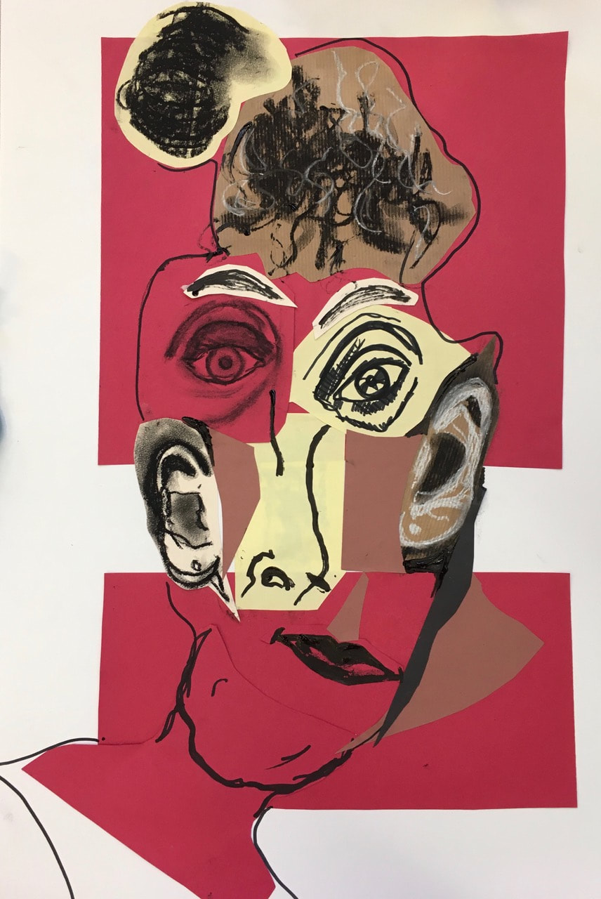
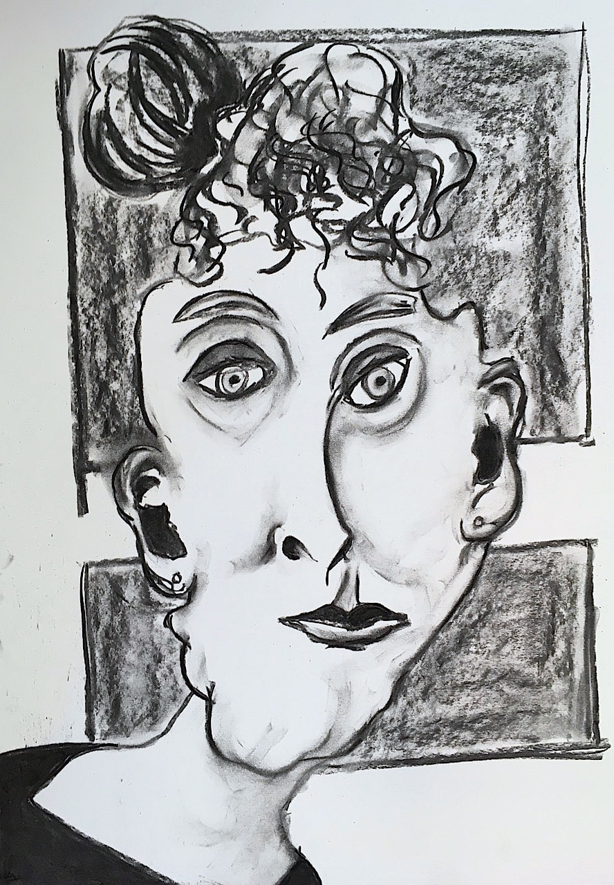
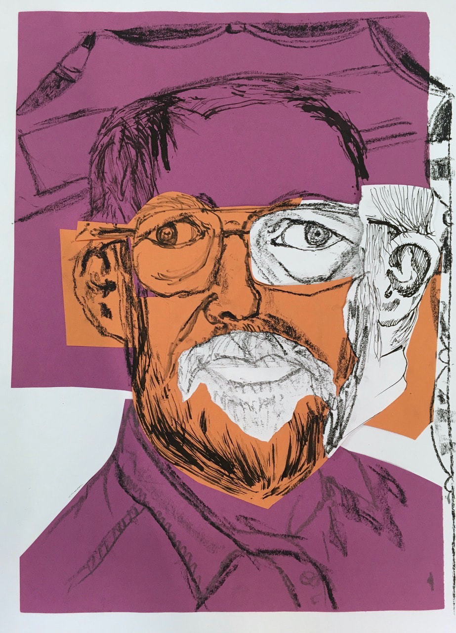
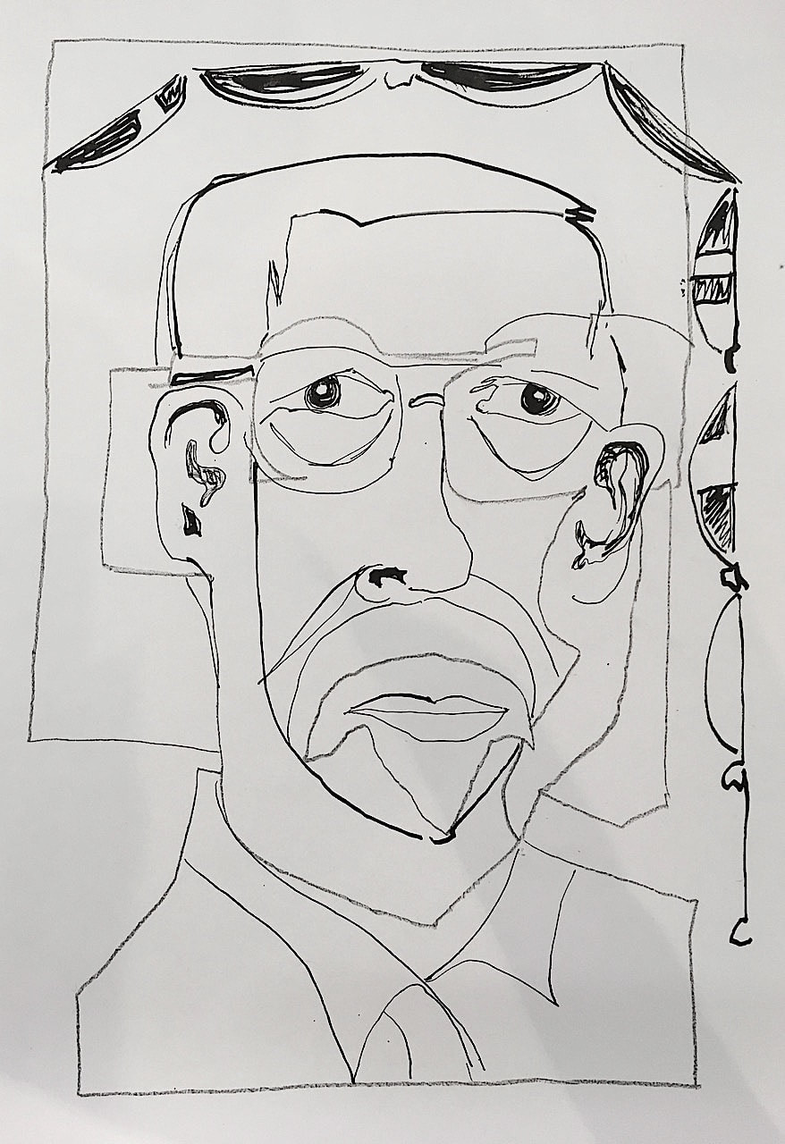
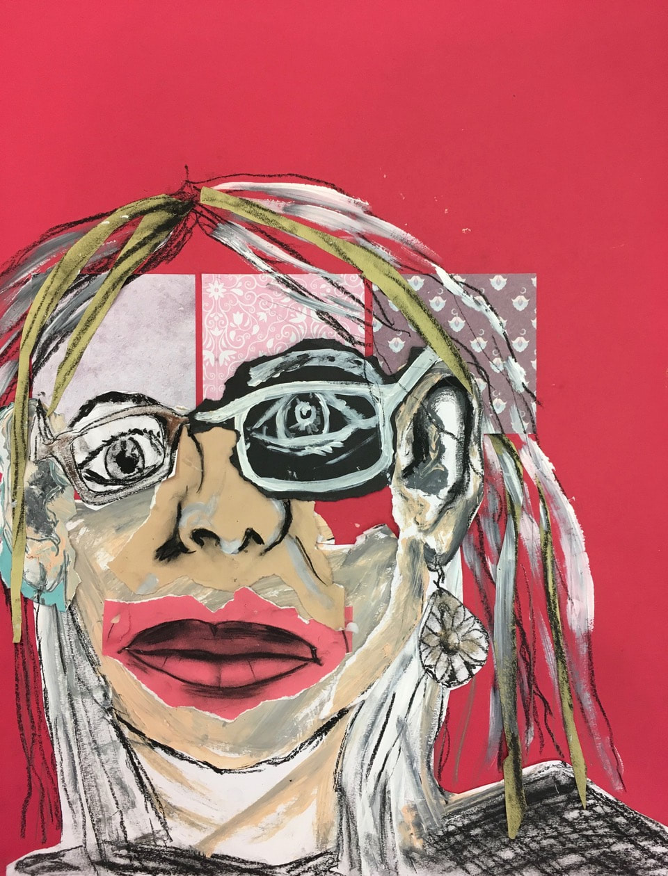
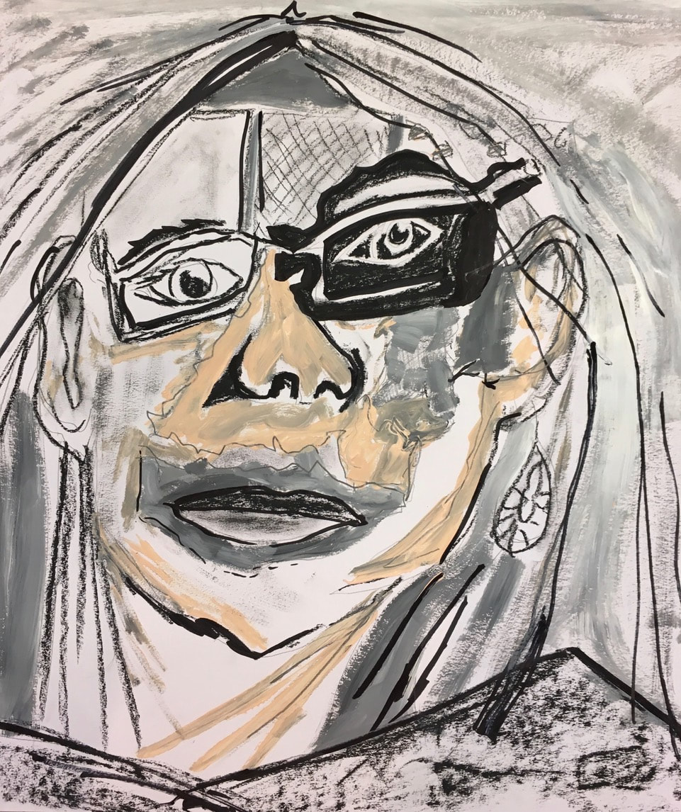
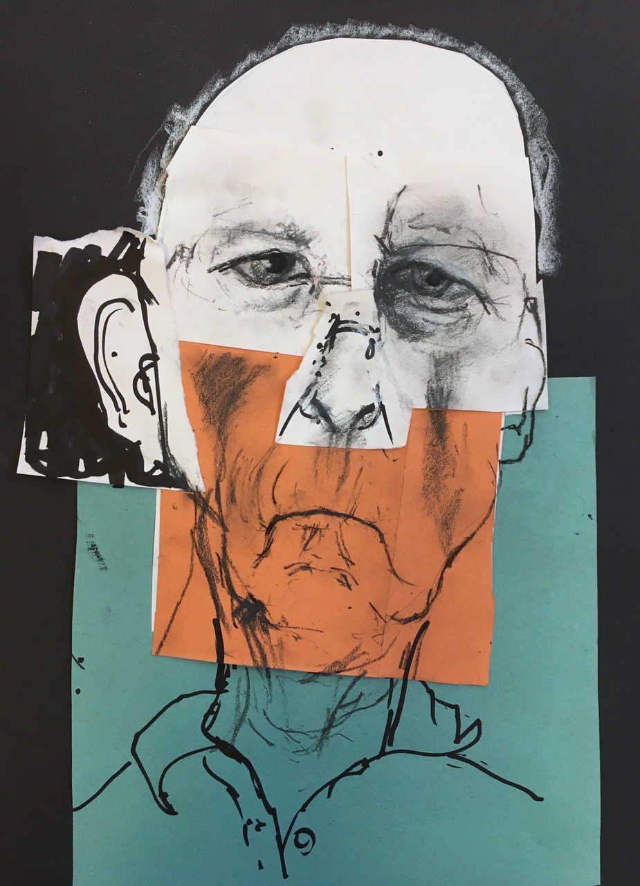
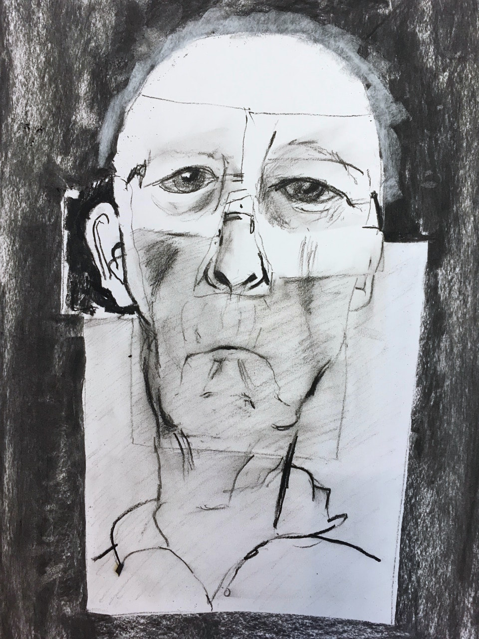
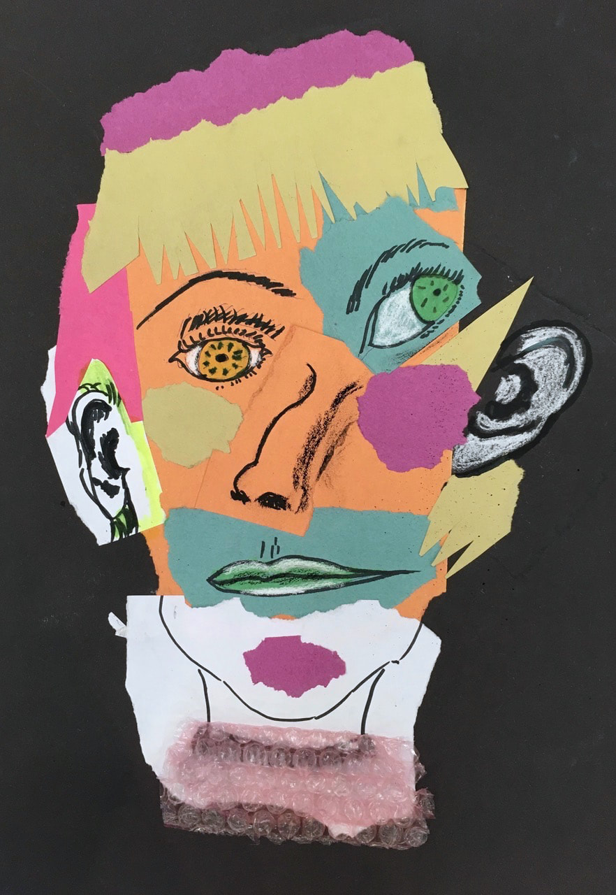
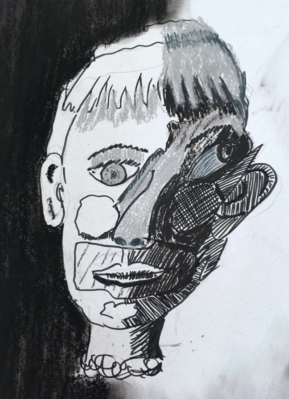
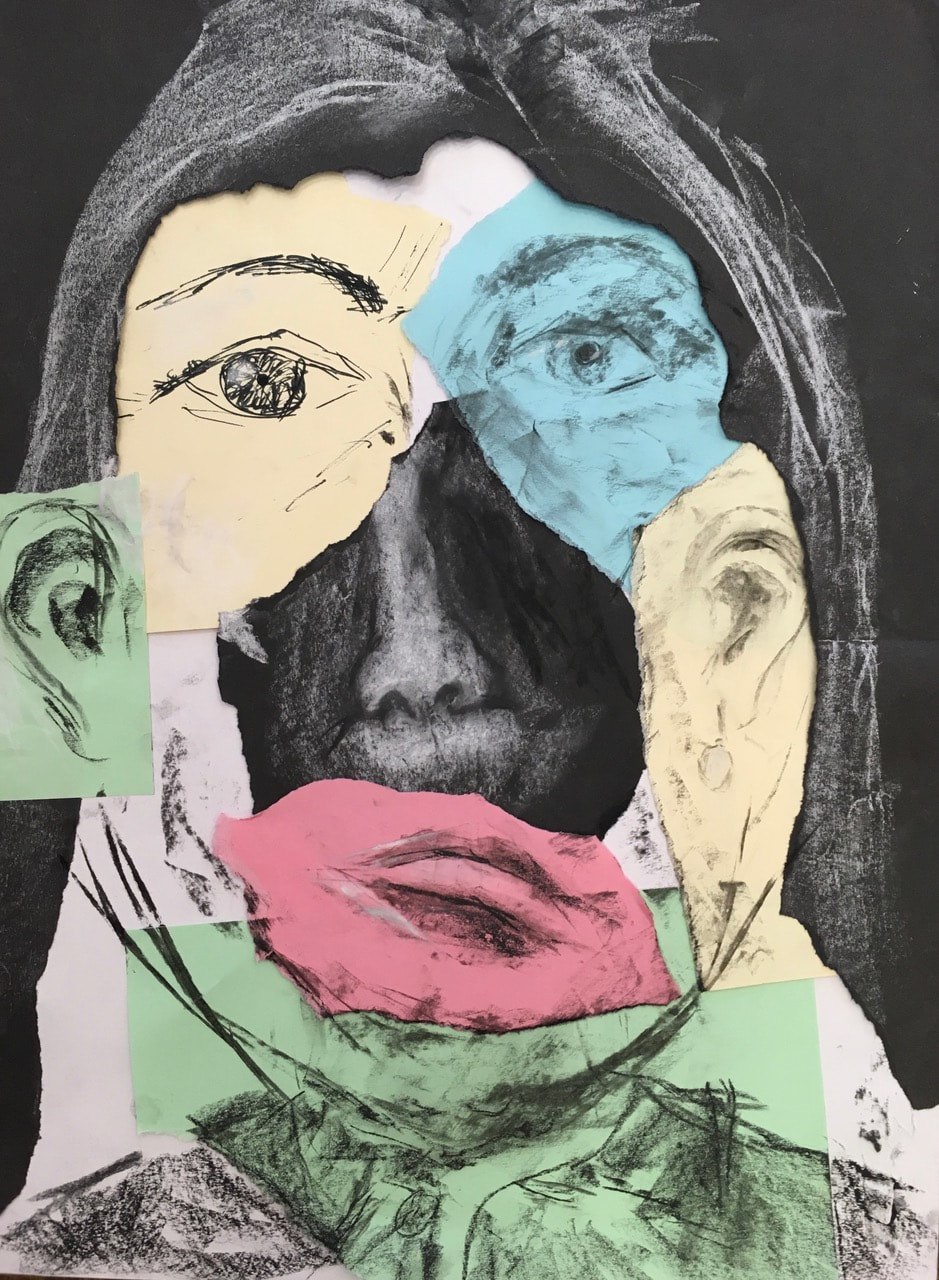
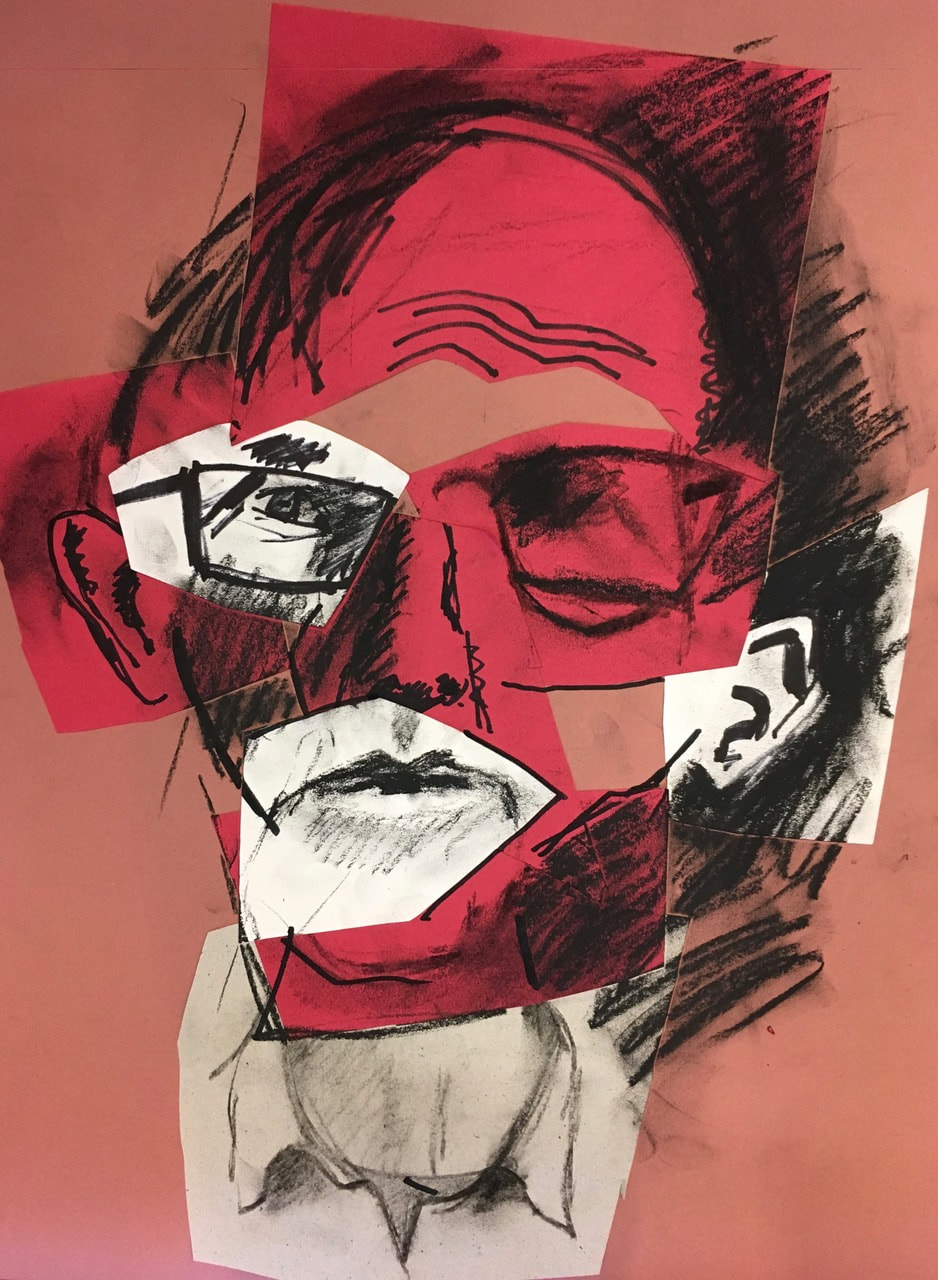
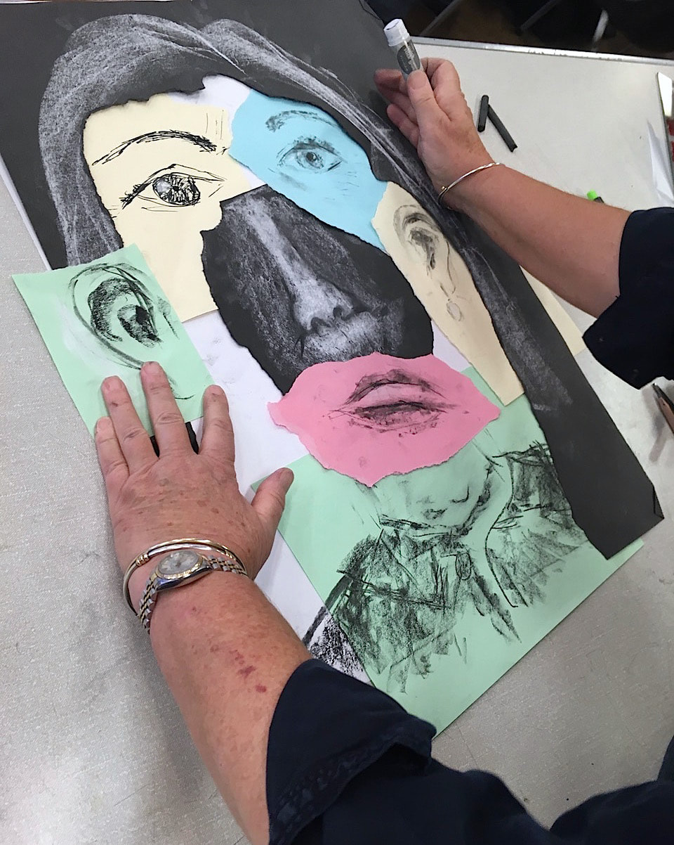
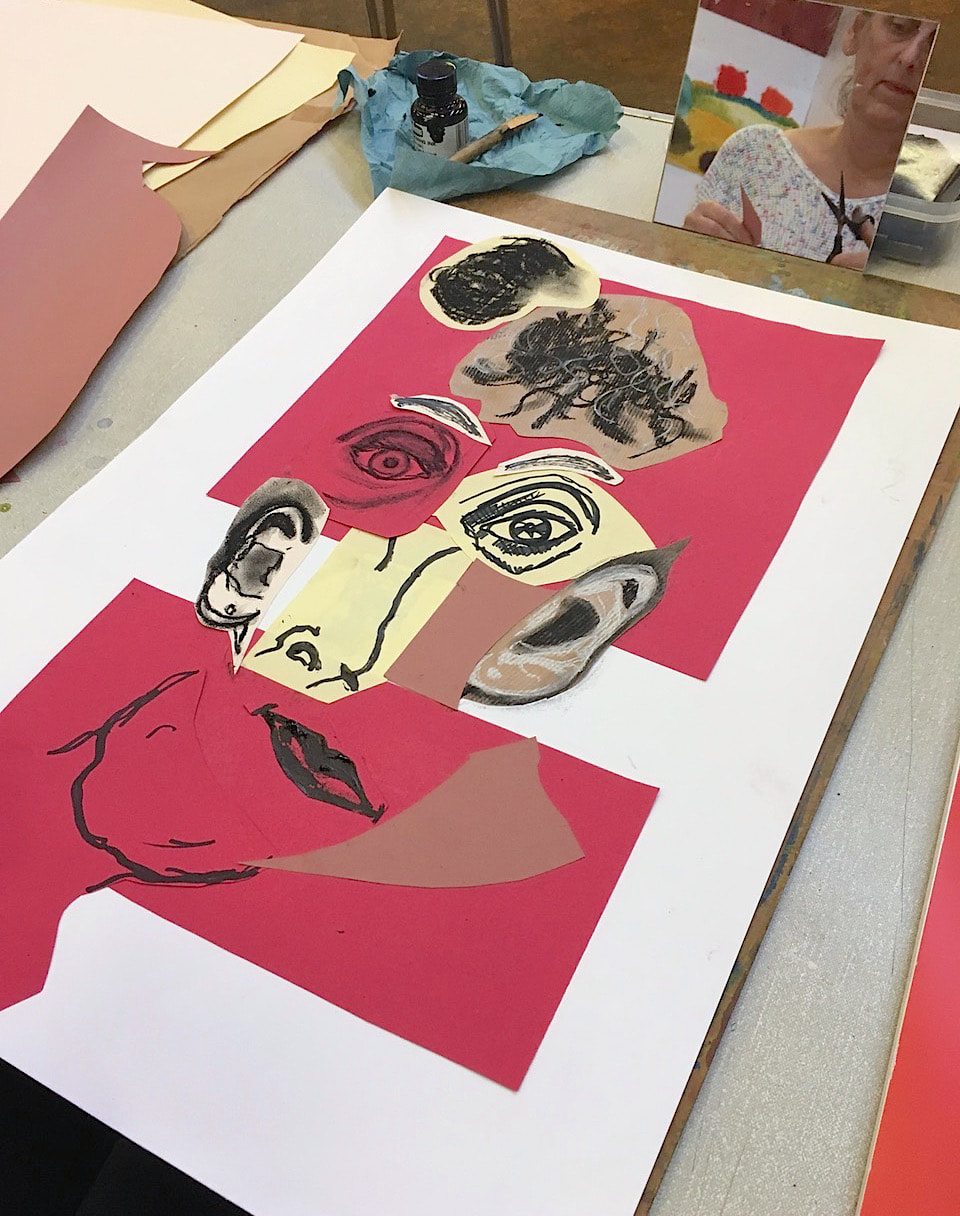
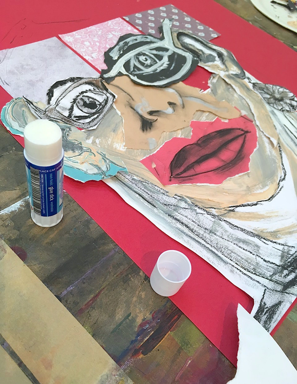
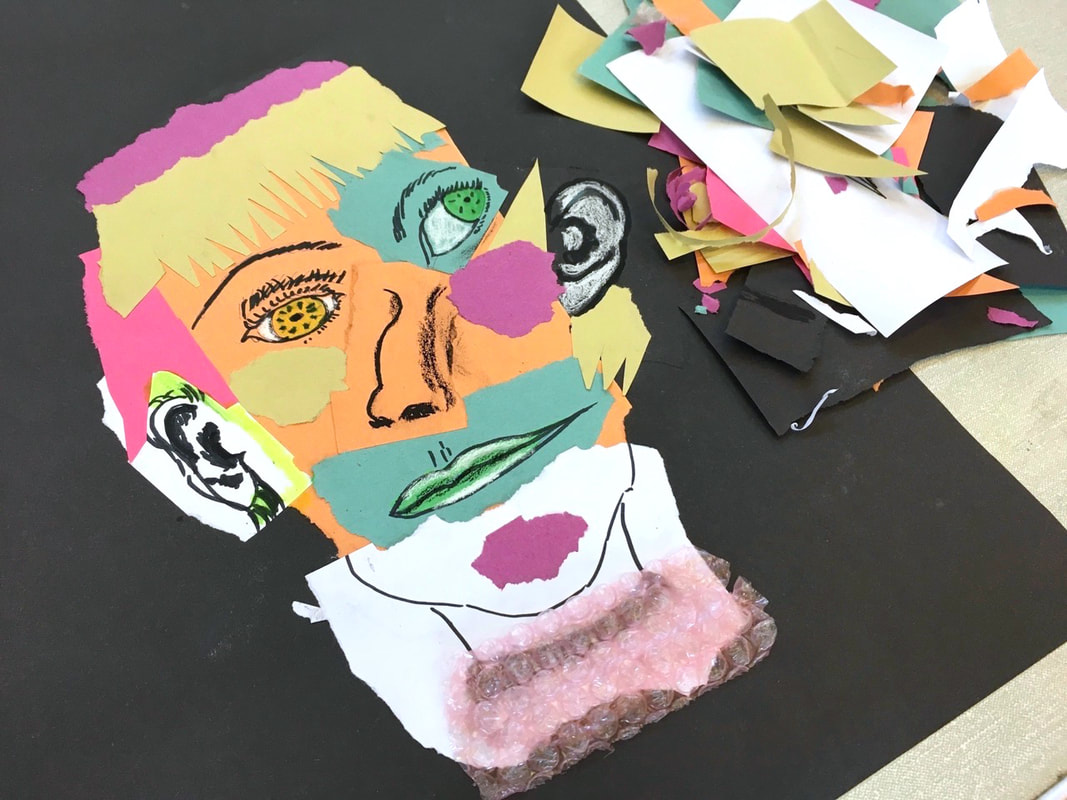
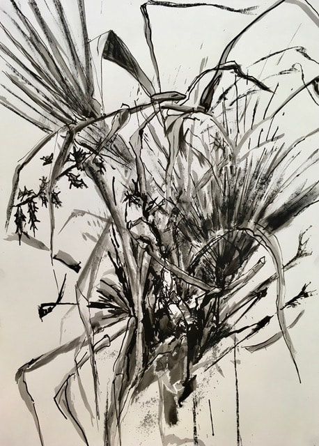
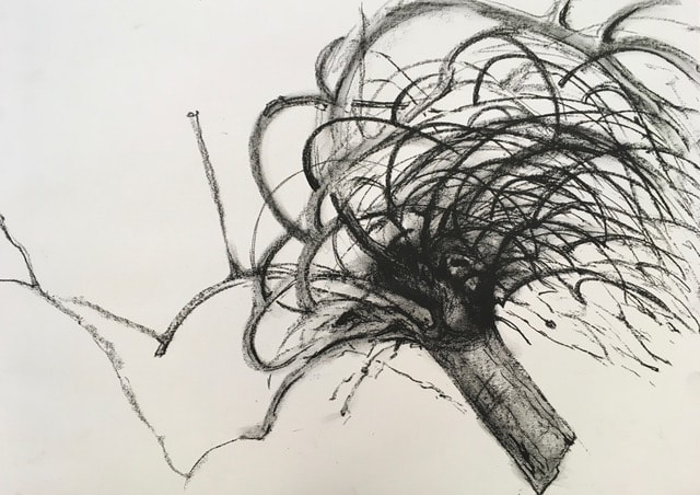
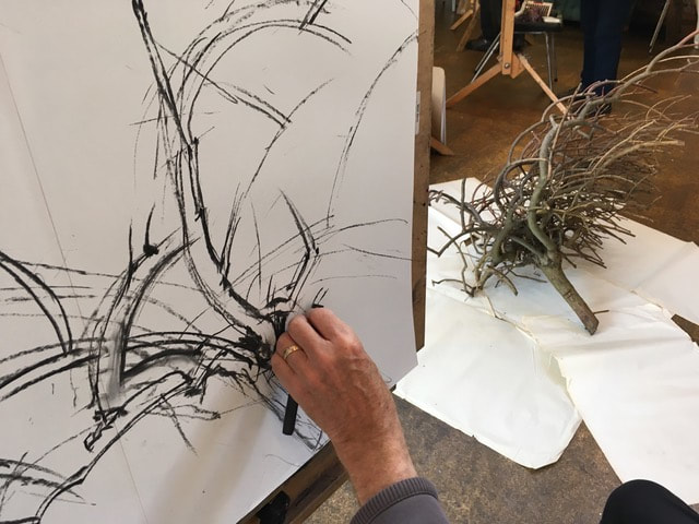
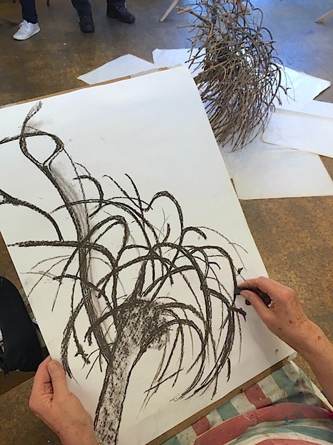
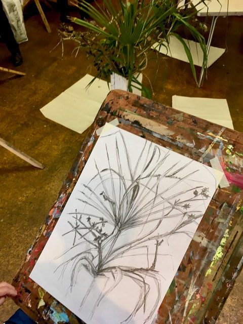
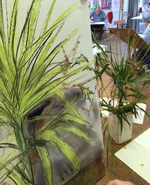
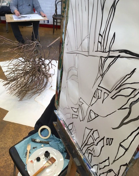
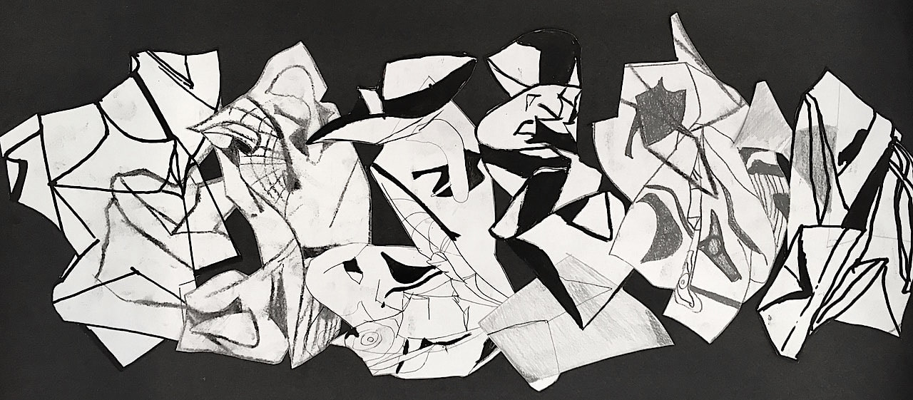
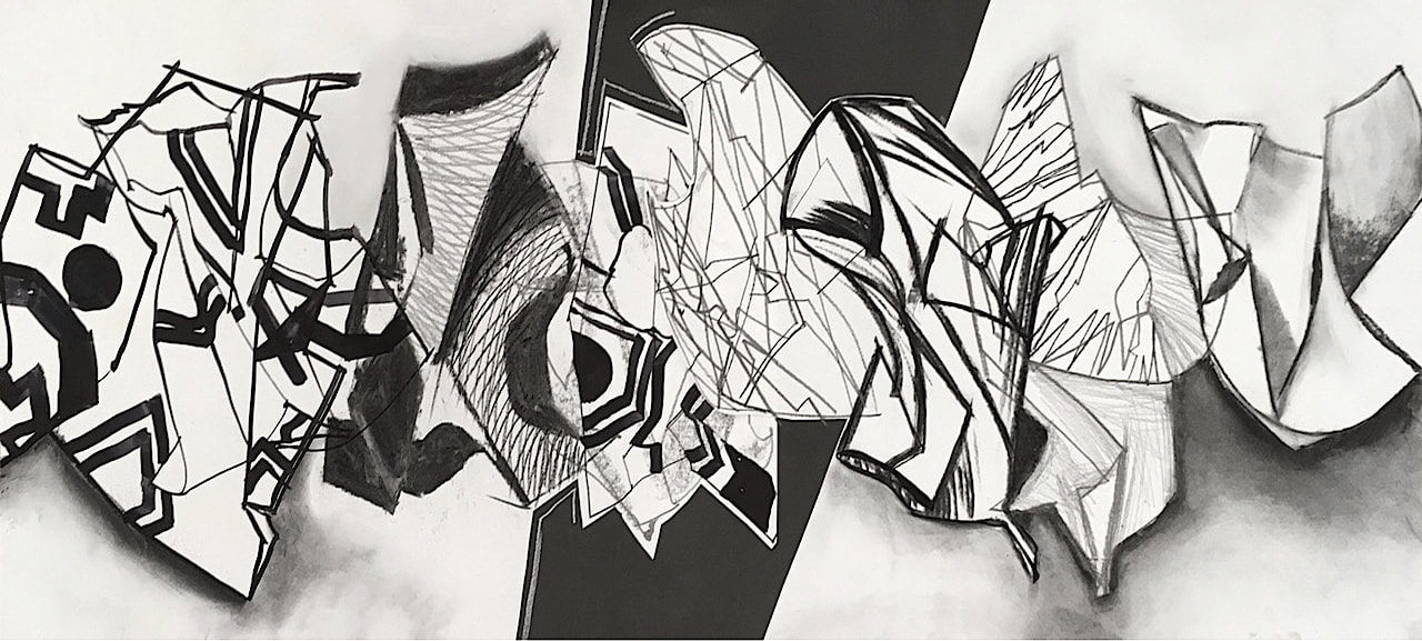
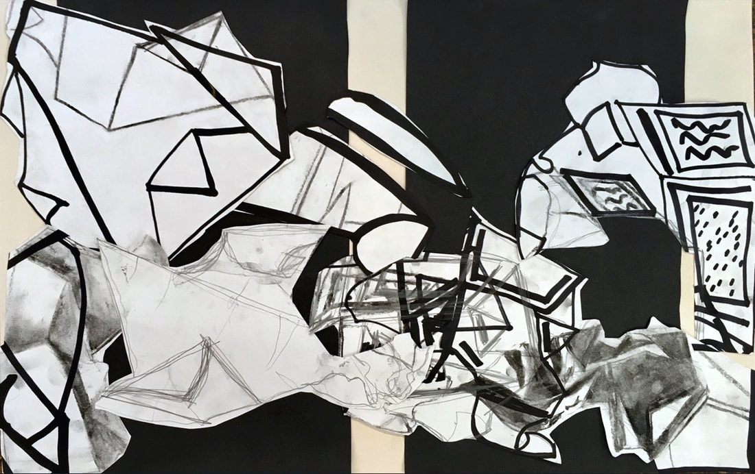
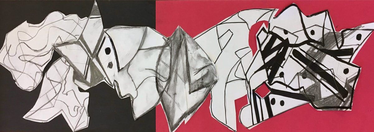
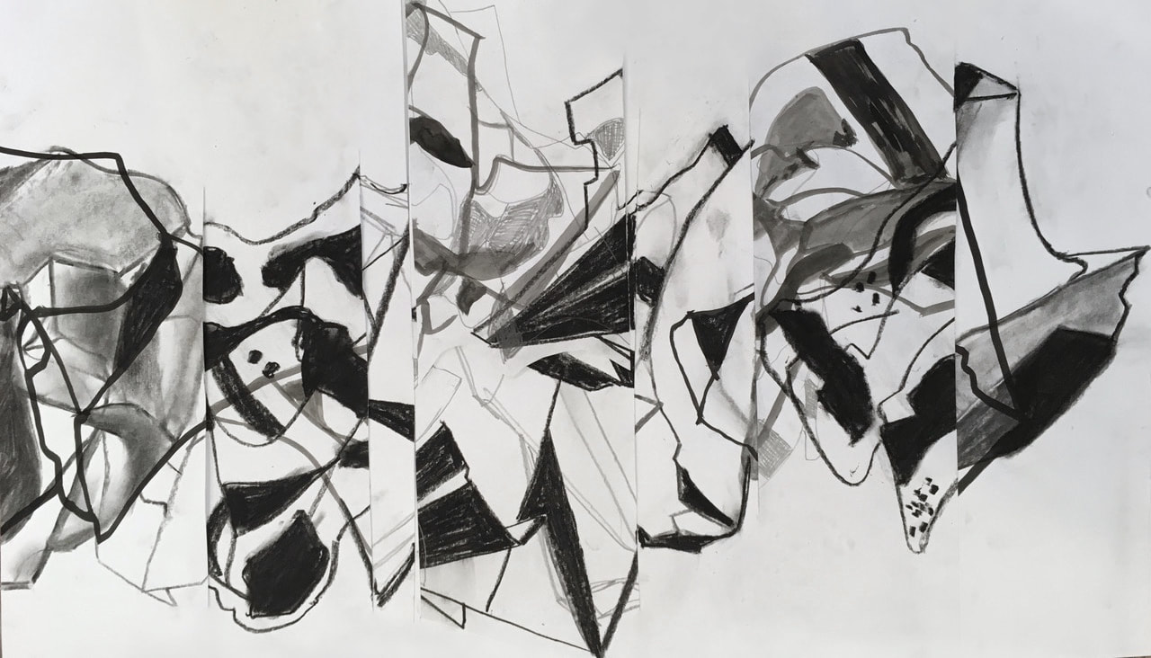
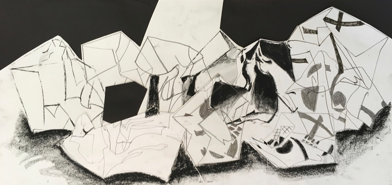
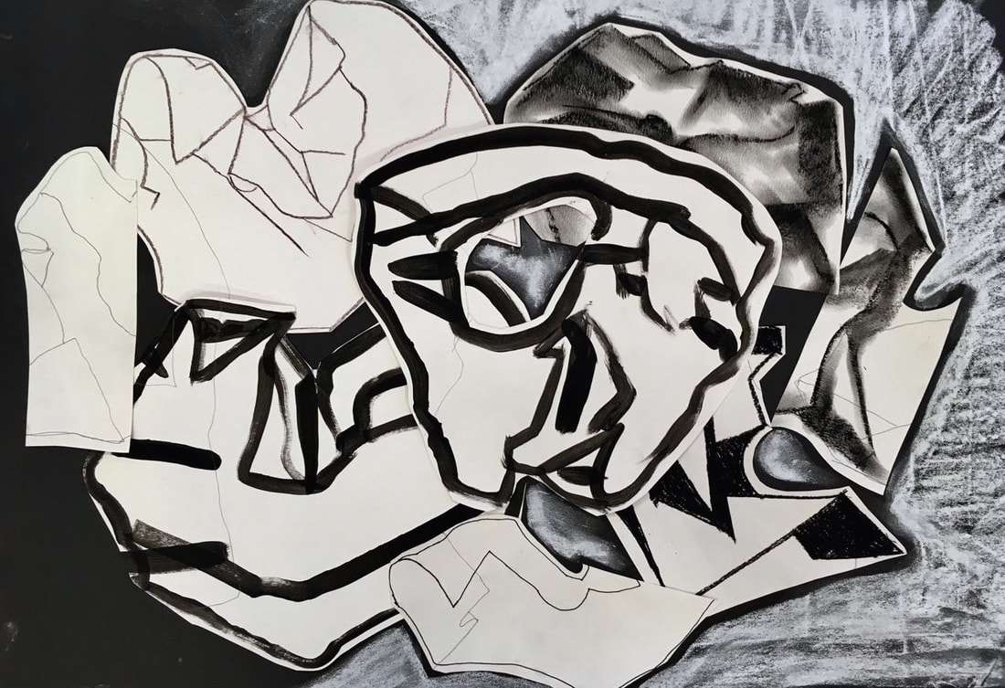
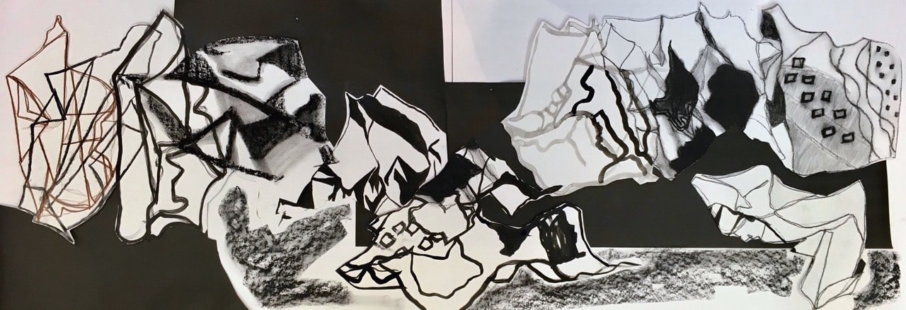
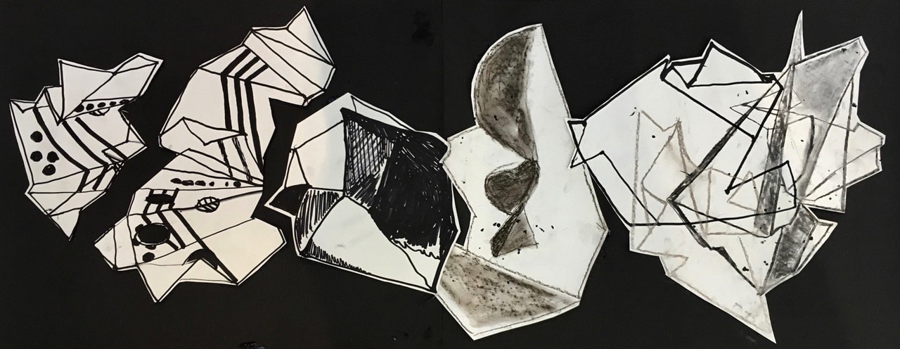
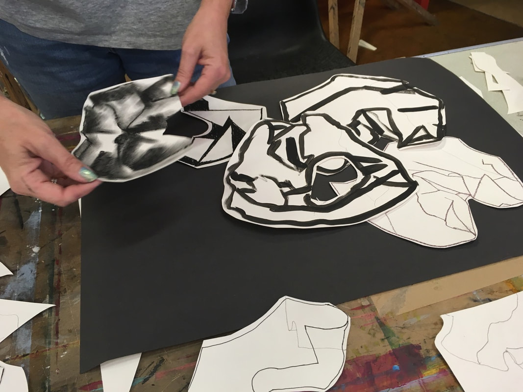
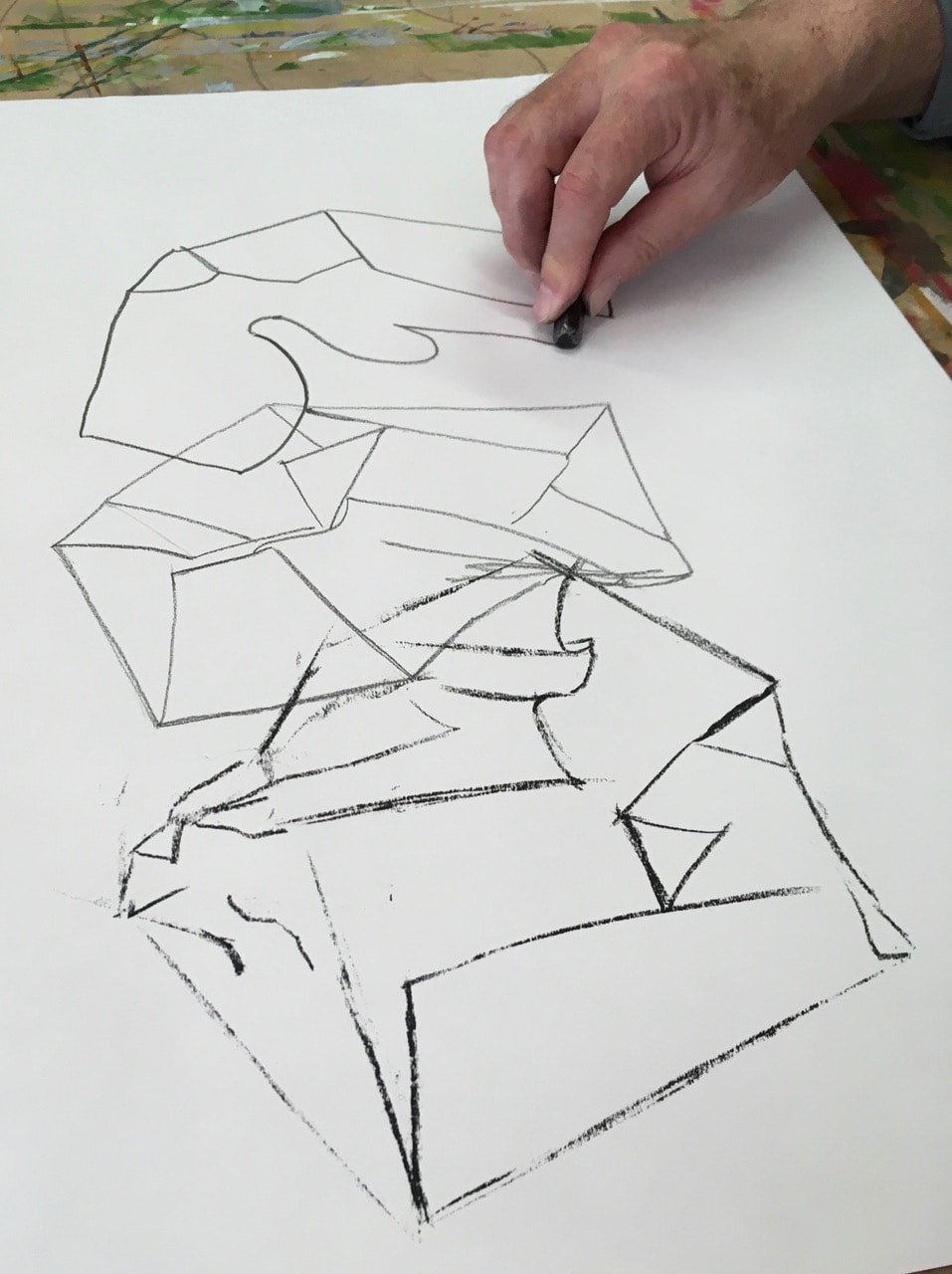
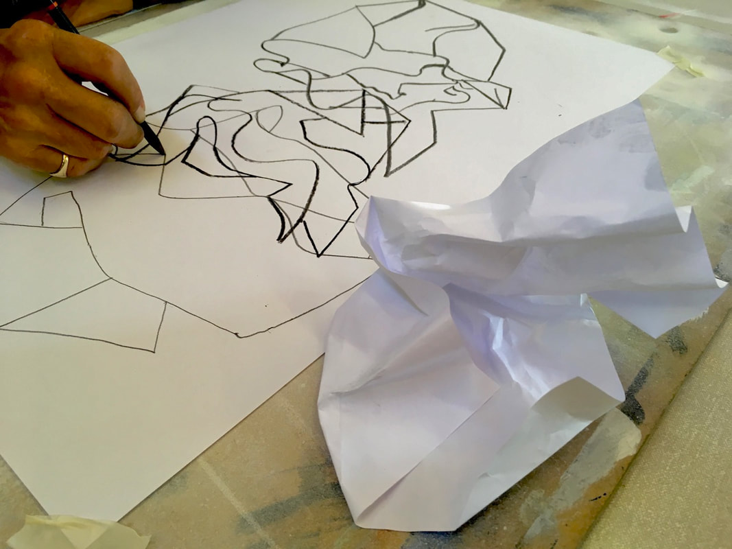
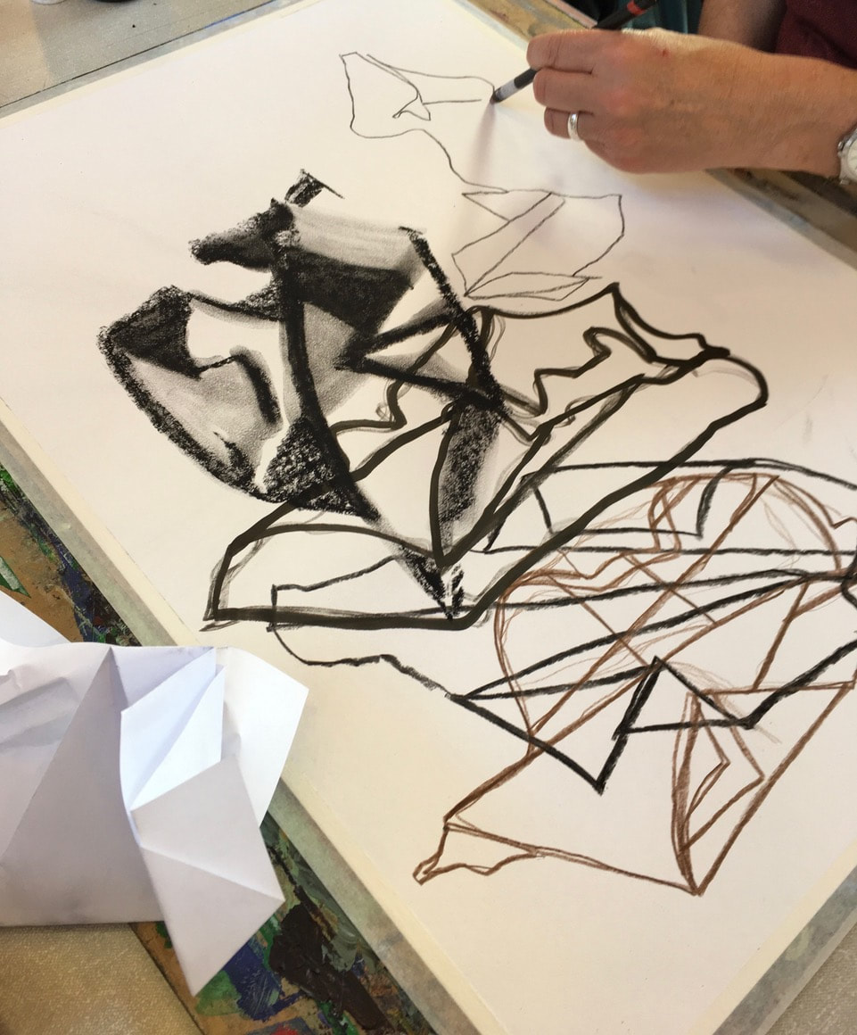
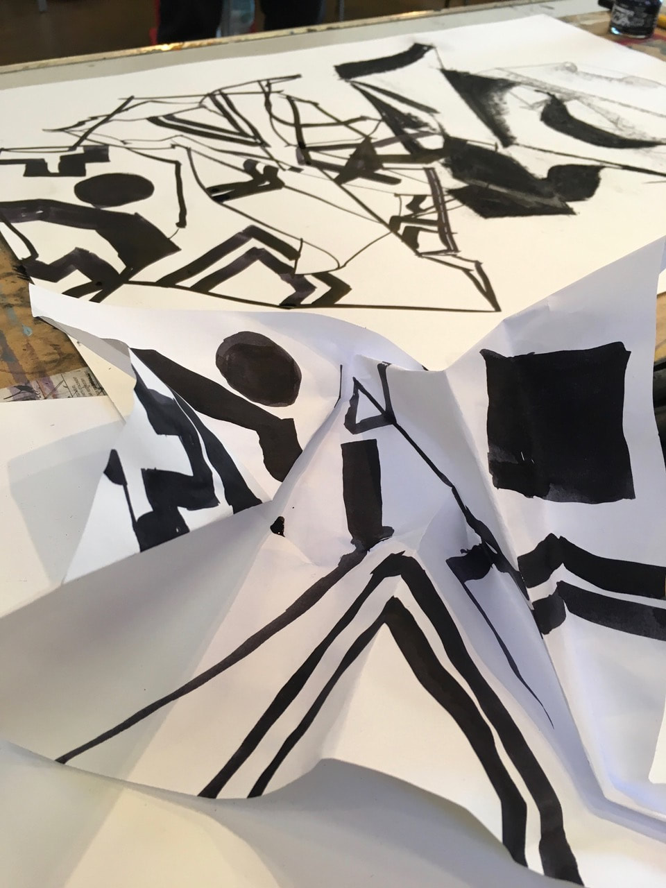
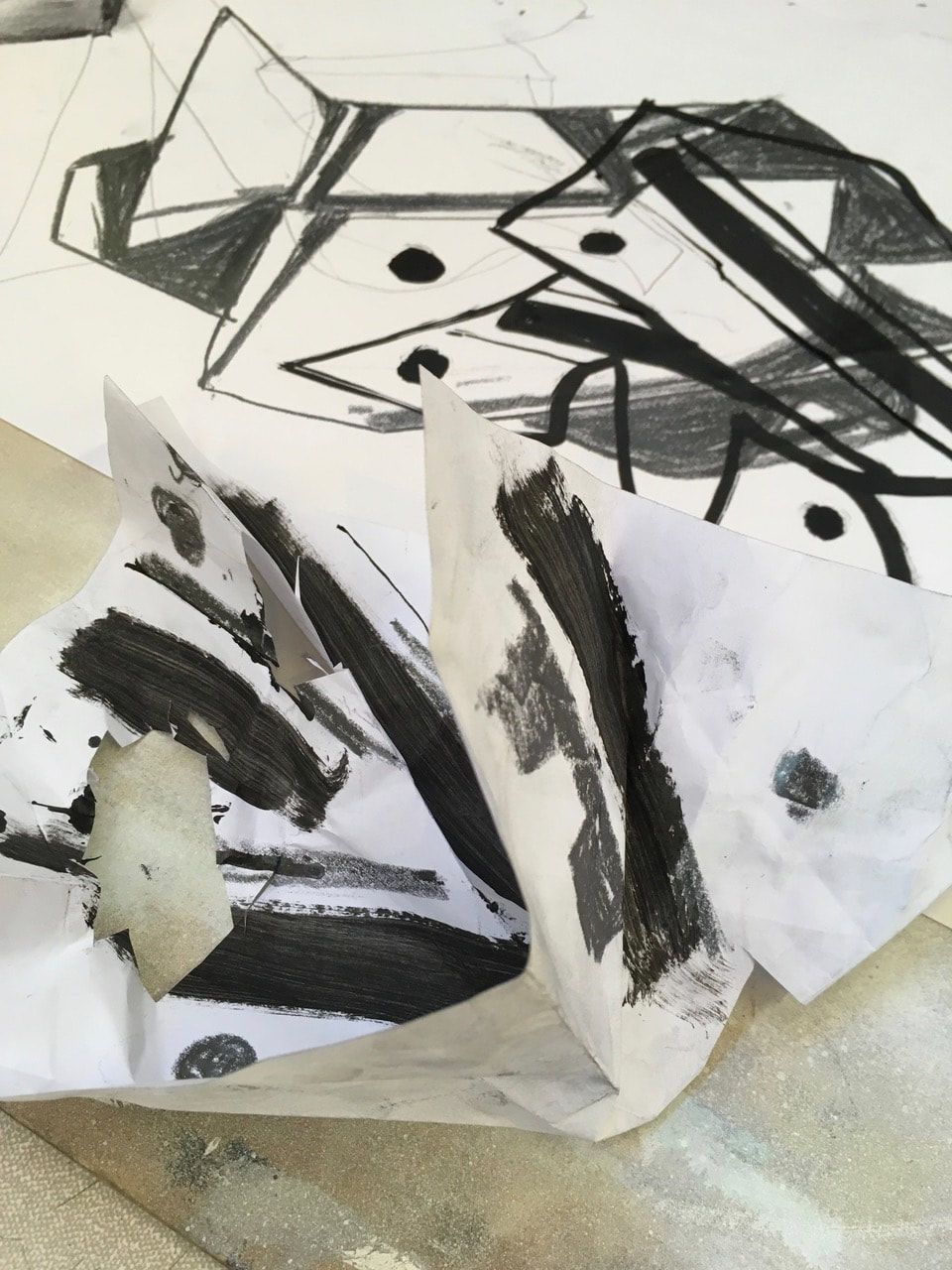
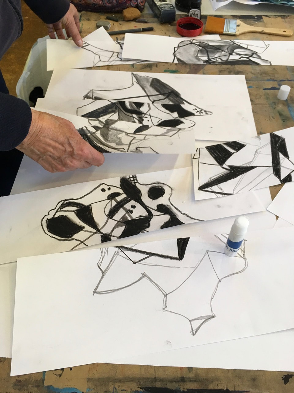
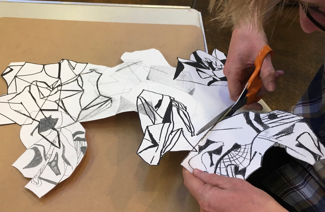
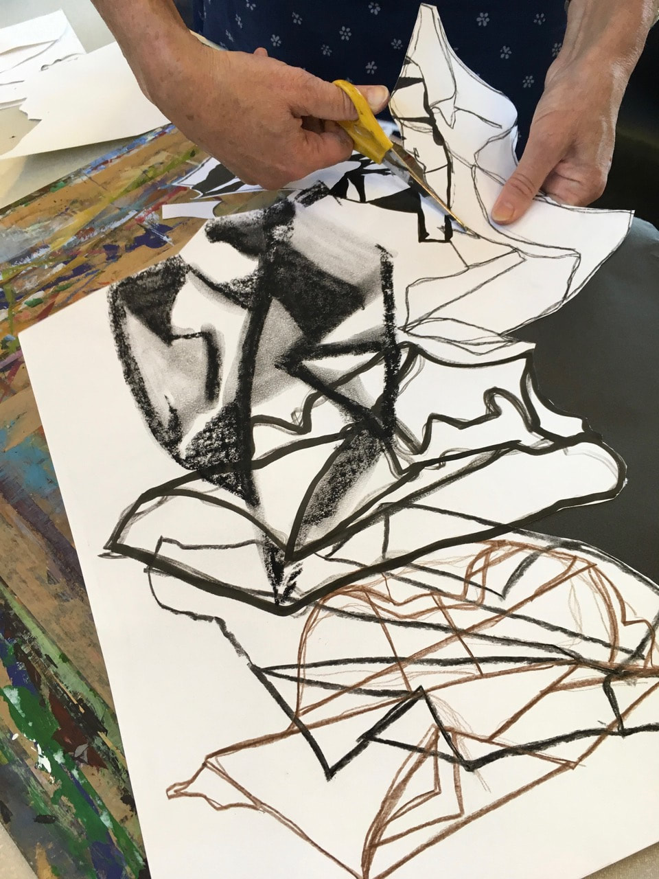
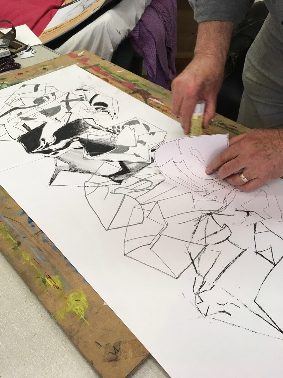
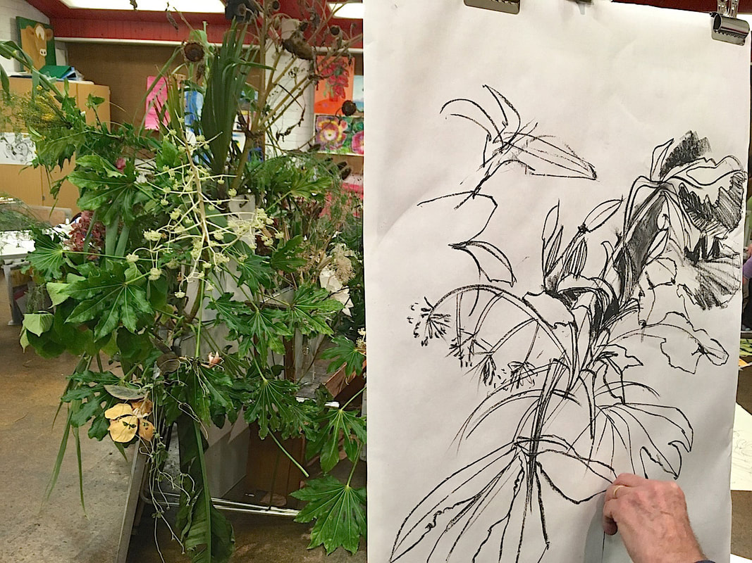
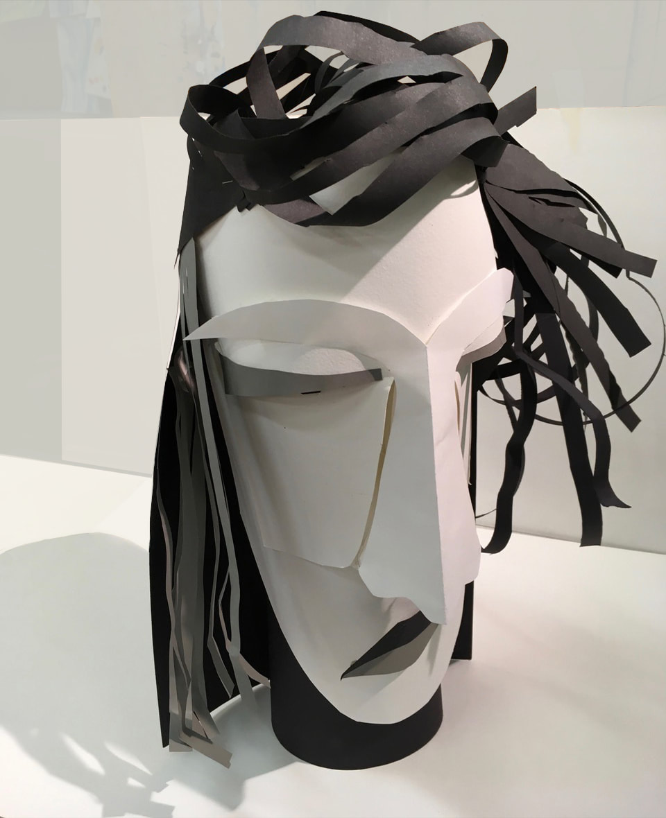
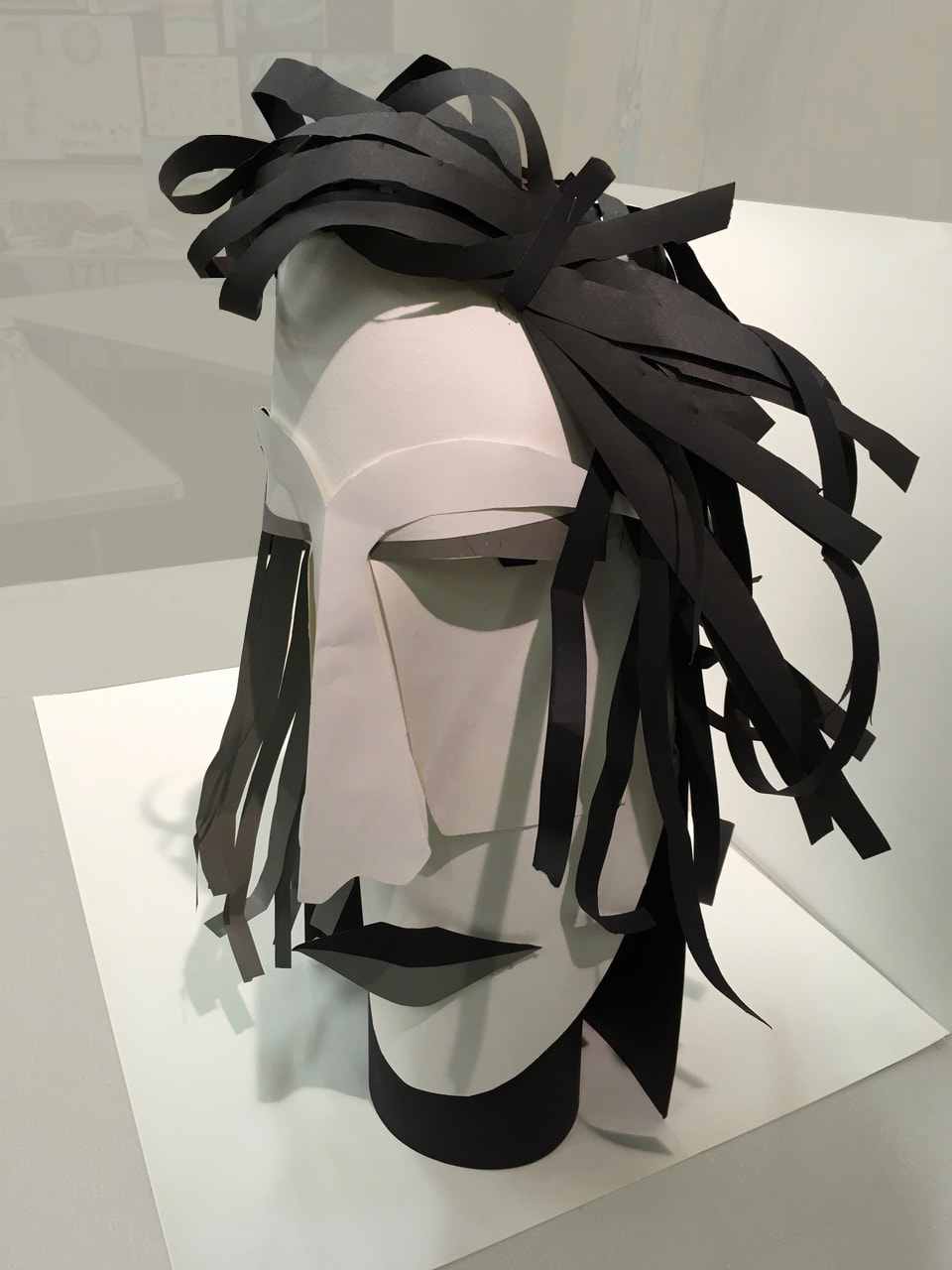
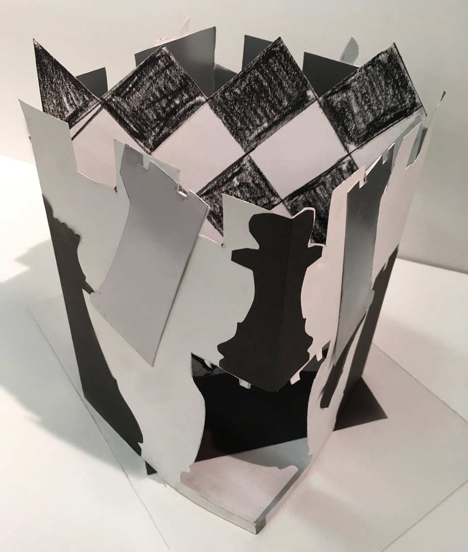
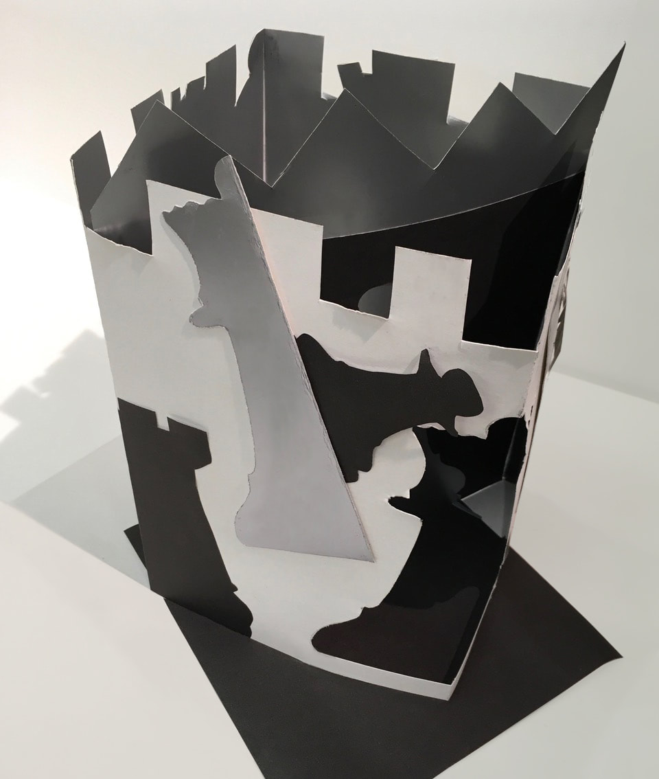
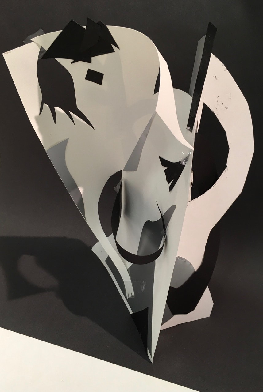
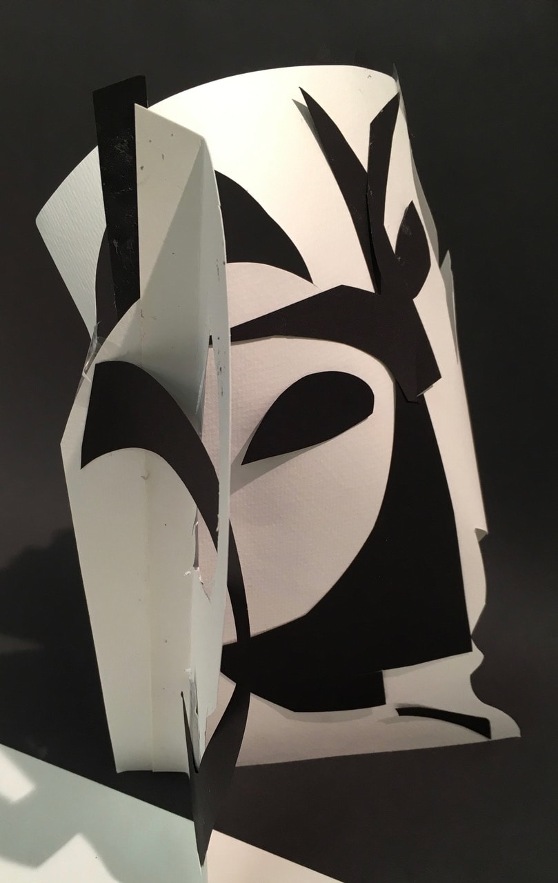
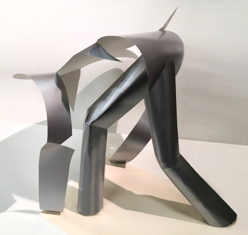
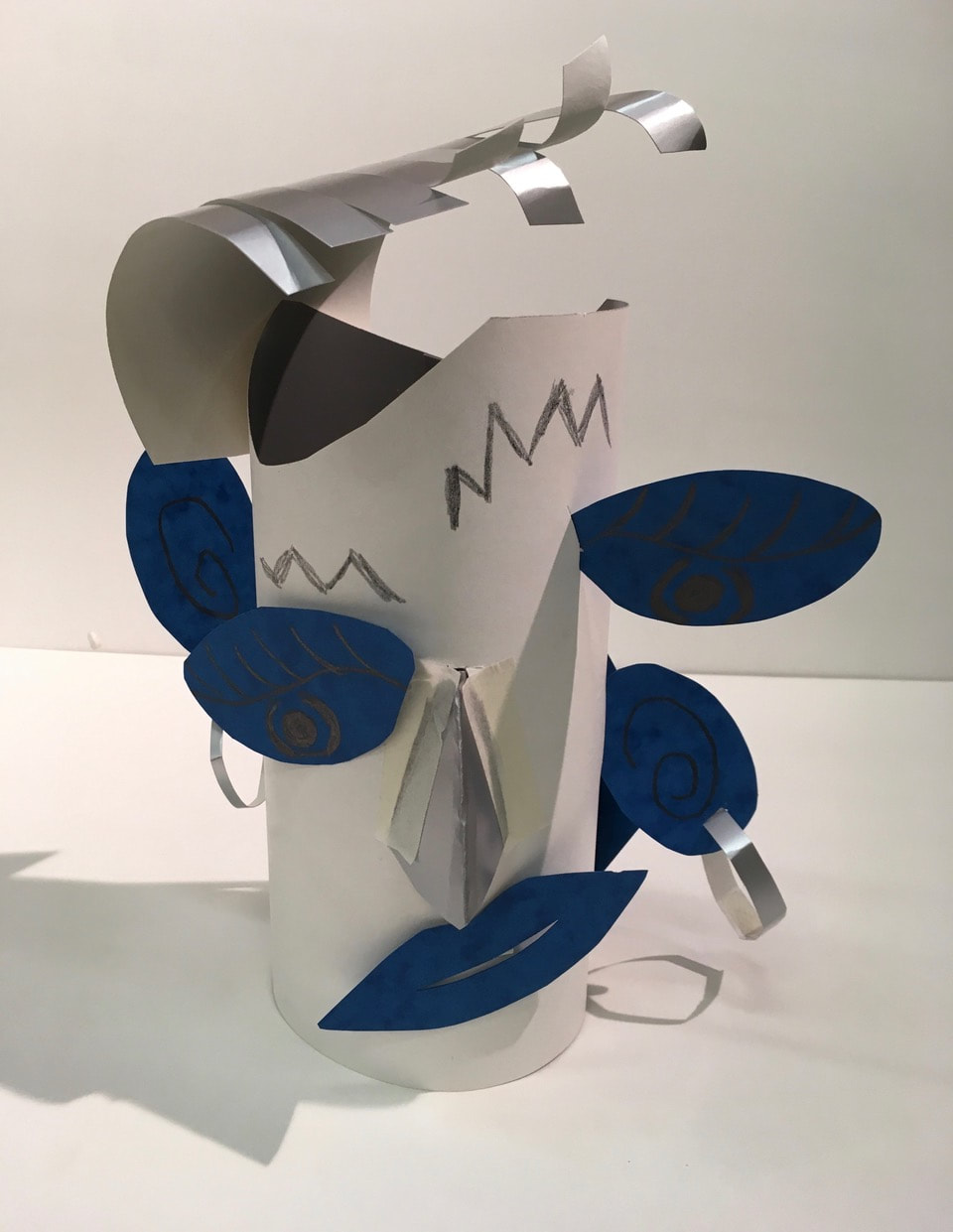
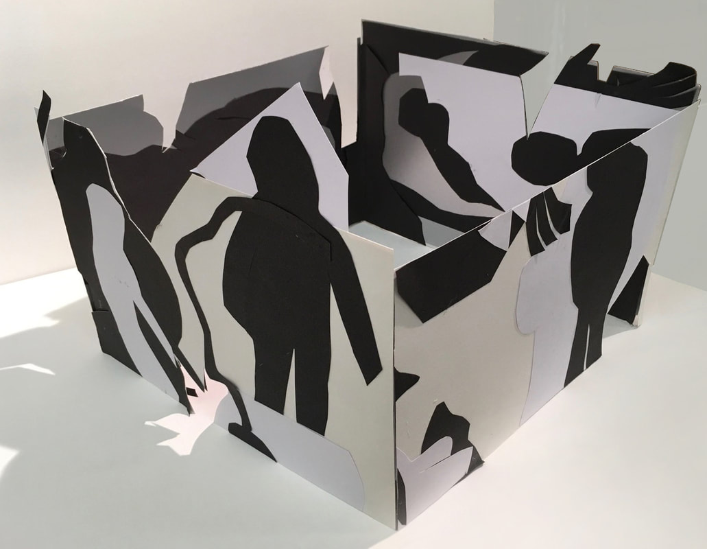
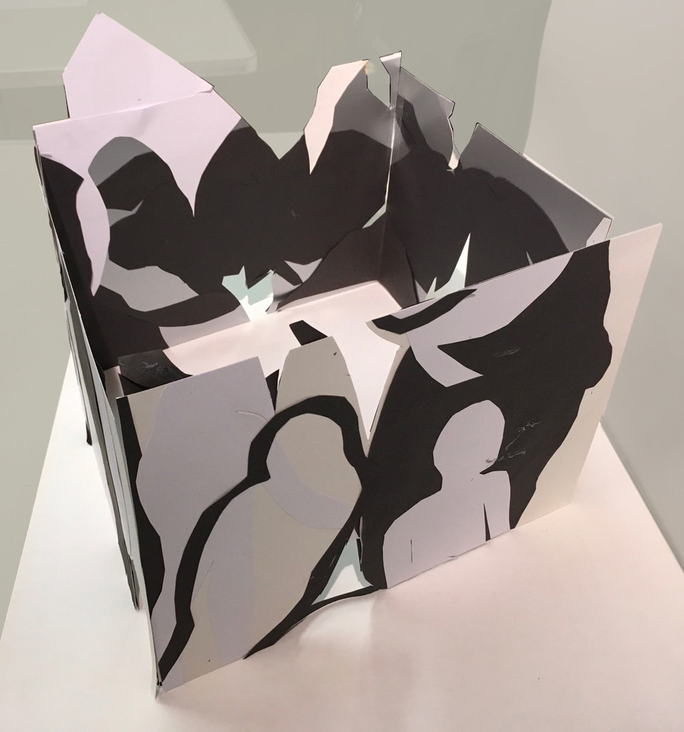
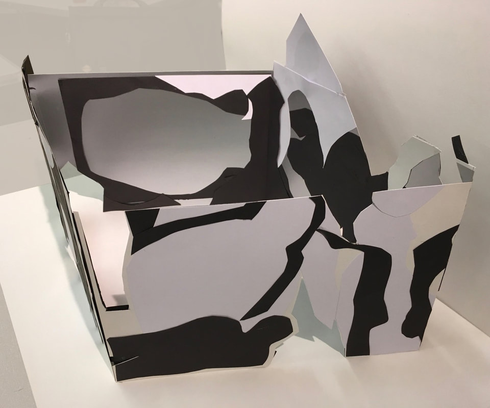
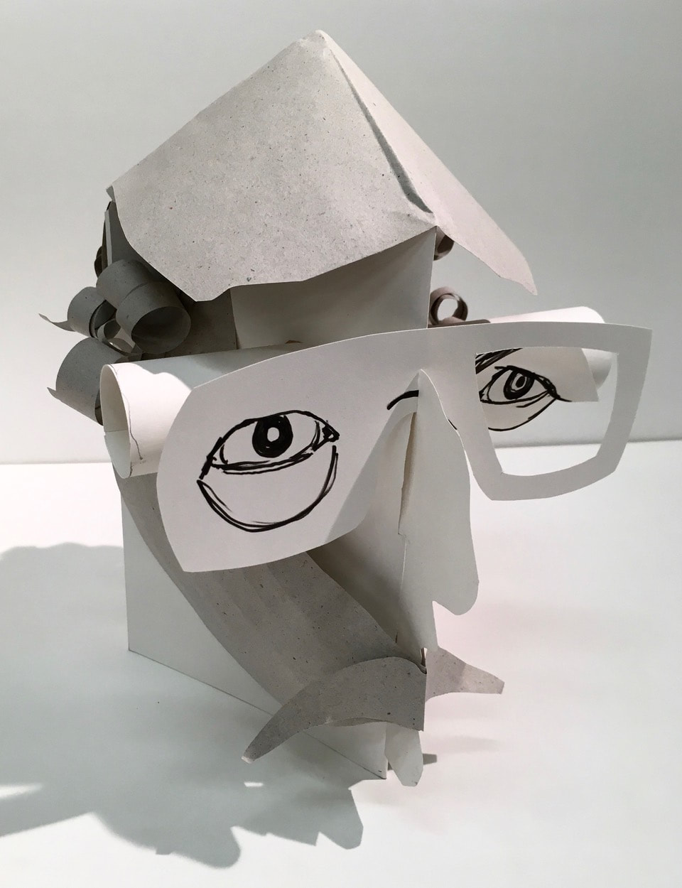
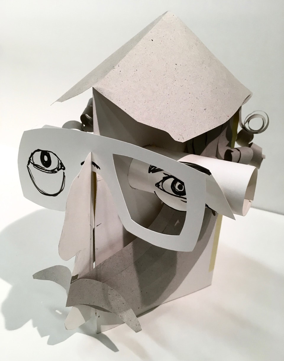
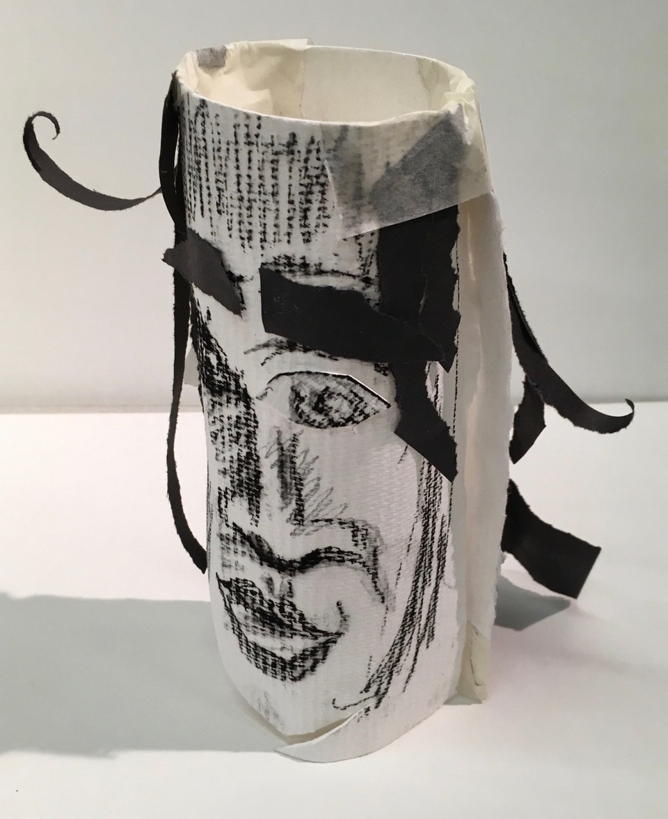
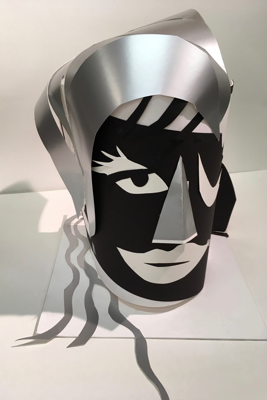
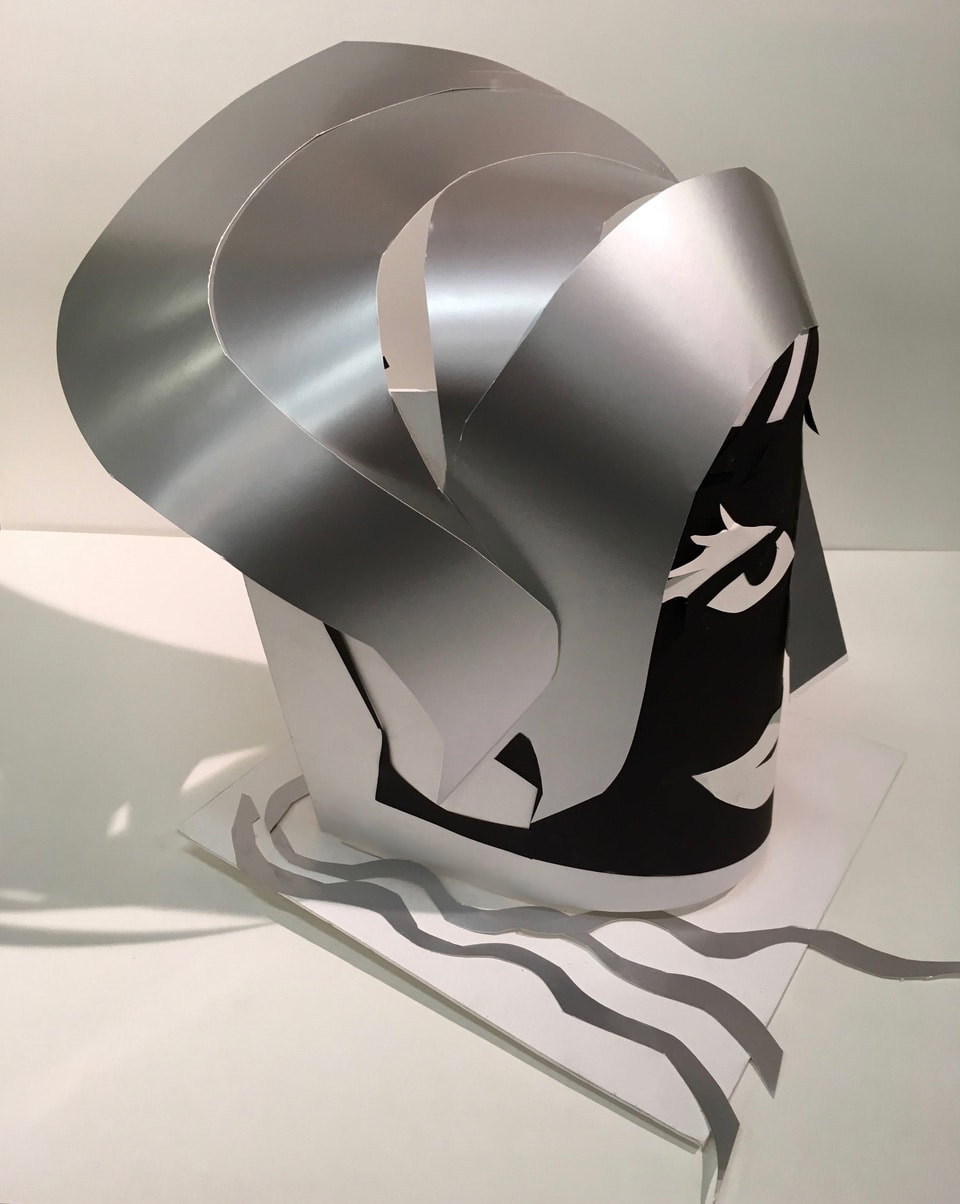
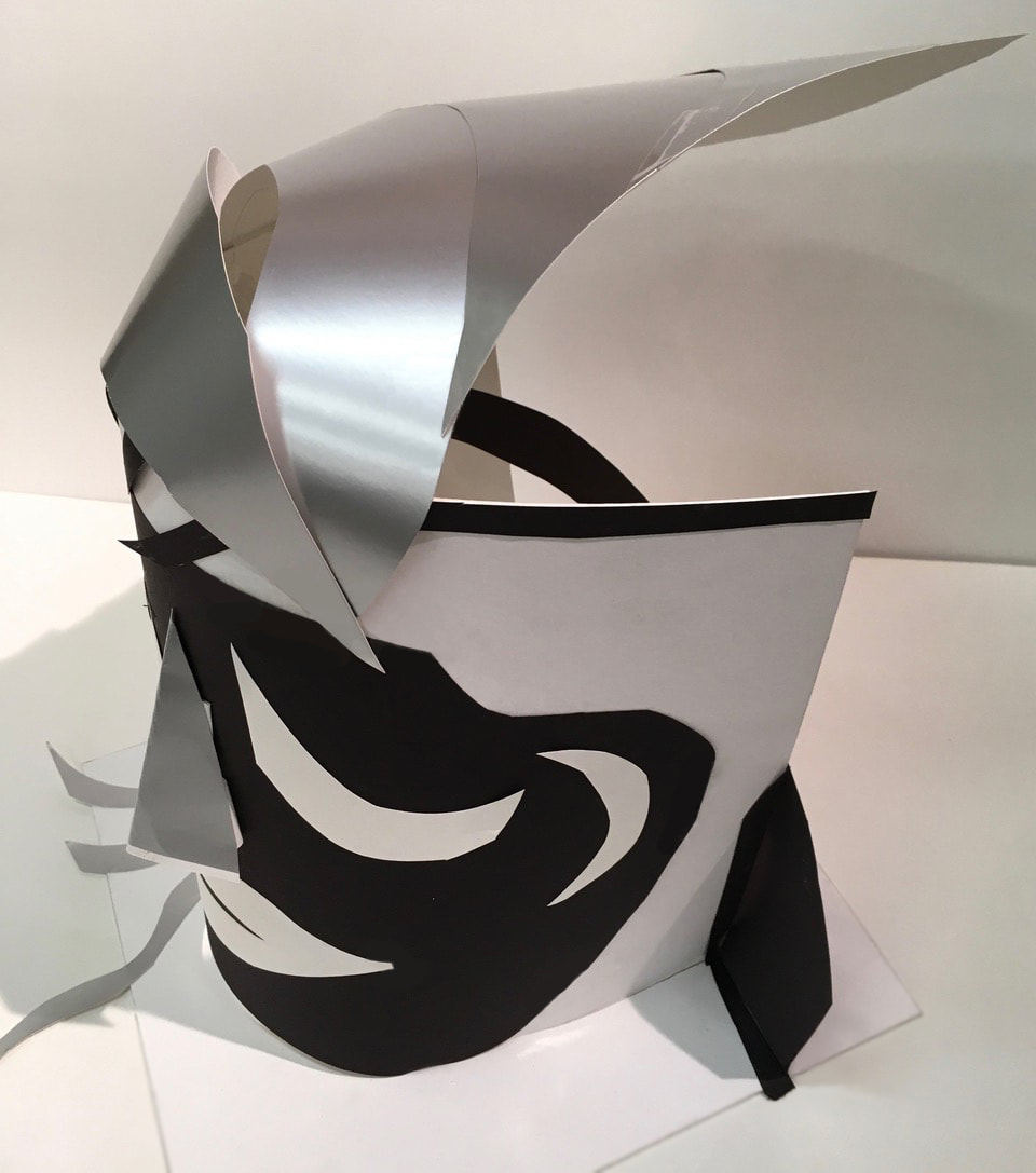
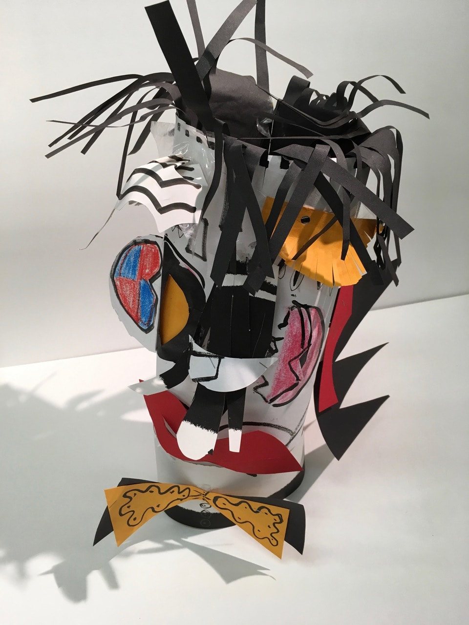
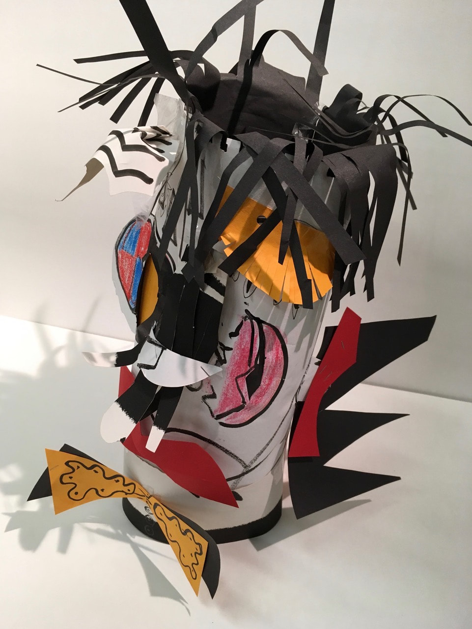
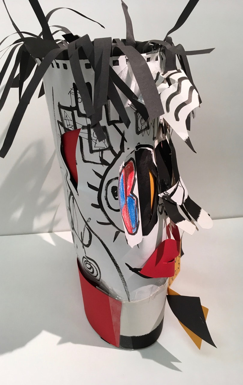
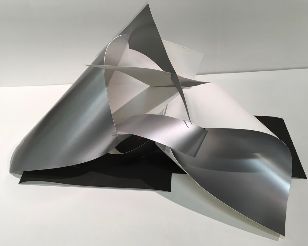
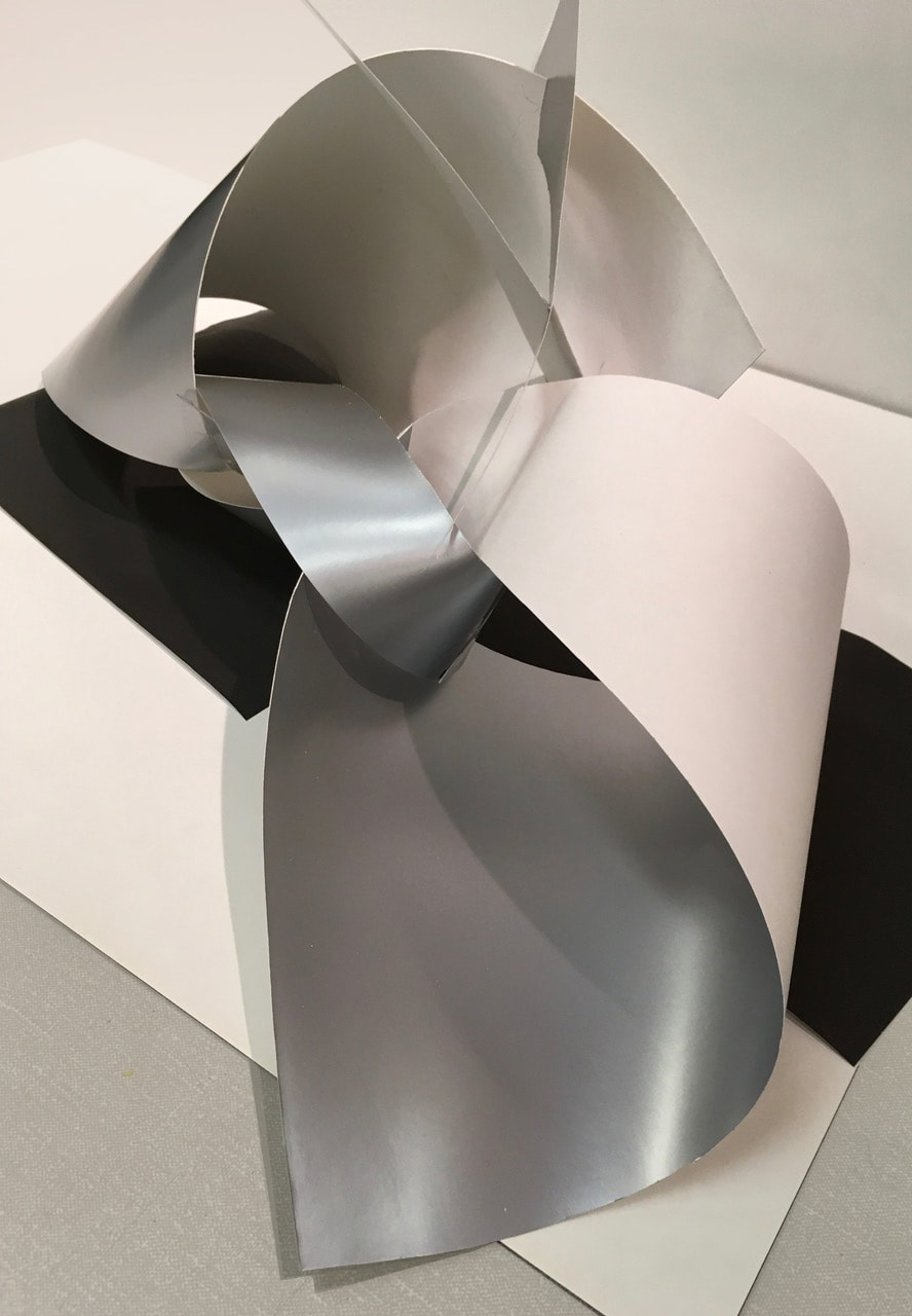
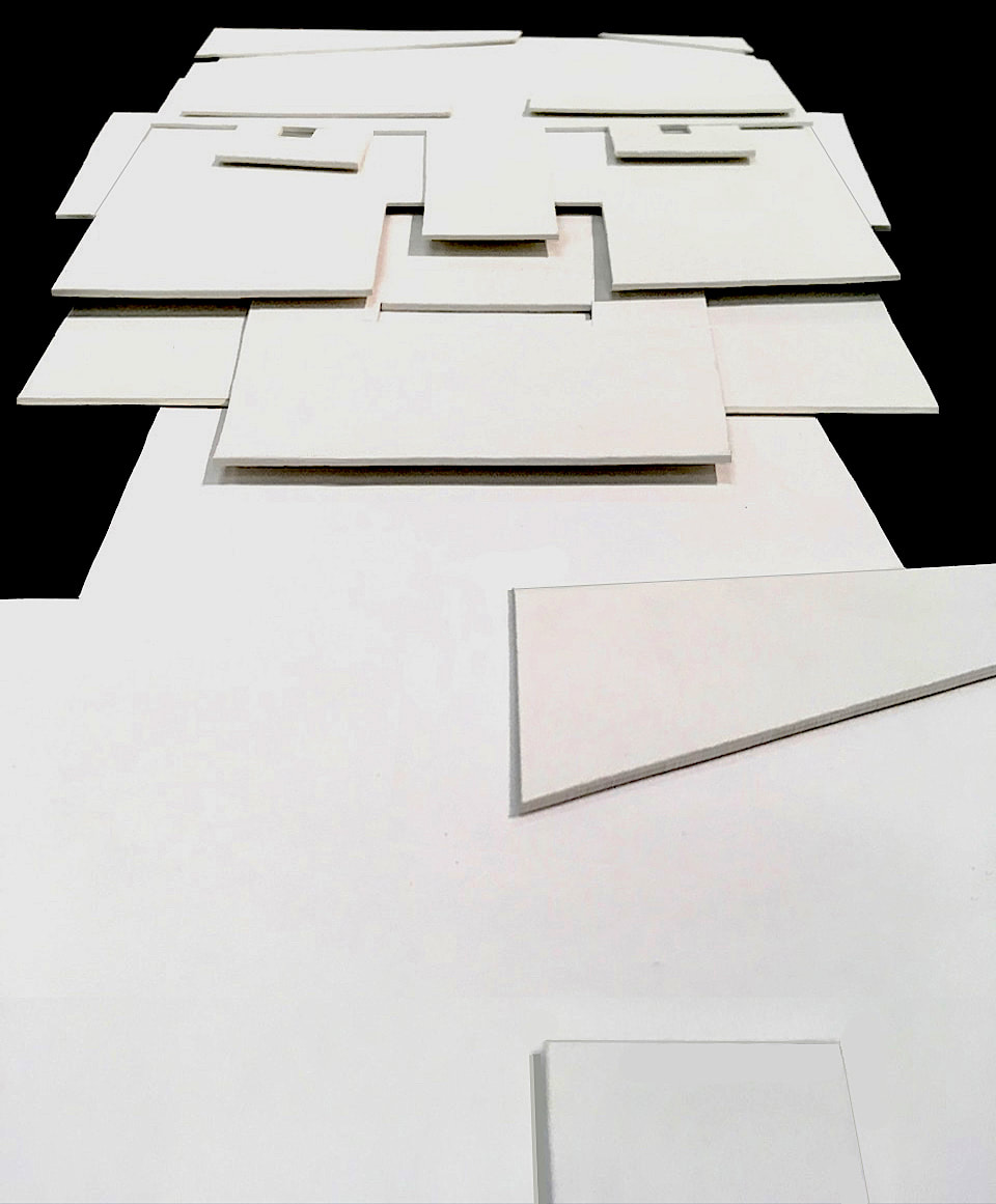
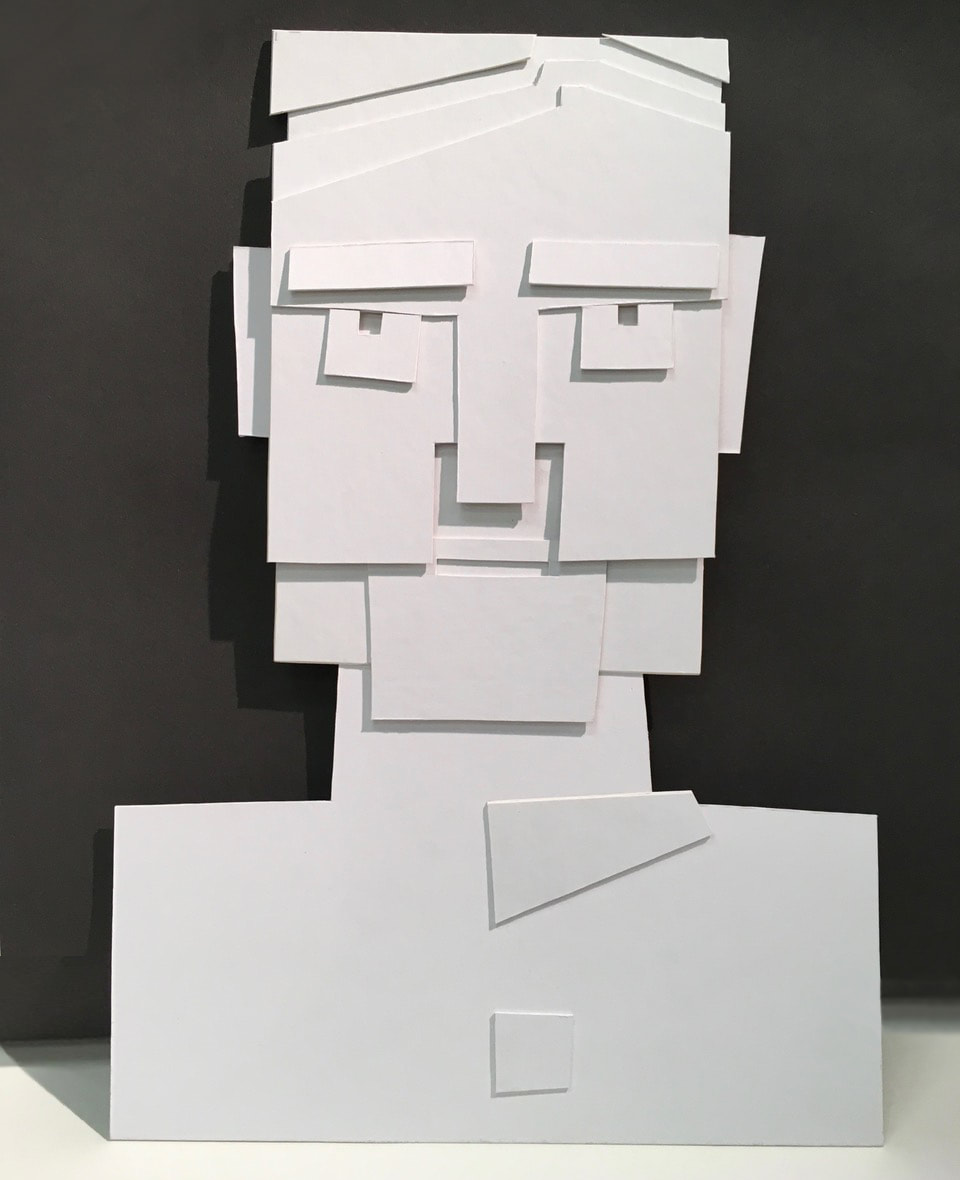
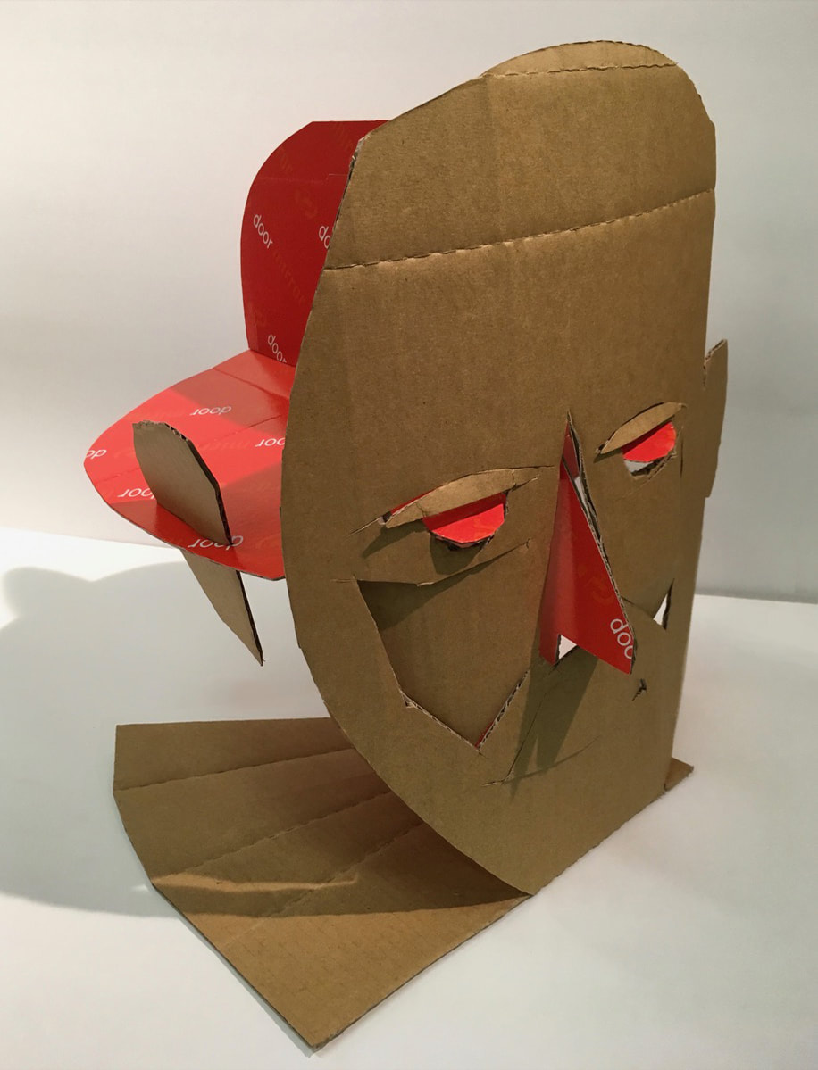
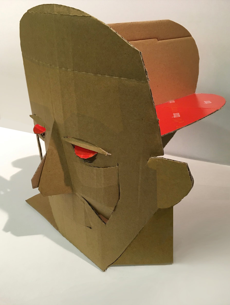
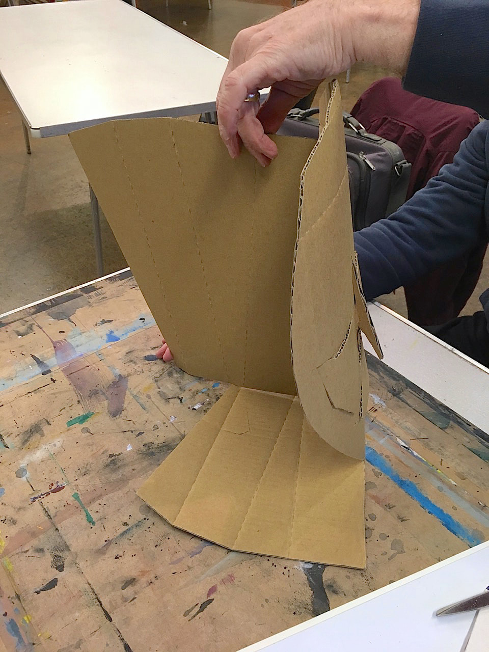
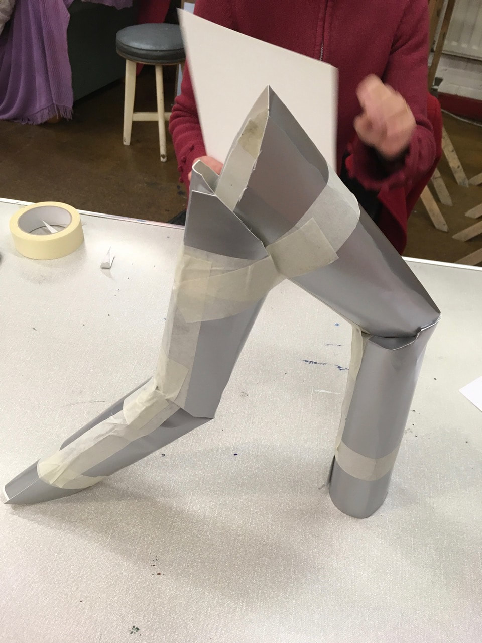
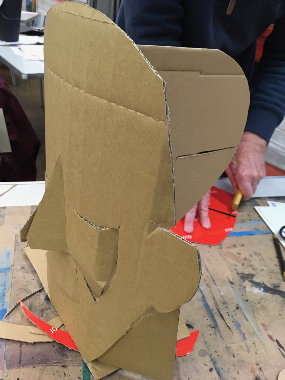
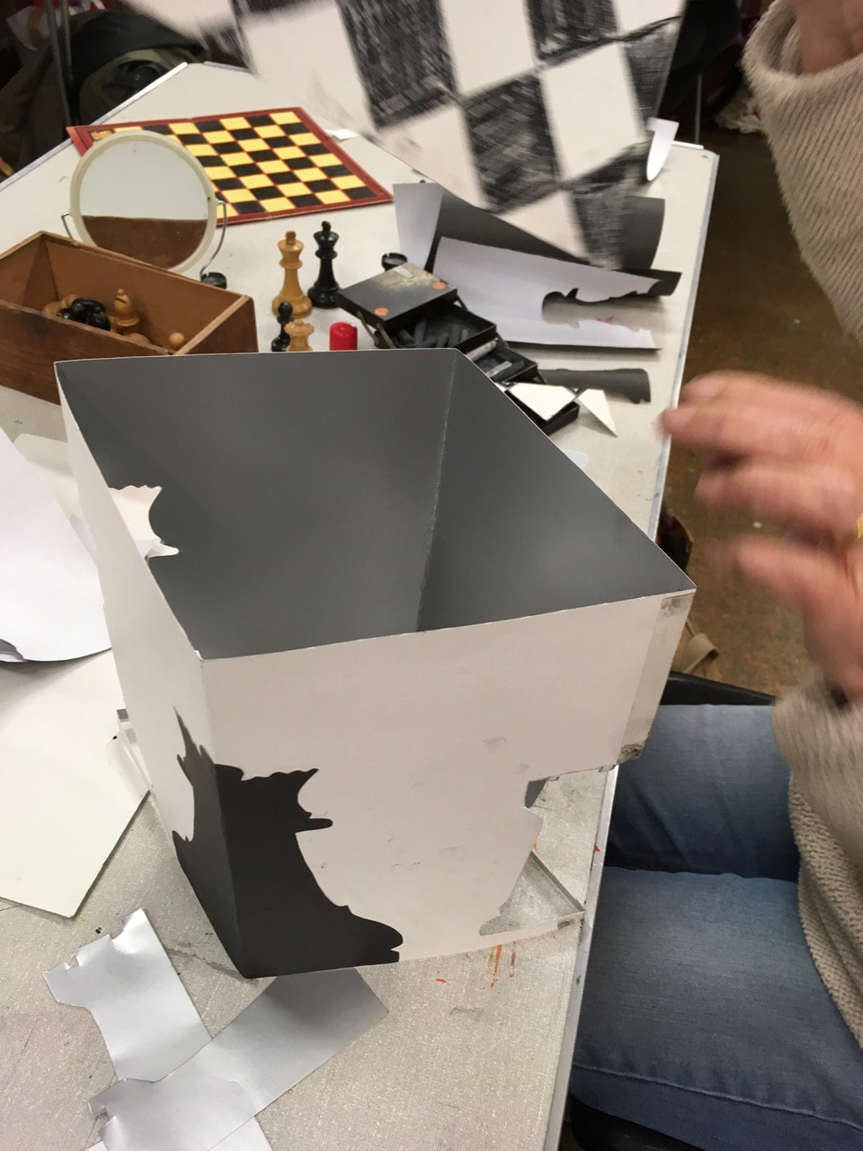
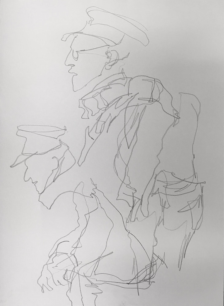
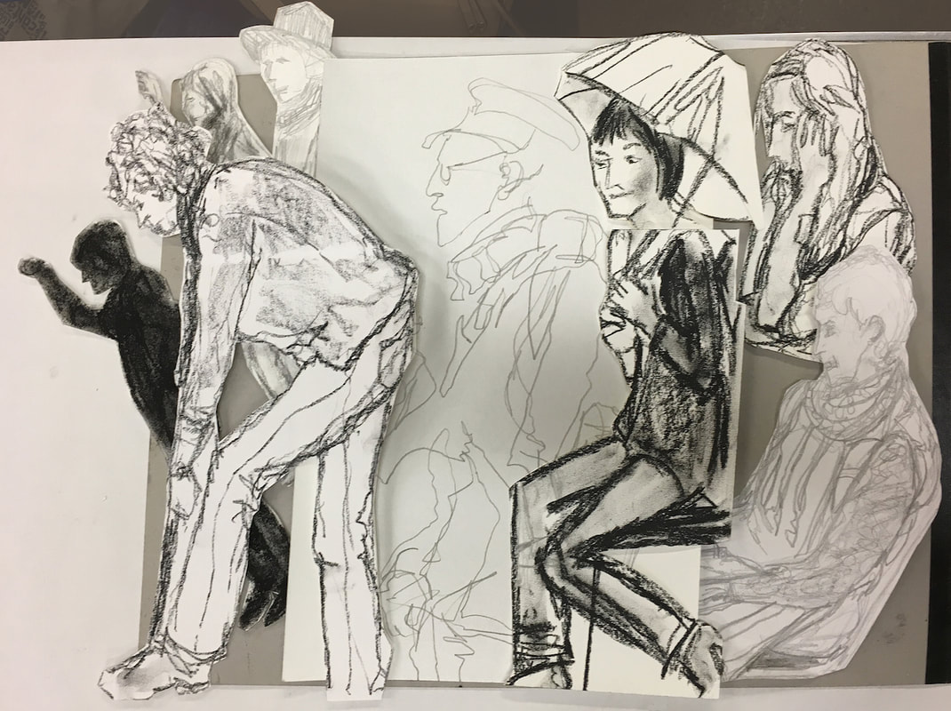
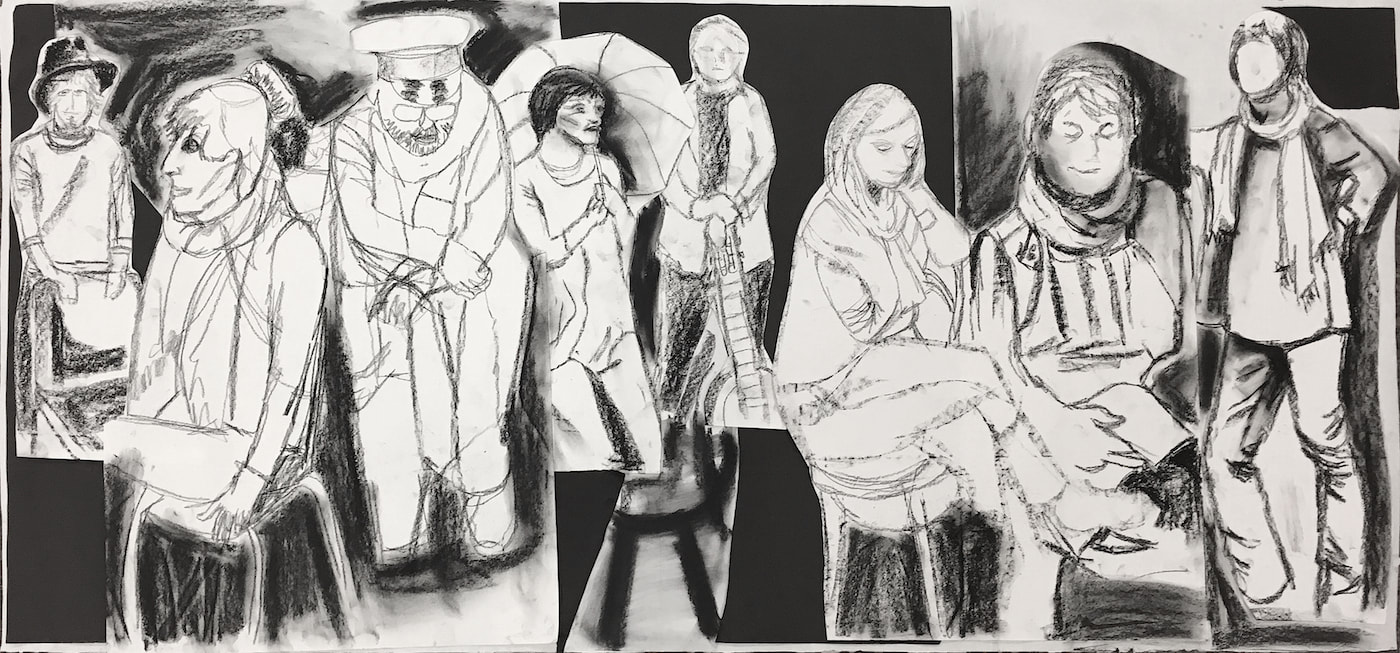
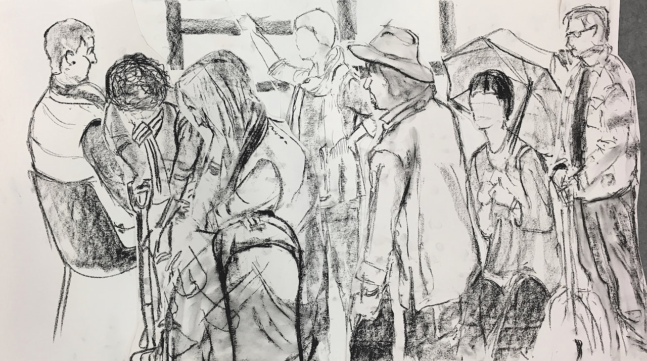
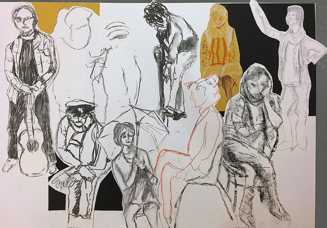
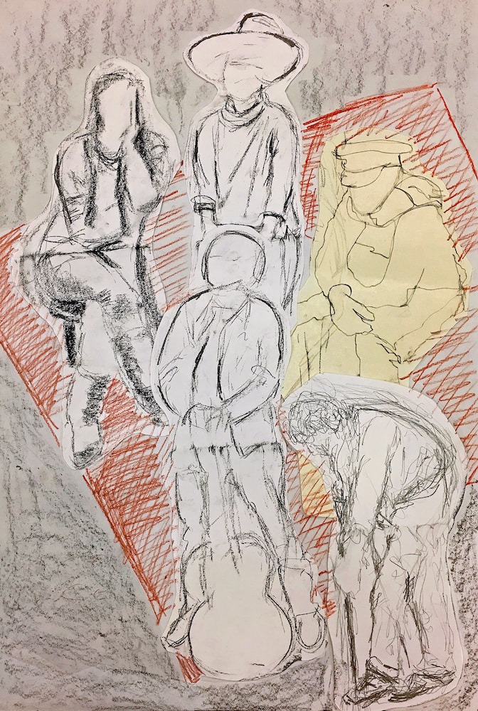
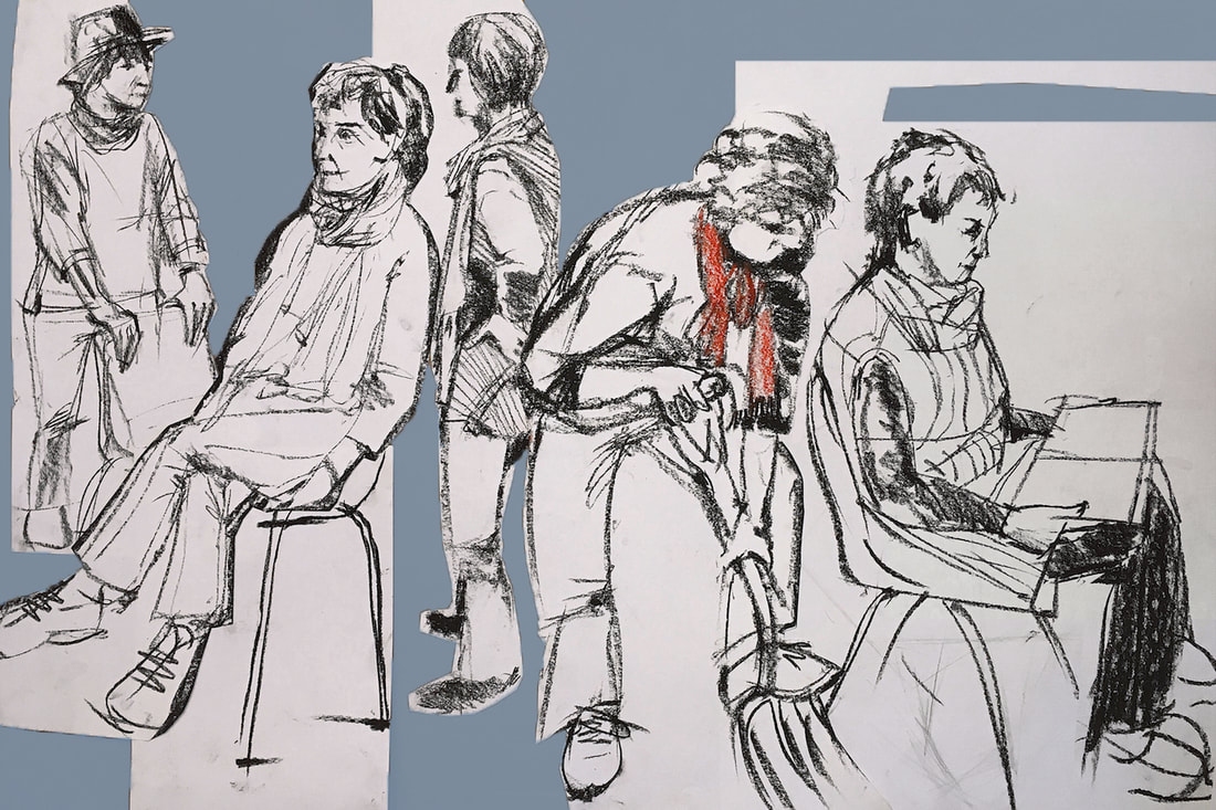
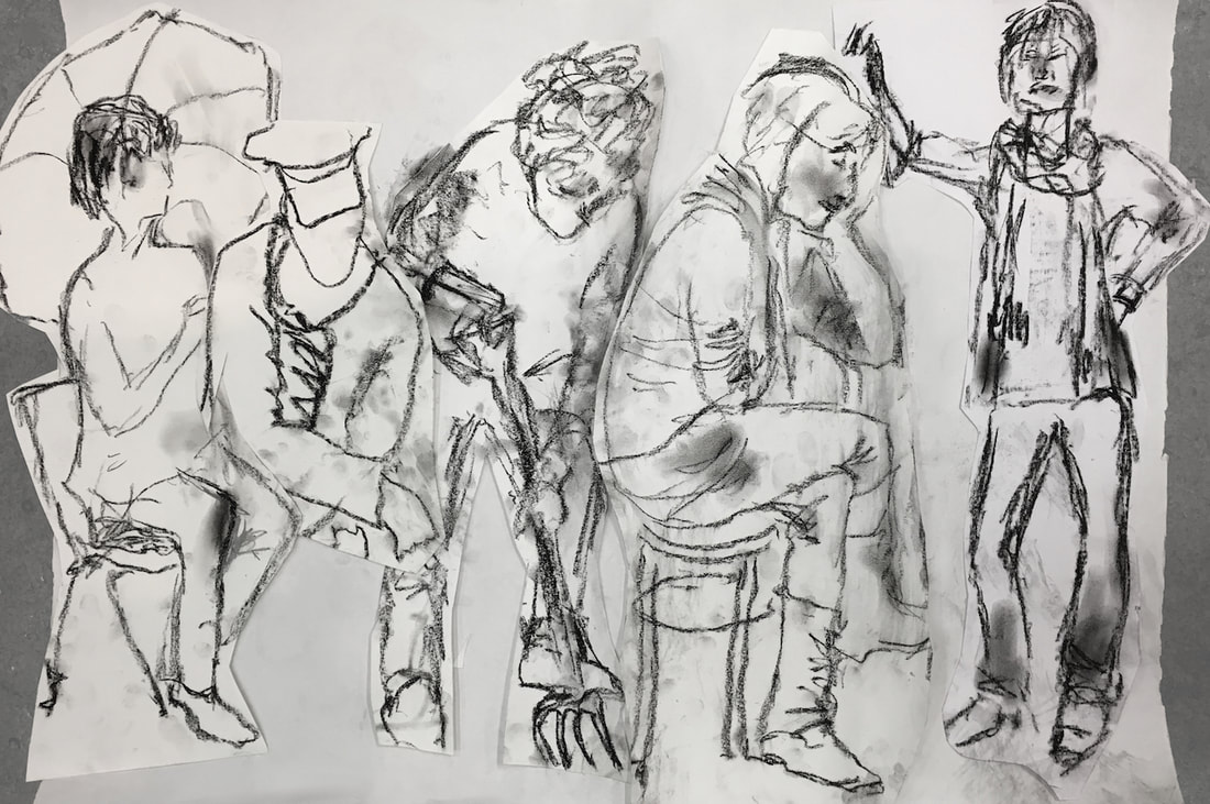
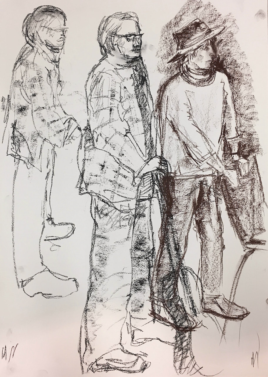
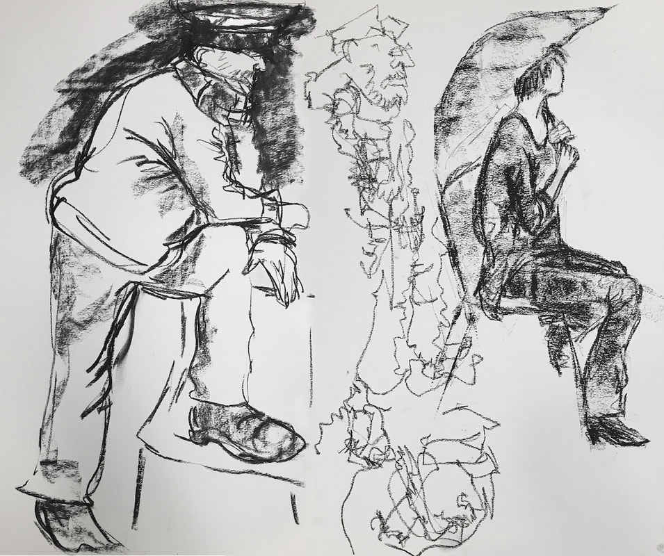
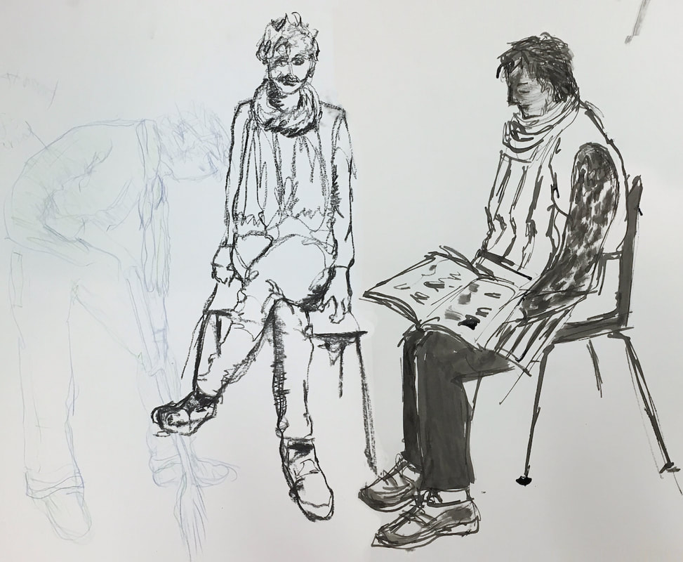
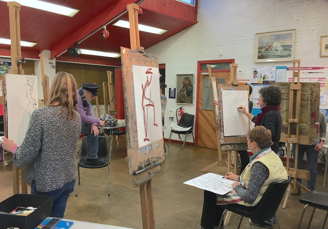
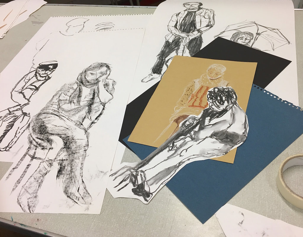
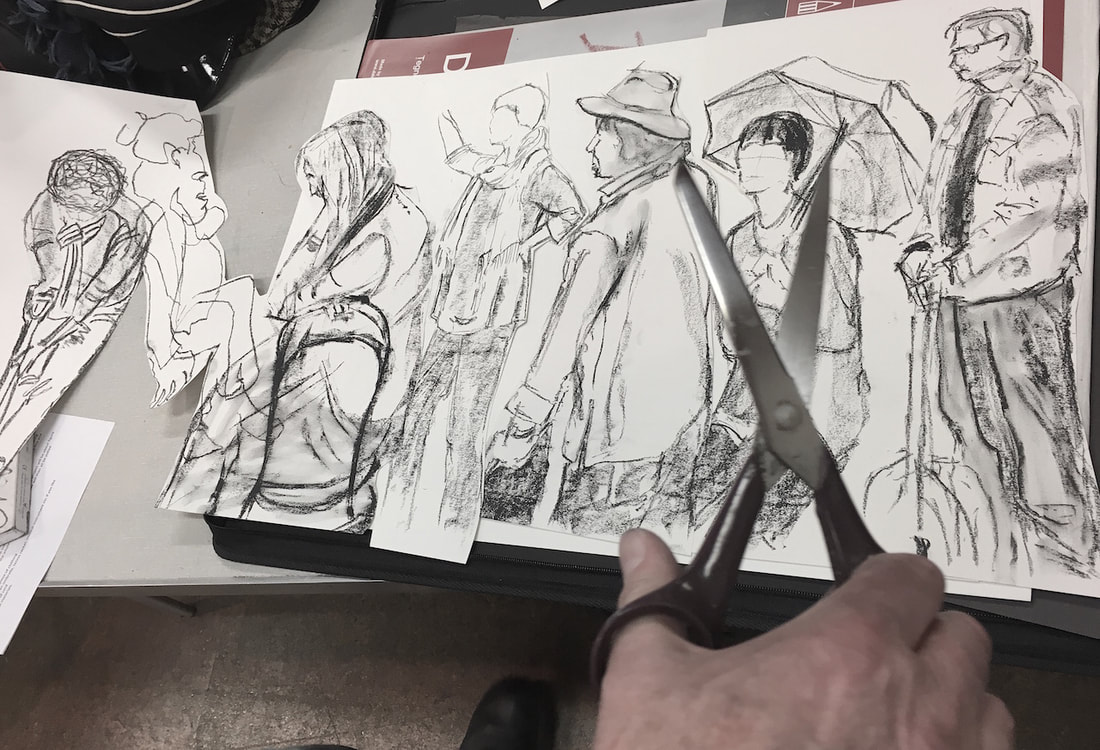
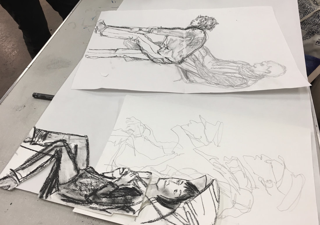
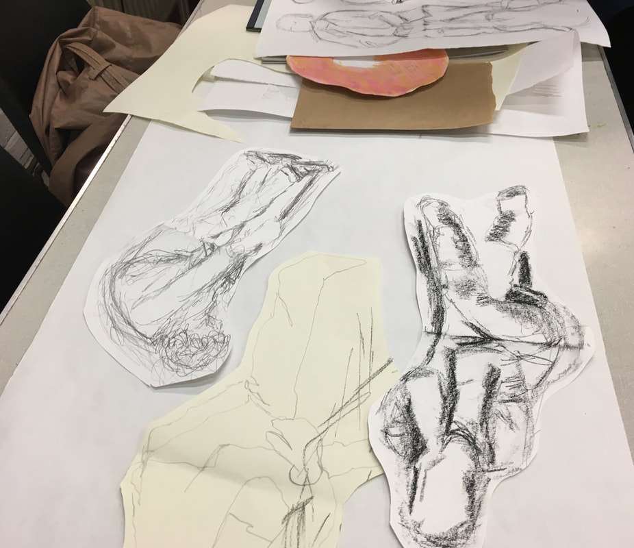
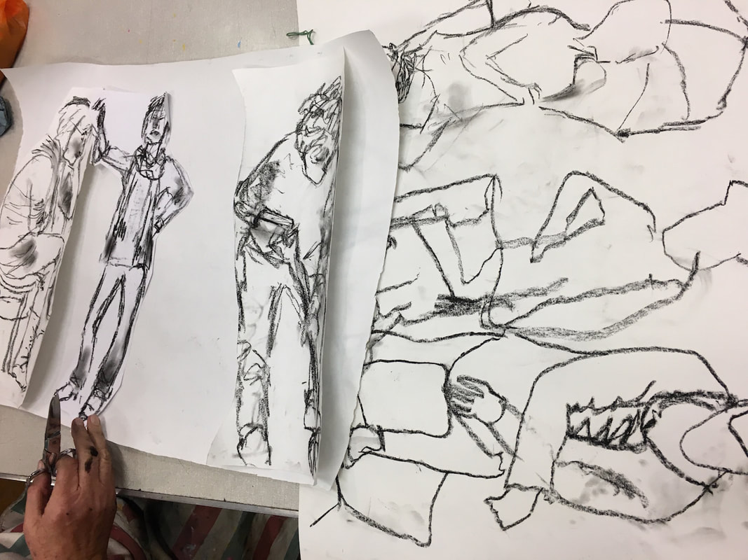
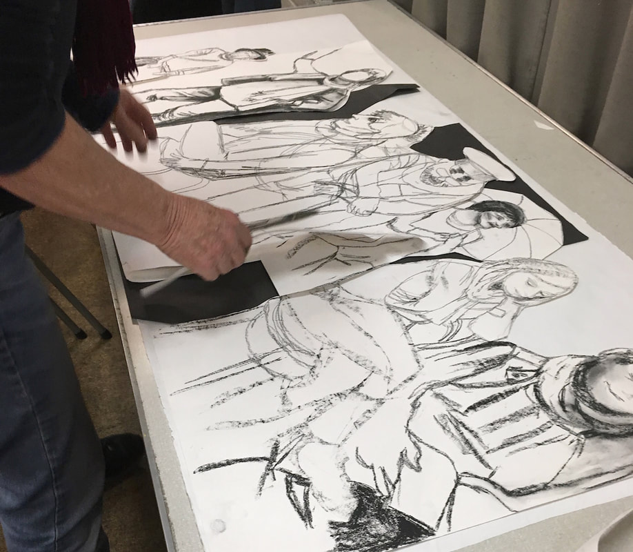
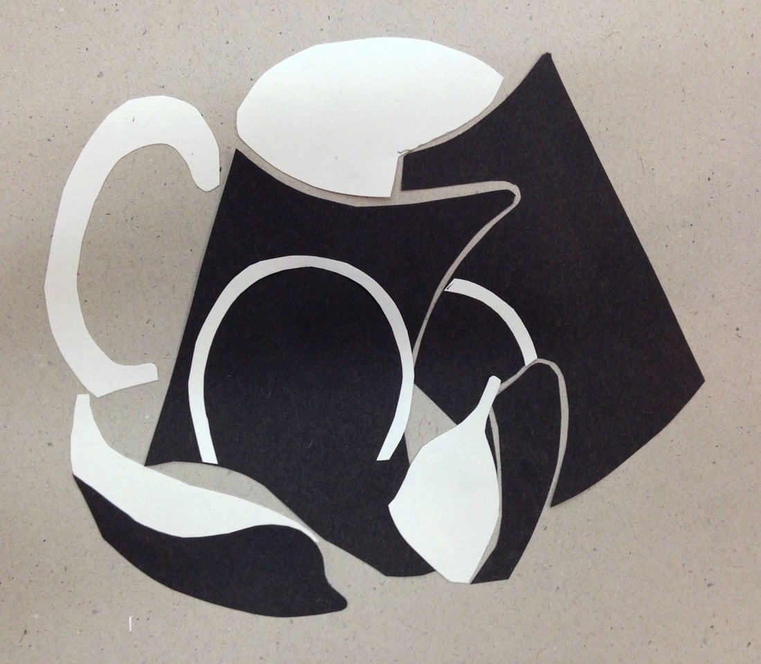
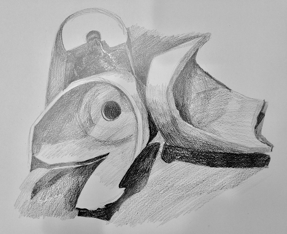
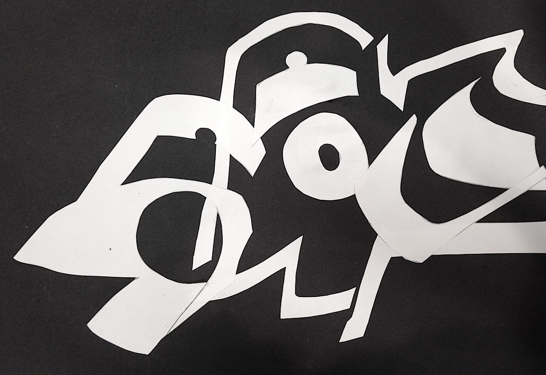
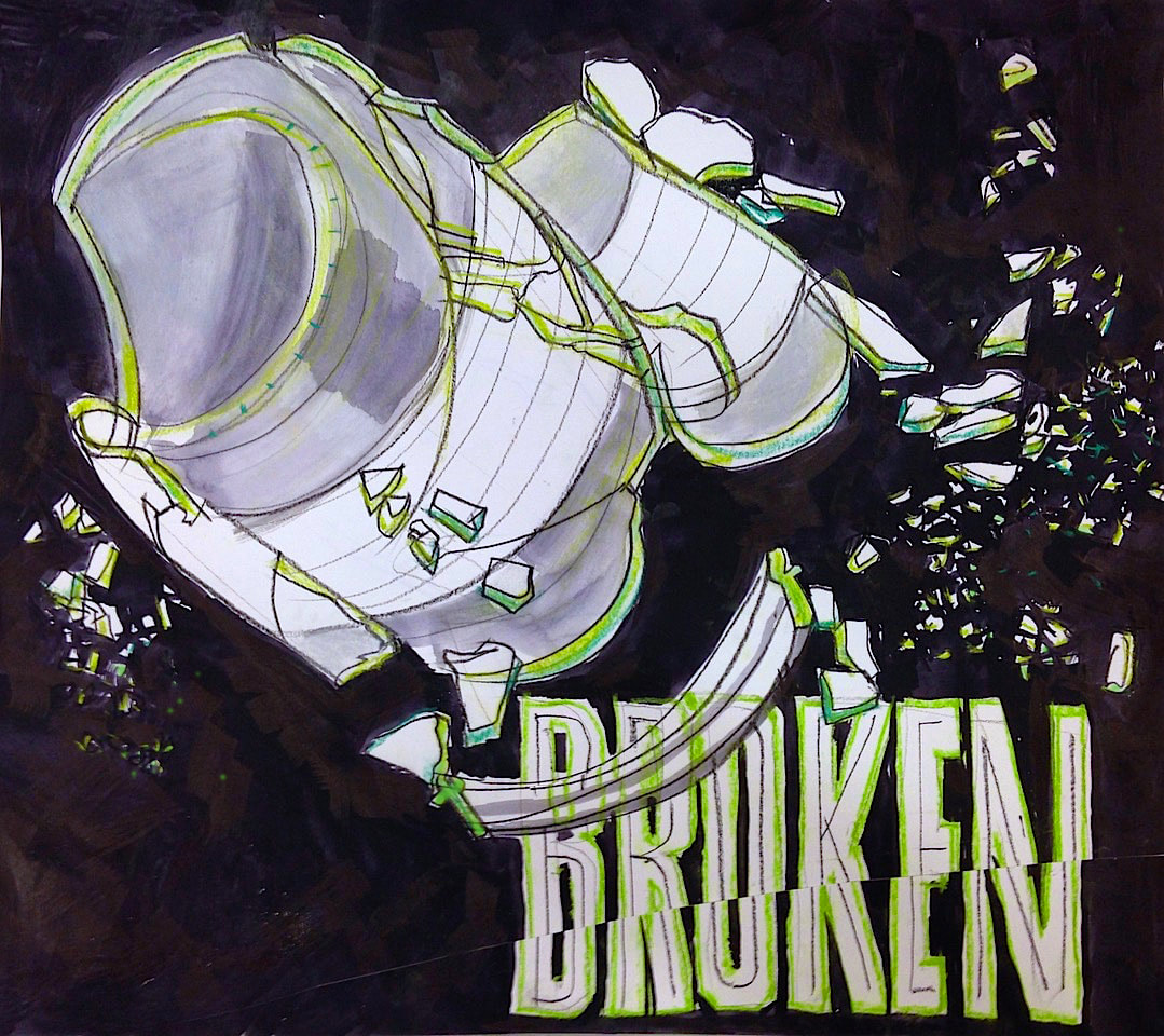
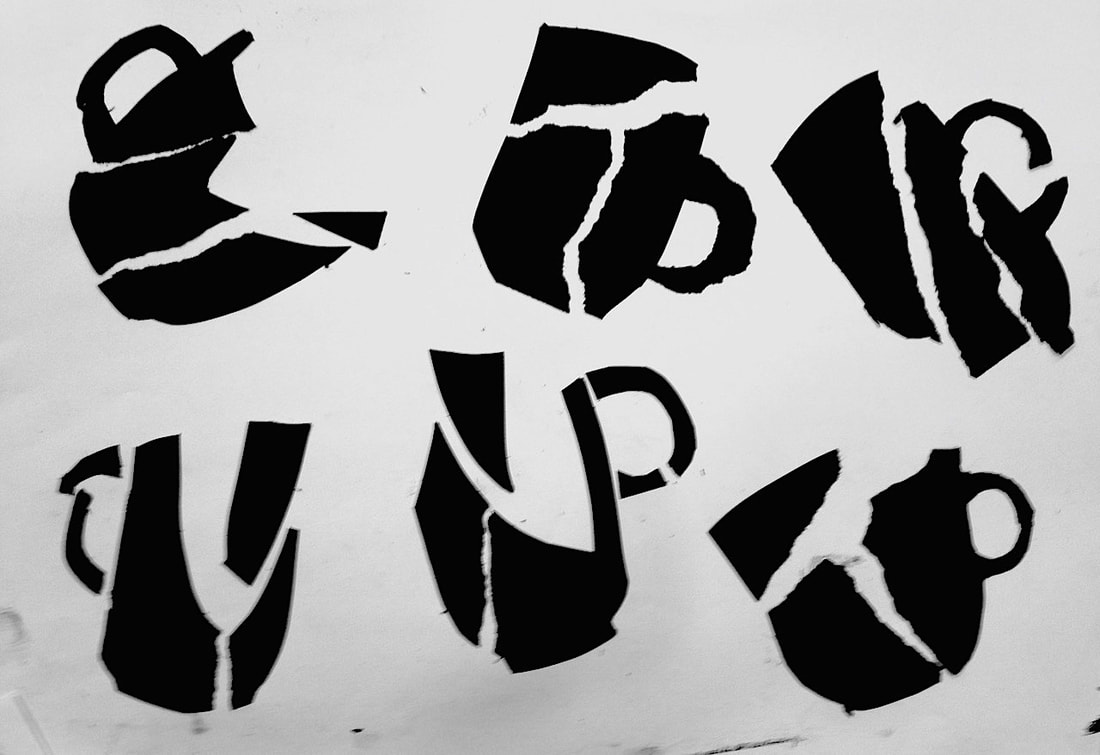
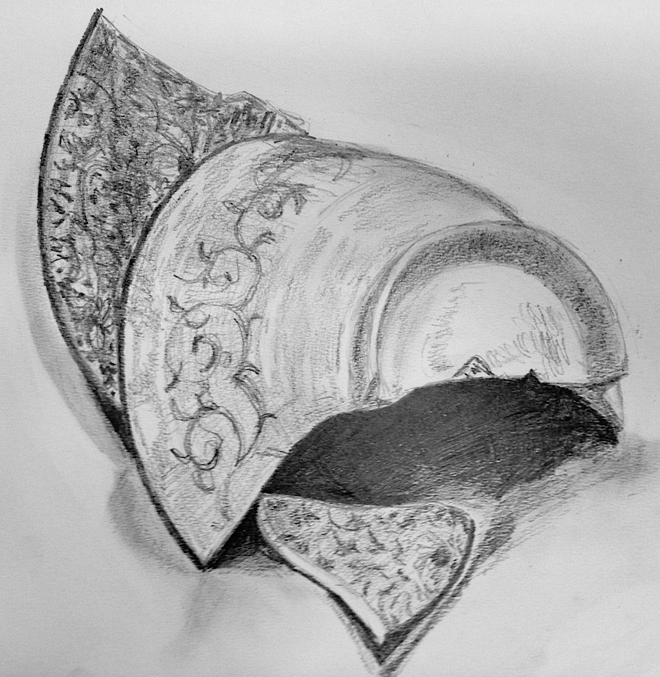
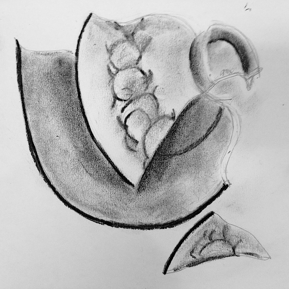
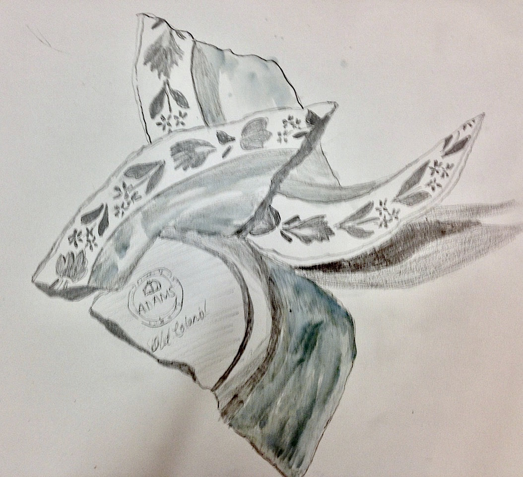
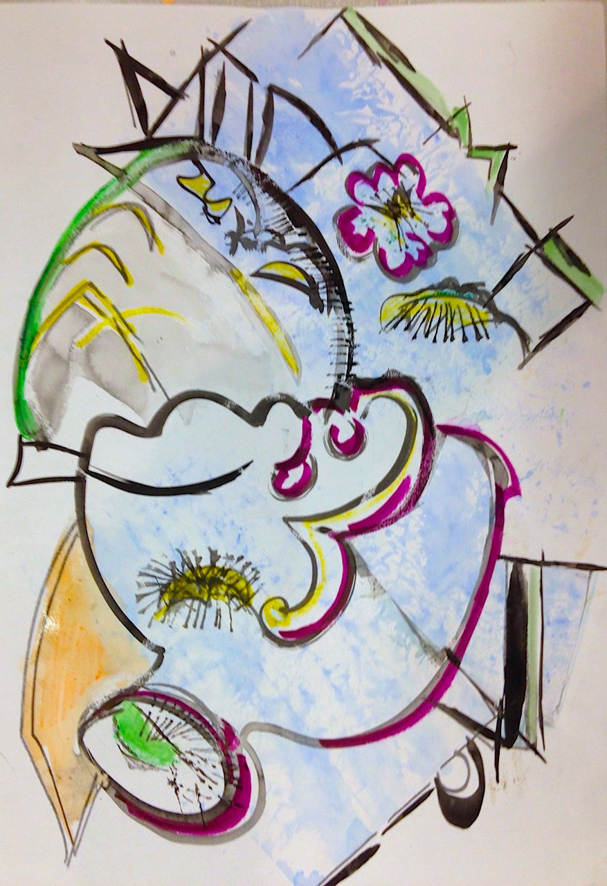
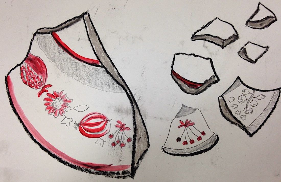
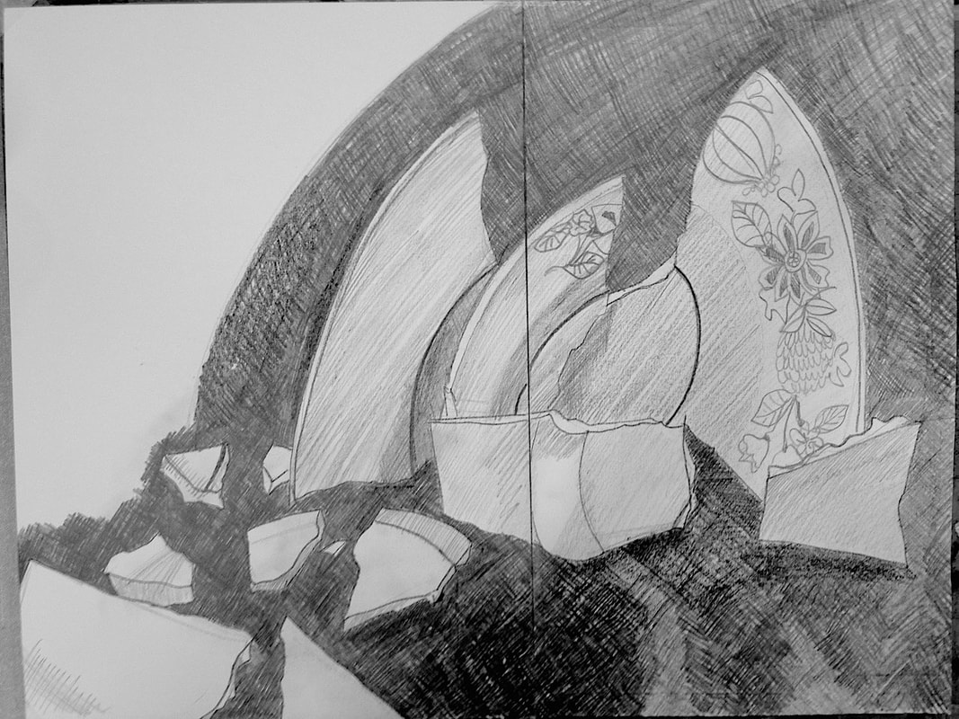
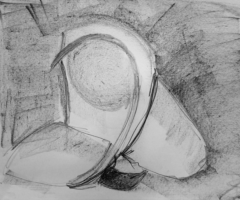
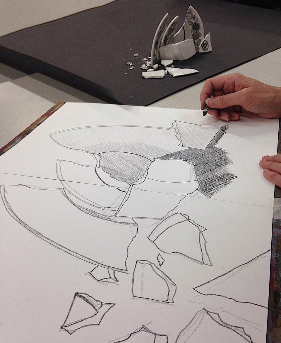
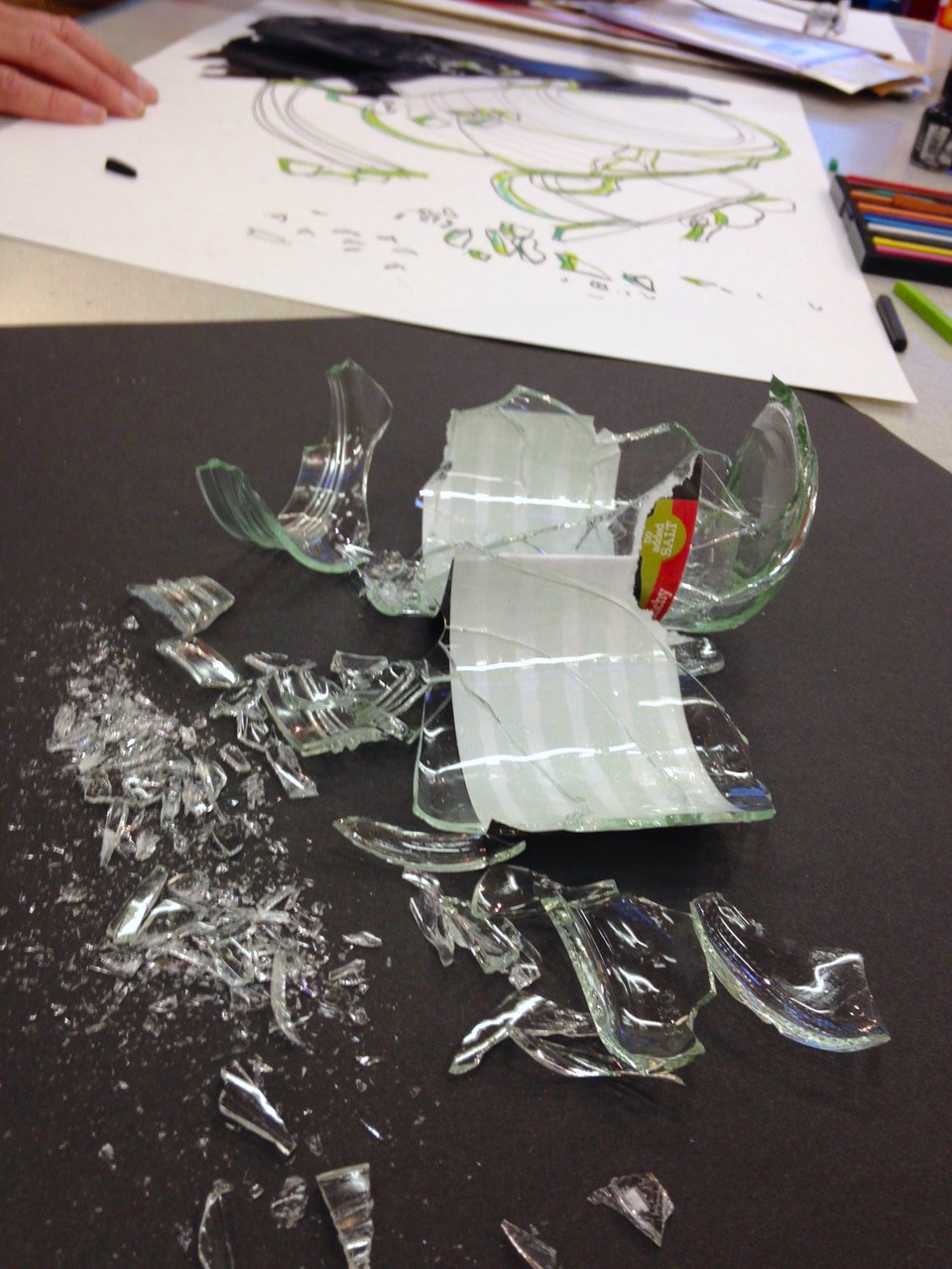
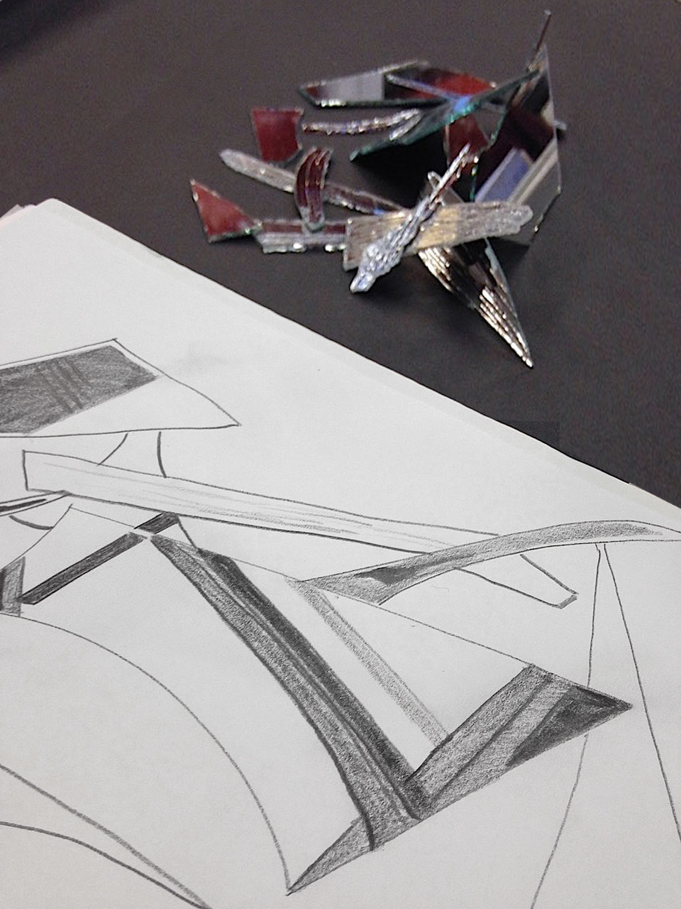
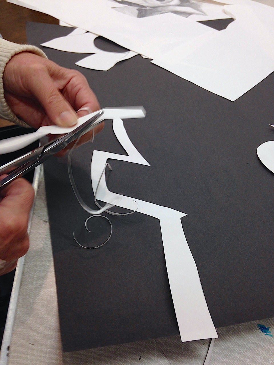
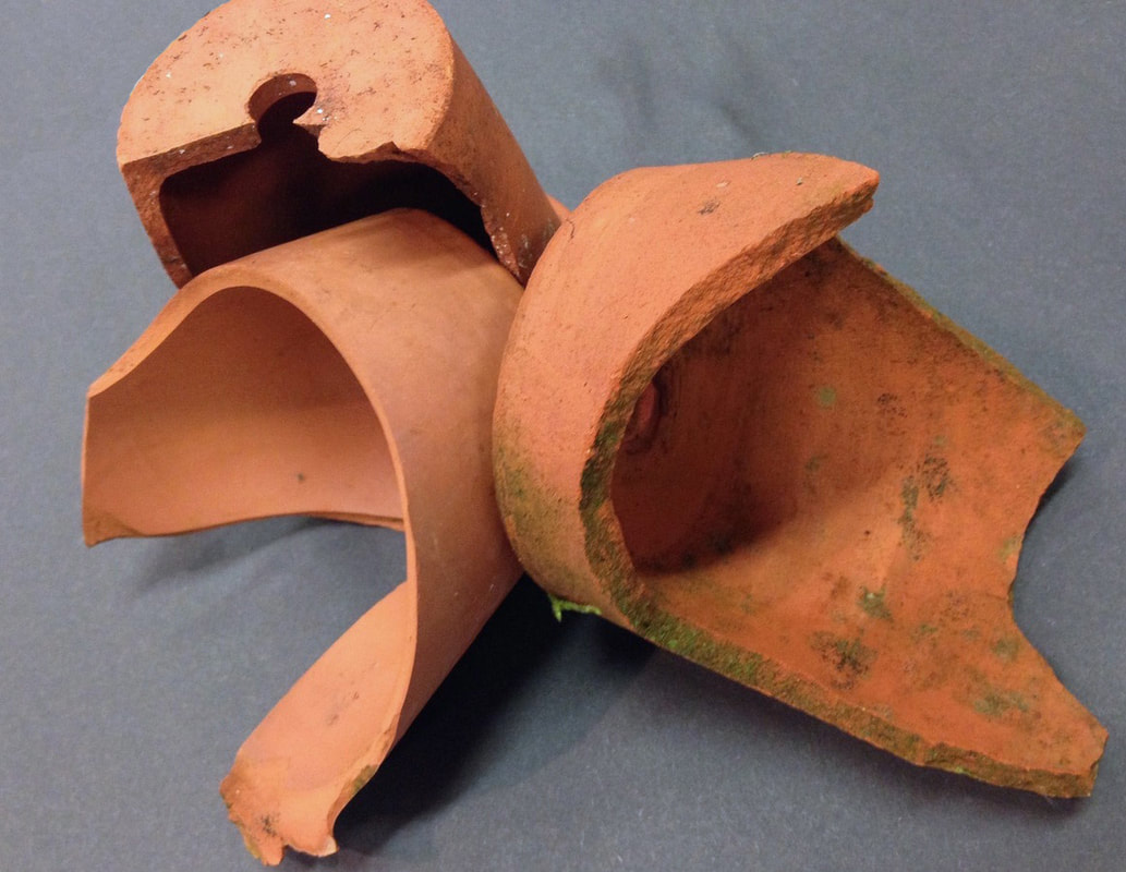
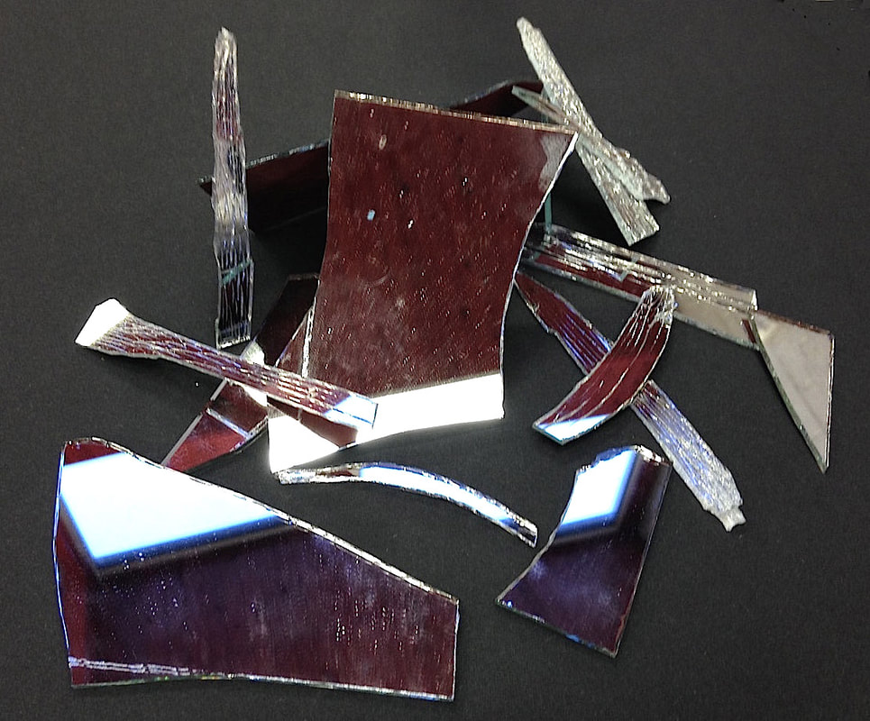
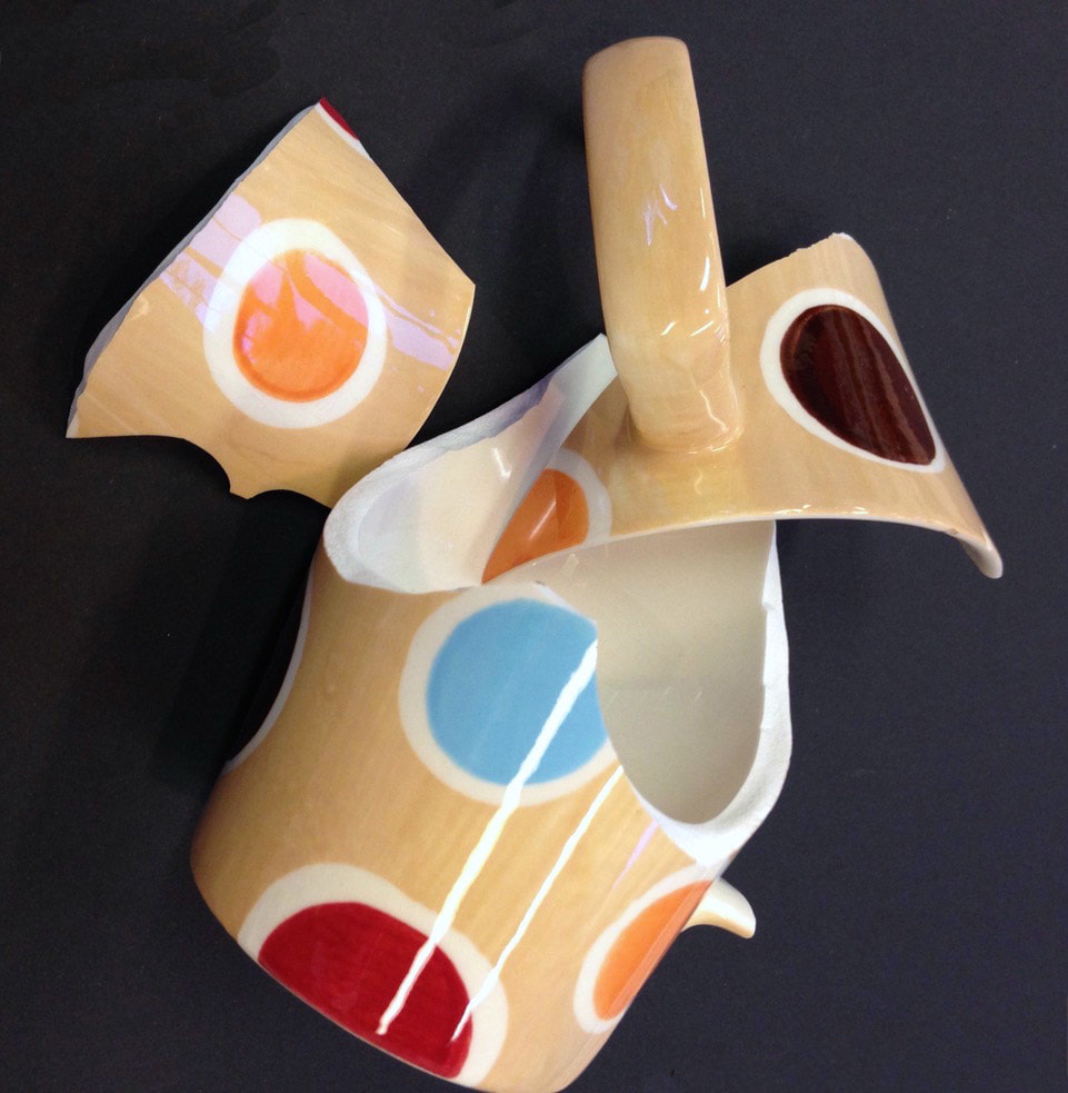
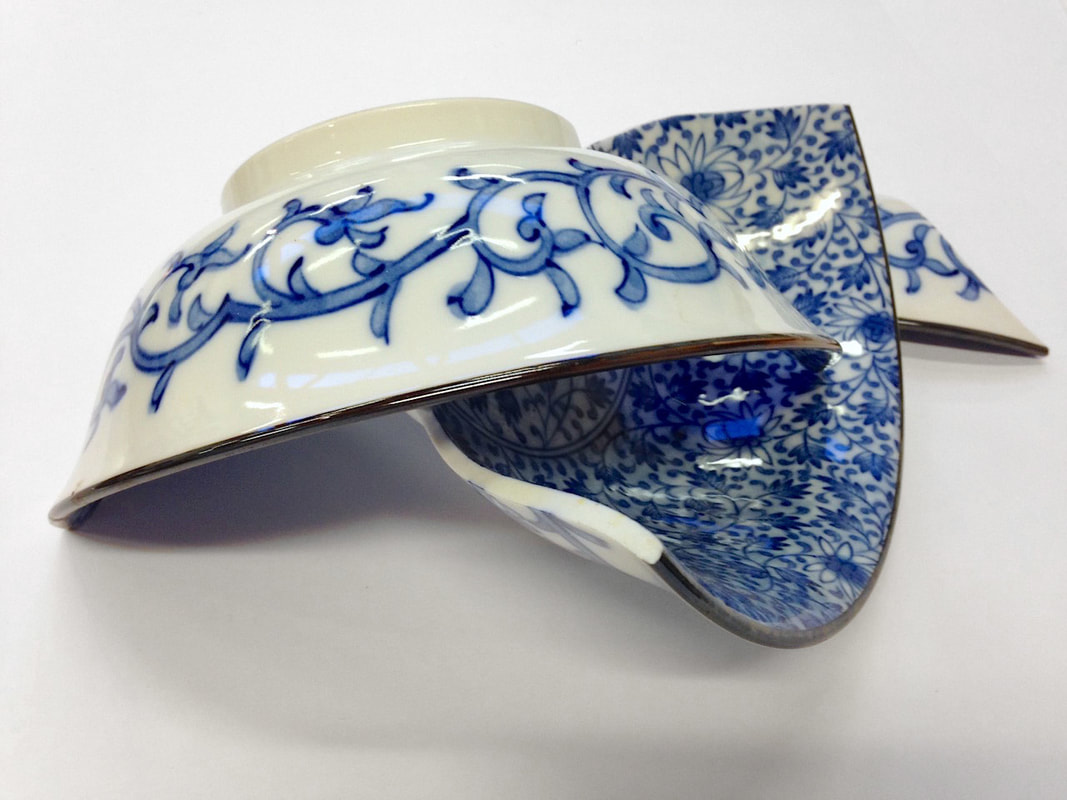
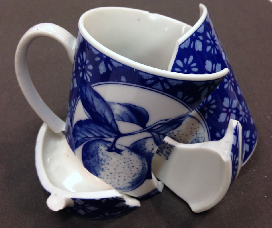
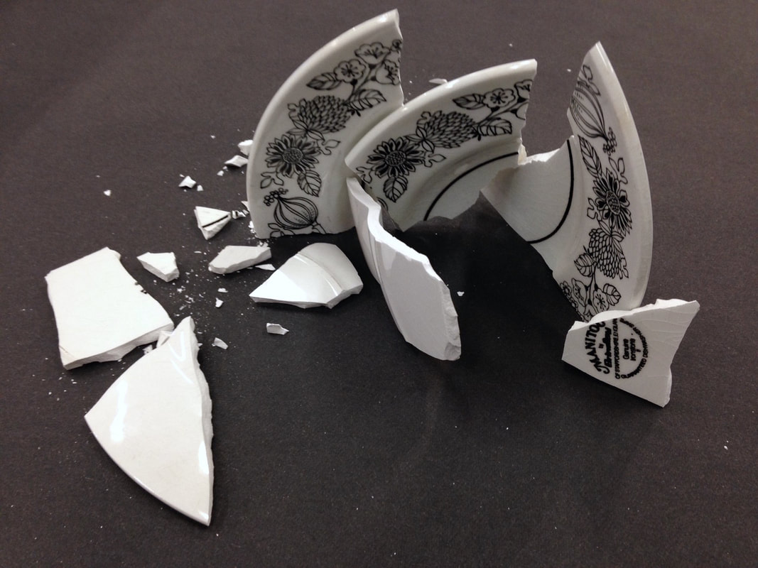
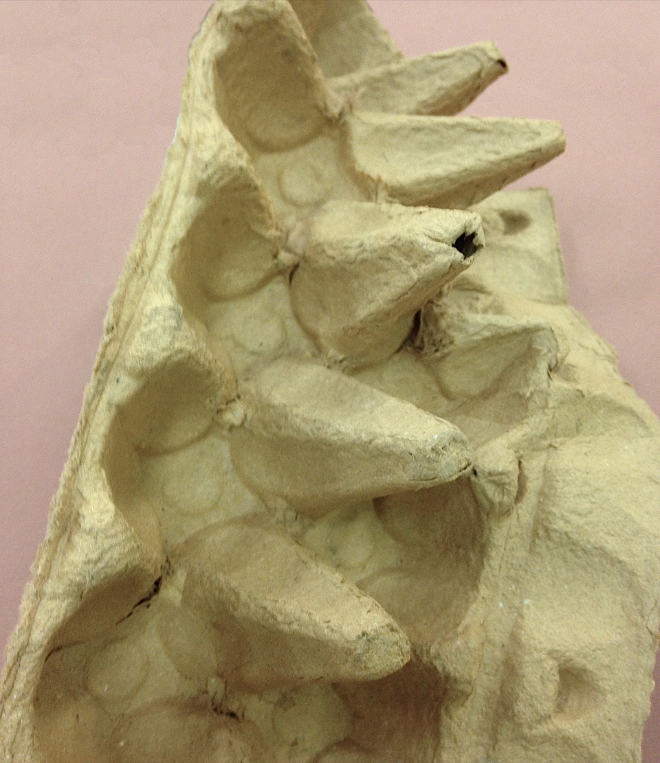
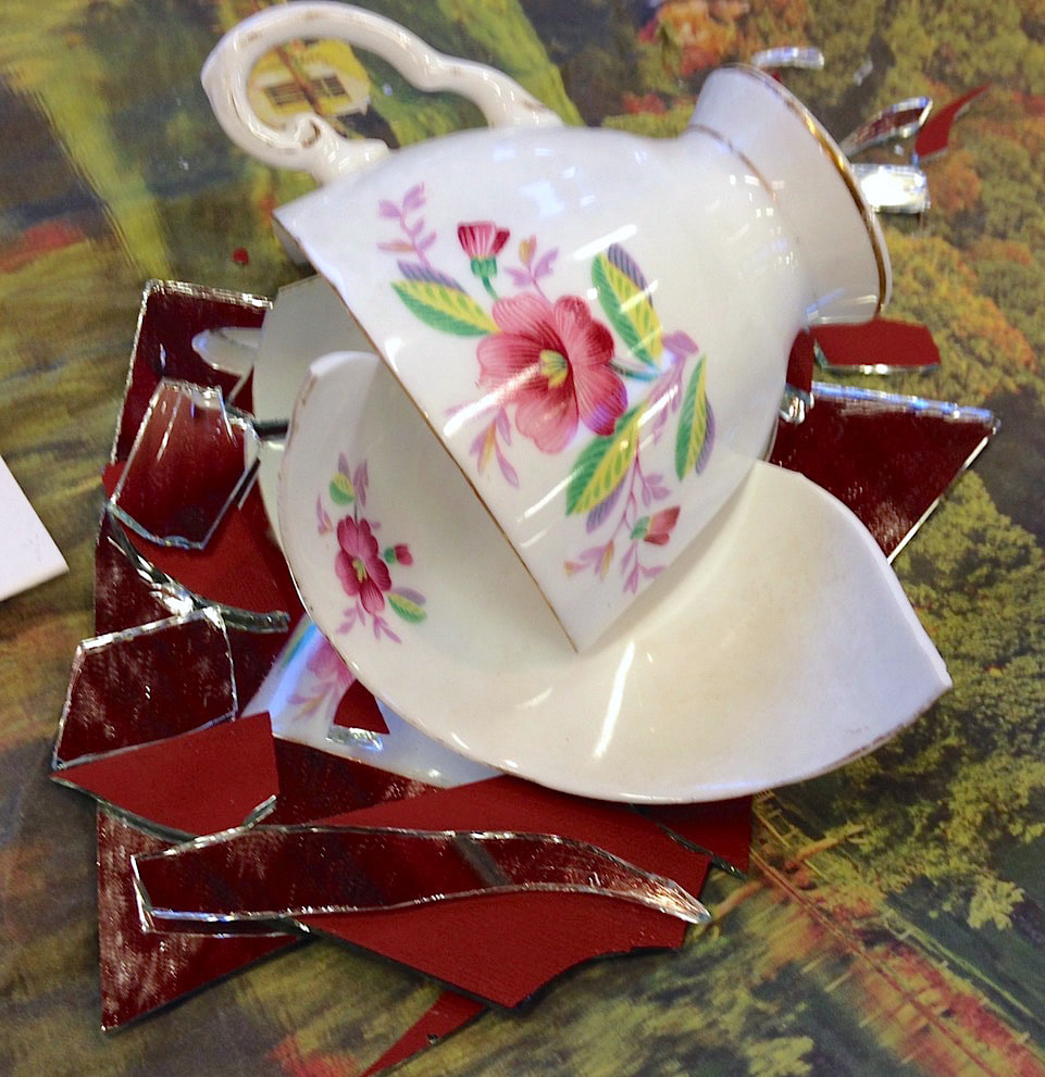
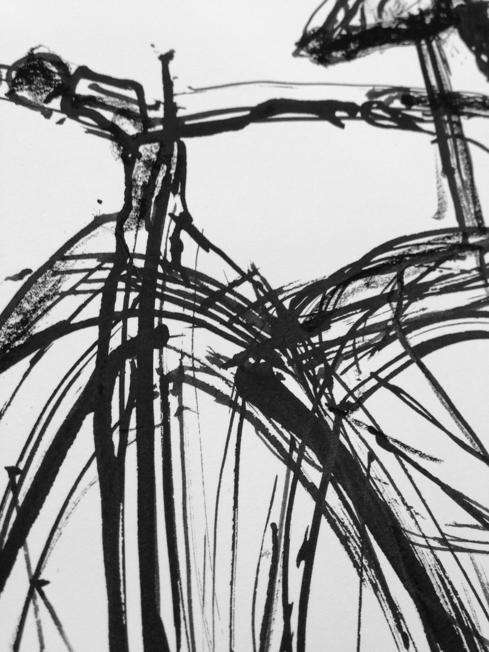
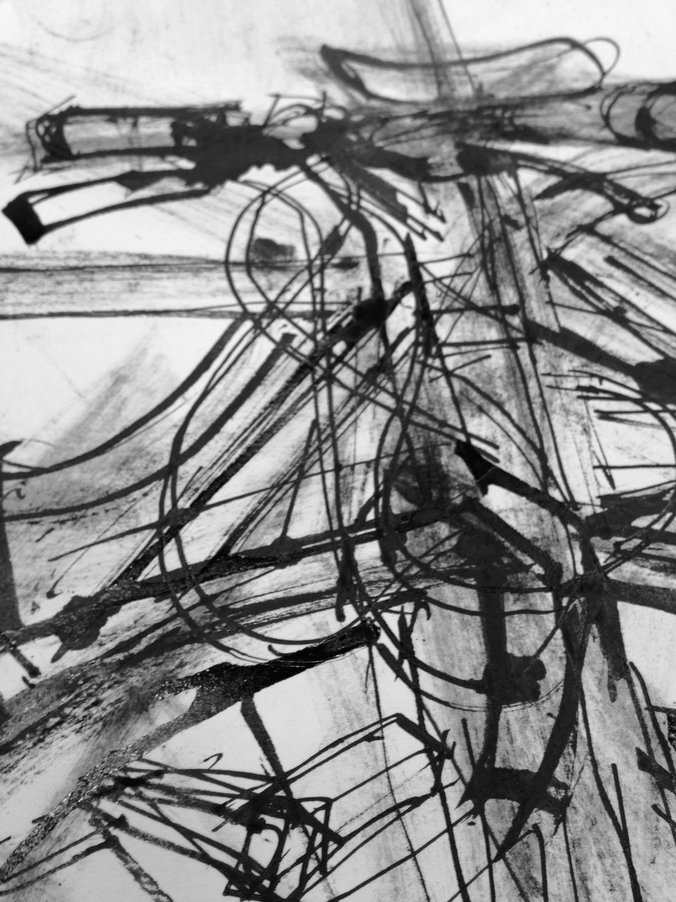
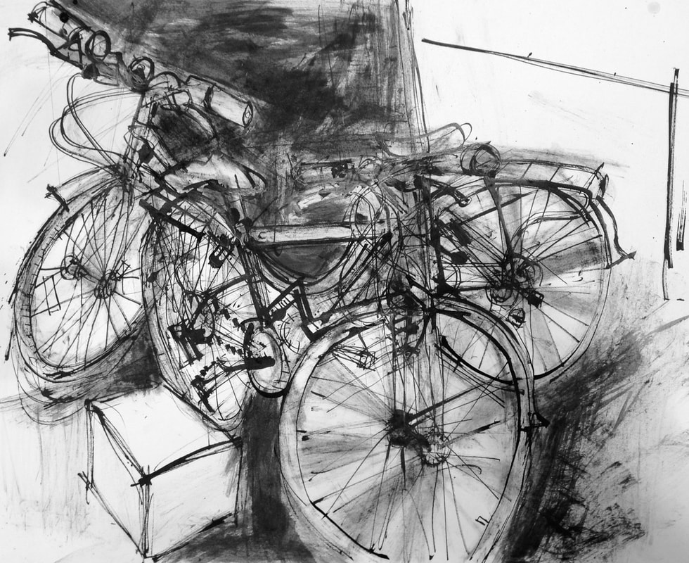
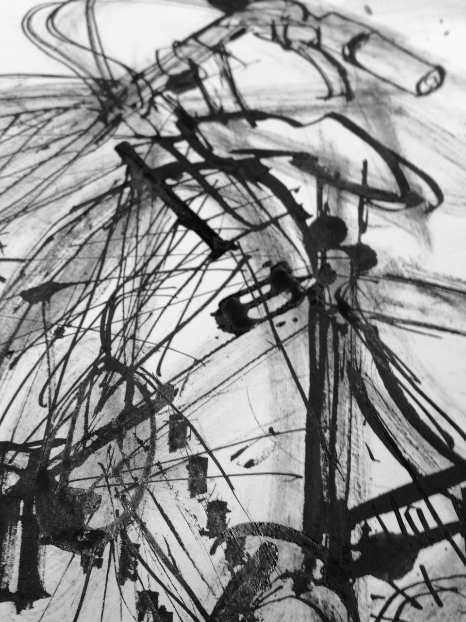
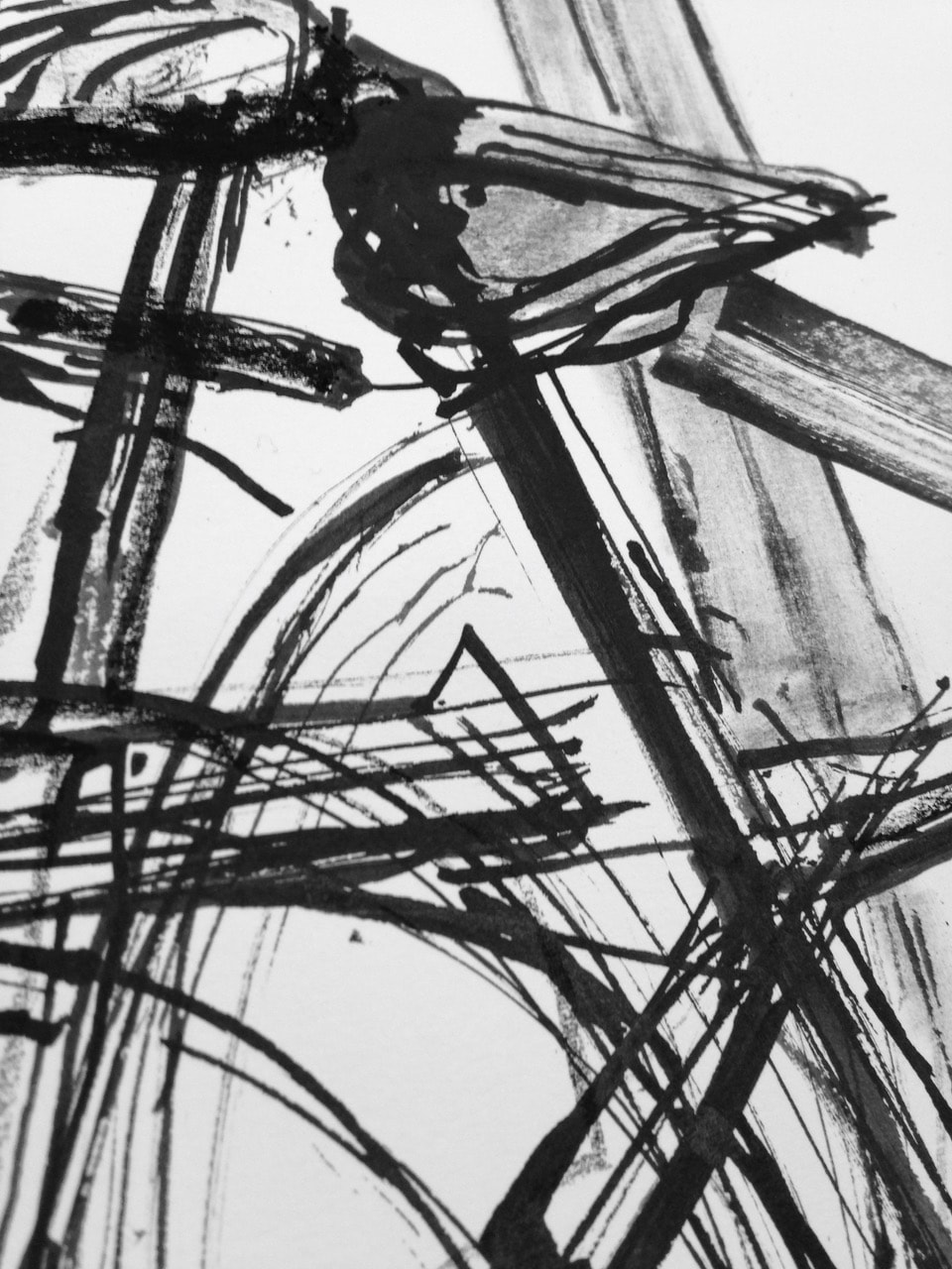
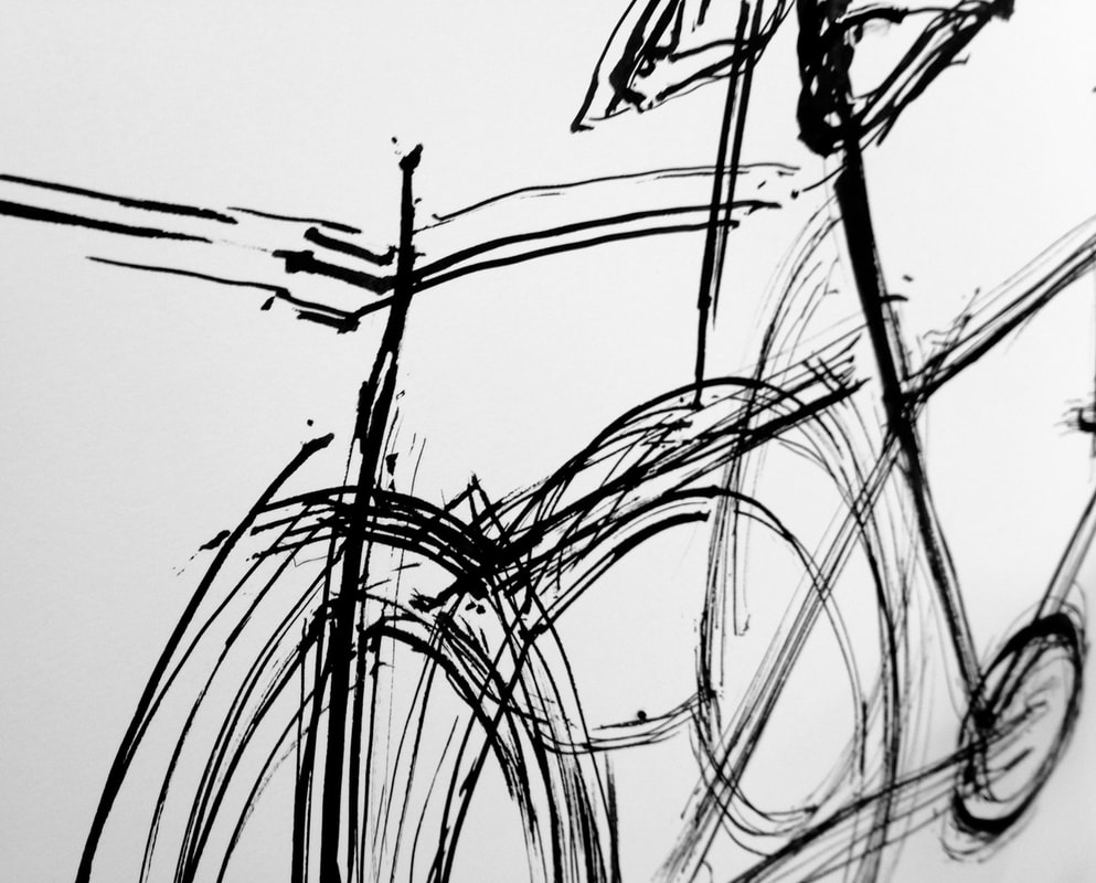
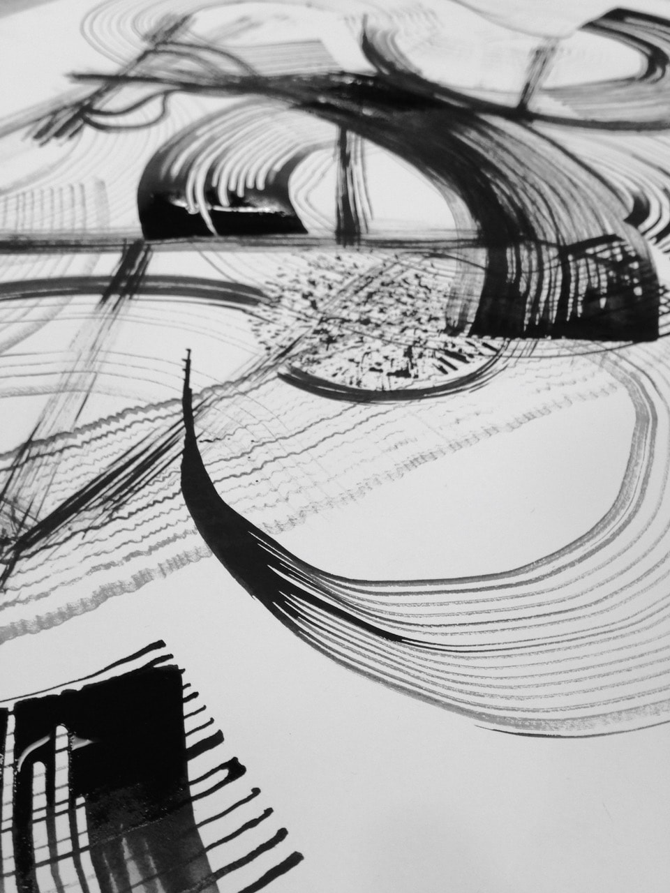
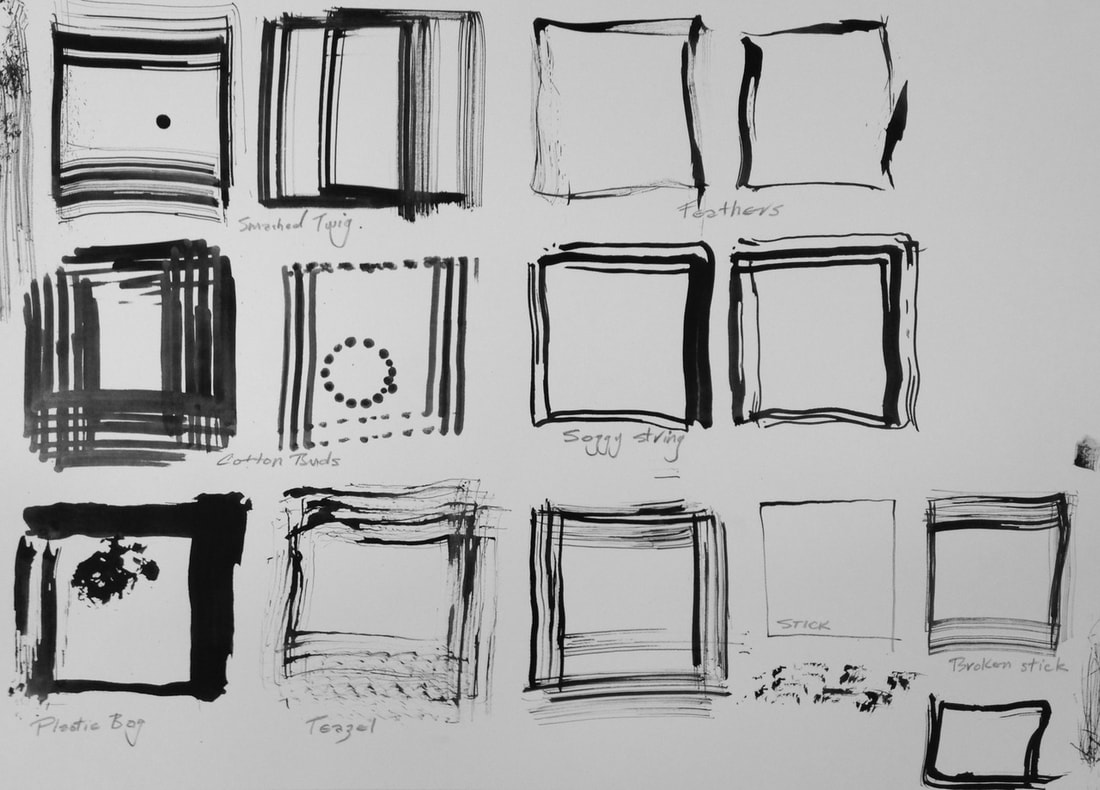
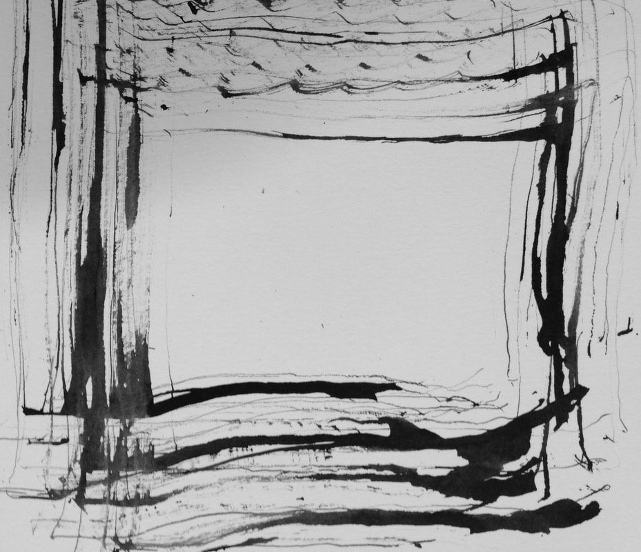
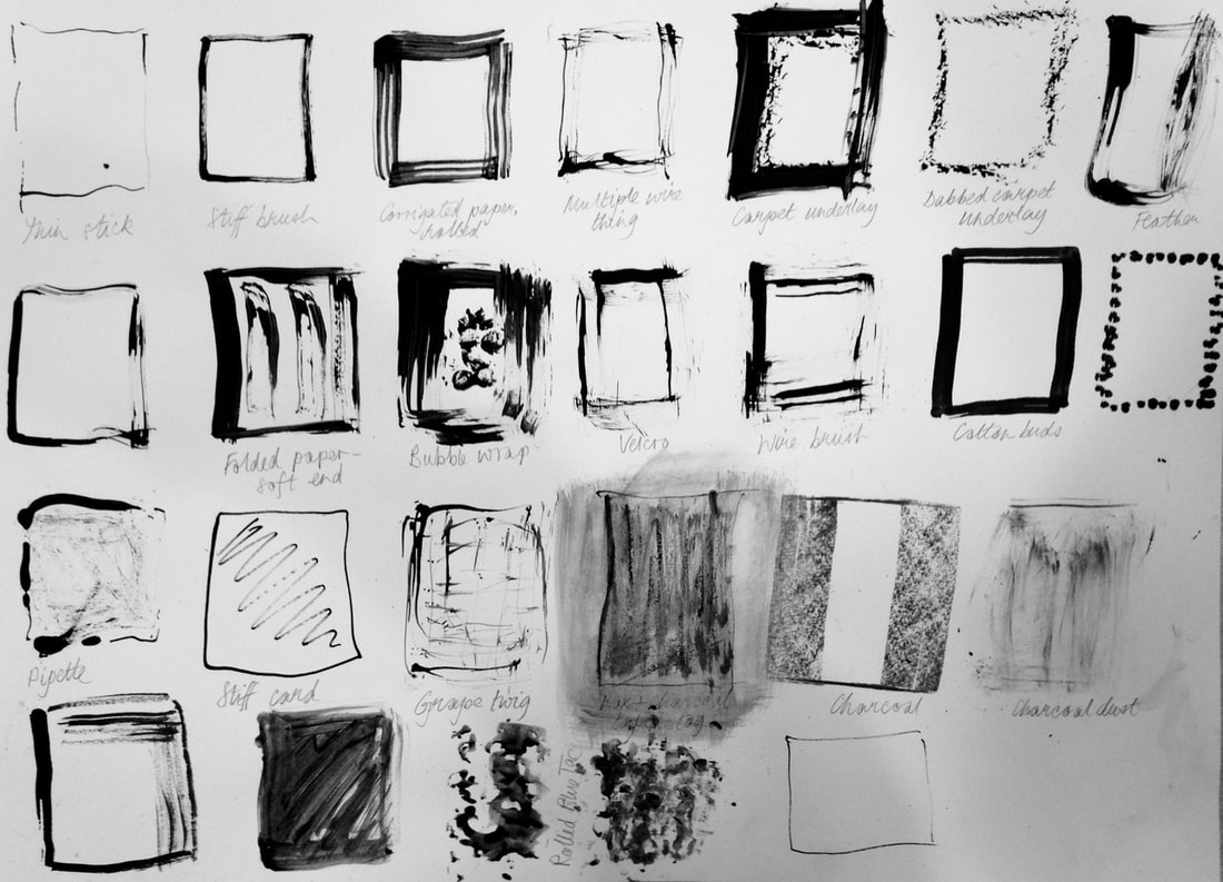
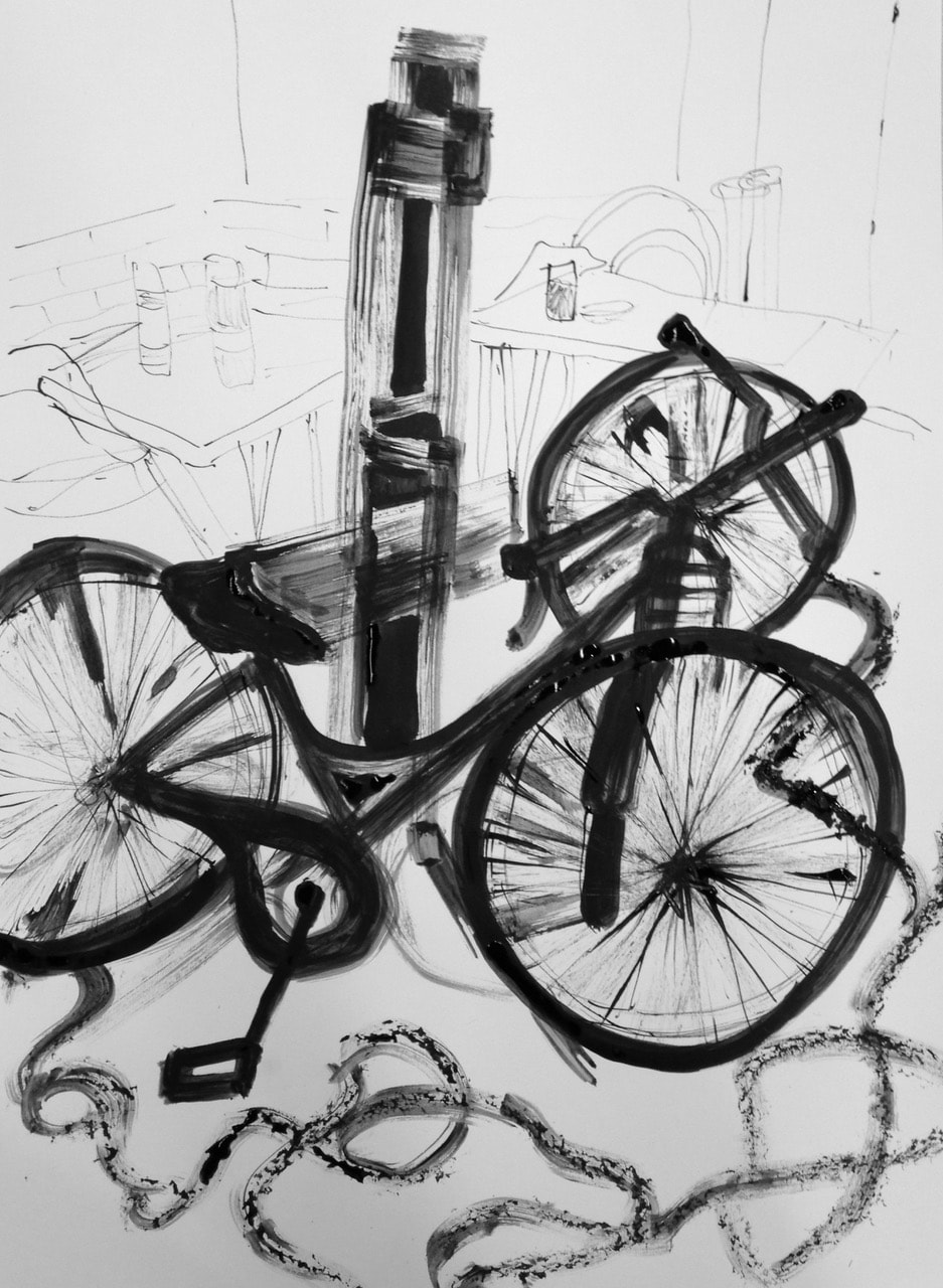
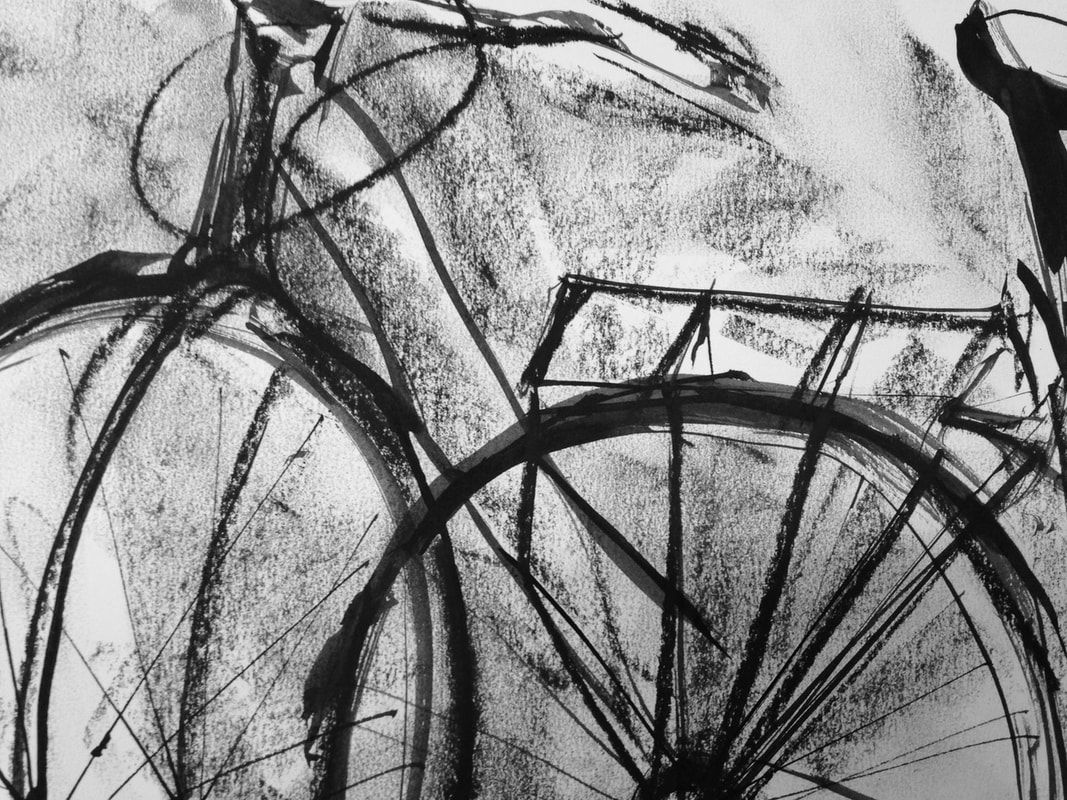
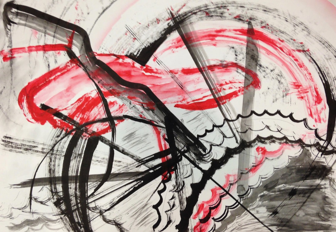
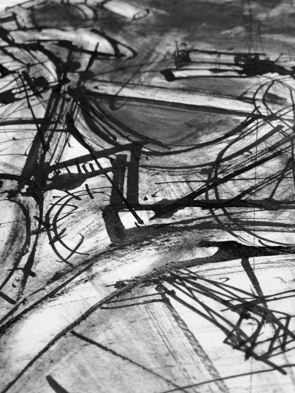
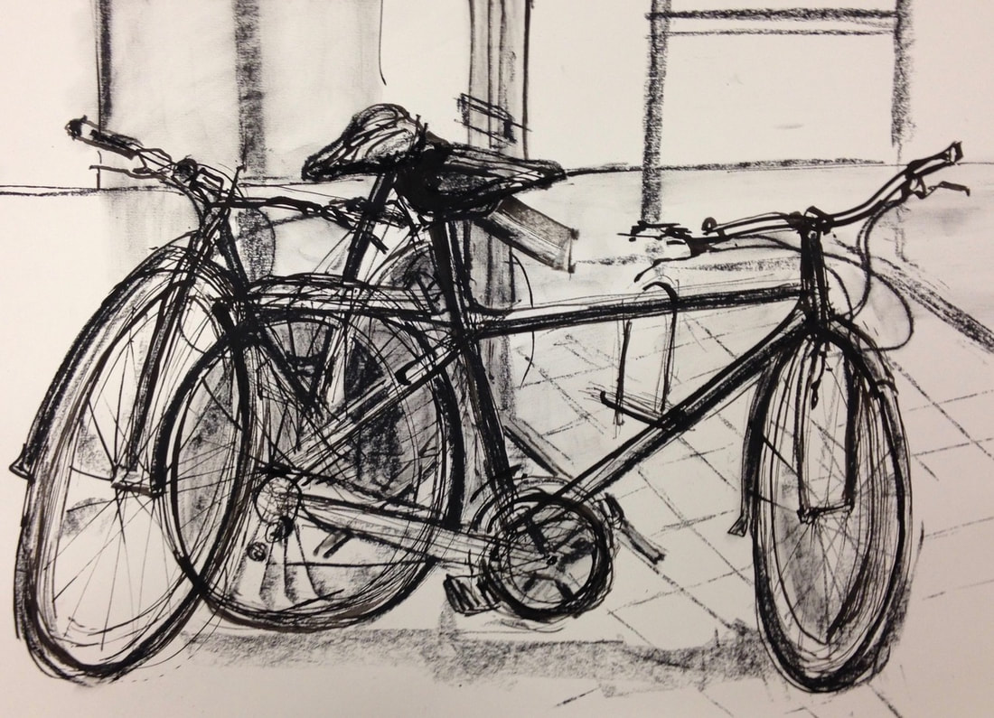
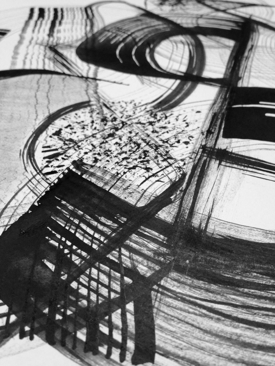
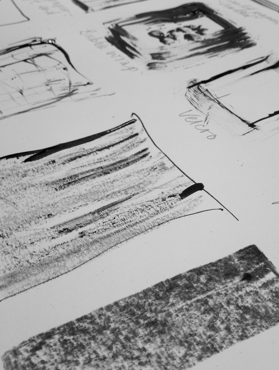
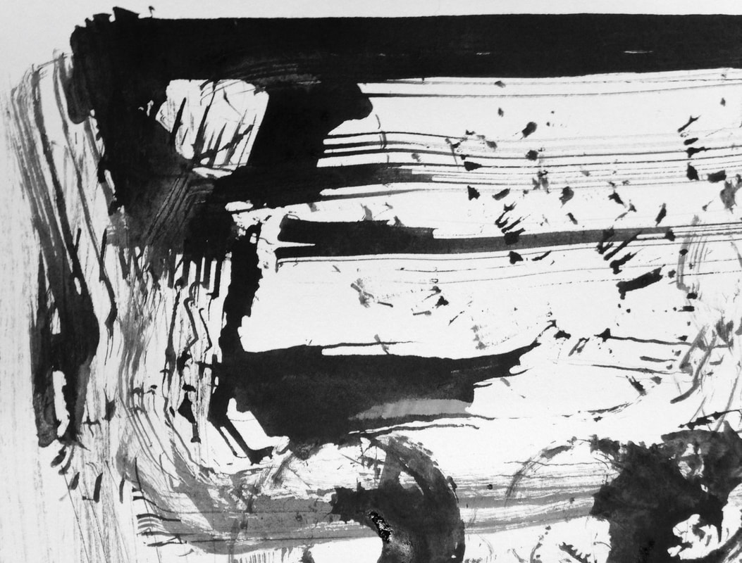
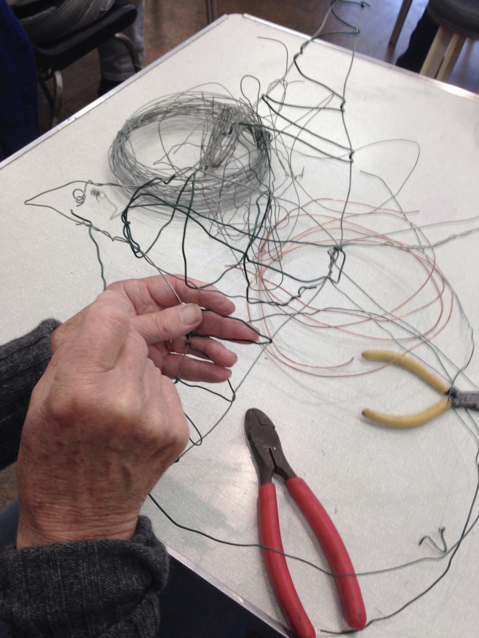
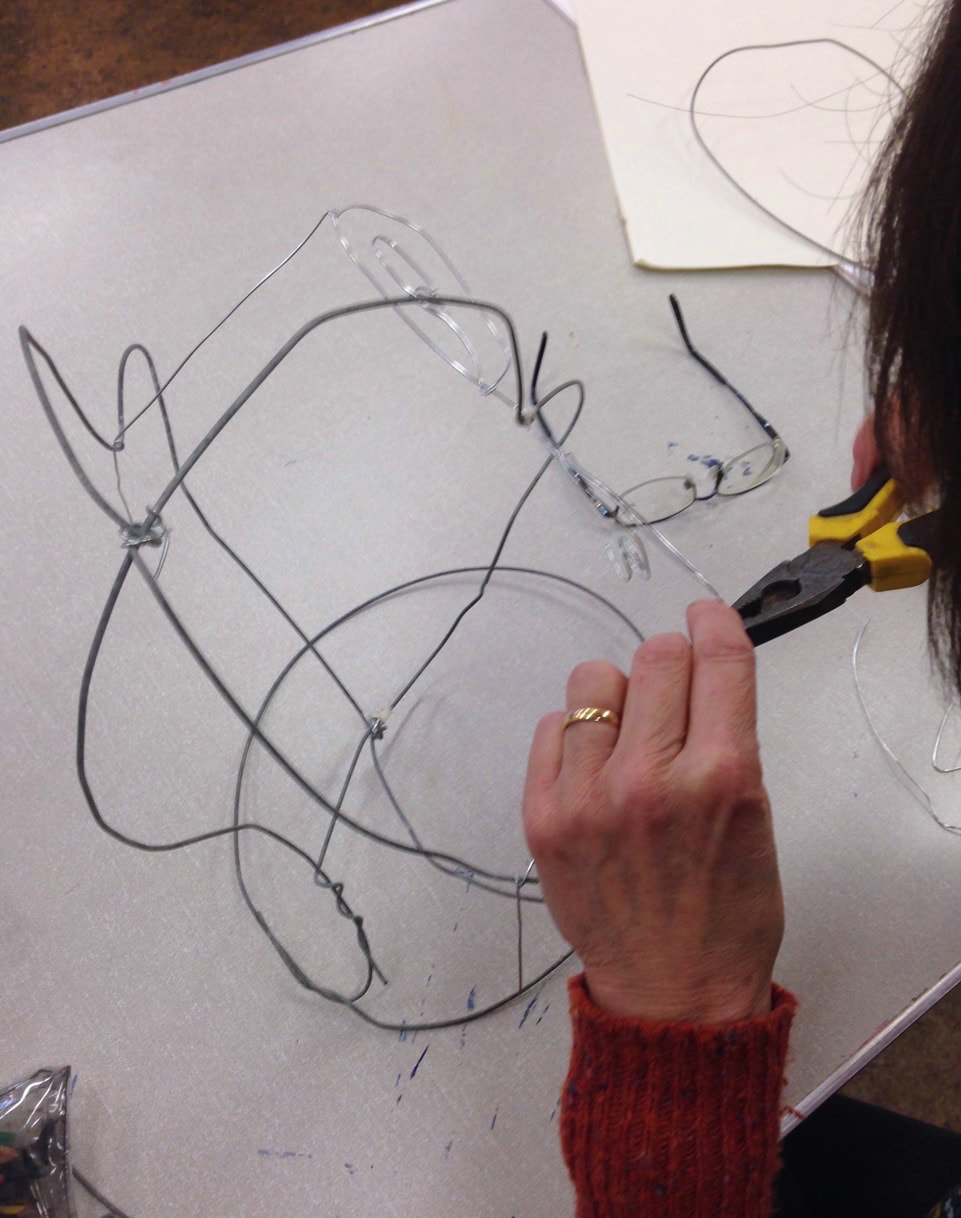
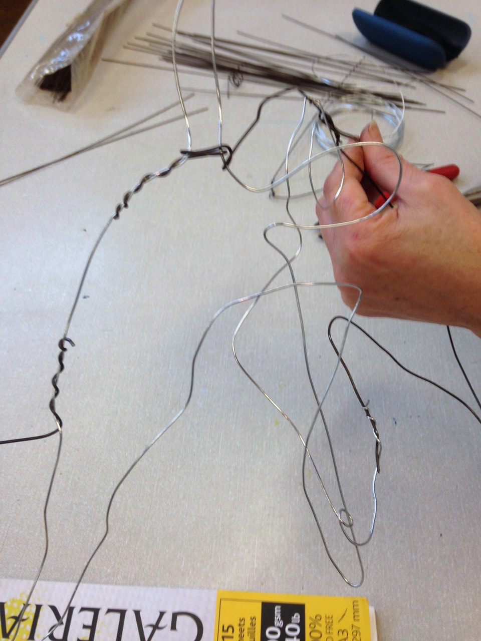
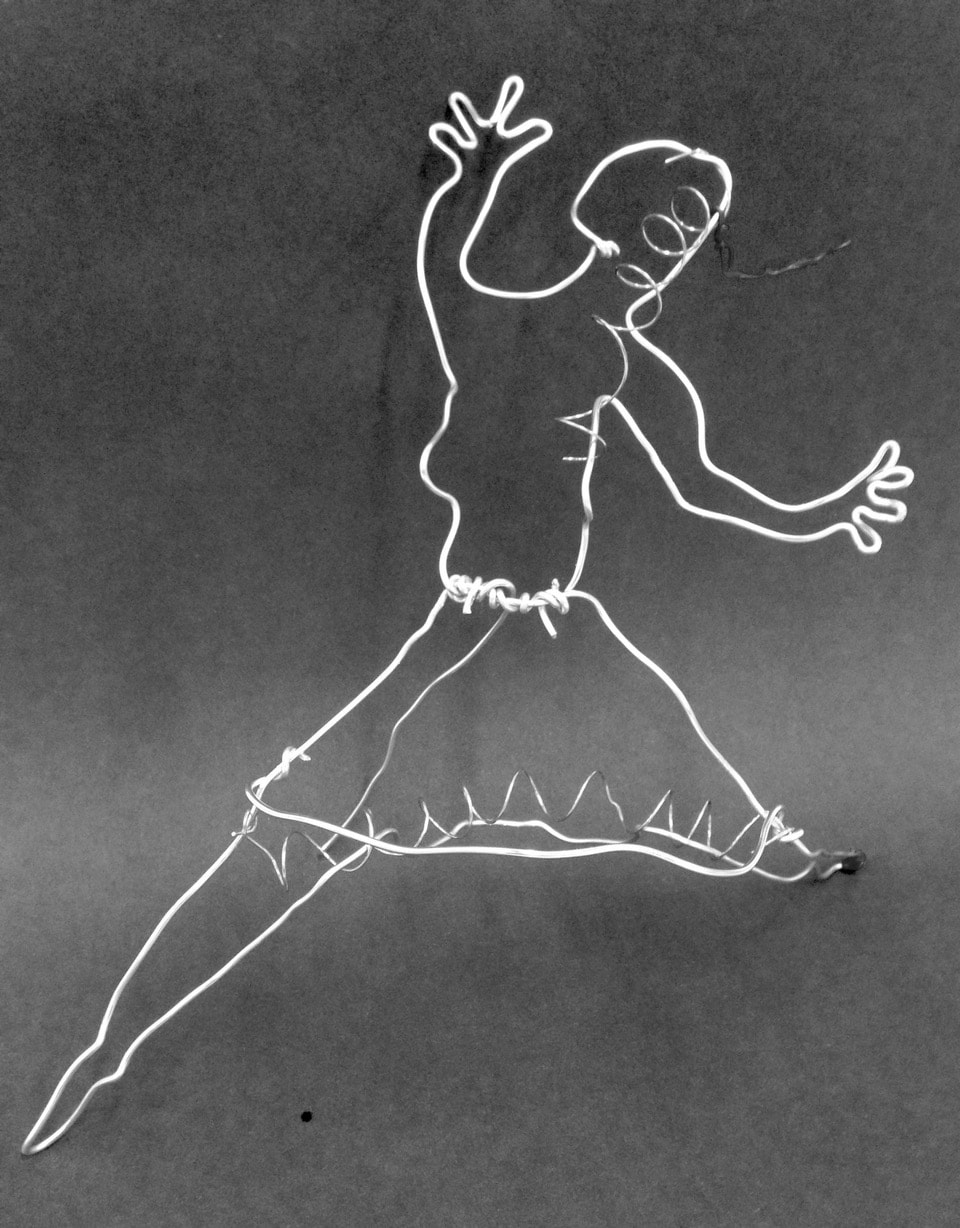
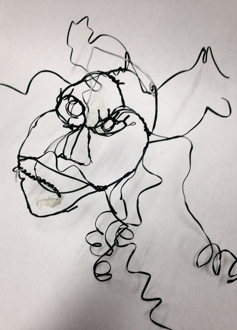
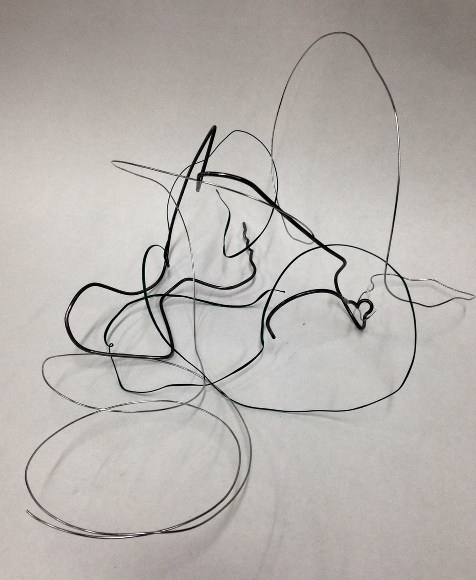
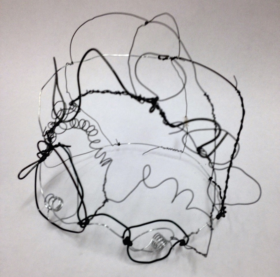
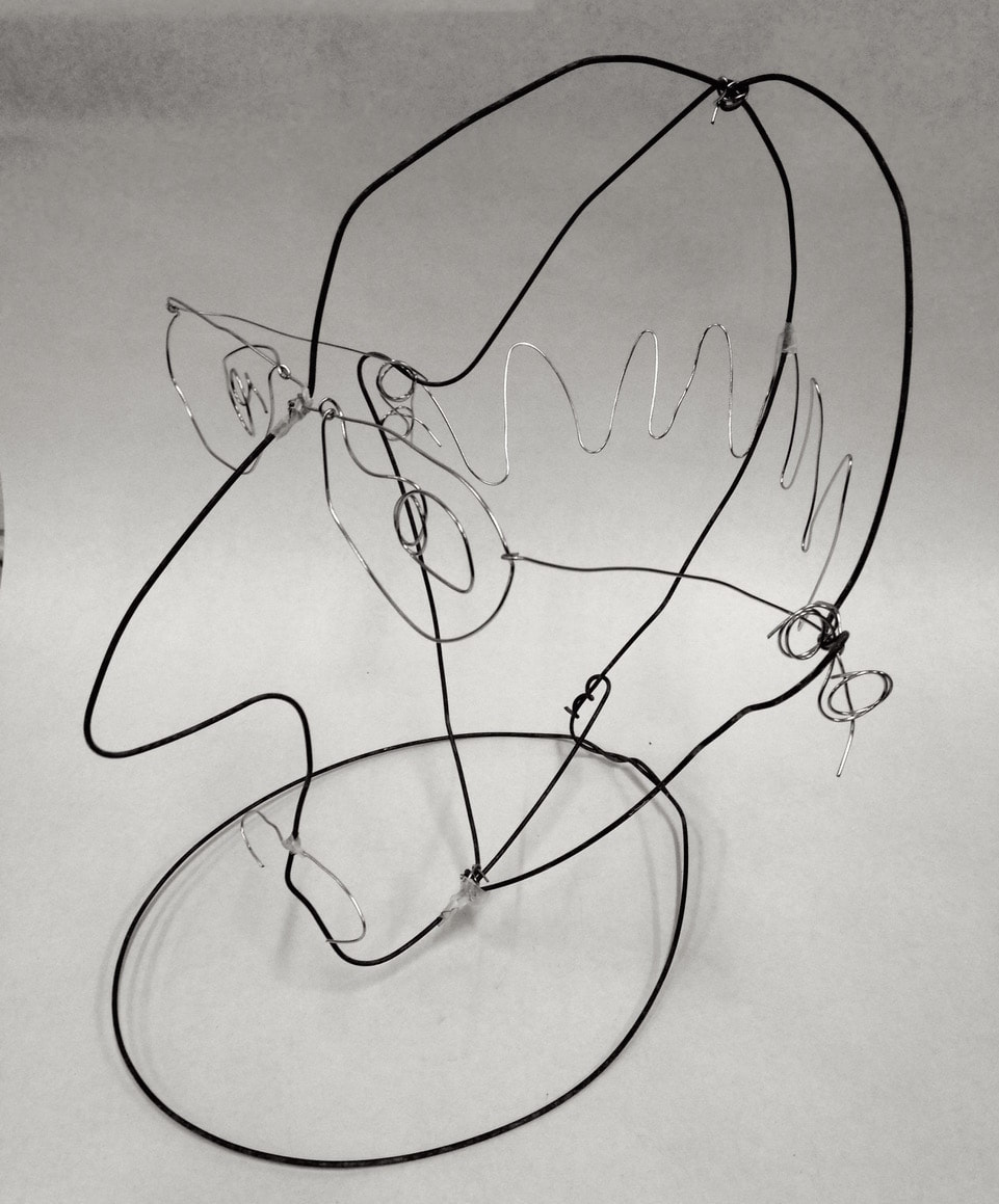
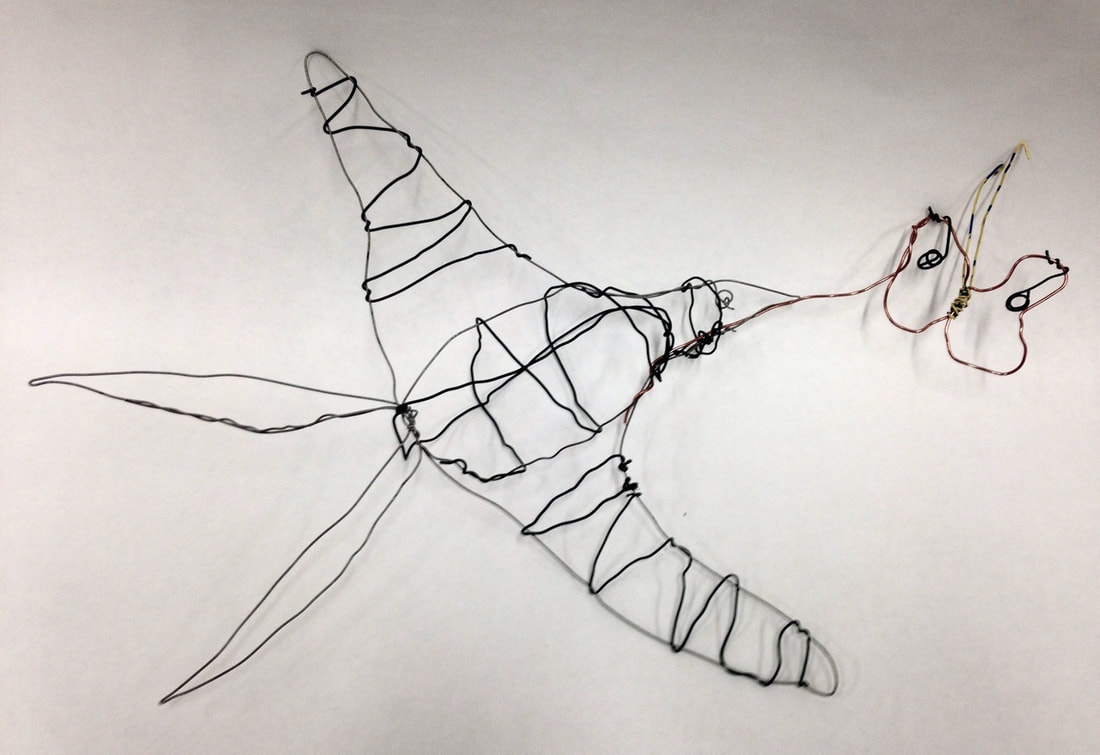
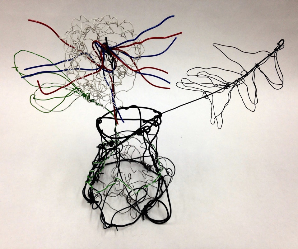
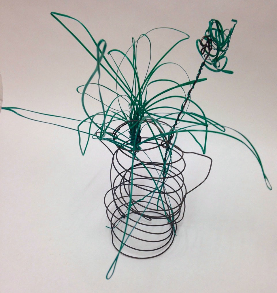
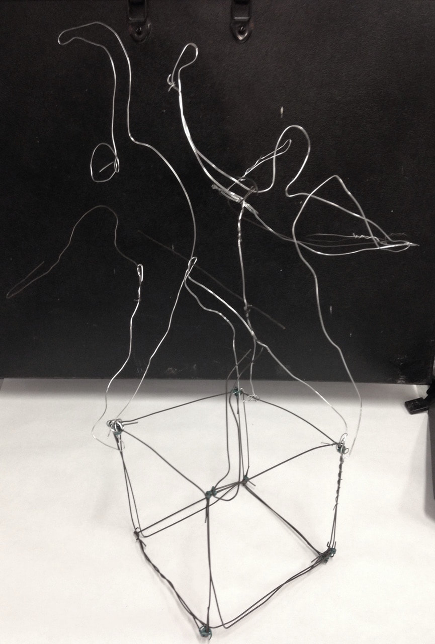
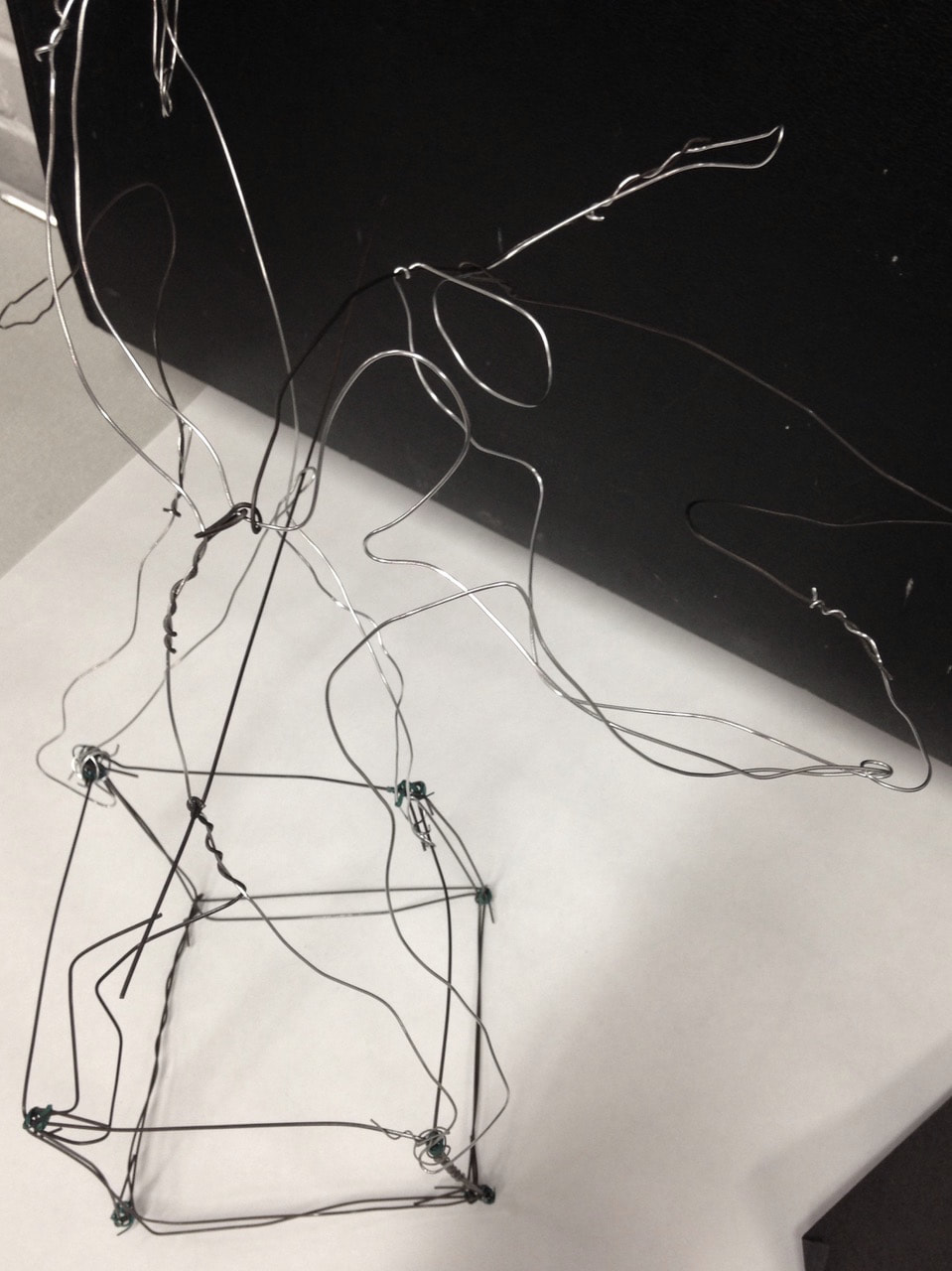
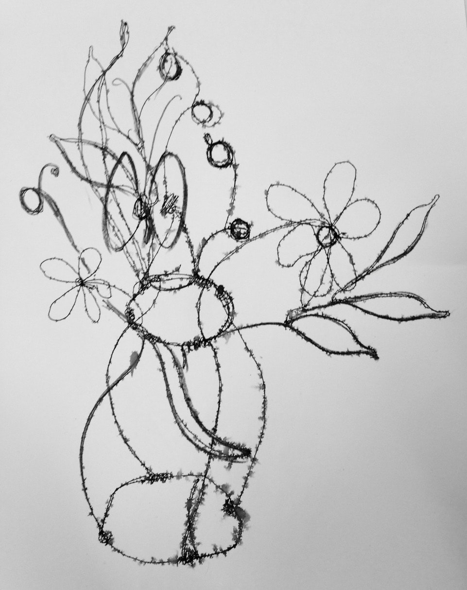
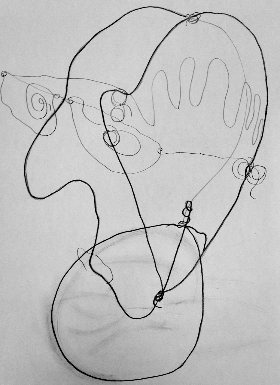
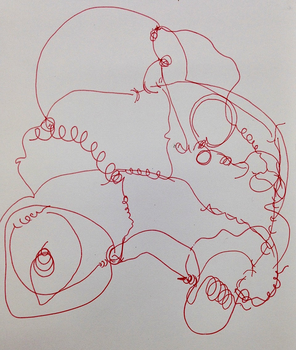
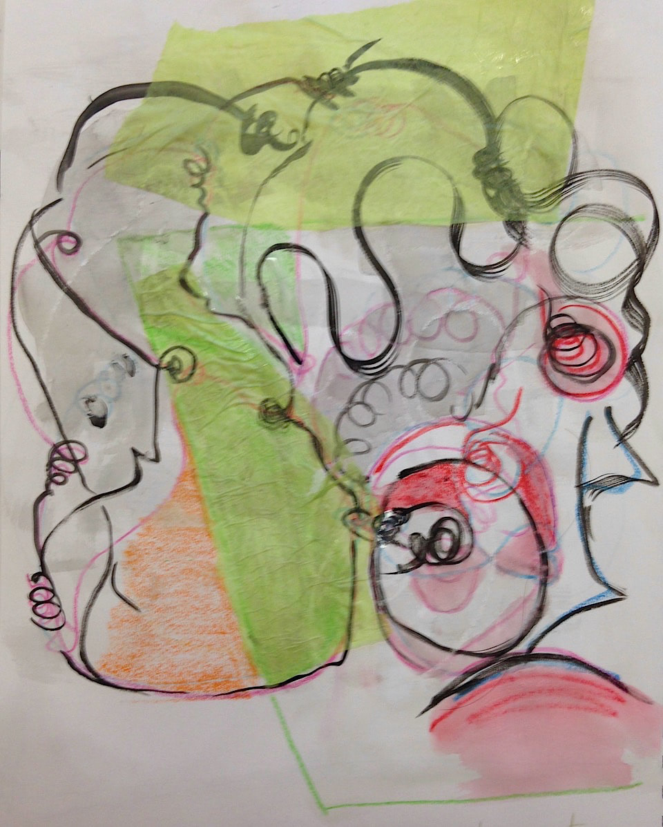
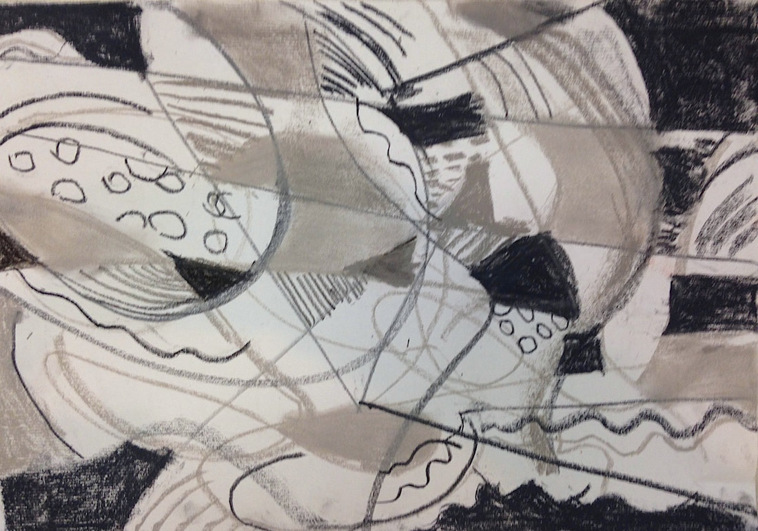
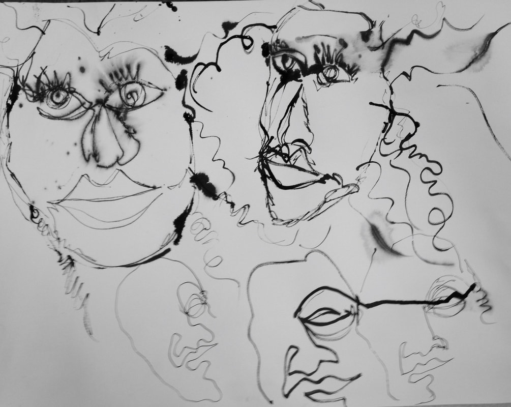
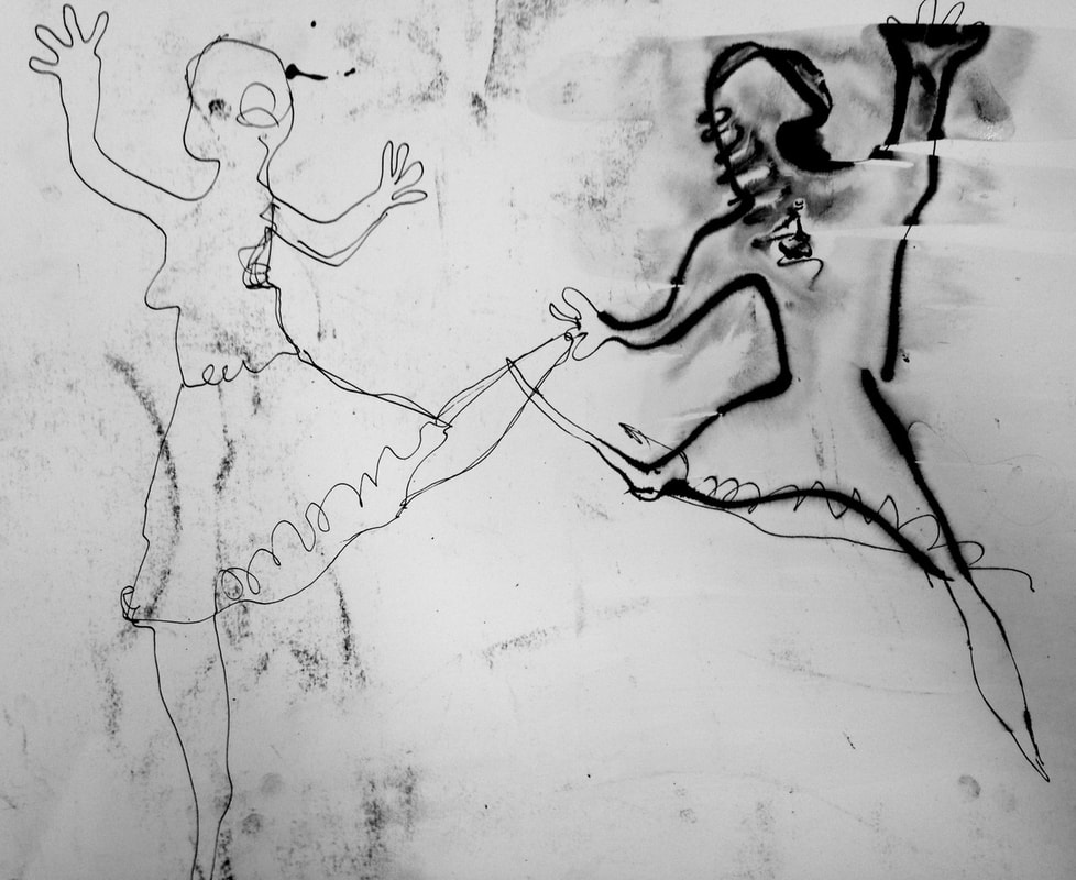
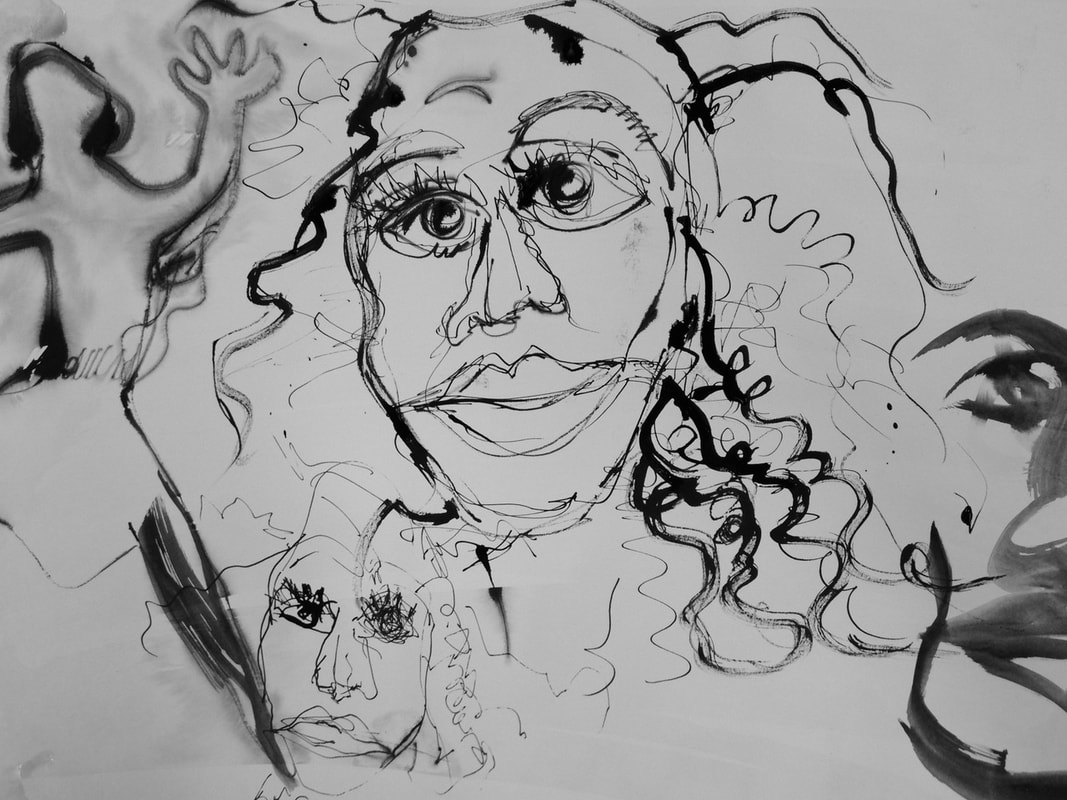
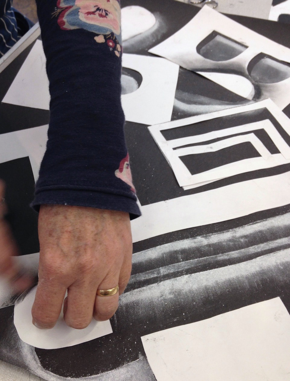
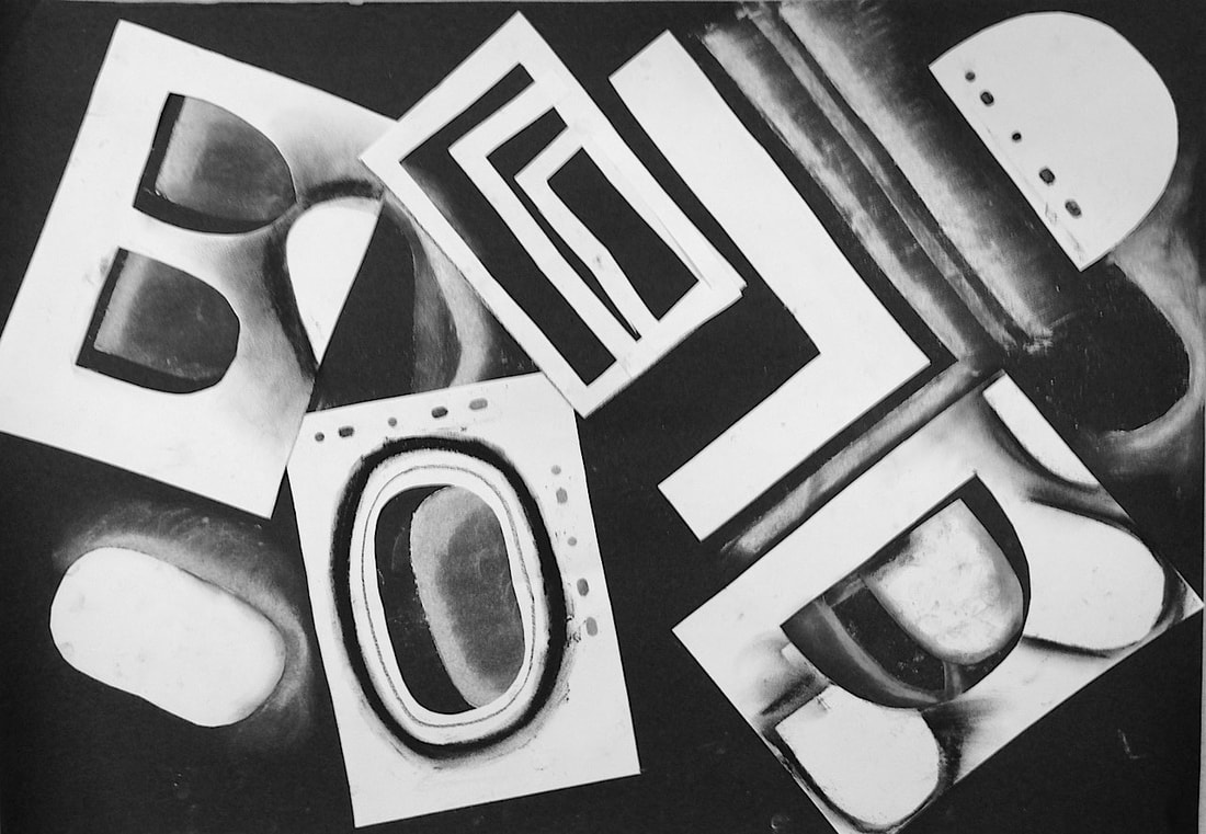
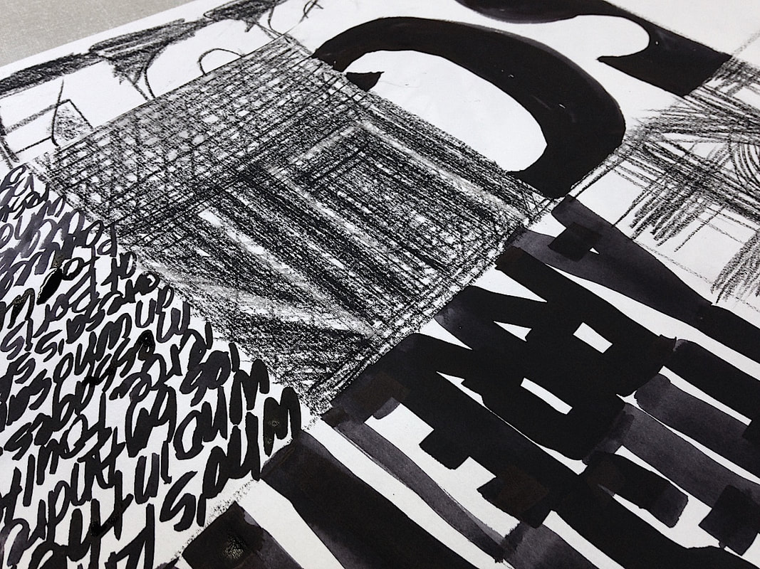
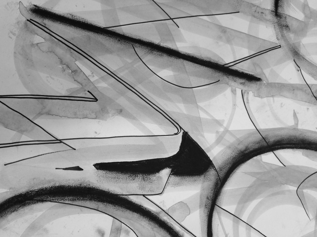
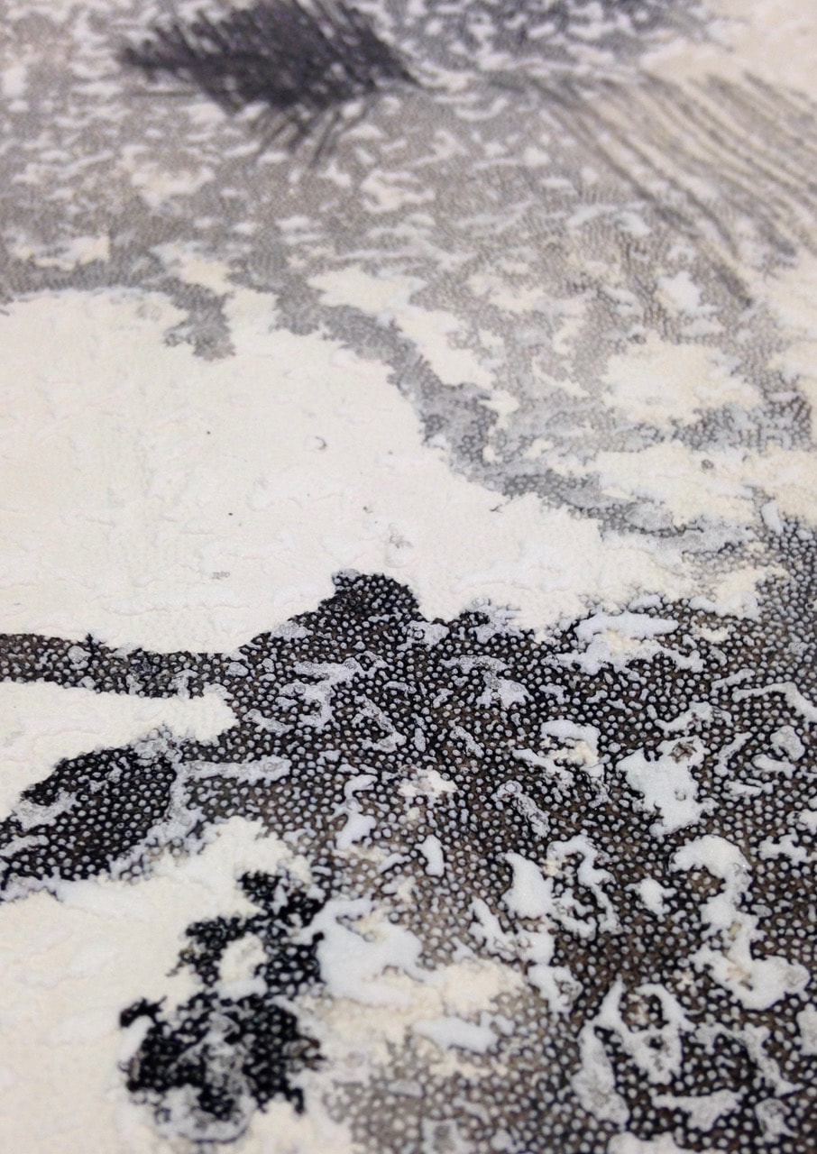
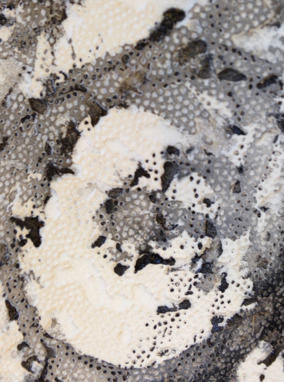
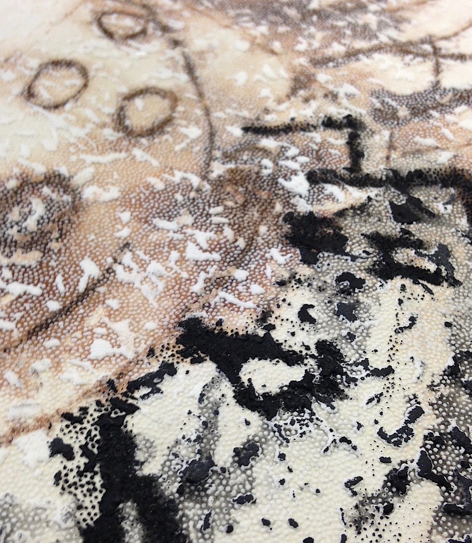
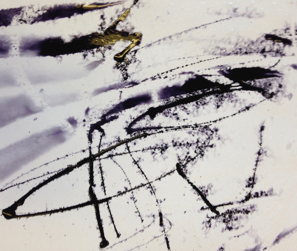
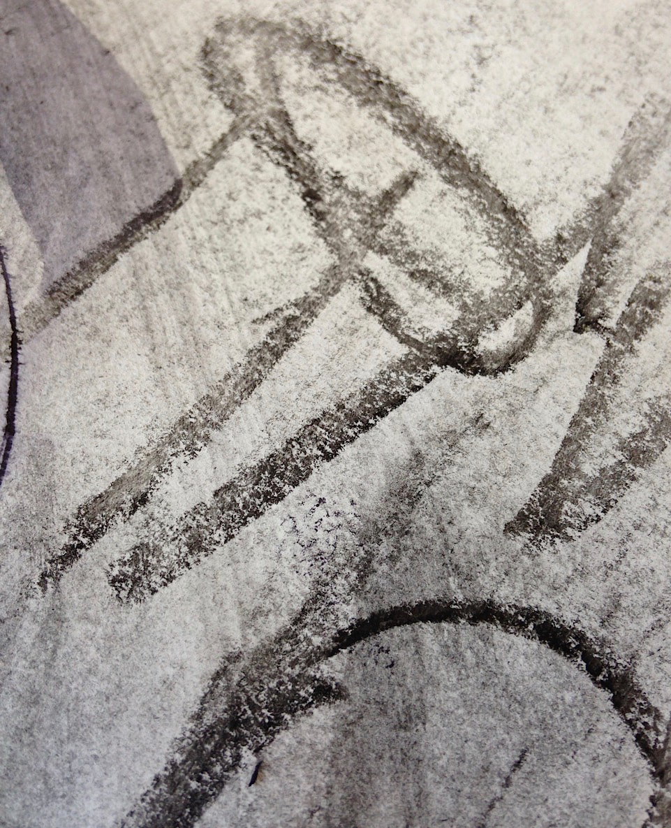
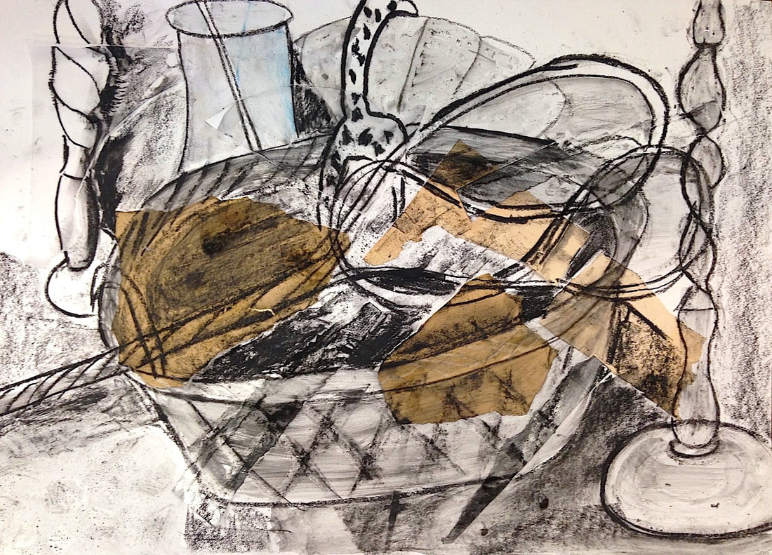
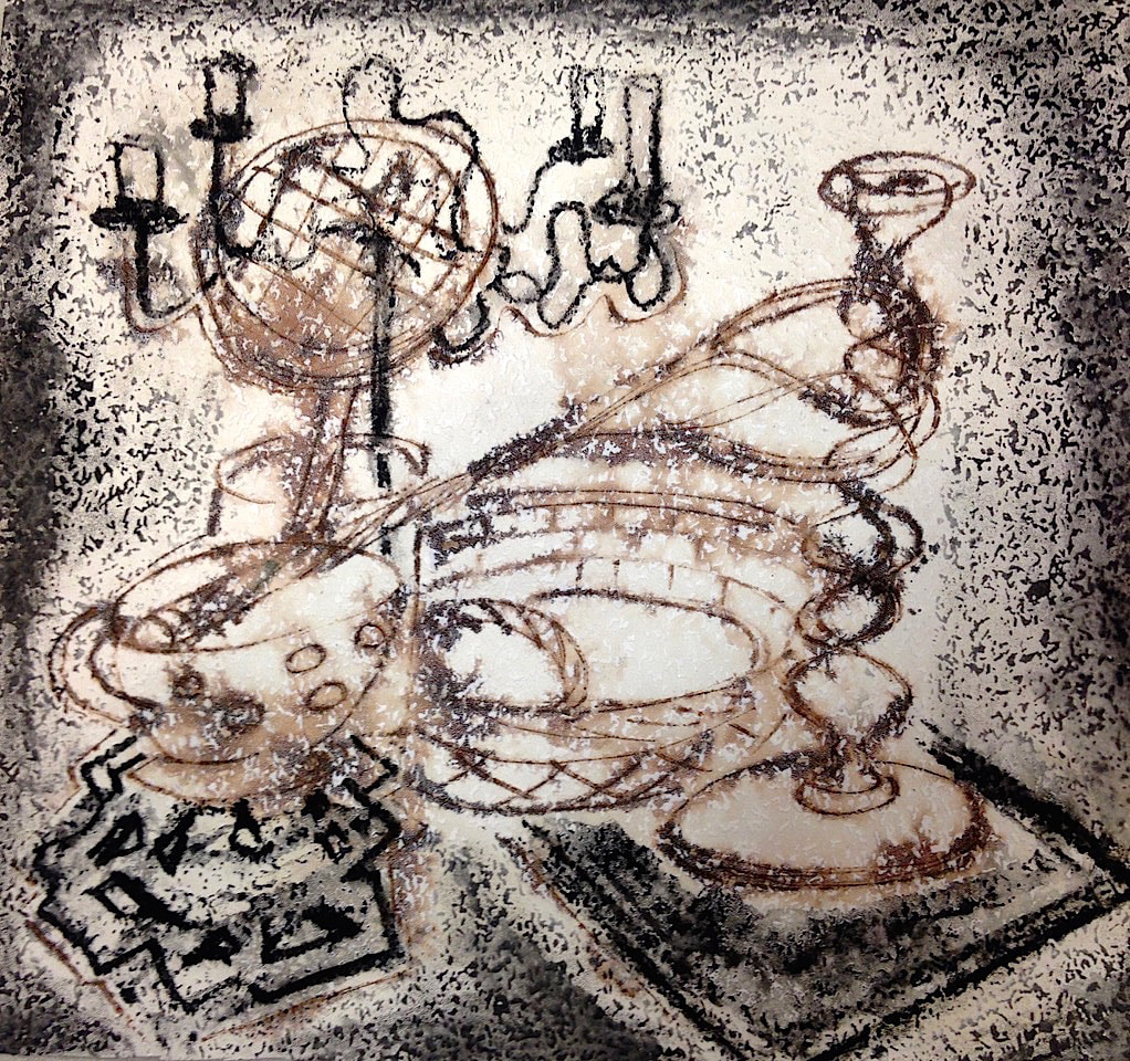
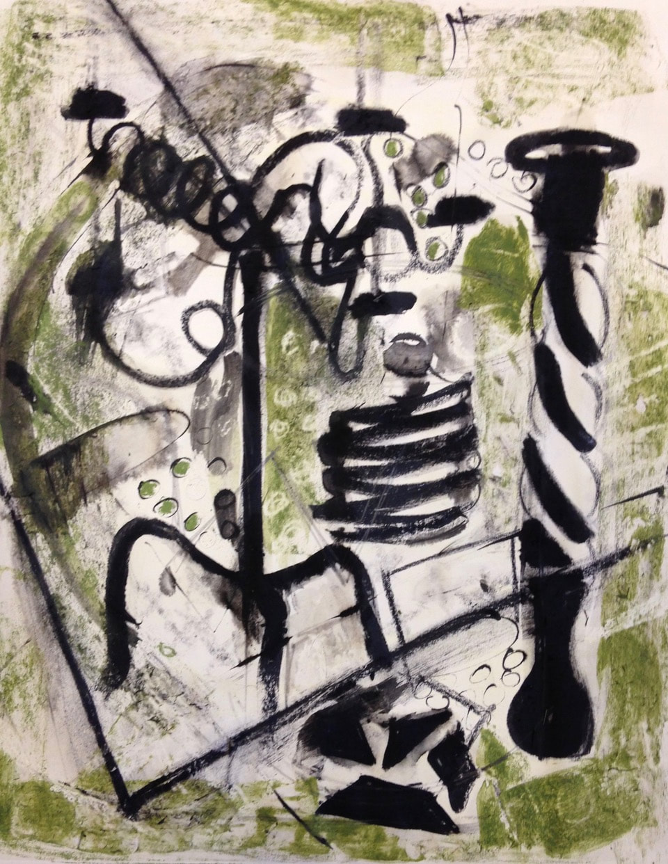
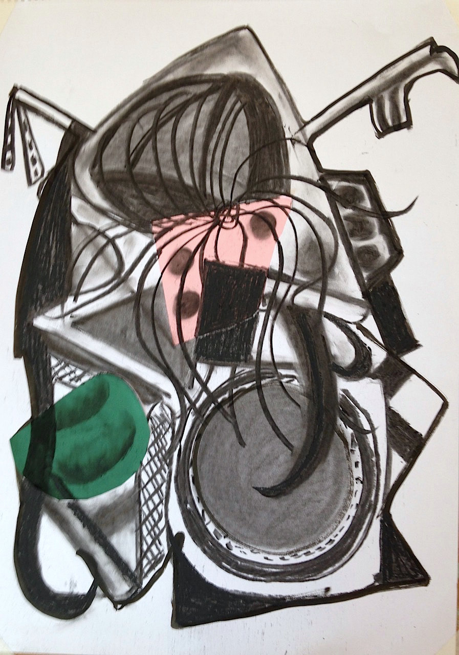
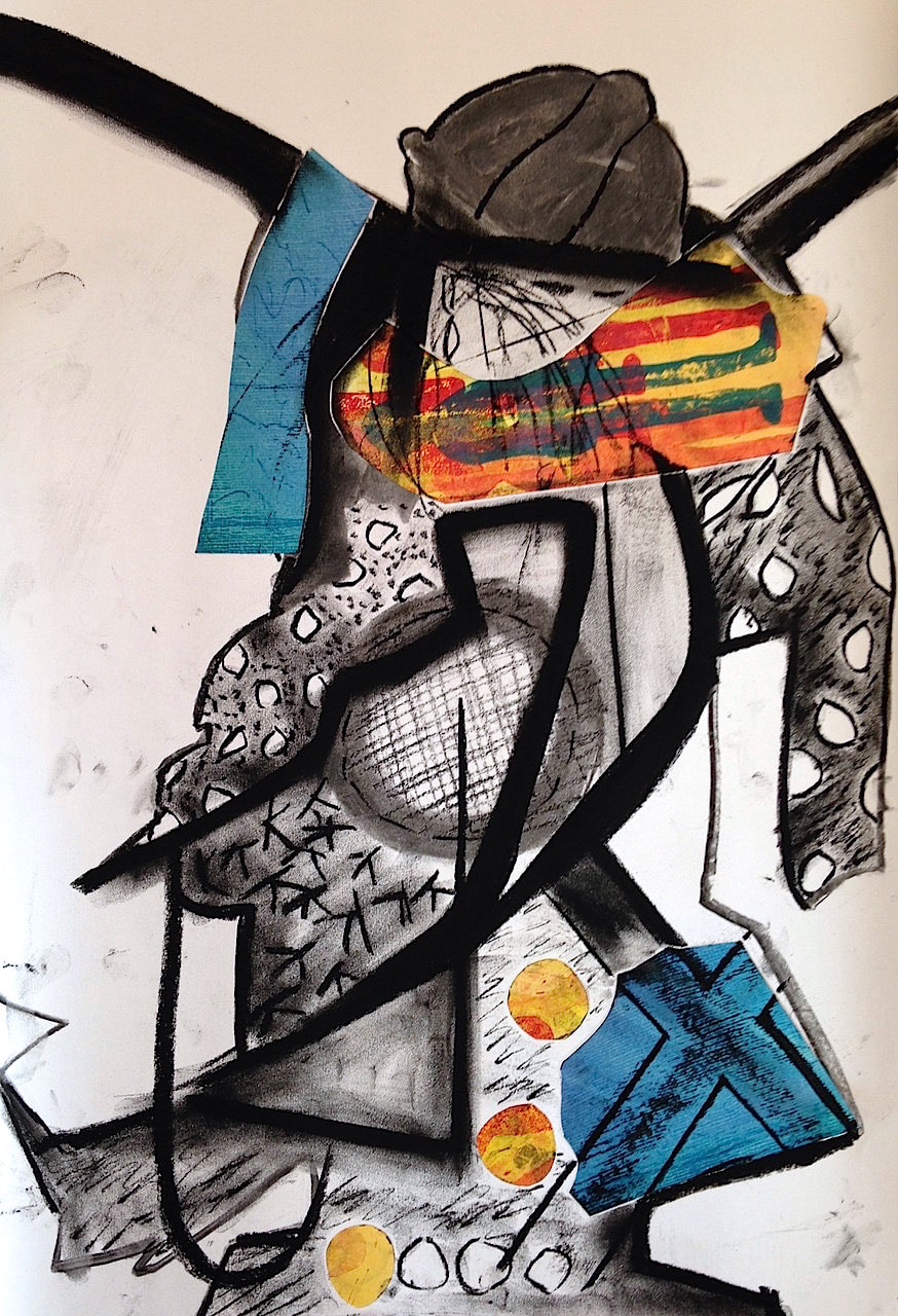
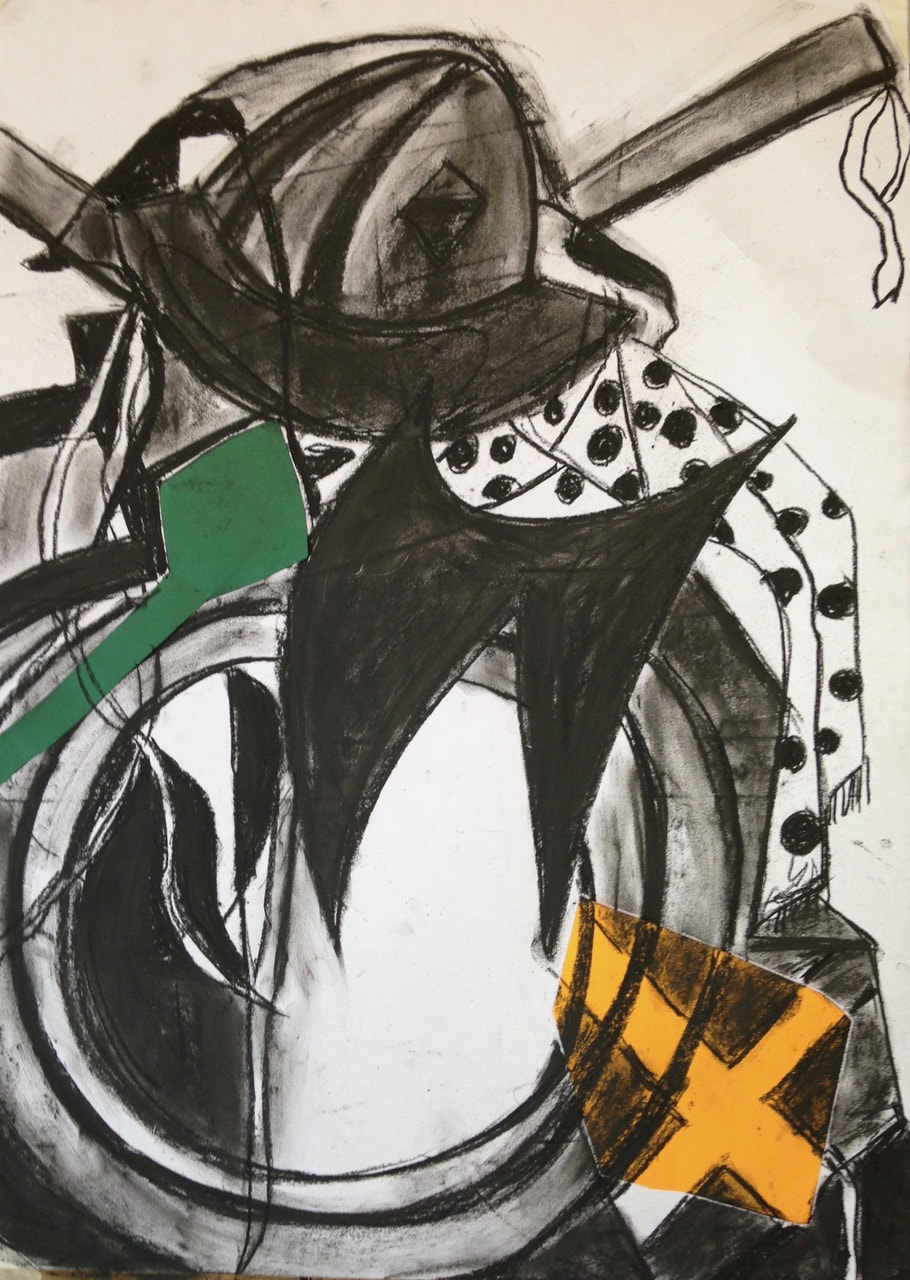
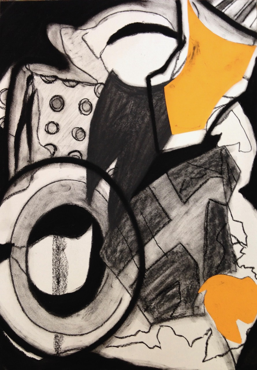
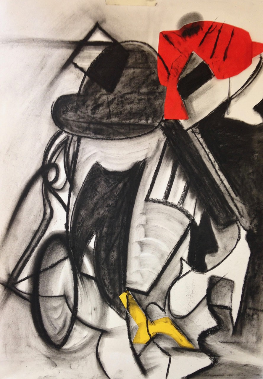
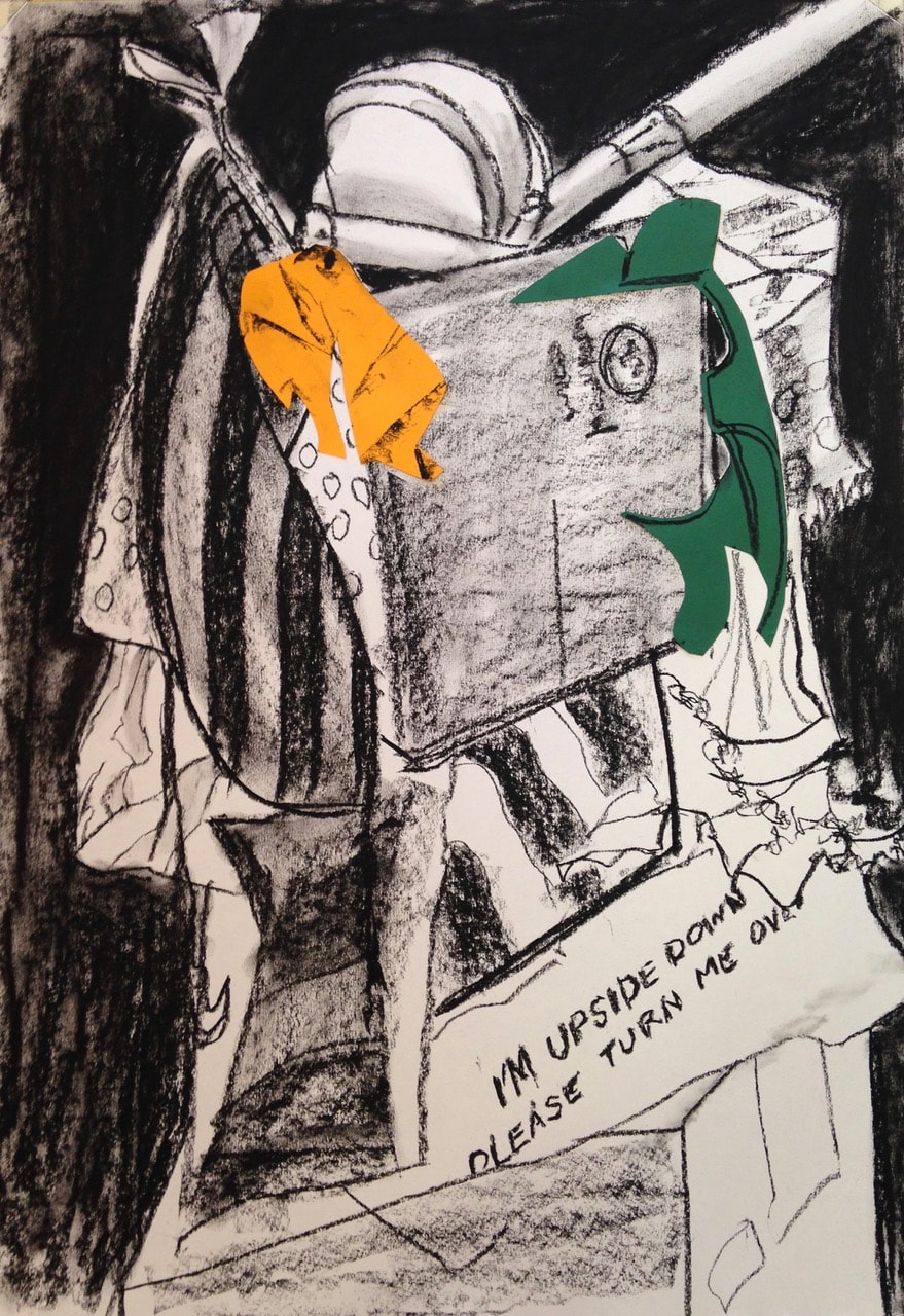
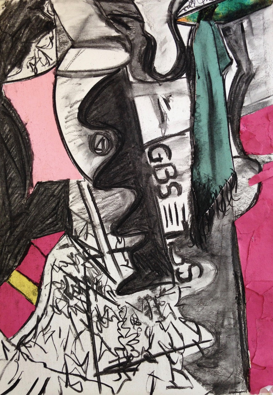
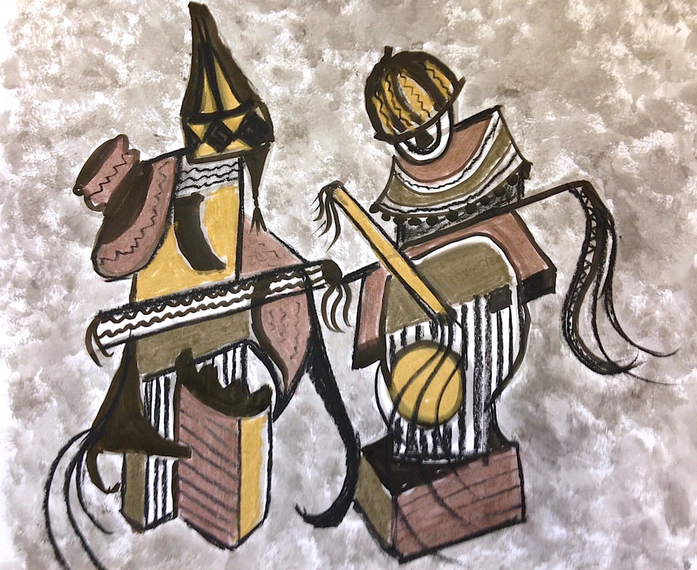
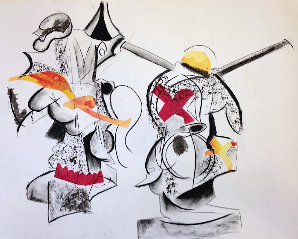
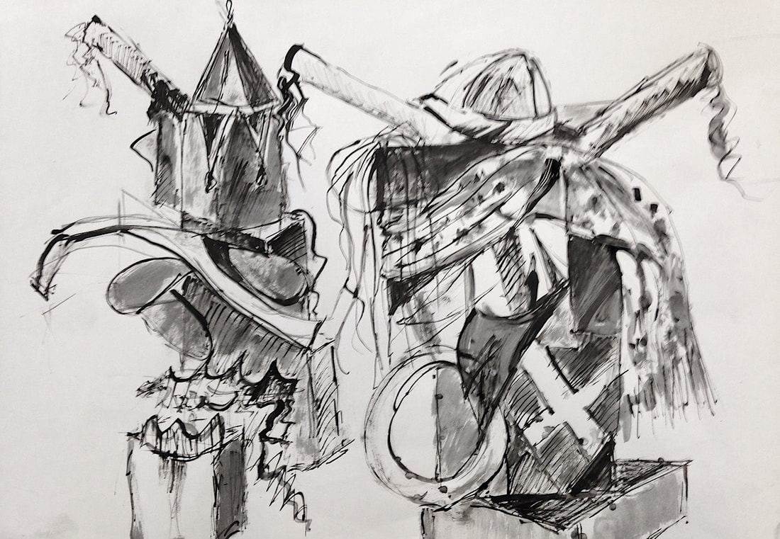
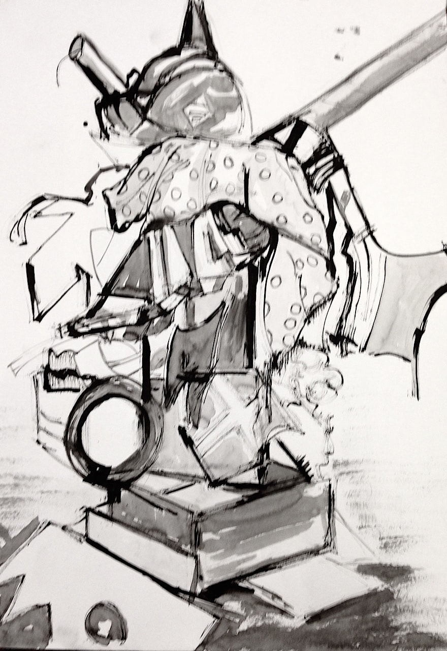
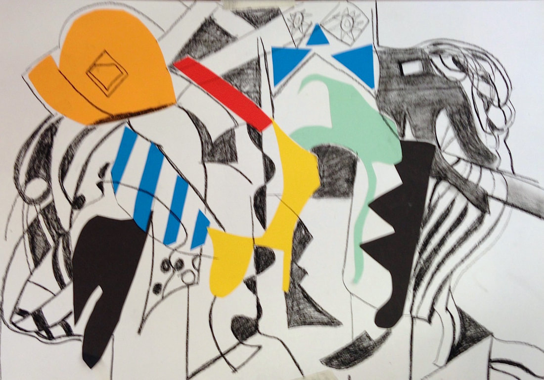
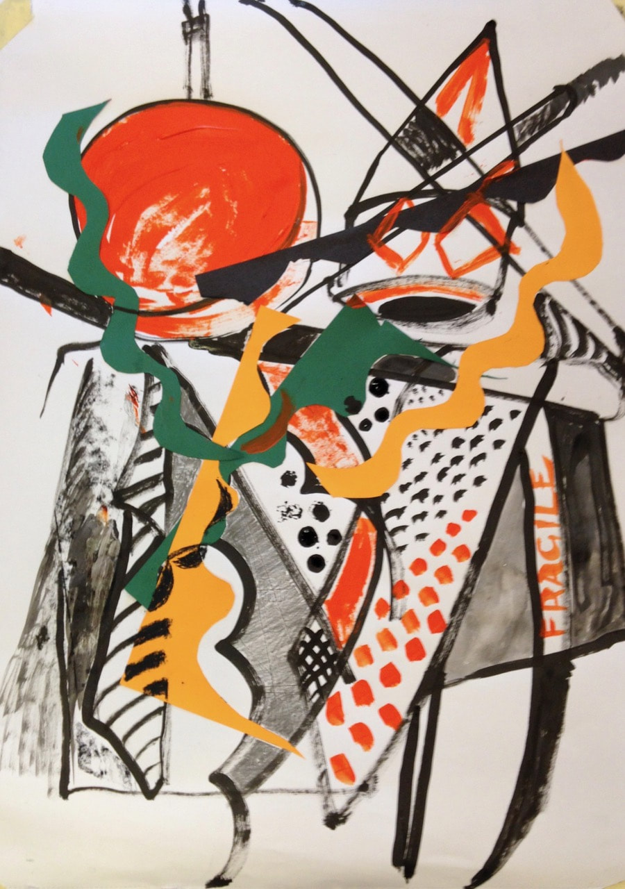
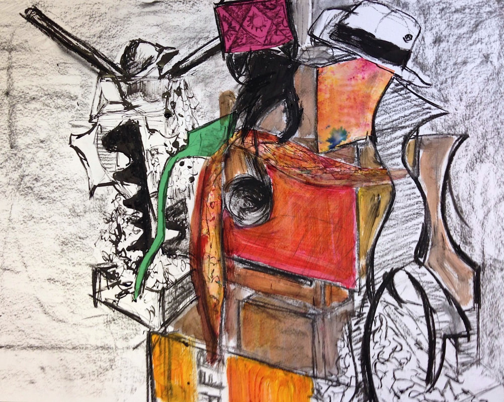
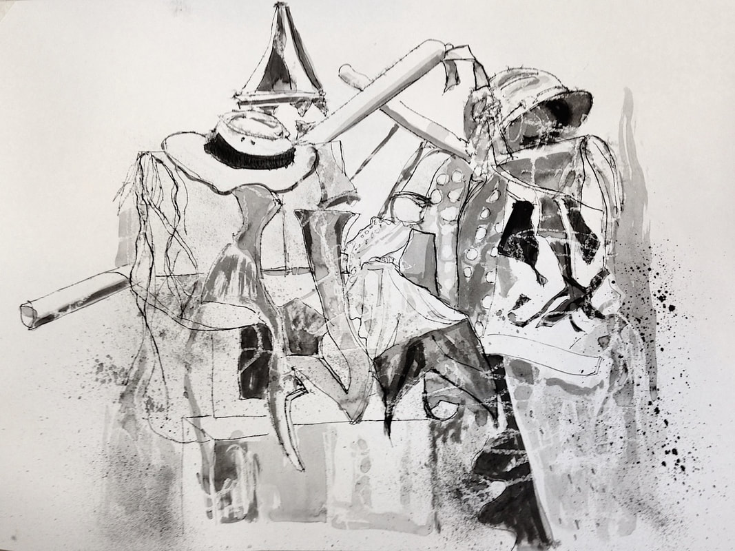
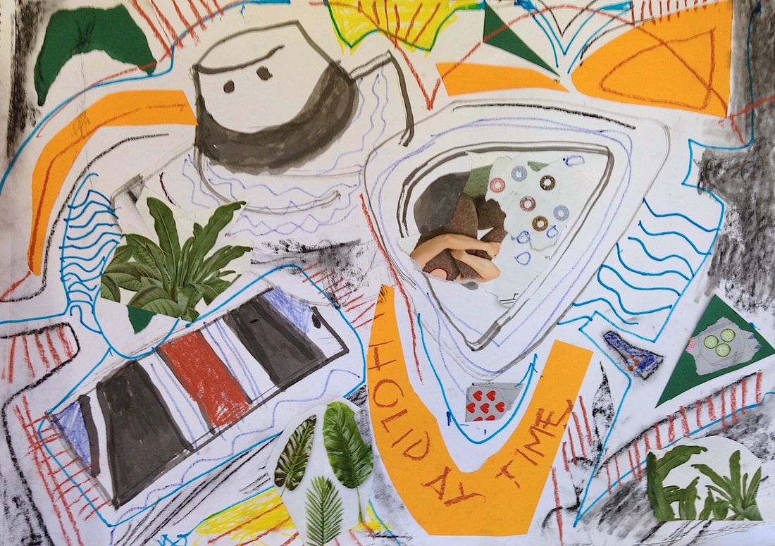
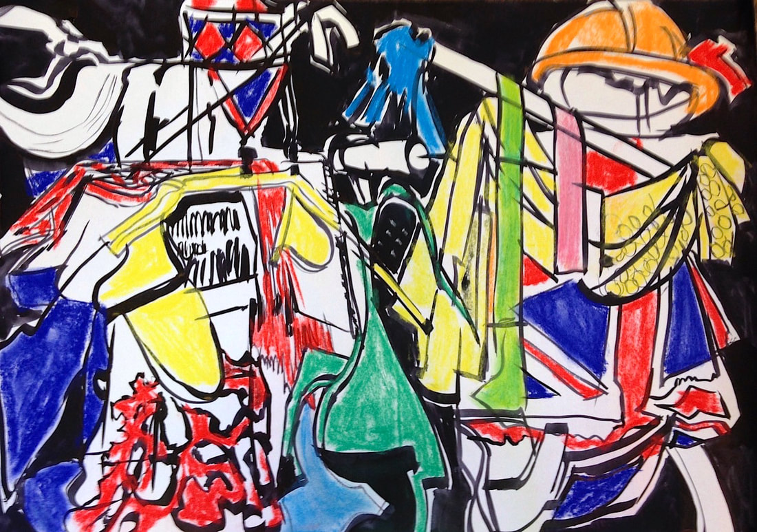
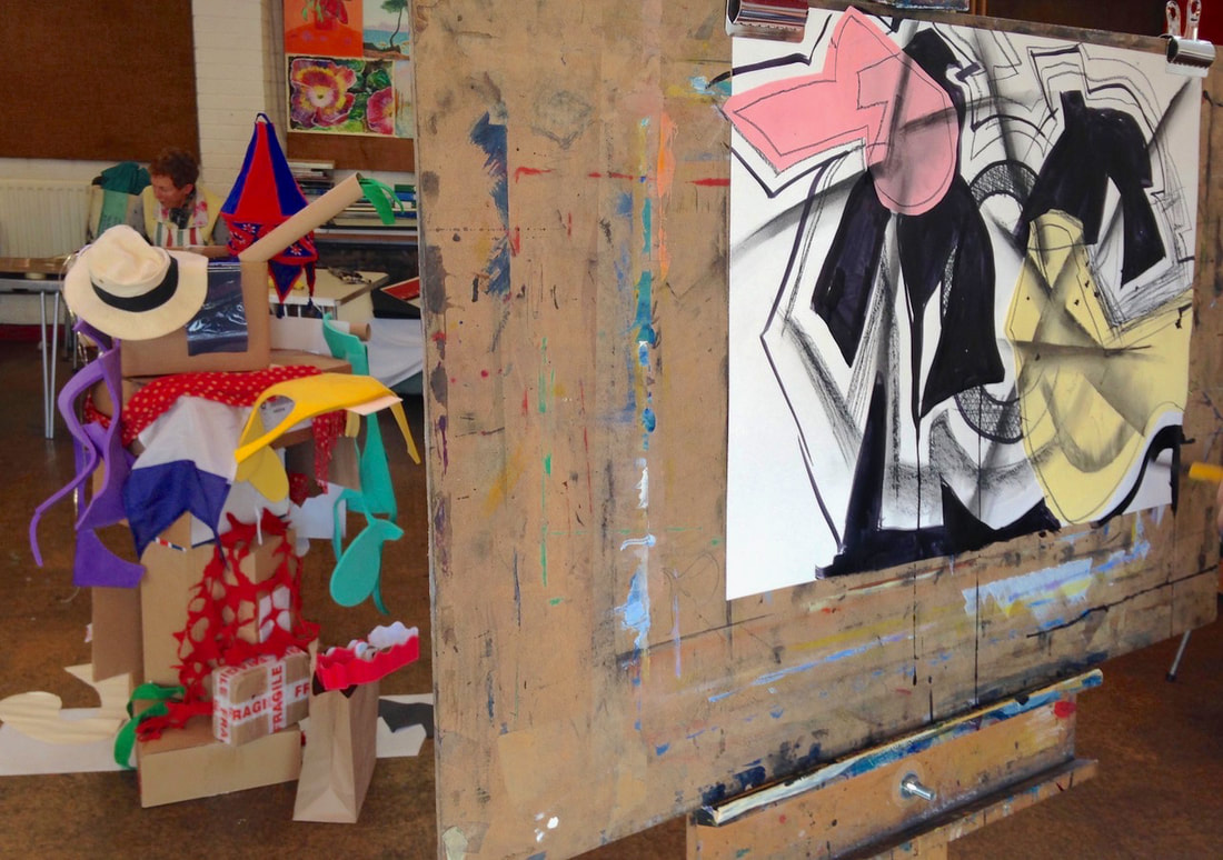
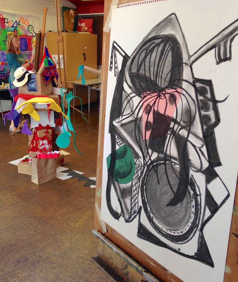
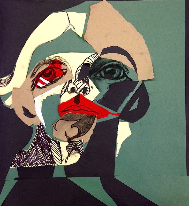
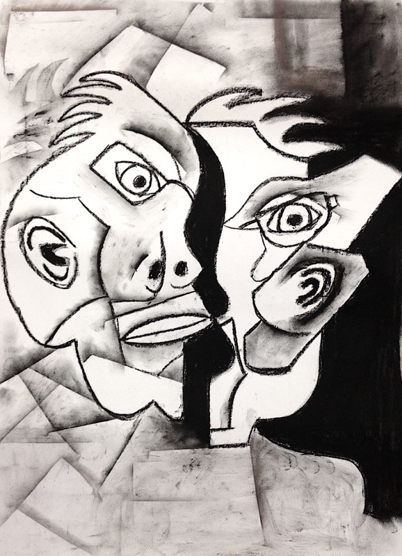
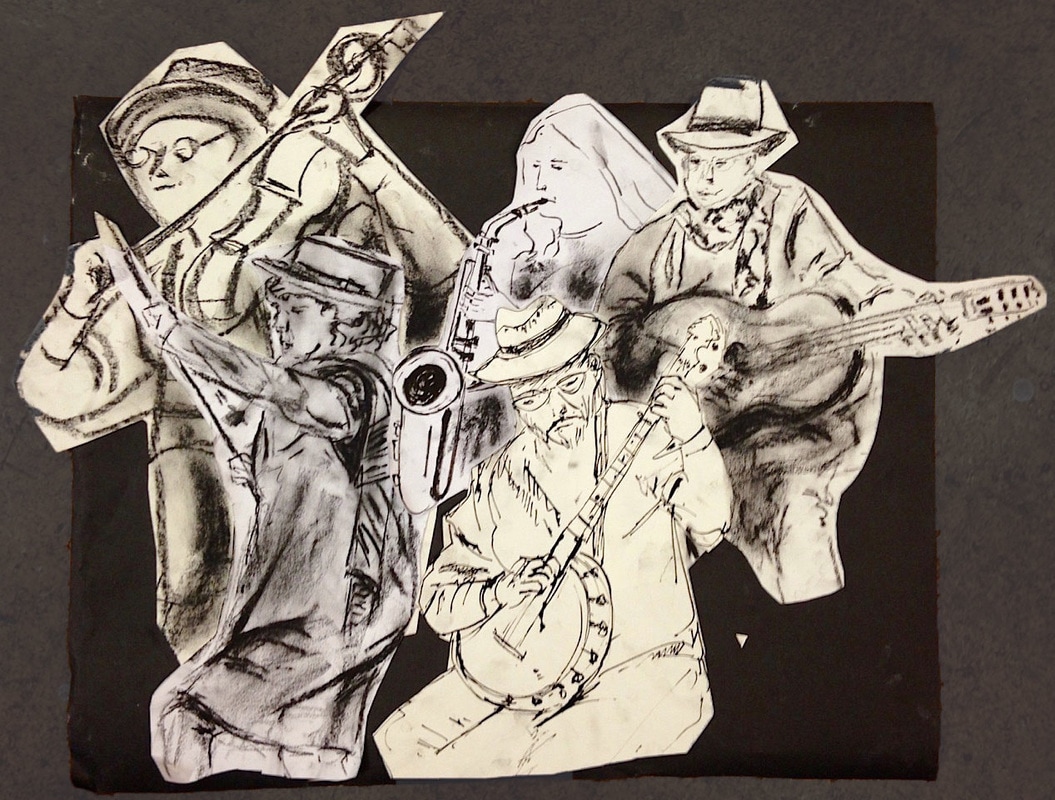
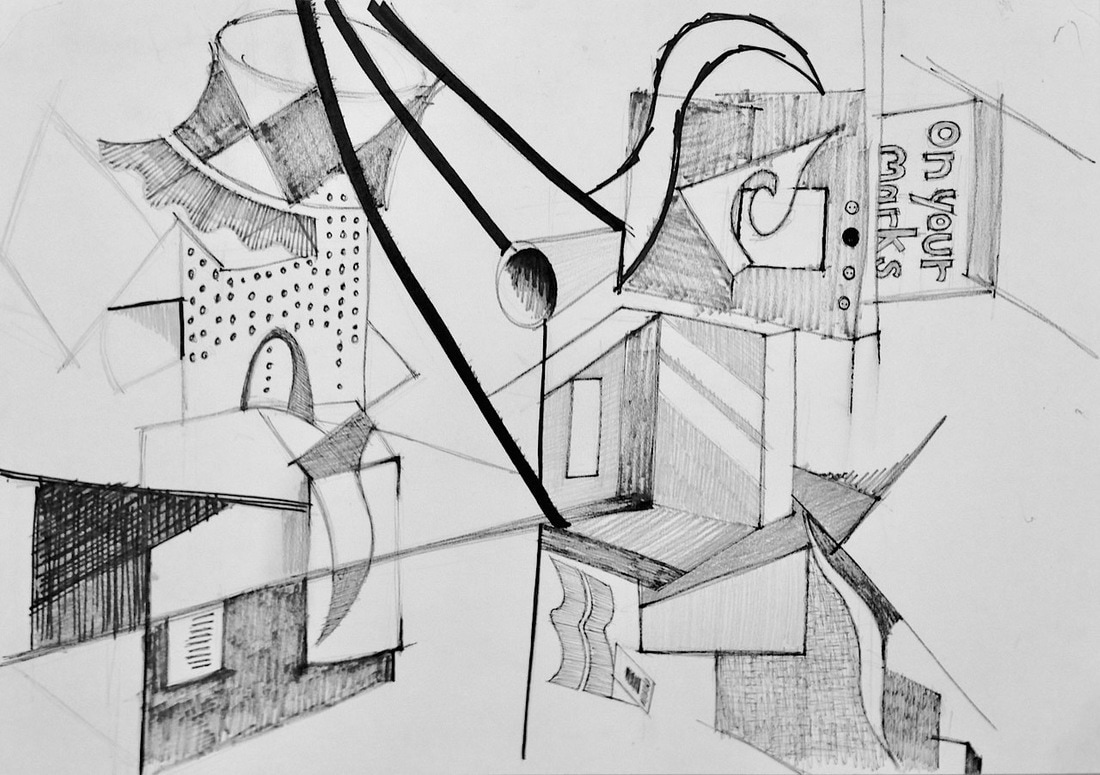
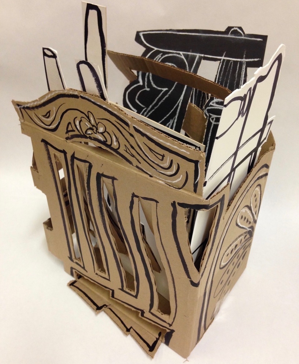
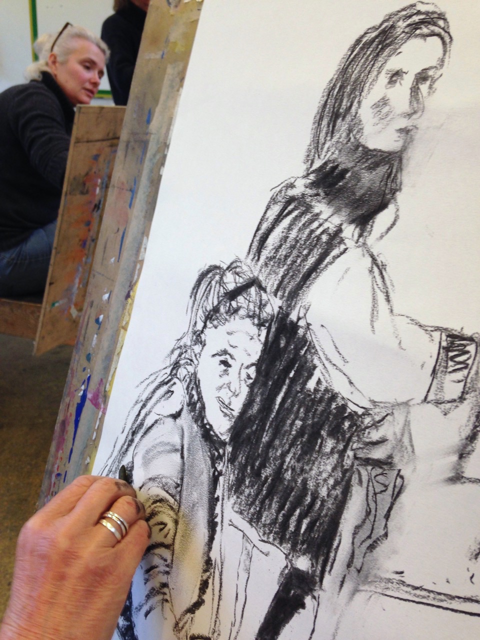
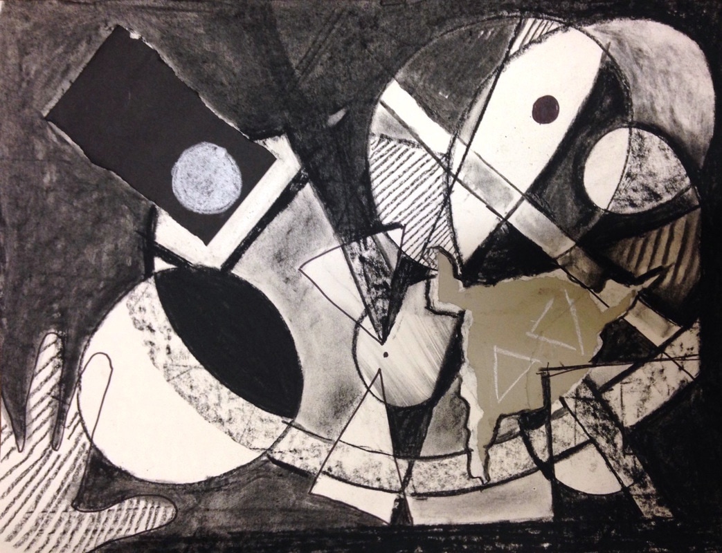
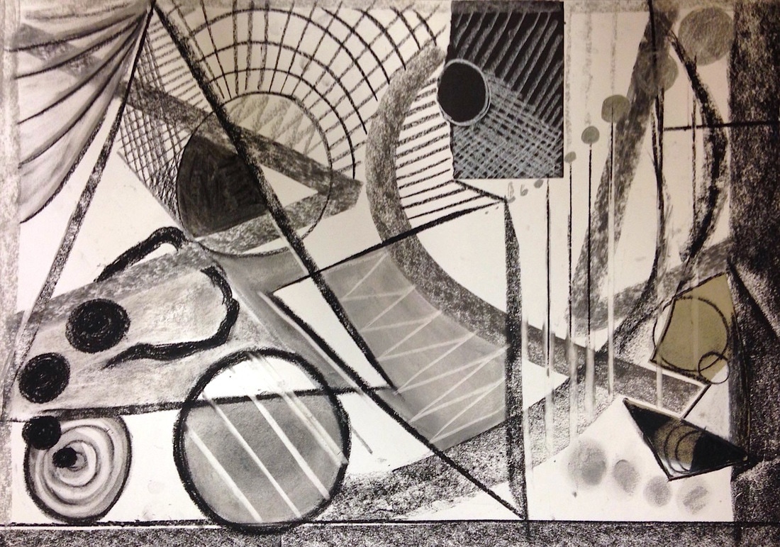
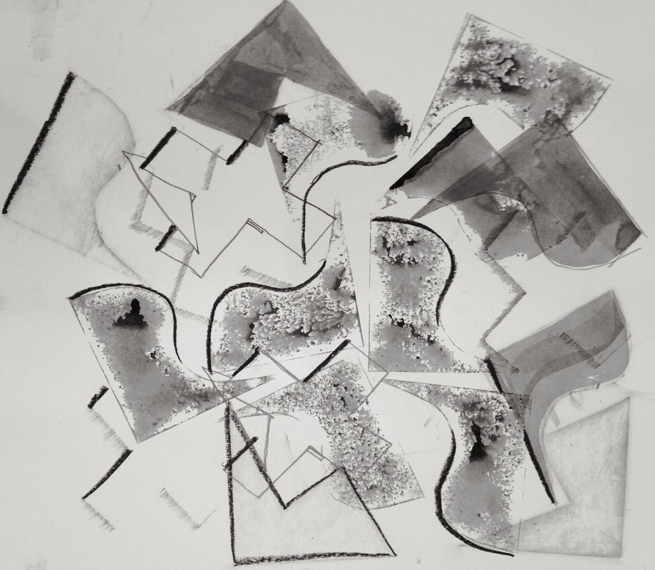
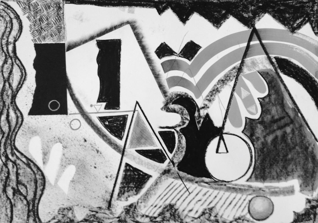
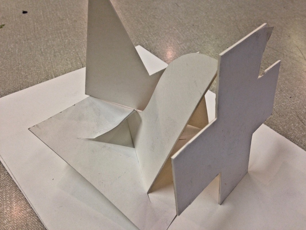
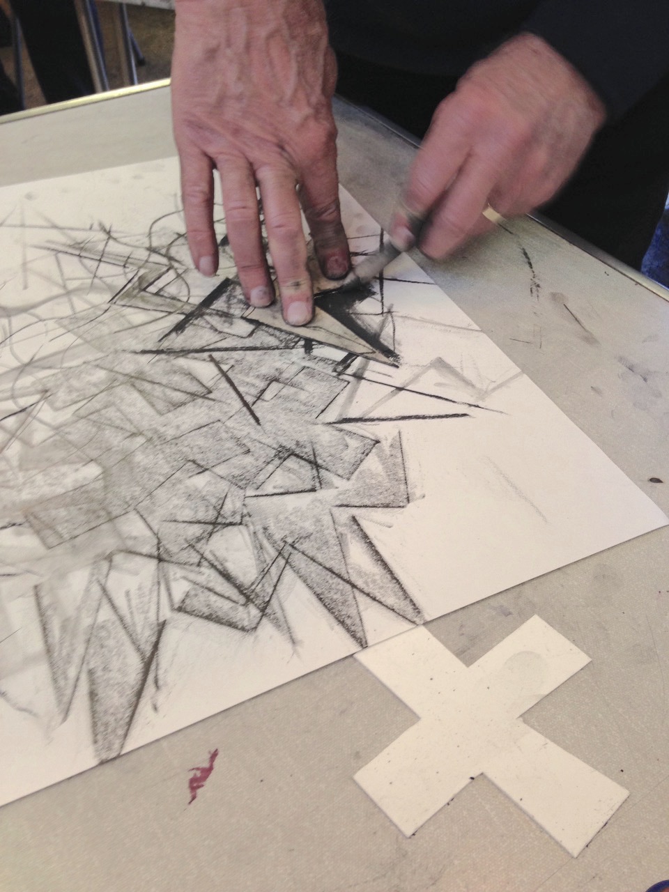
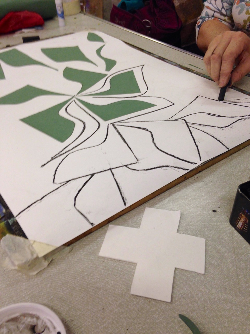
Most portraits are concerned with patches of colour and tone, locking together to model the form of the face. But here we were doing the opposite, with a number of separate drawings of the individual features of the face in different mediums with different approaches. These were then cut and collaged together in a deliberately dramatic way - and then drawings were done of the collage. progress photos... The aim was to work out strategies to tackle complicated subjects. We tried analysing into basic shapes and structures, simplifying into thick, medium and thin lines, concentrating on the edges and looking for the particular/quirky rather than generalising too much. We started by folding a simple A4 piece of paper into an interesting shape, then doing lots of varied overlapping drawings of it from all angles in different mediums. Then these were cut up and collaged together into a frieze. So, it was a drawing of nothing - but ended up as a fascinating composition of shapes, lines, tones and texture. click image to enlarge... Large scale drawings, working at arms length with charcoal etc on sticks to produce bold design and marks that are less under control...... We made 3 dimensional drawings of figures/self portraits or chess pieces that could be seen from every angle. Designing and building the structure as an abstract sculpture was as important as describing the features, and most of the drawing was done with a knife or scissors. Several quick 5 - 10 minute drawings of each other with a prop using various media. We tried different approaches but an important part was composing these together at the end to form a group; cropping, overlapping and sometimes using pieces of different coloured background. click a thumbnail to see the whole image... work in progress... This was planned as a design brief to illustrate the idea of 'broken', smashed, distorted - either emotionally or physically. Everyone worked from broken objects but had to decide the best way to make an image that showed this sense of 'broken.' click an image to enlarge... We experimented, making marks with all sorts of tools made up from card, bubble wrap, twigs taped together etc - resulting in a huge range of unique qualities. Then some of the group used these experiments to make a drawing based on bicycles.
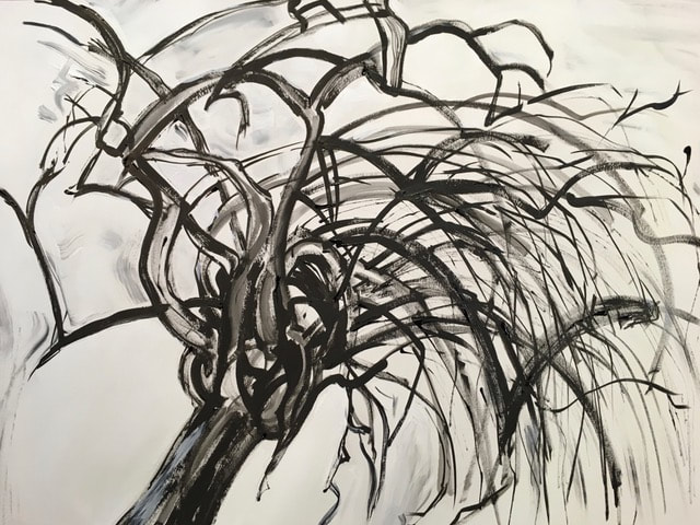
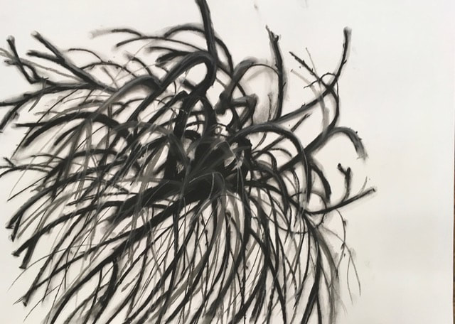
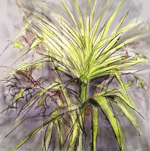
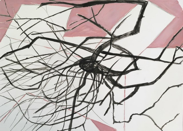
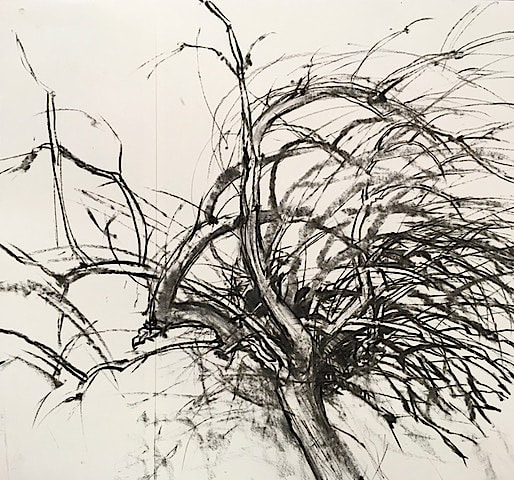
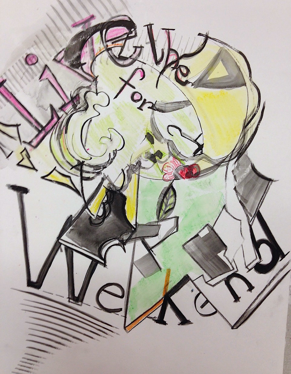
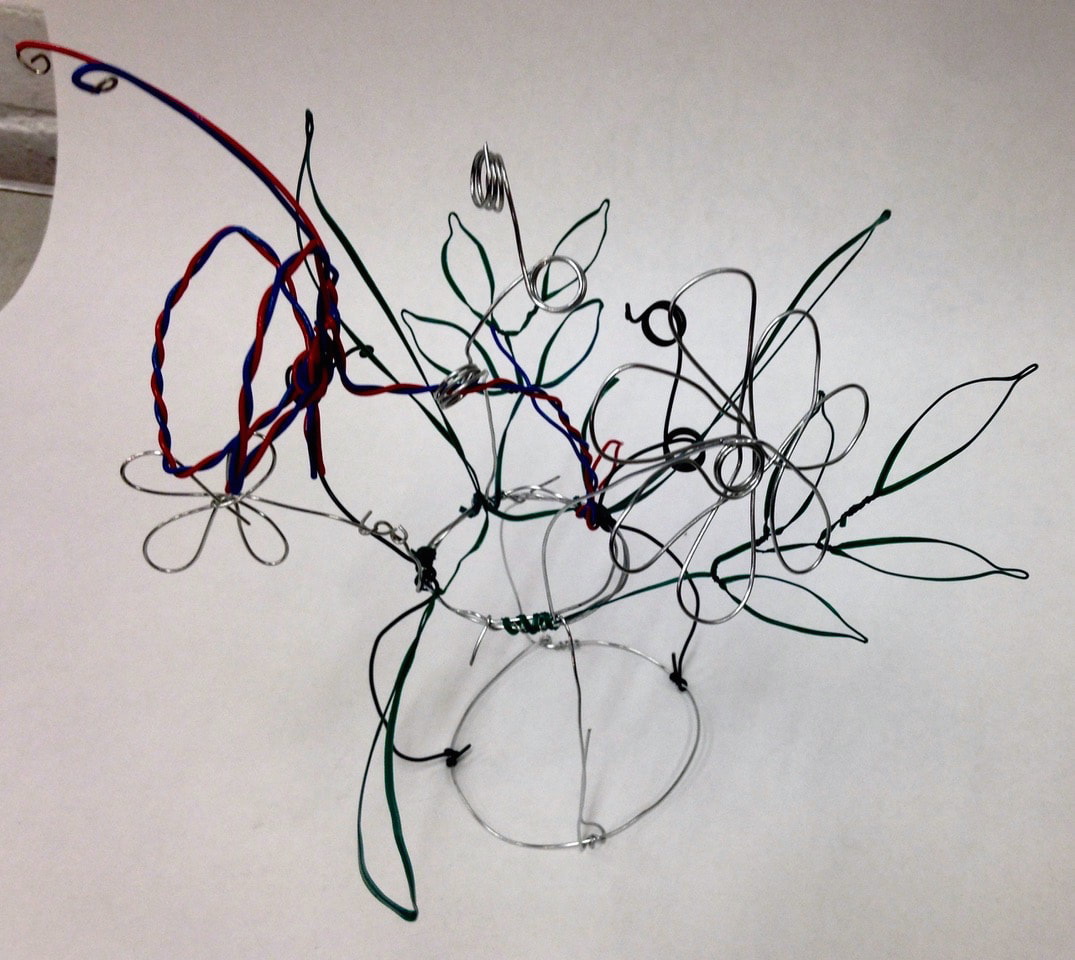
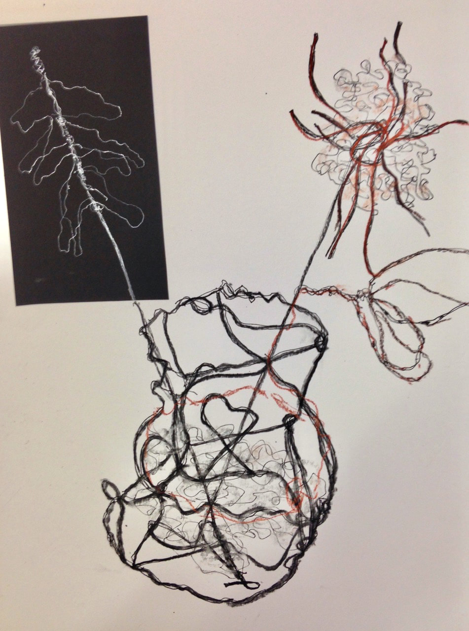
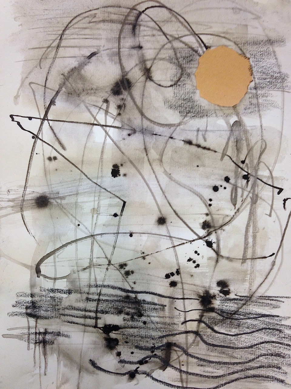
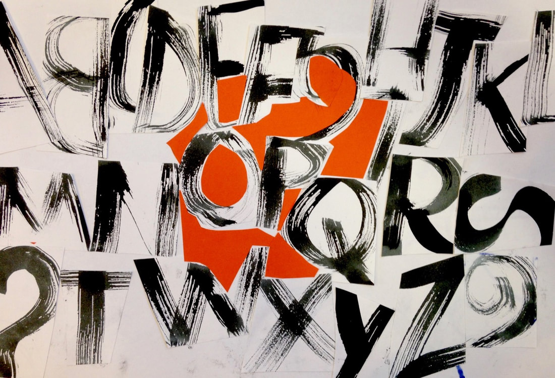
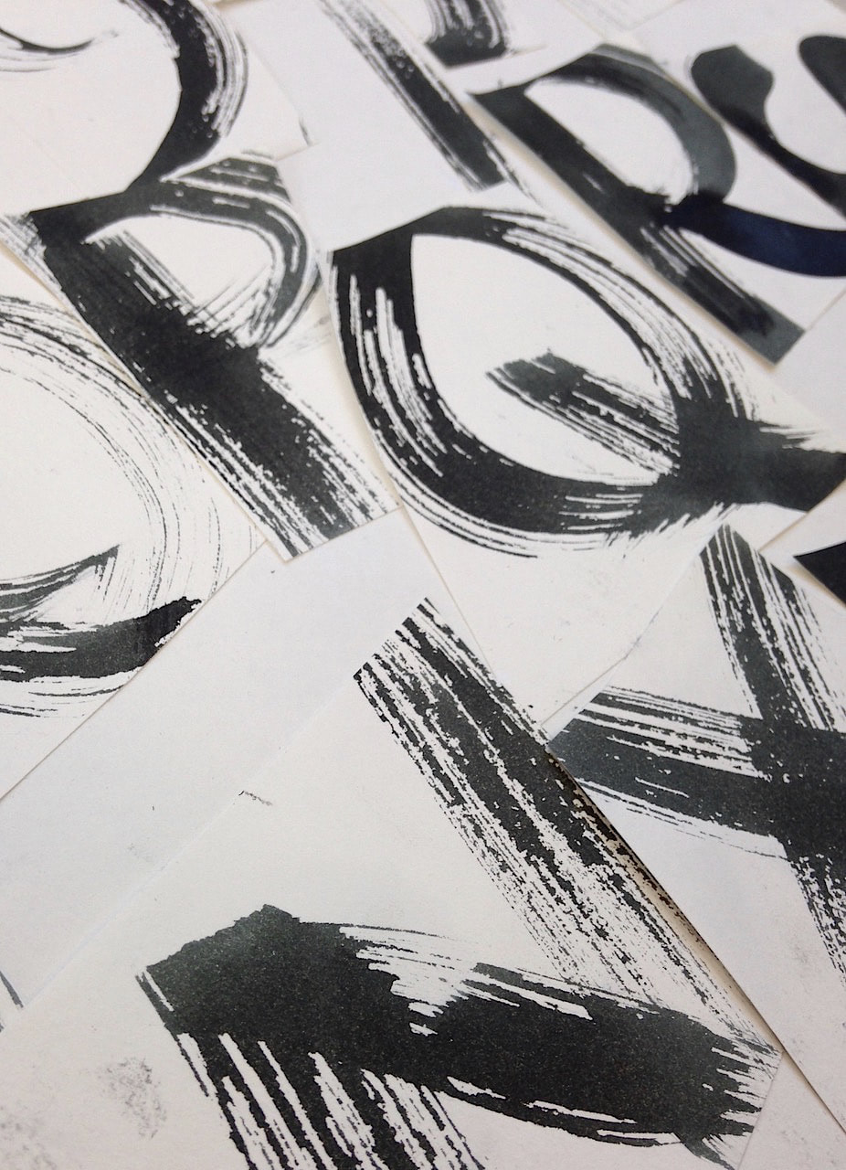
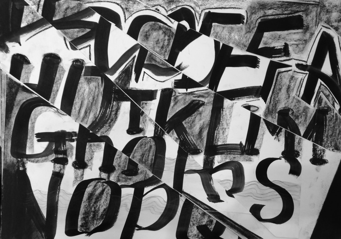
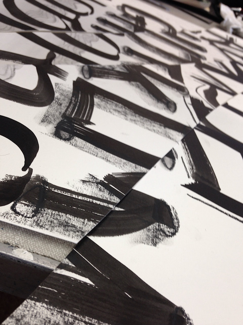
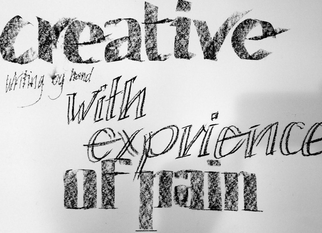
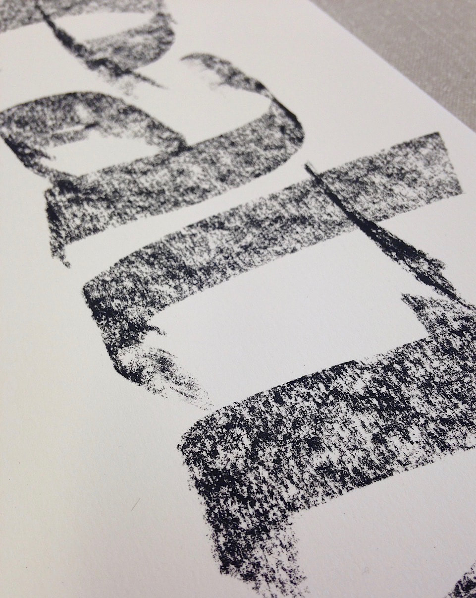
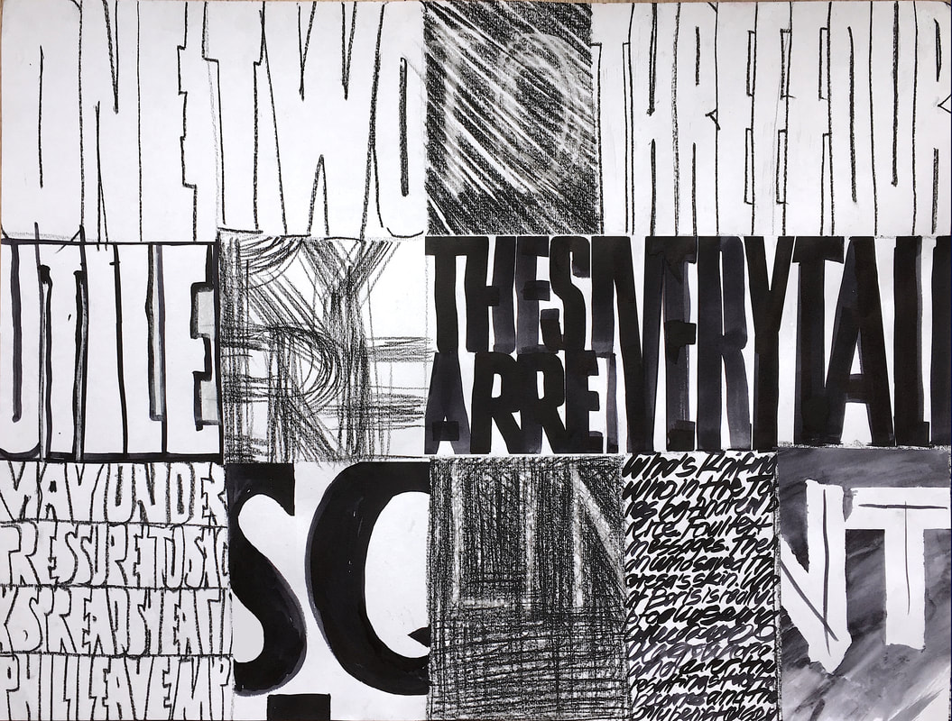
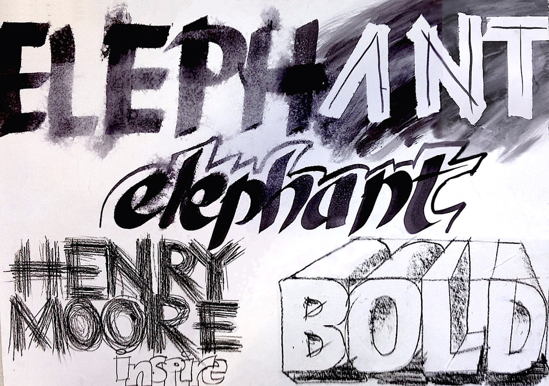
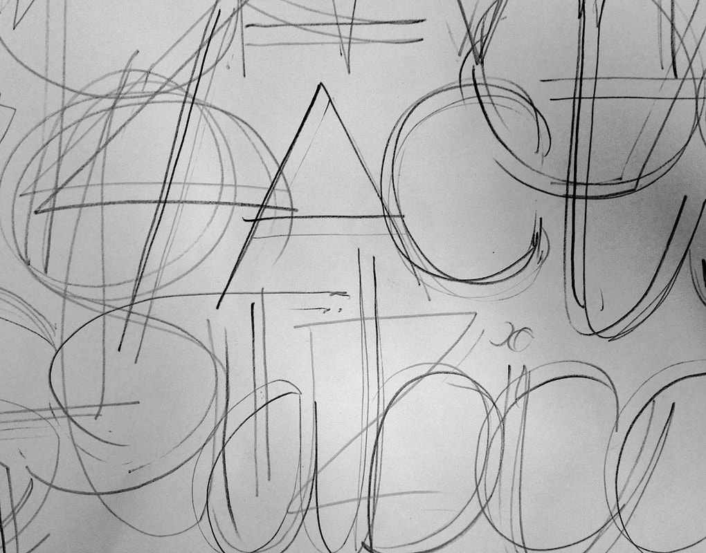
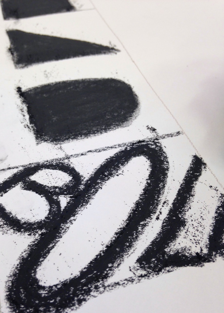
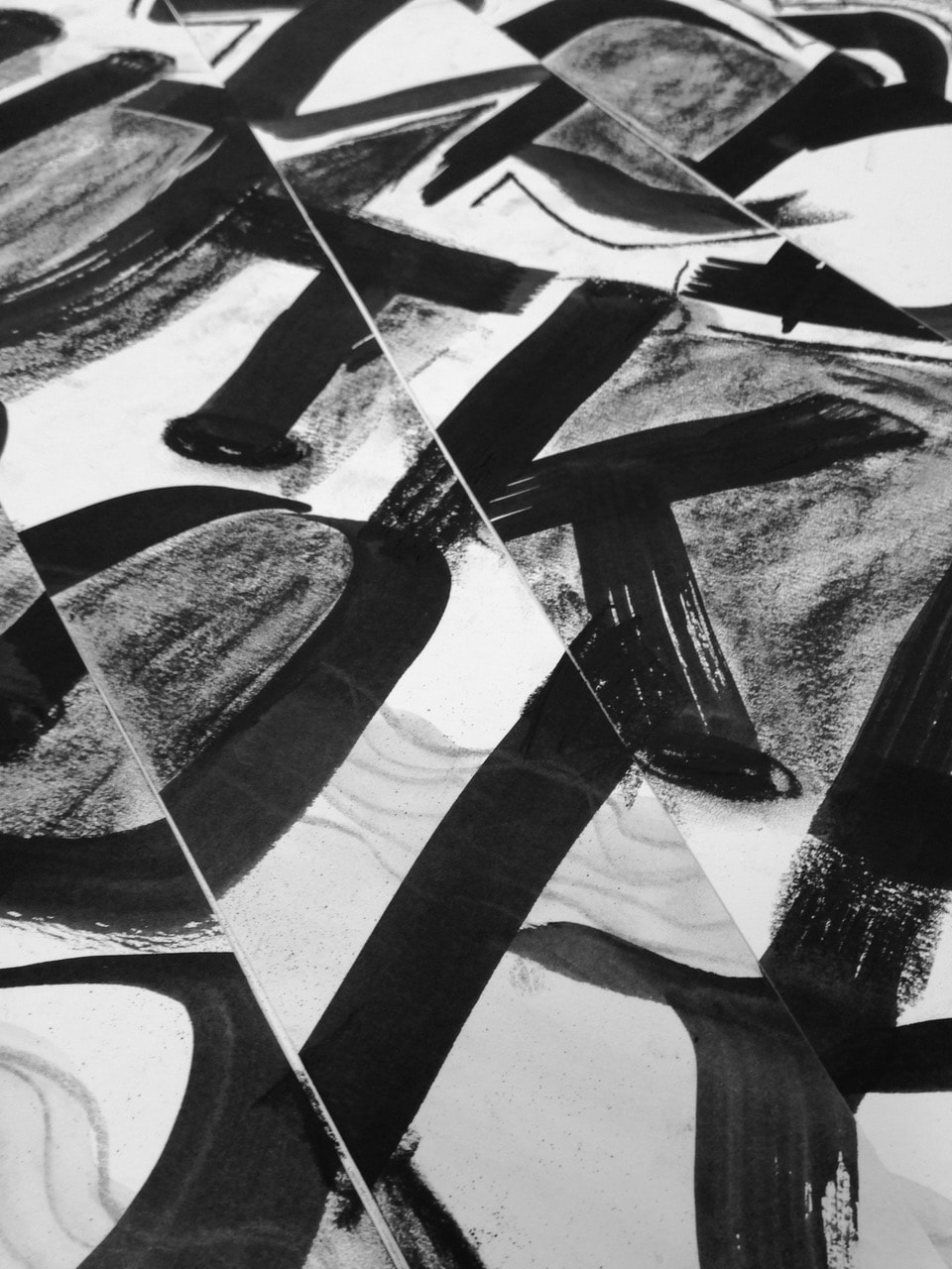
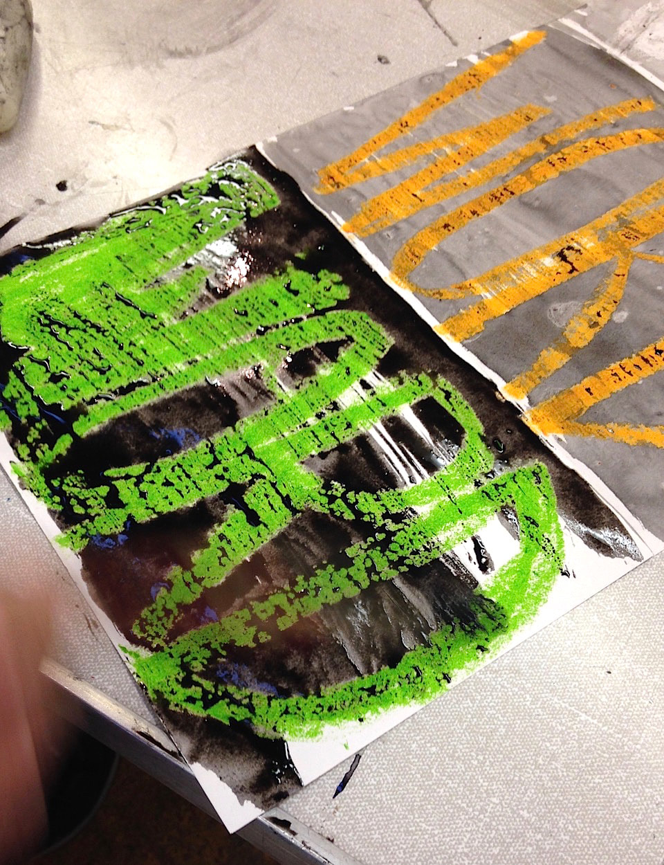
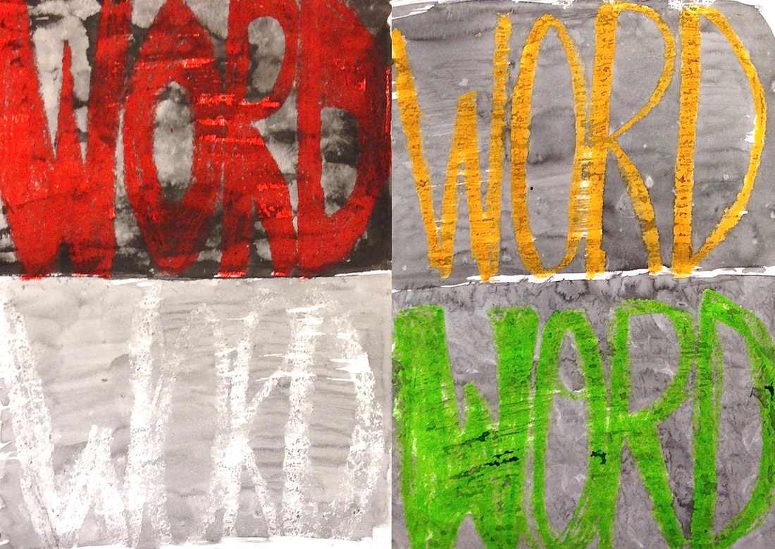
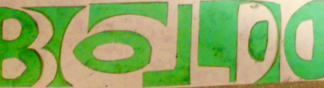
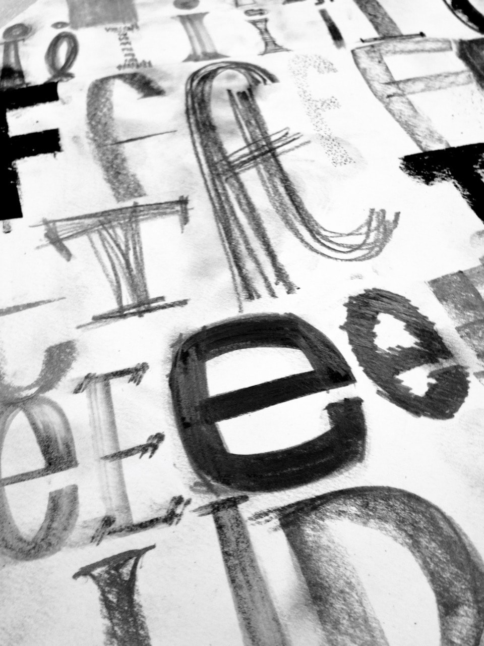
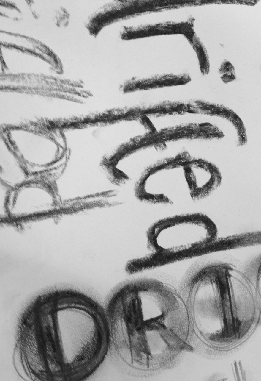
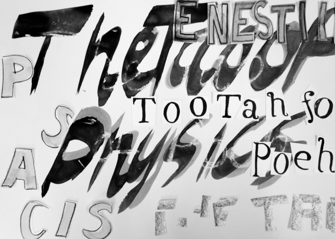
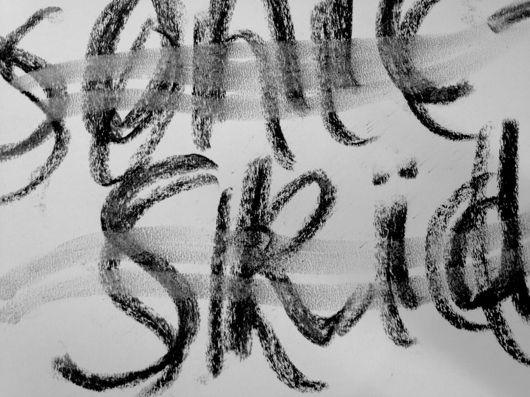
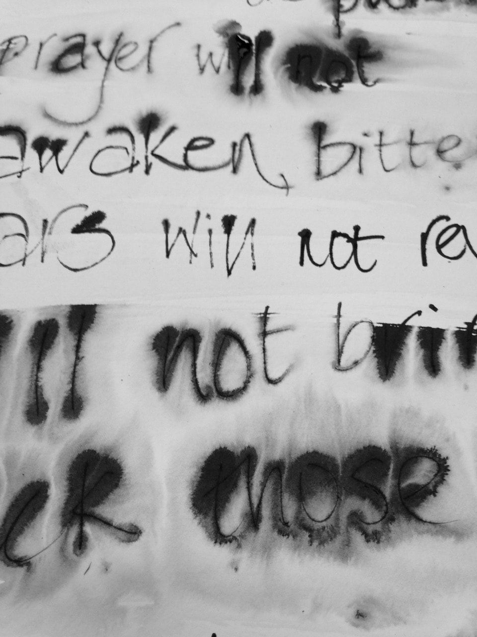
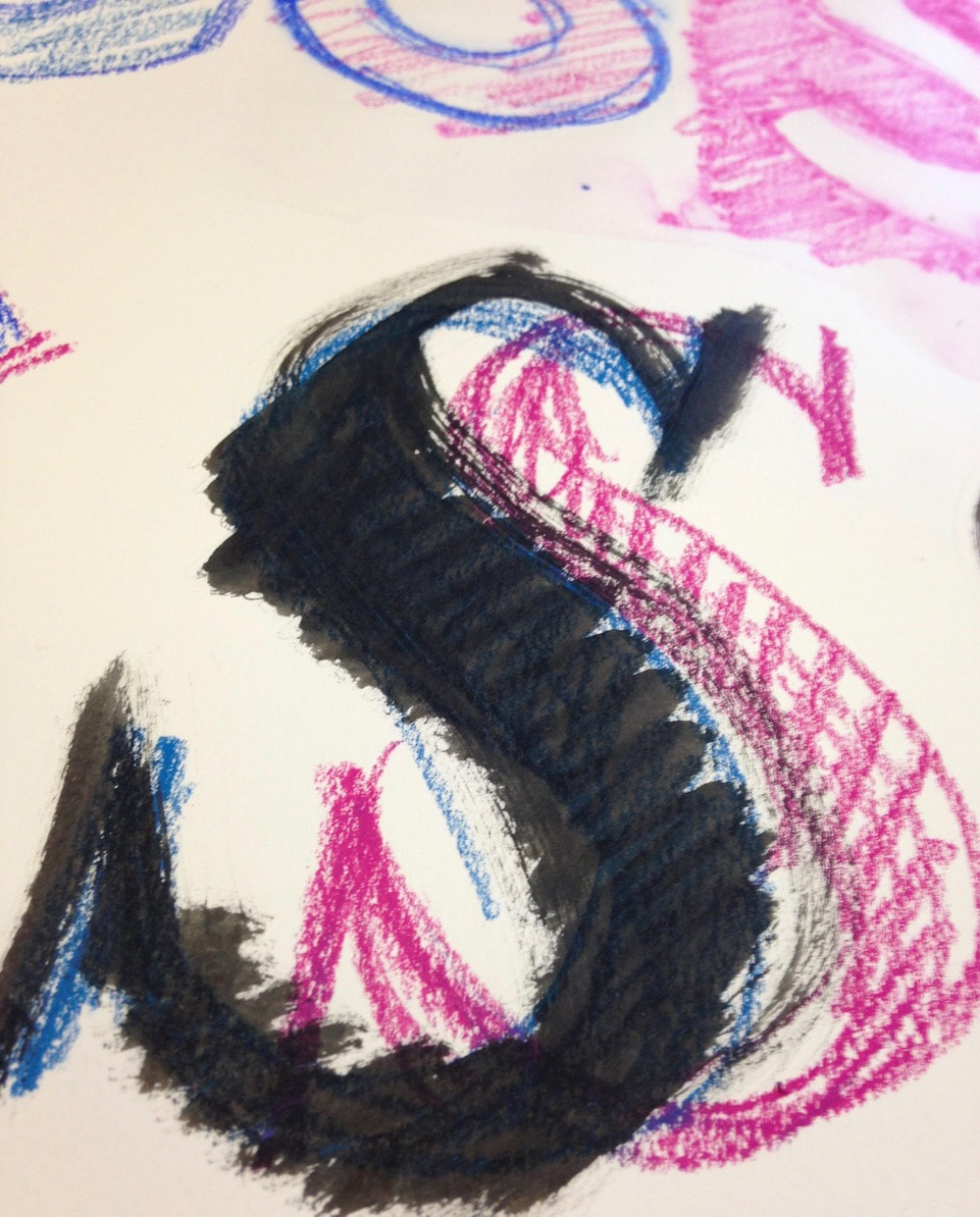
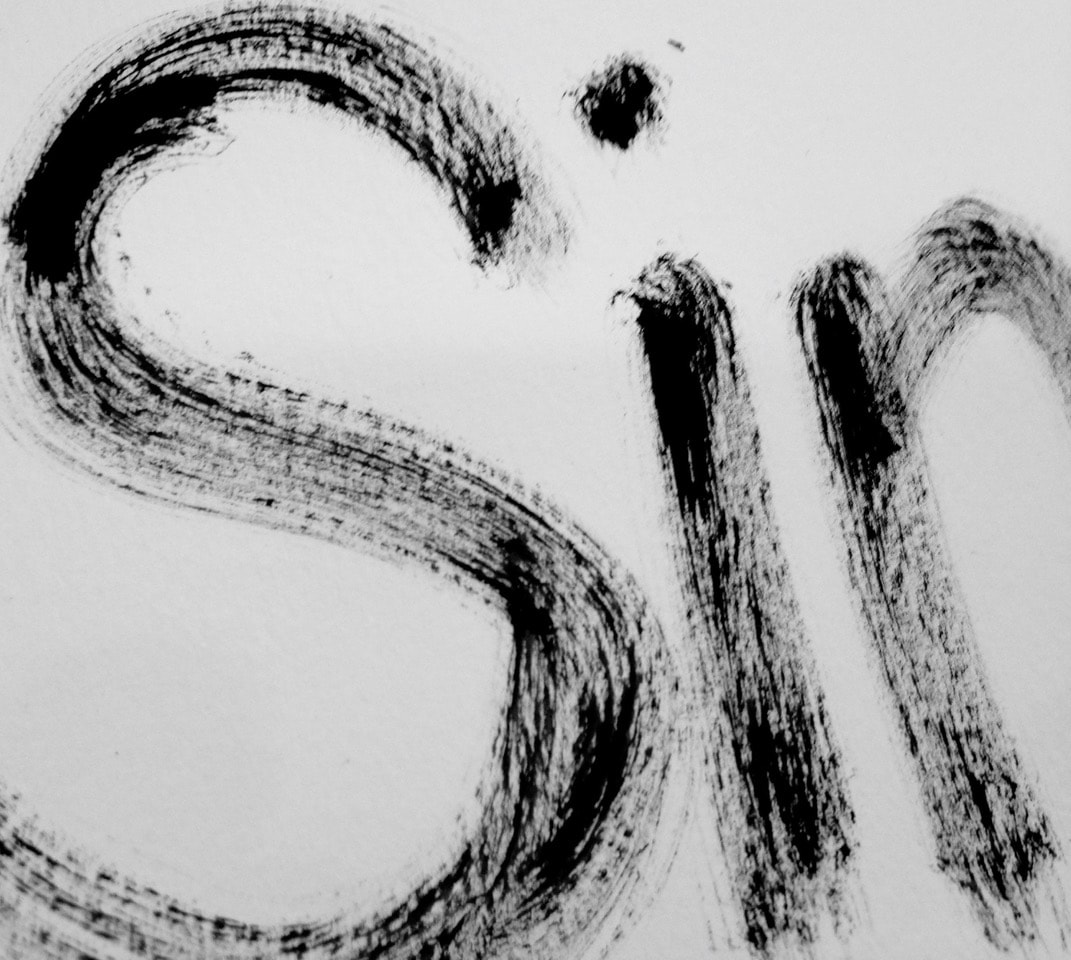
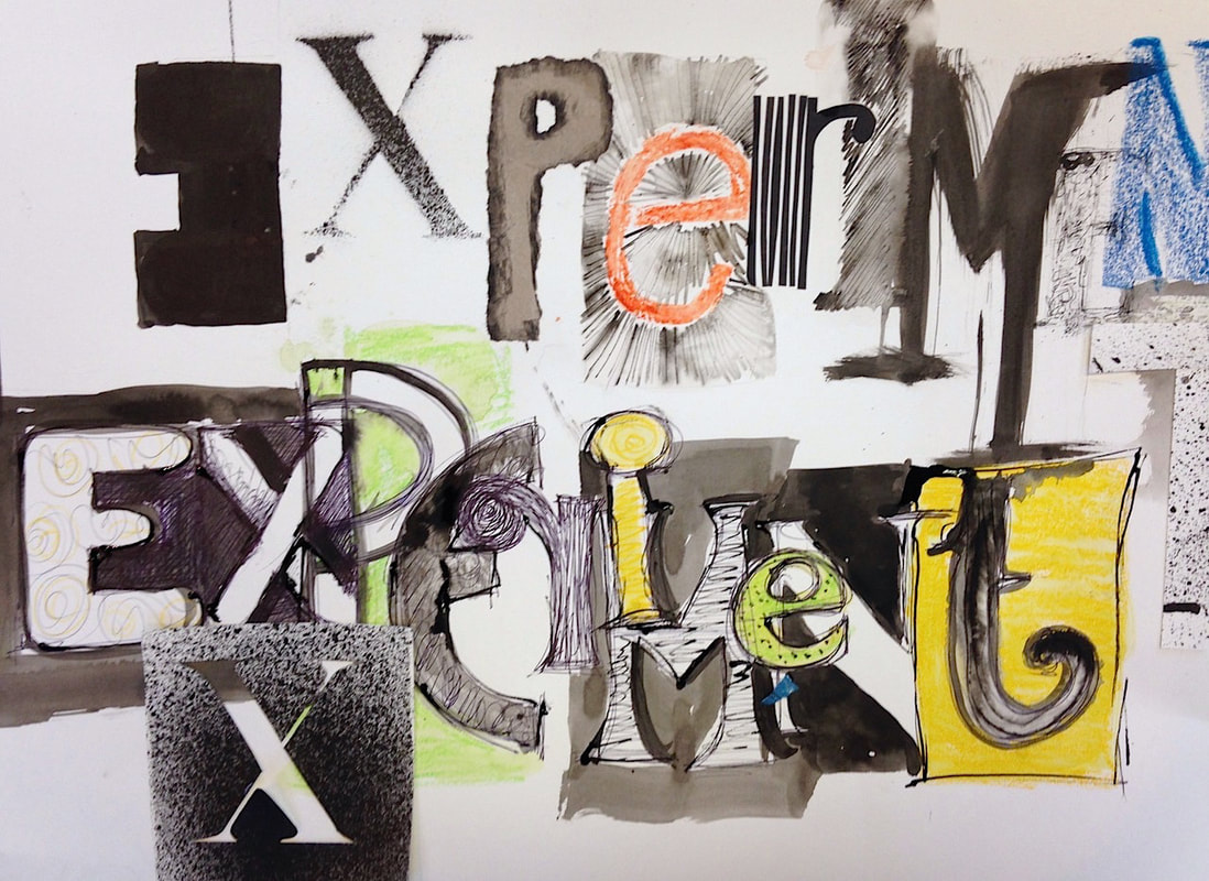
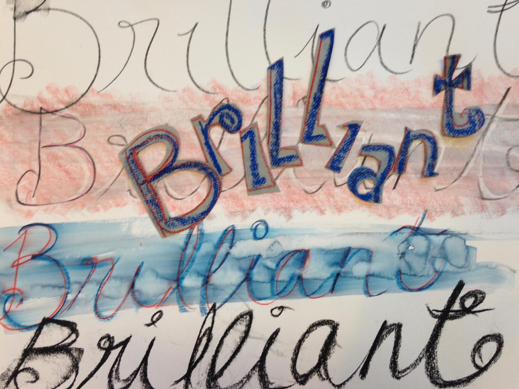
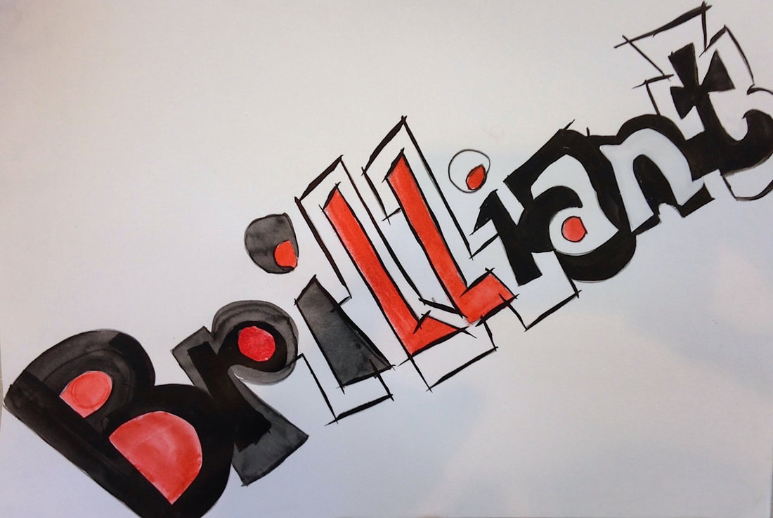
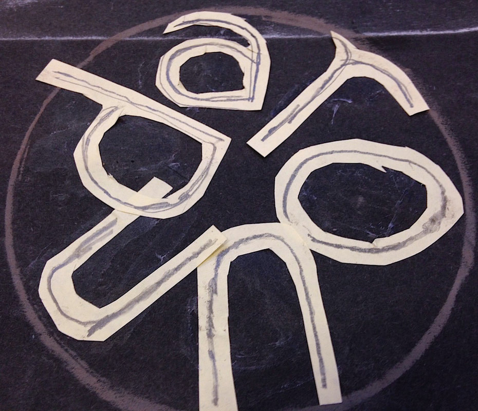
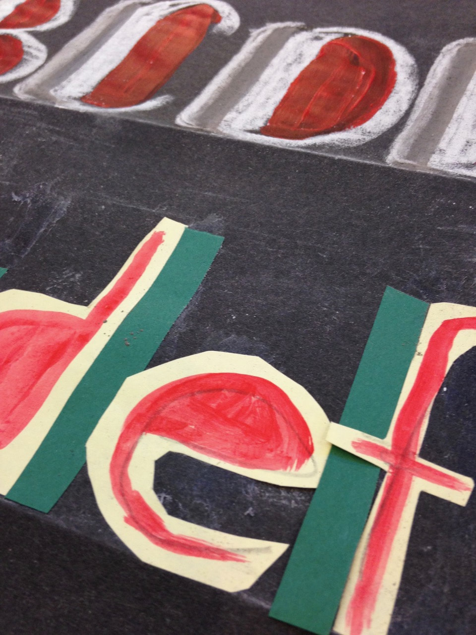
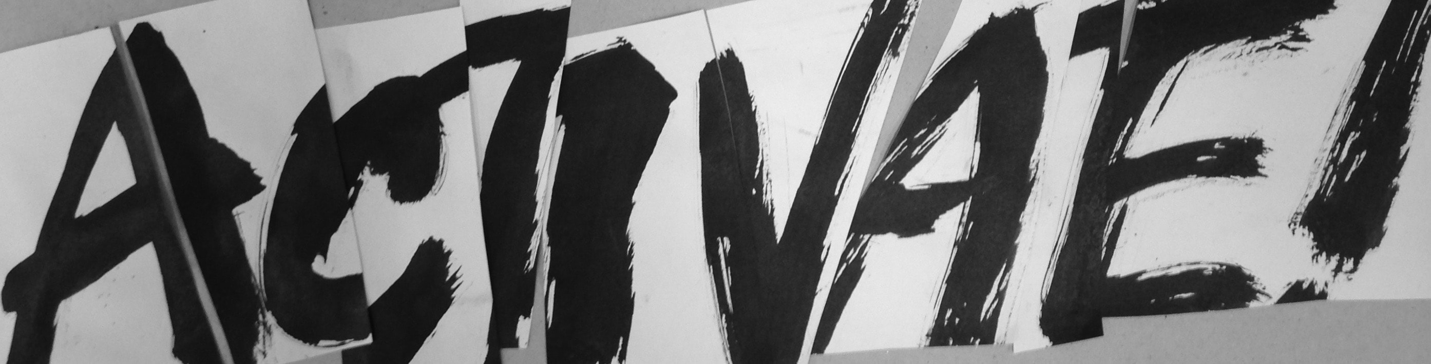
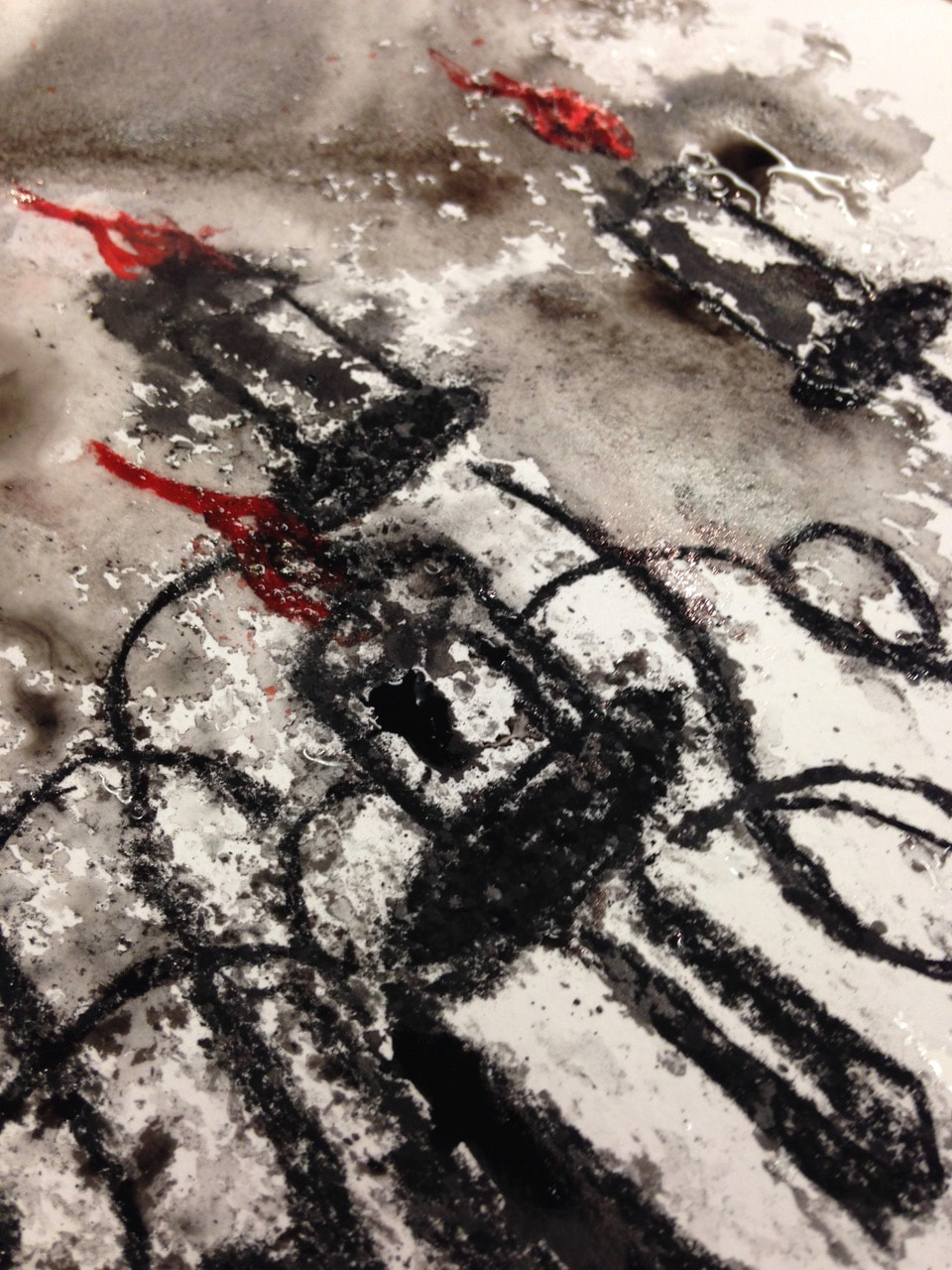
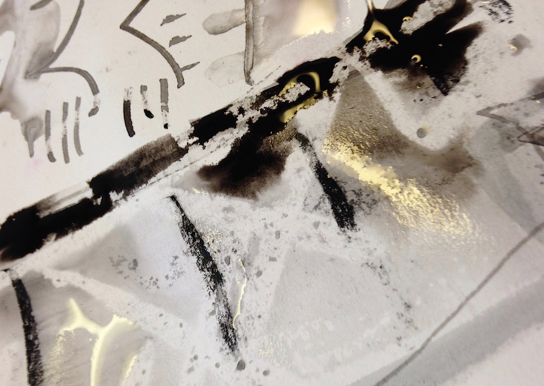
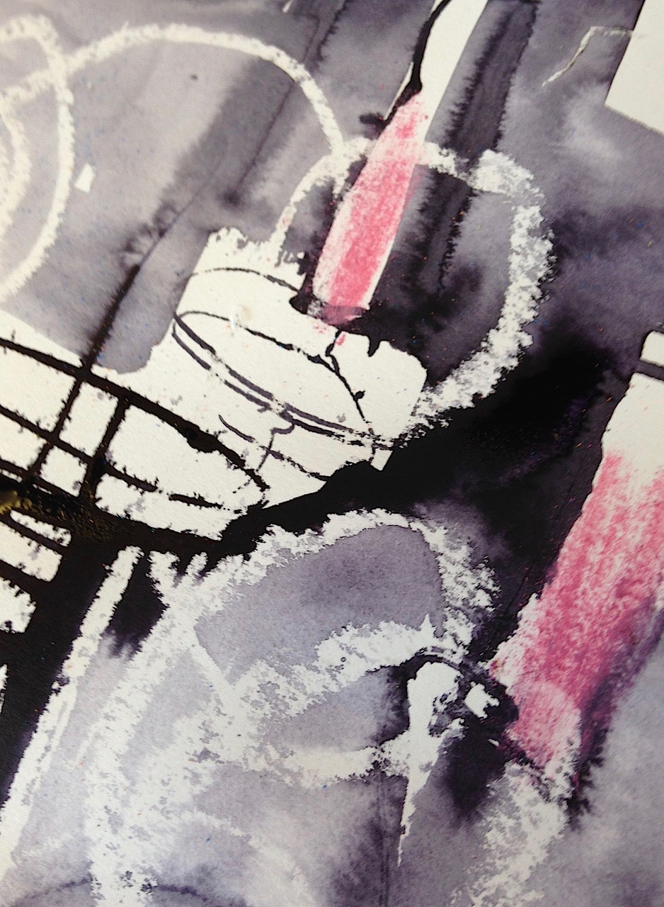
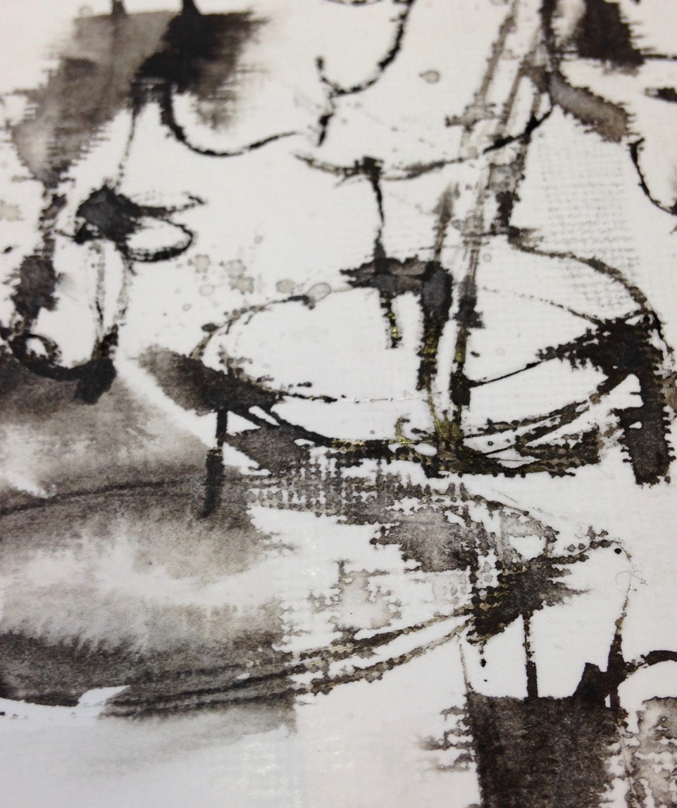
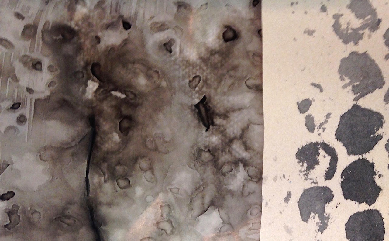
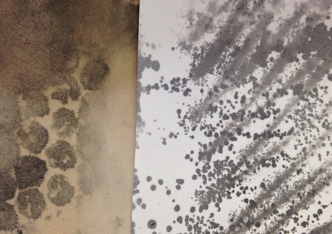
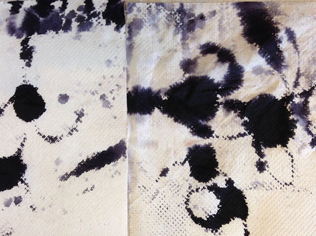
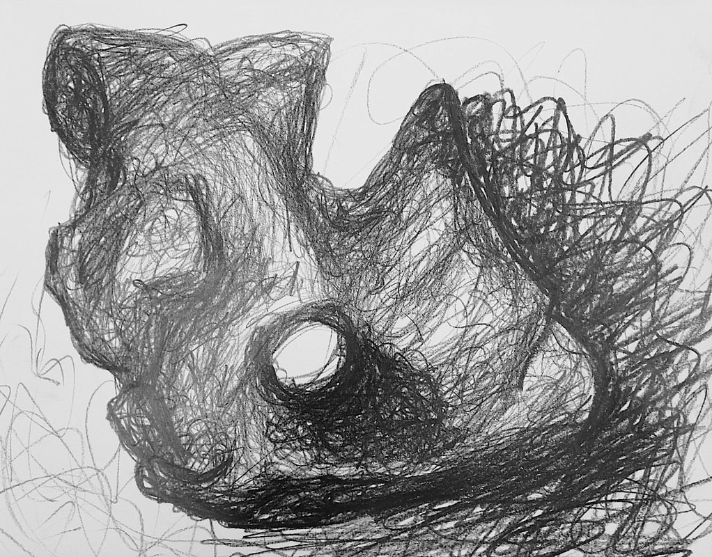
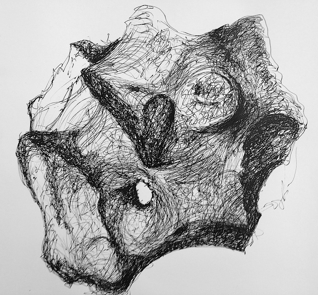
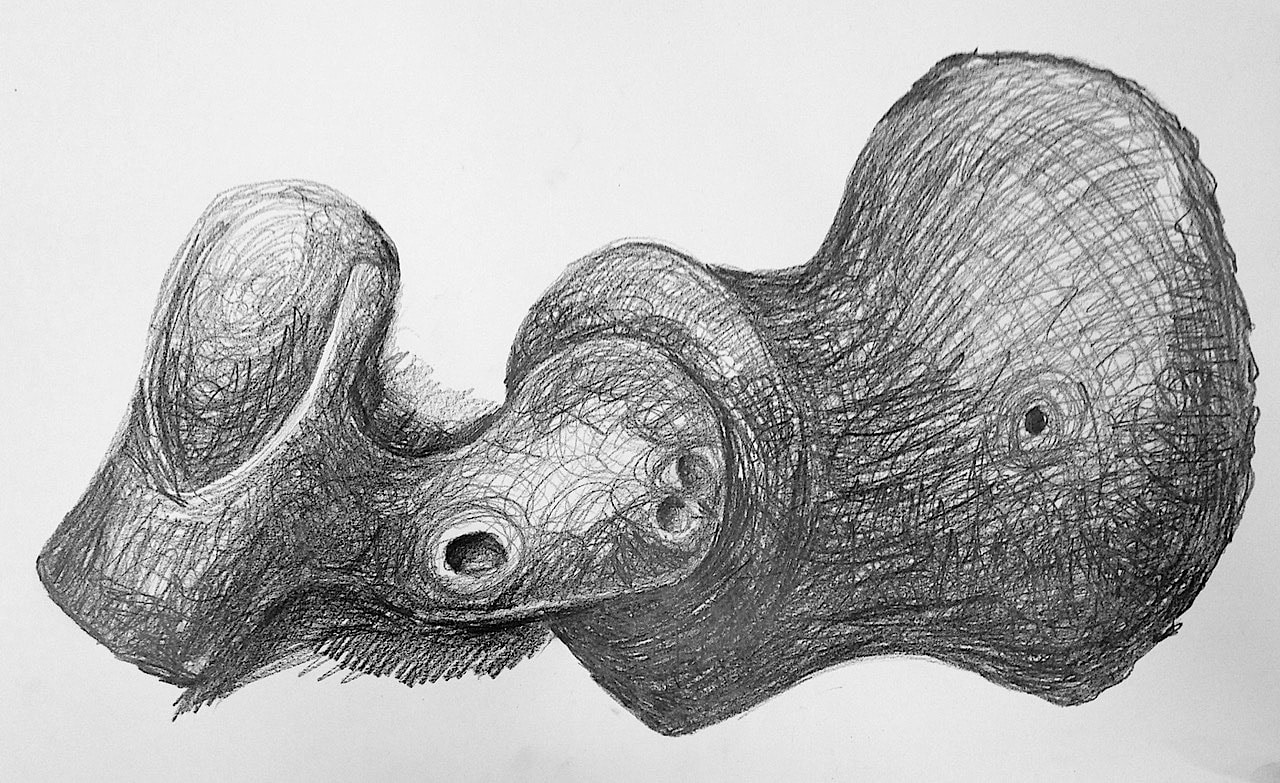
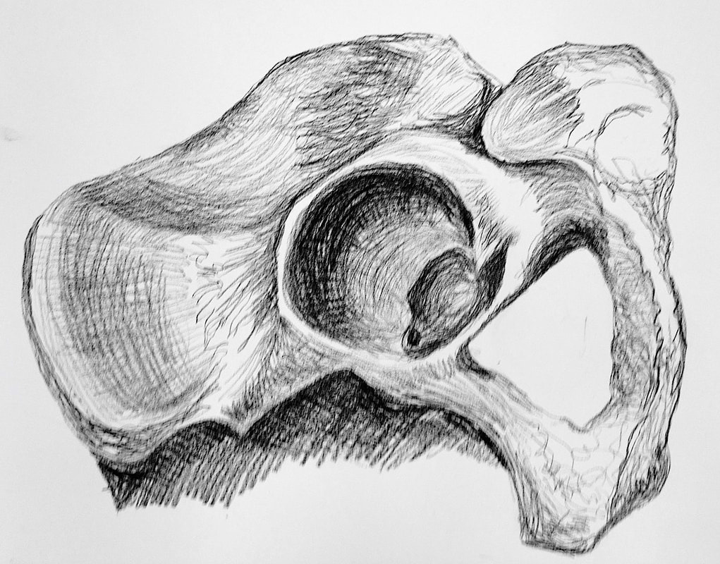
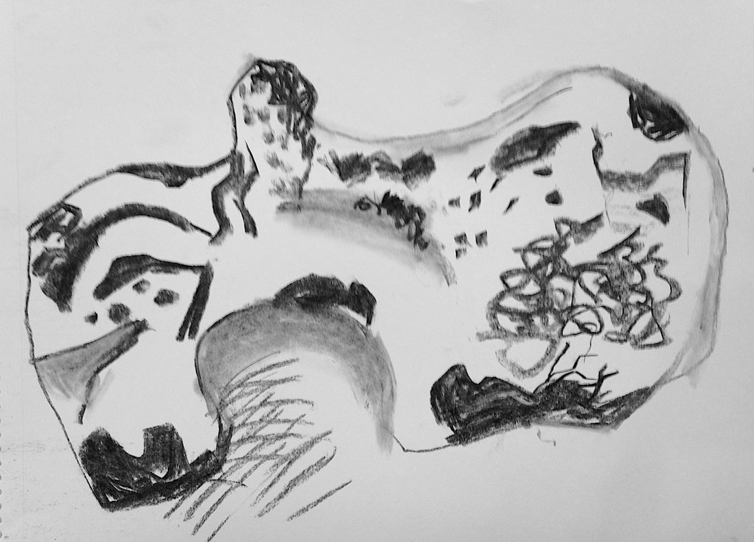
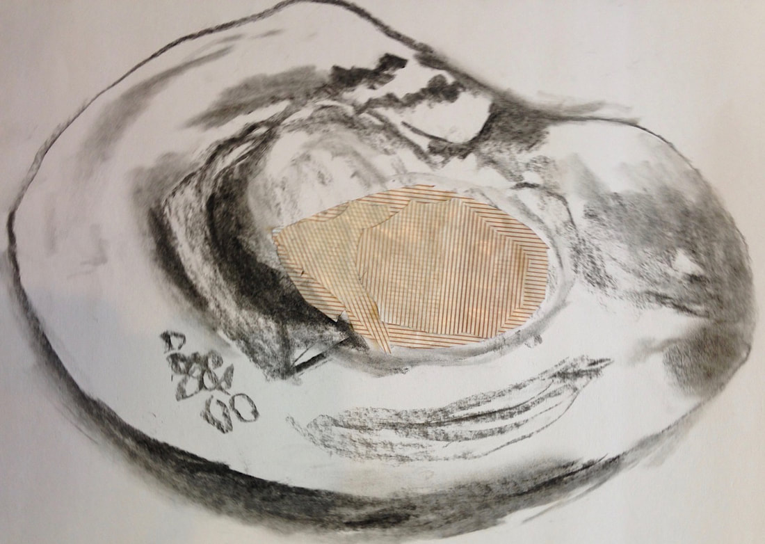
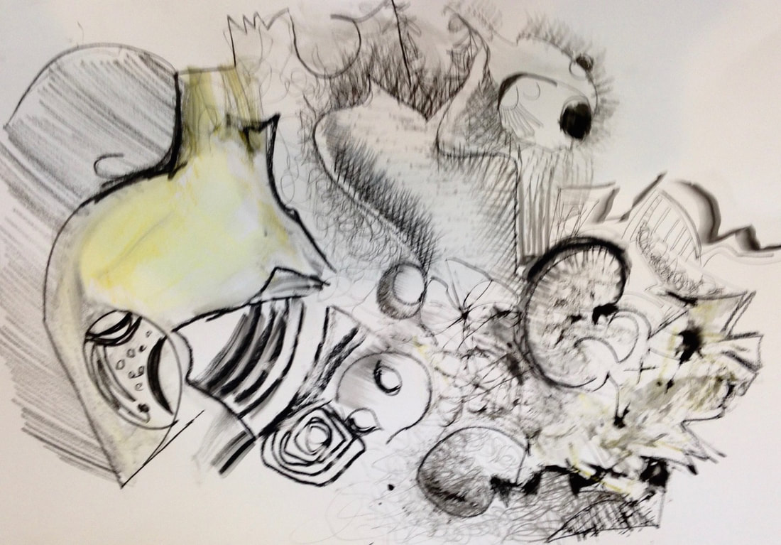
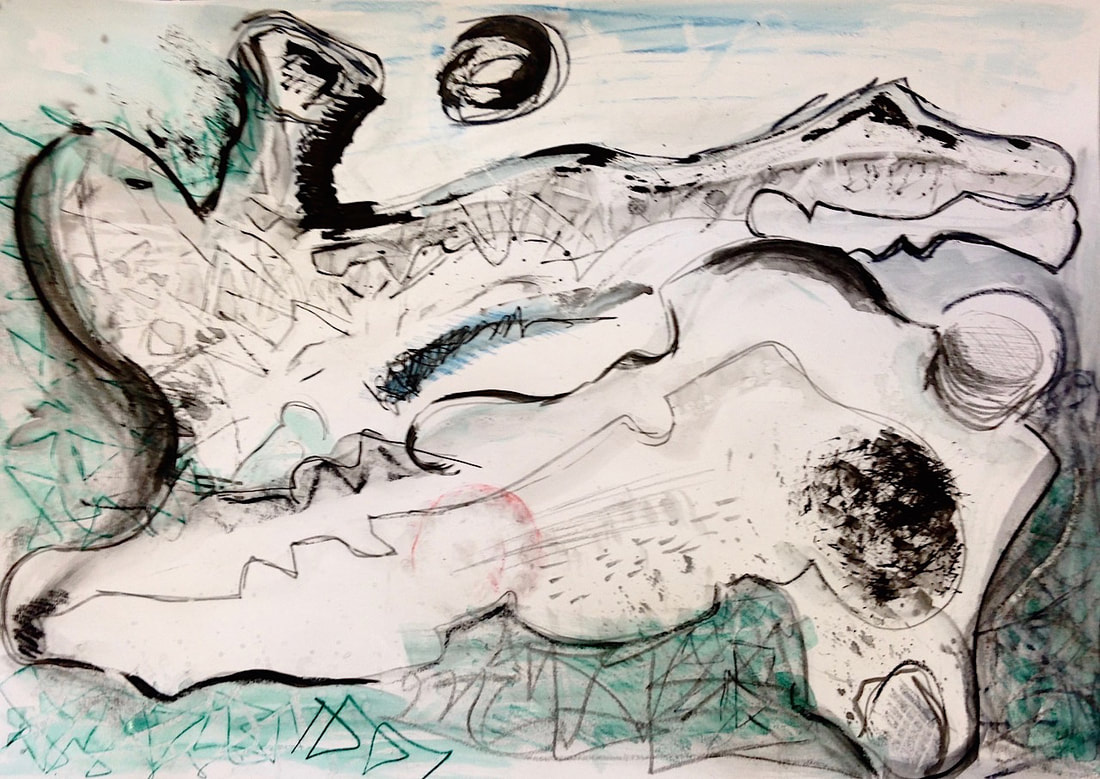
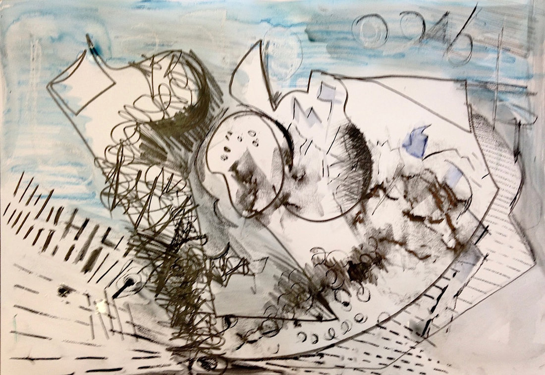
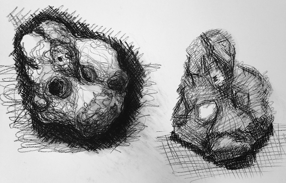
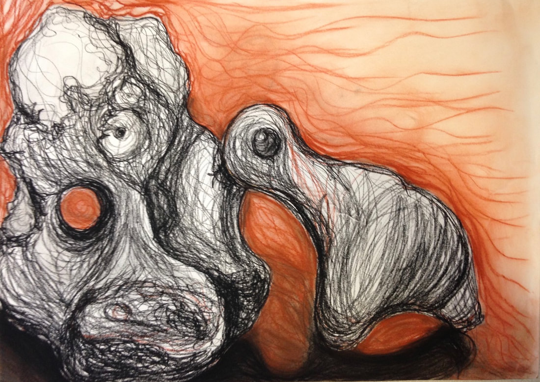
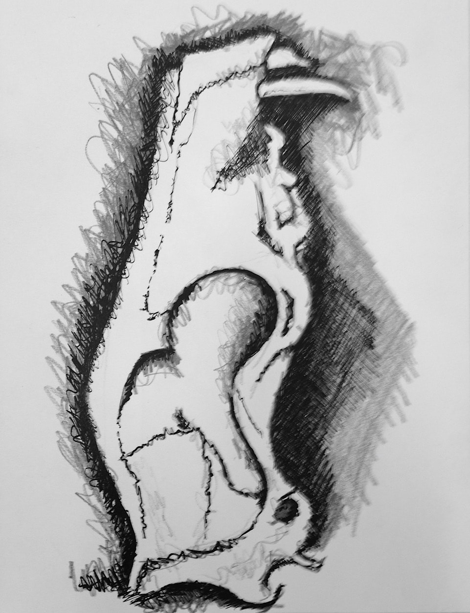
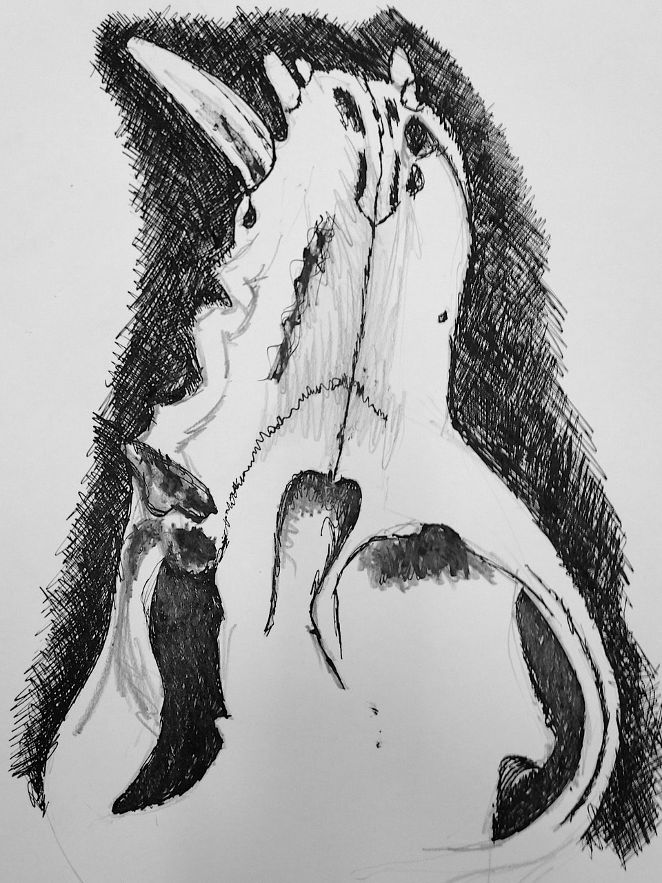
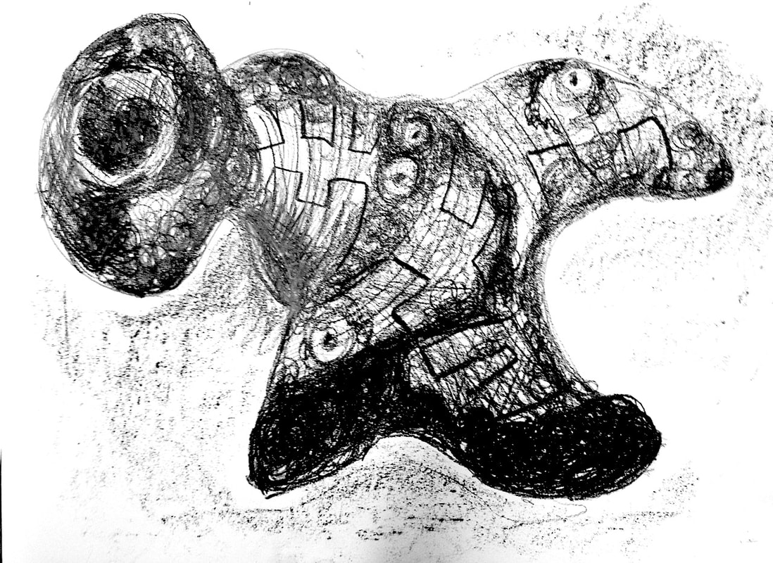
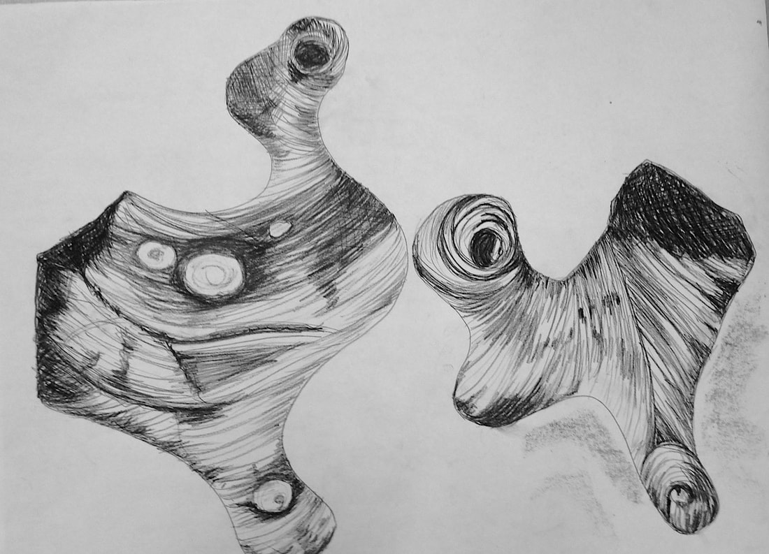
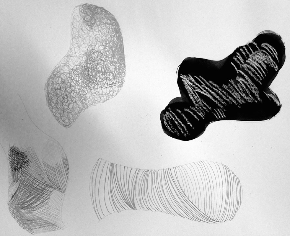
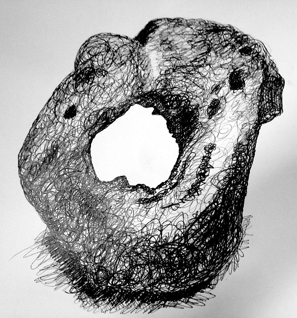
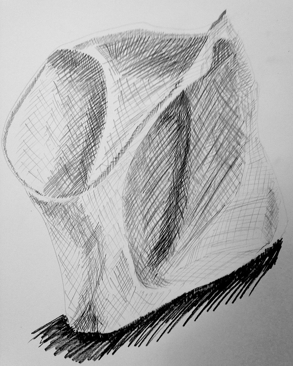
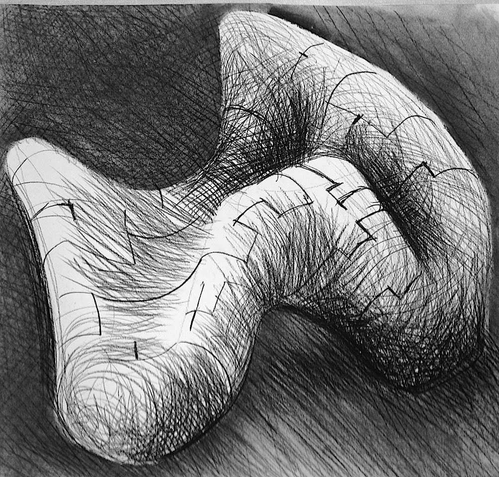
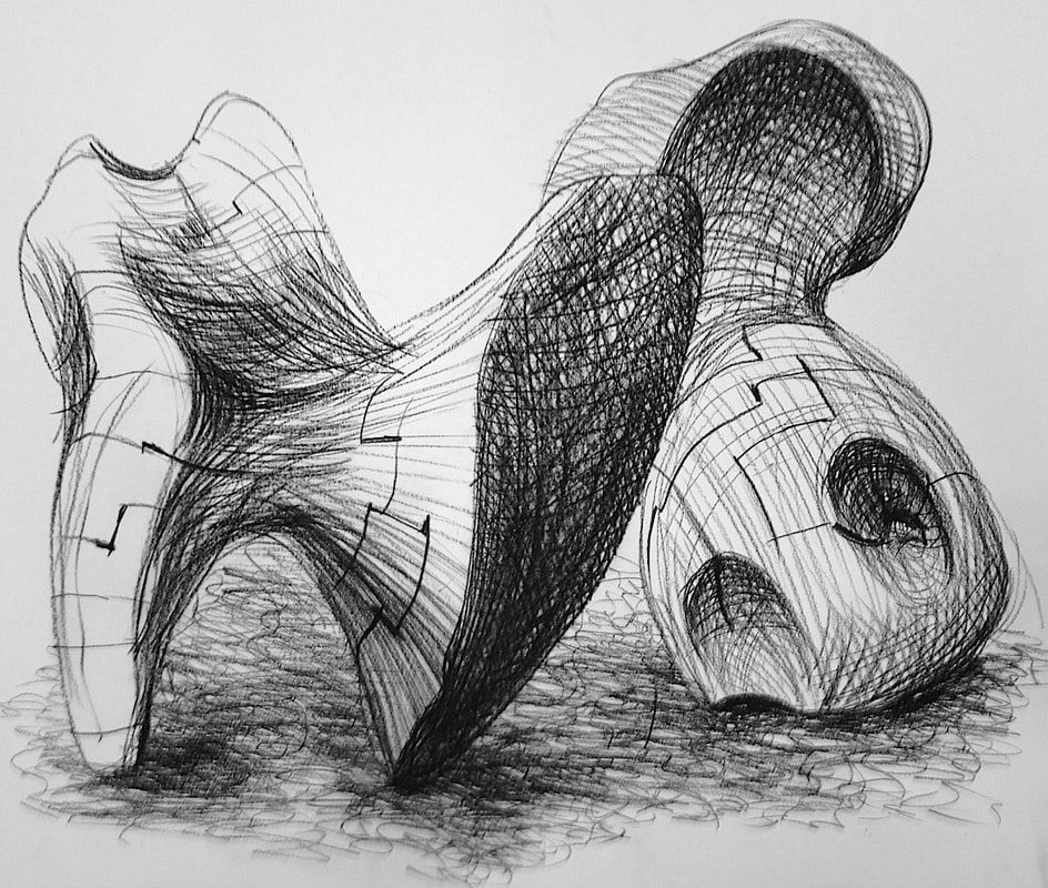
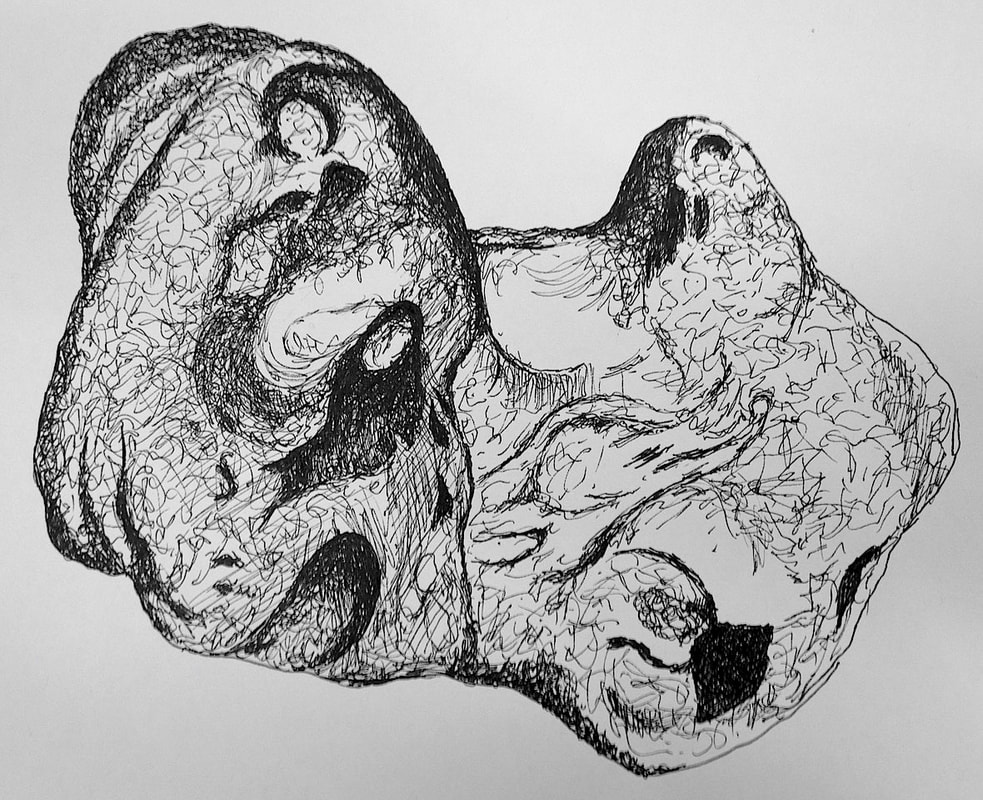
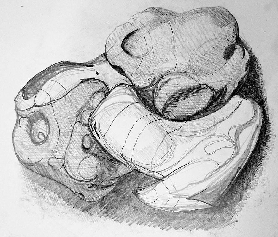
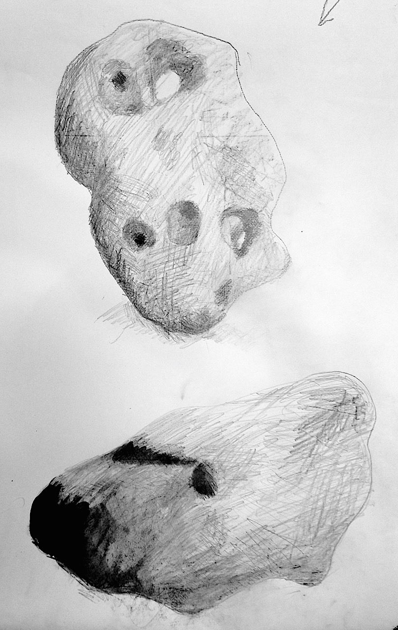
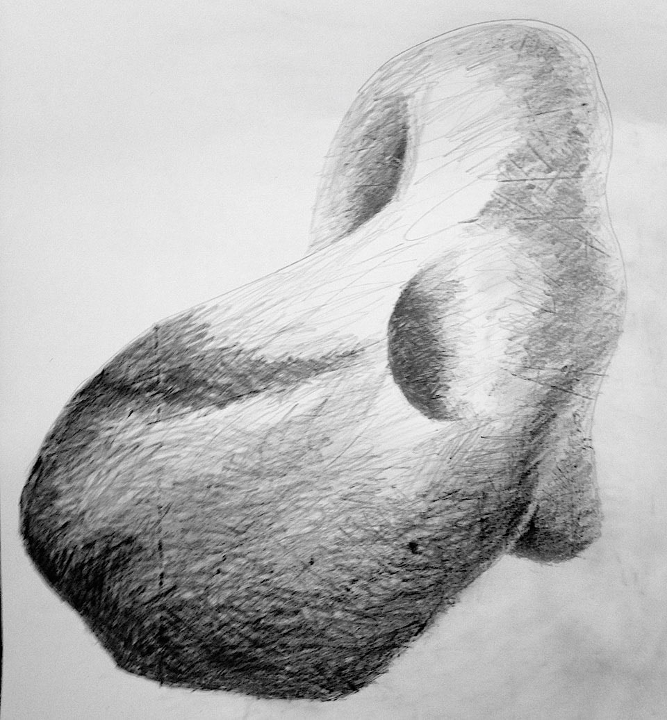
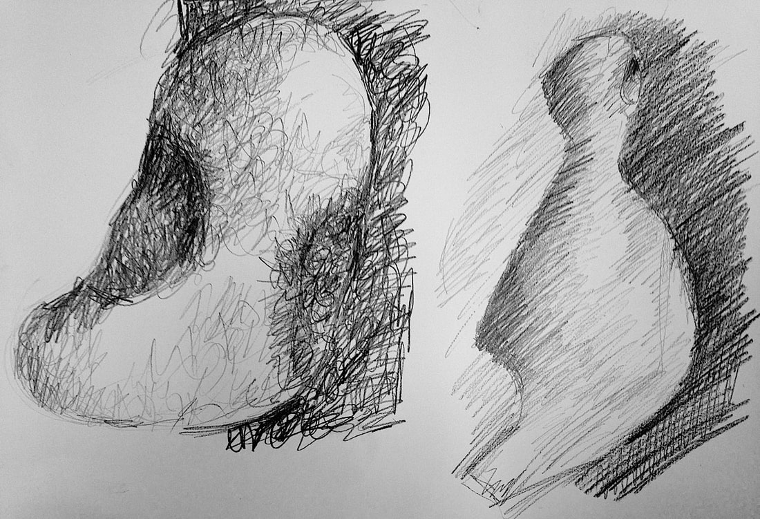
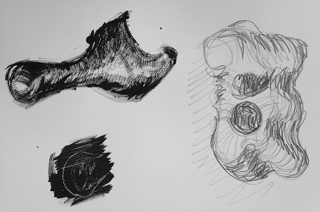
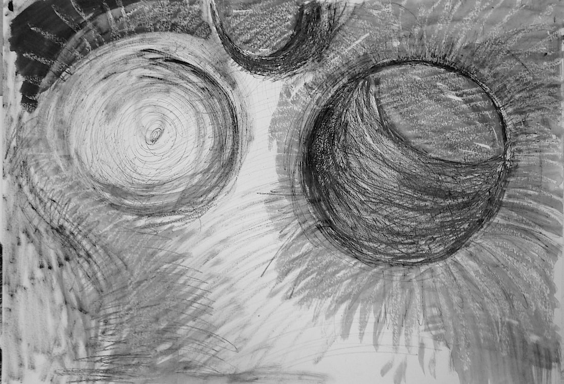
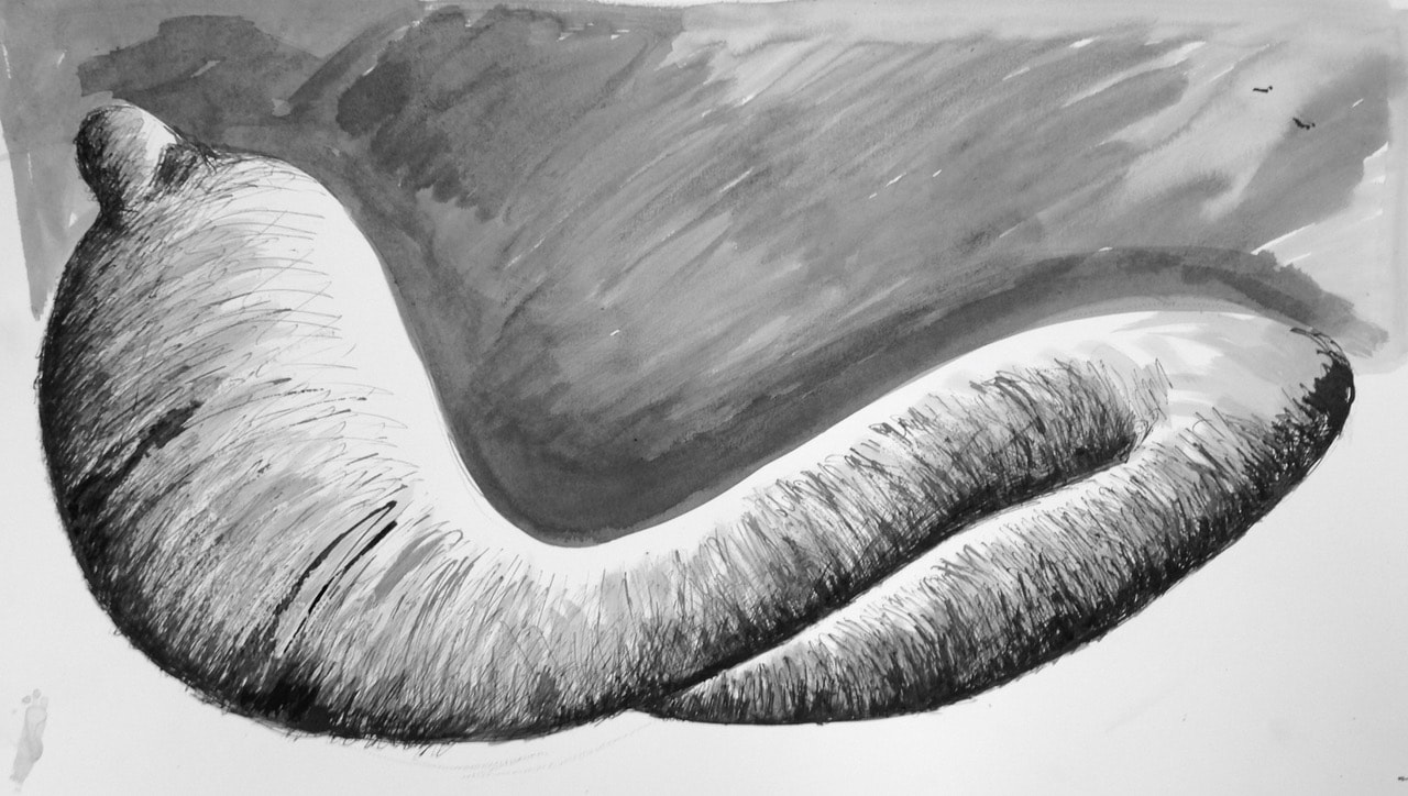
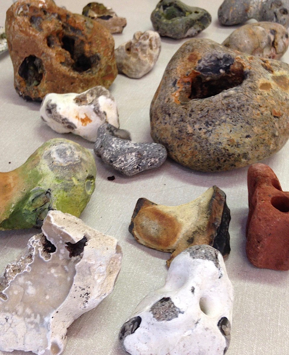
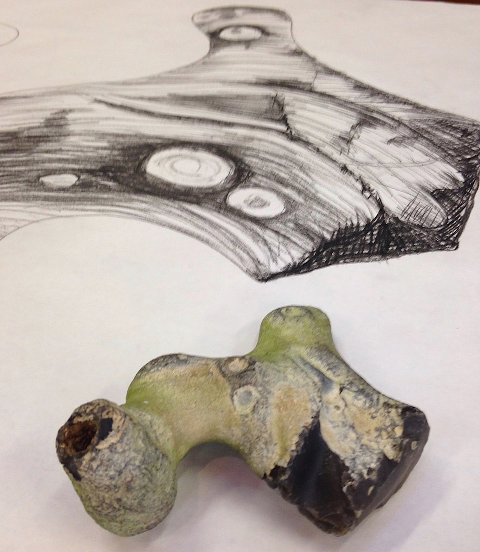
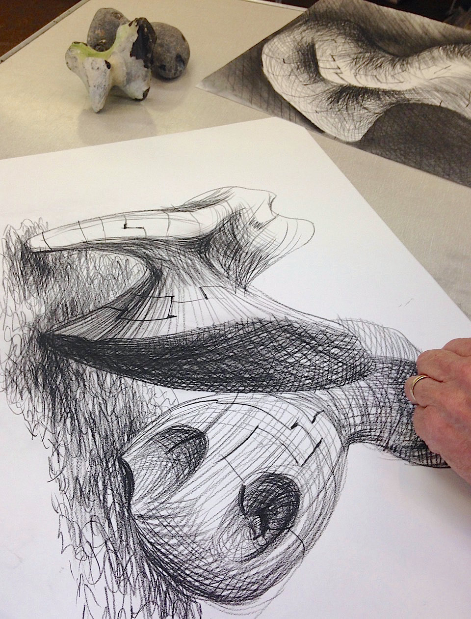
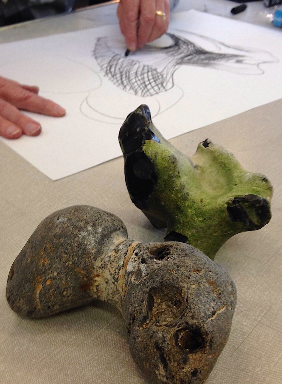
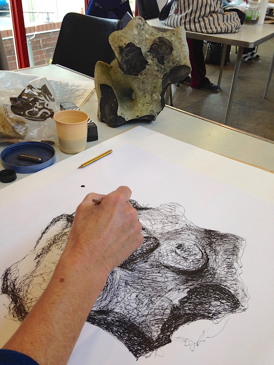
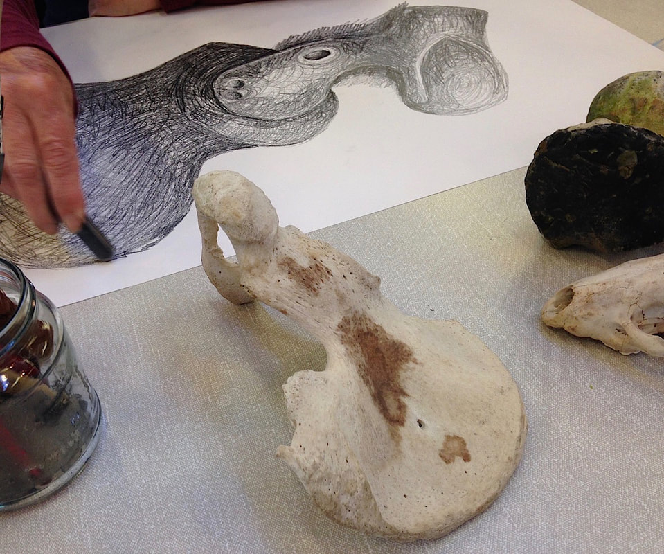
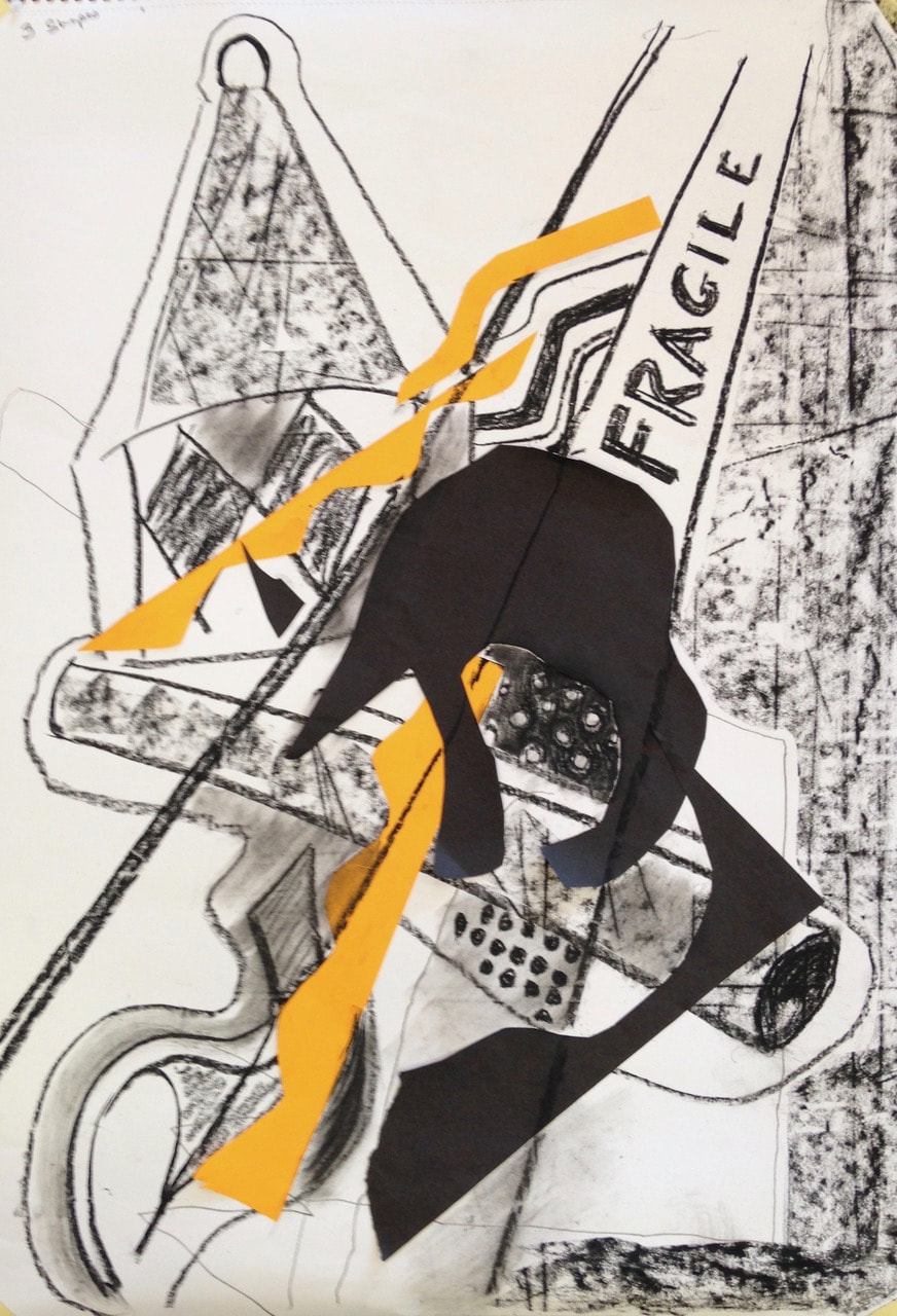
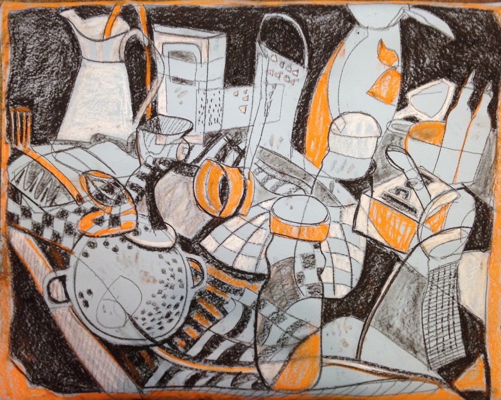
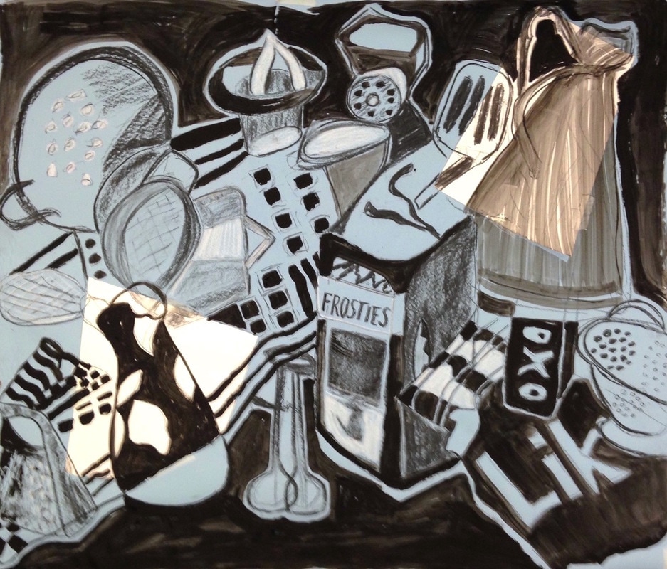
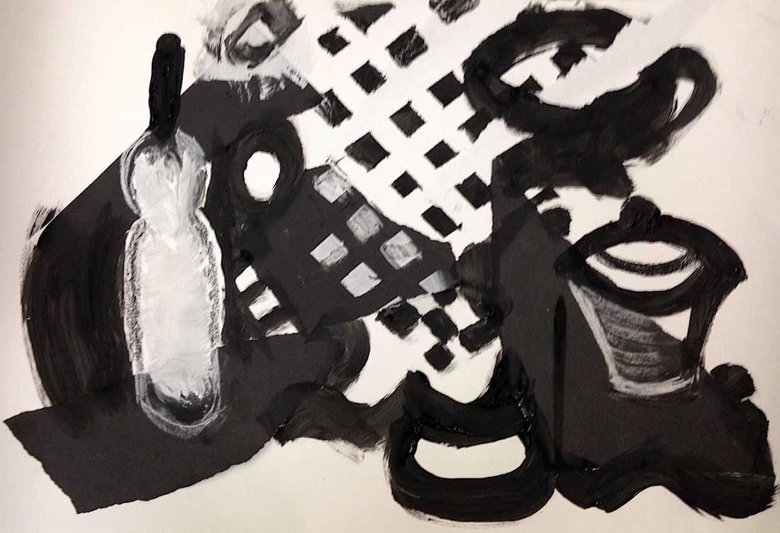
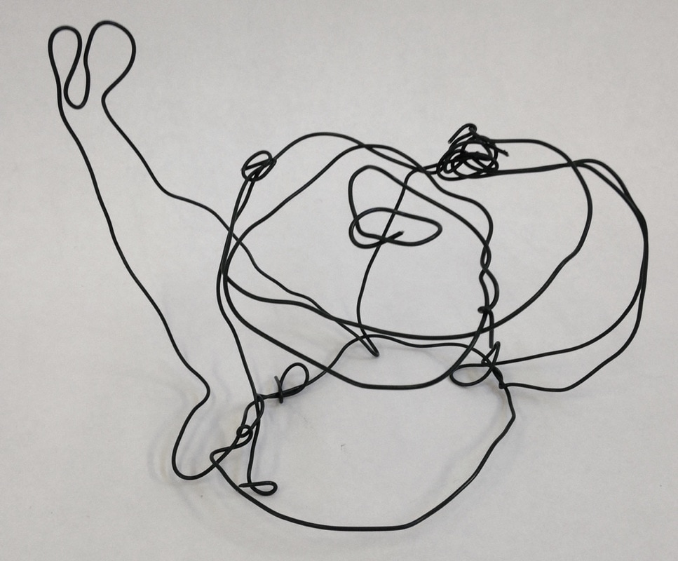
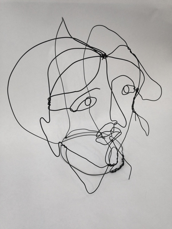
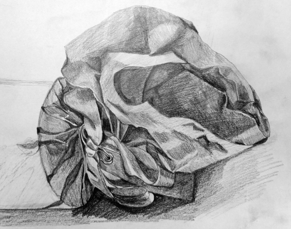
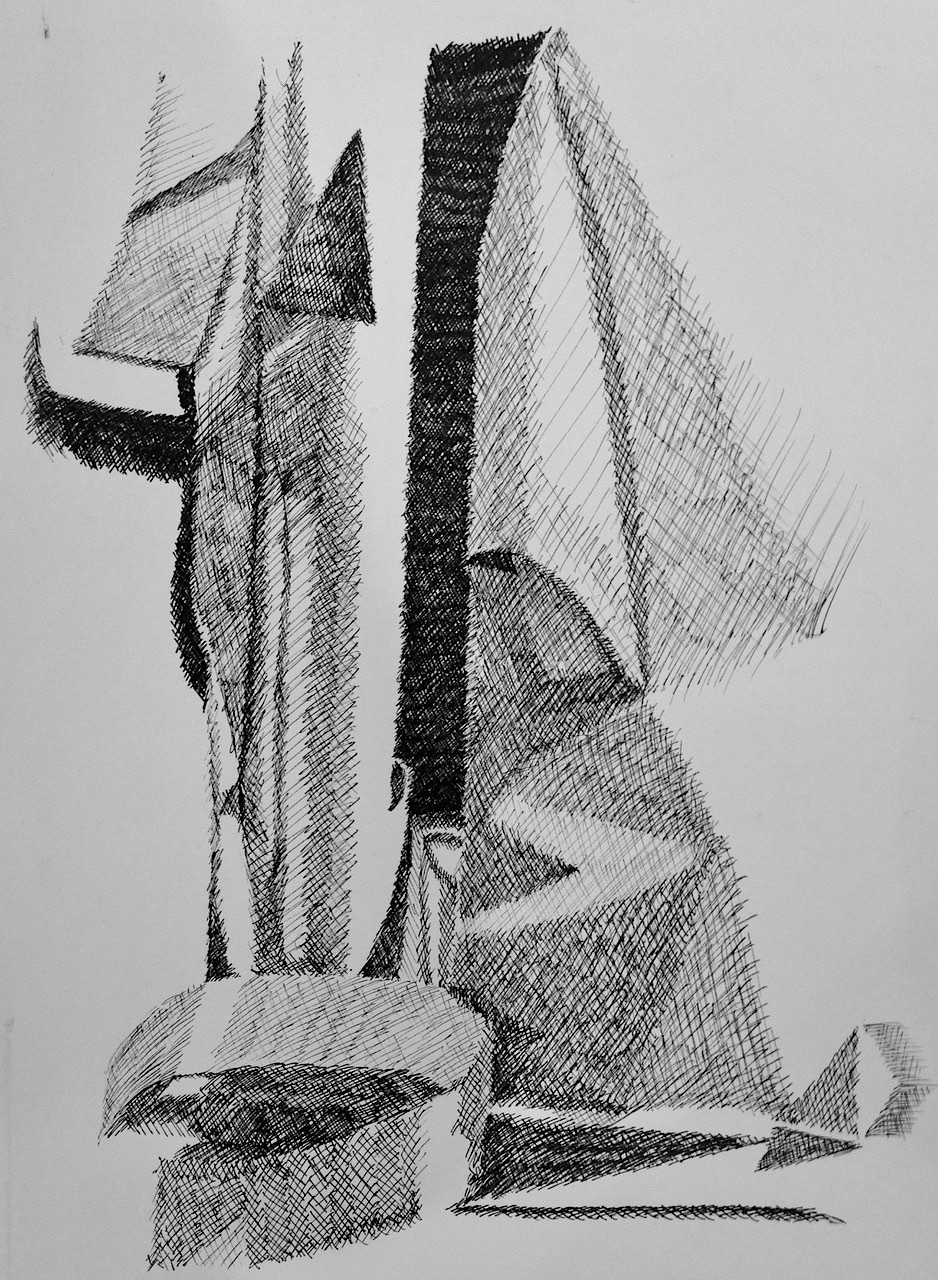
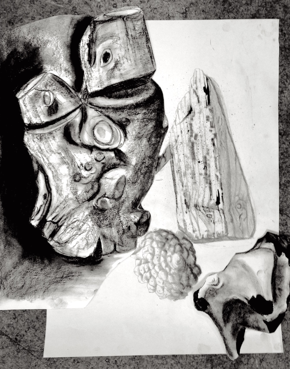
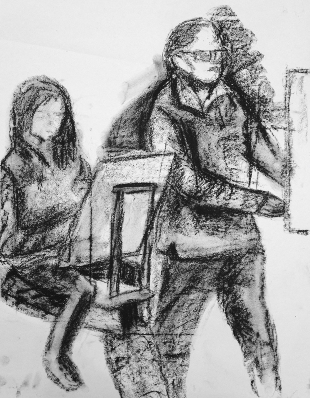
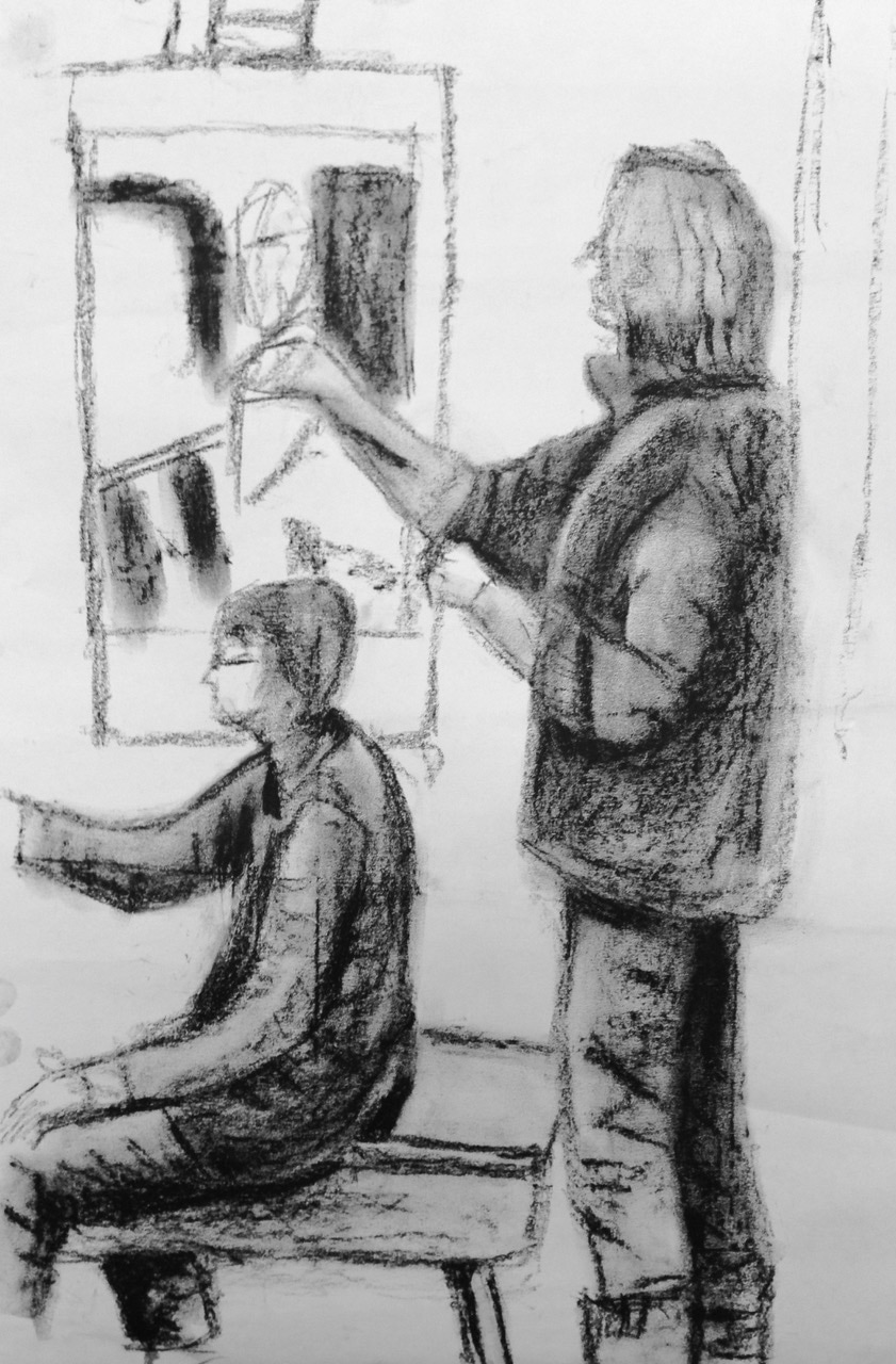
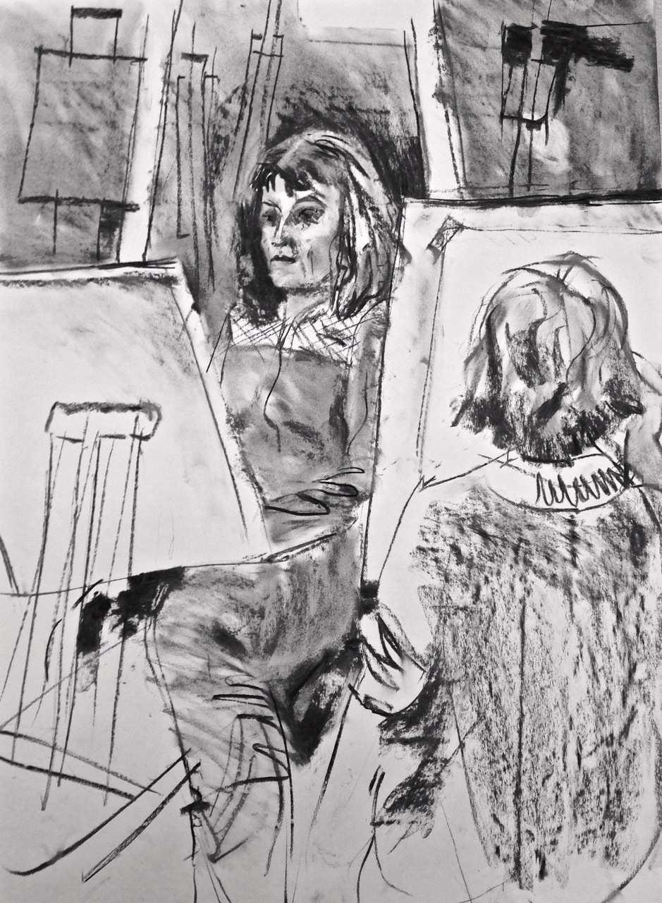
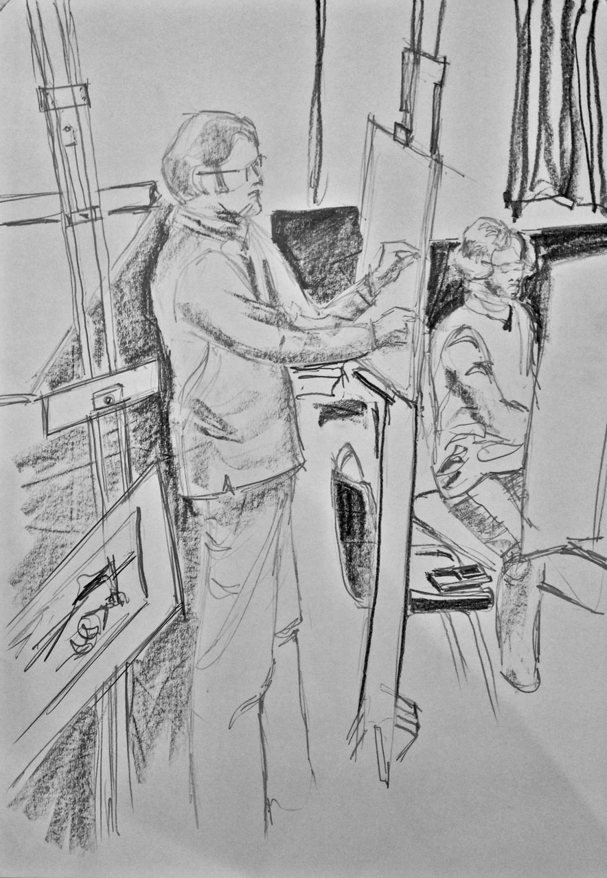
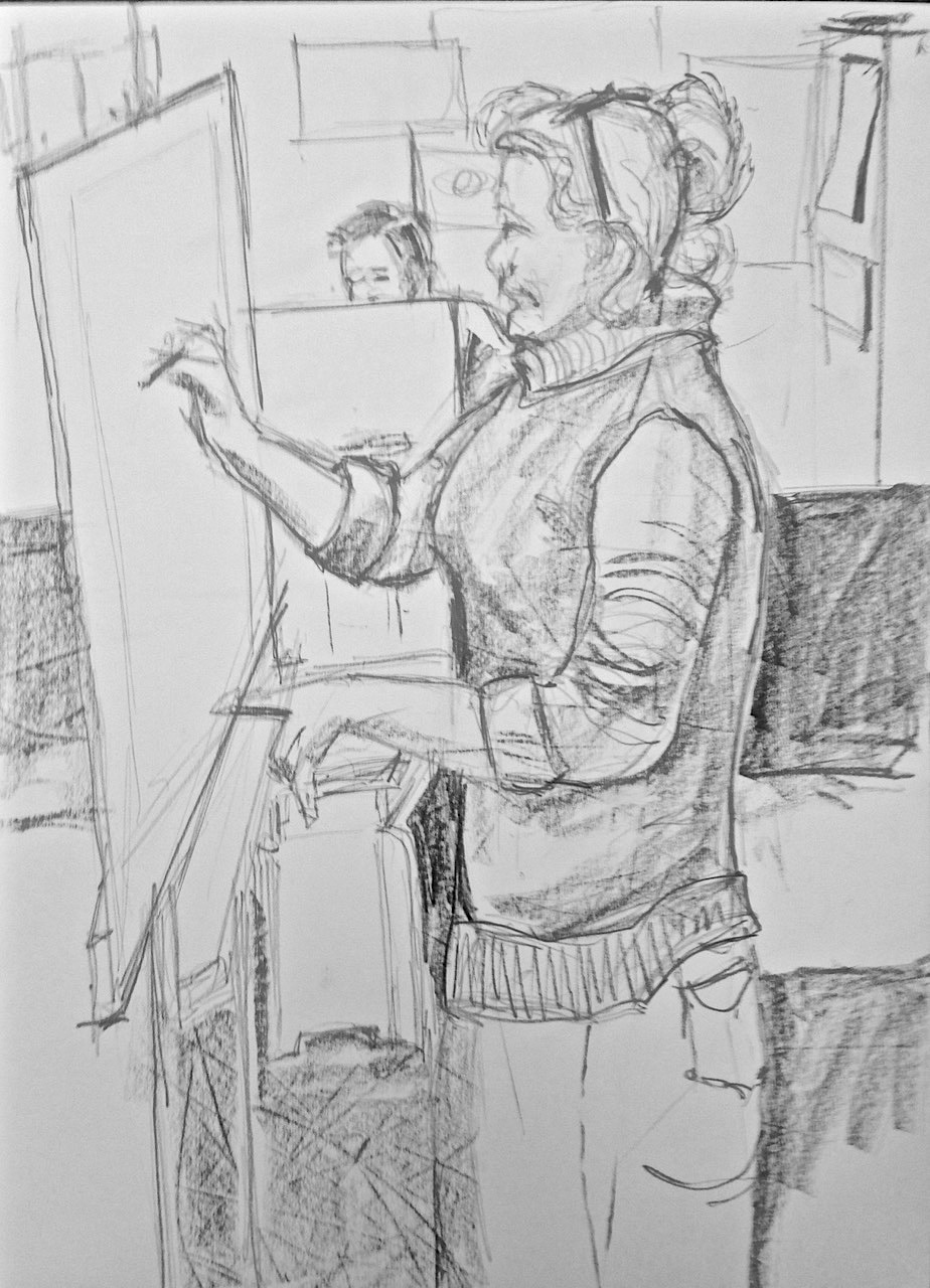
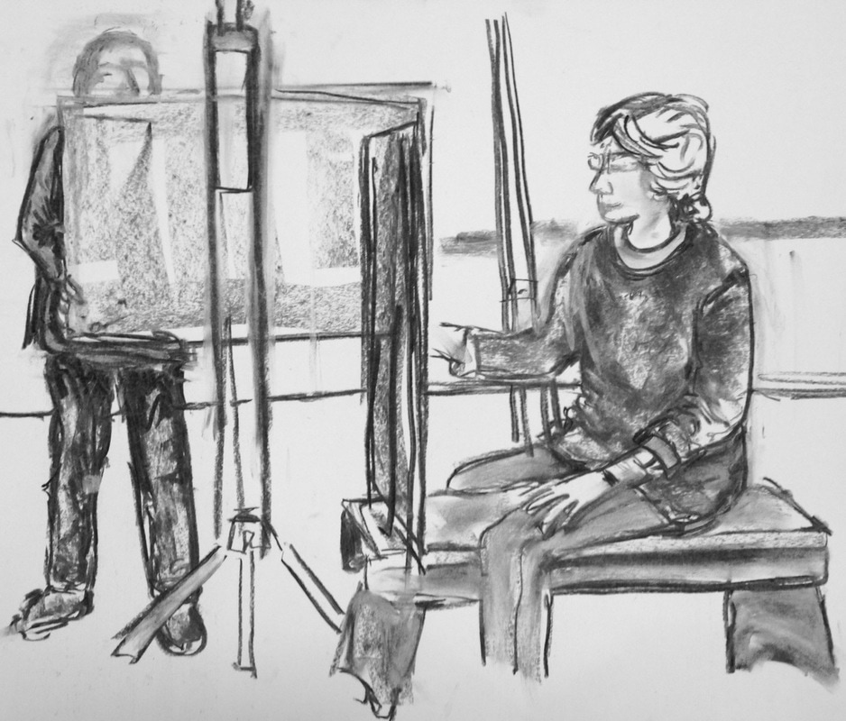
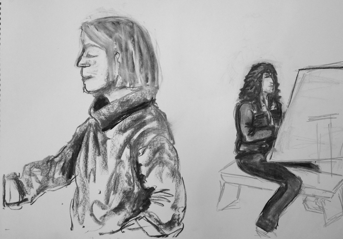
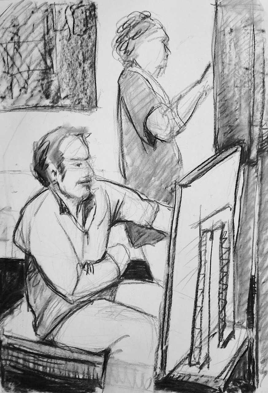
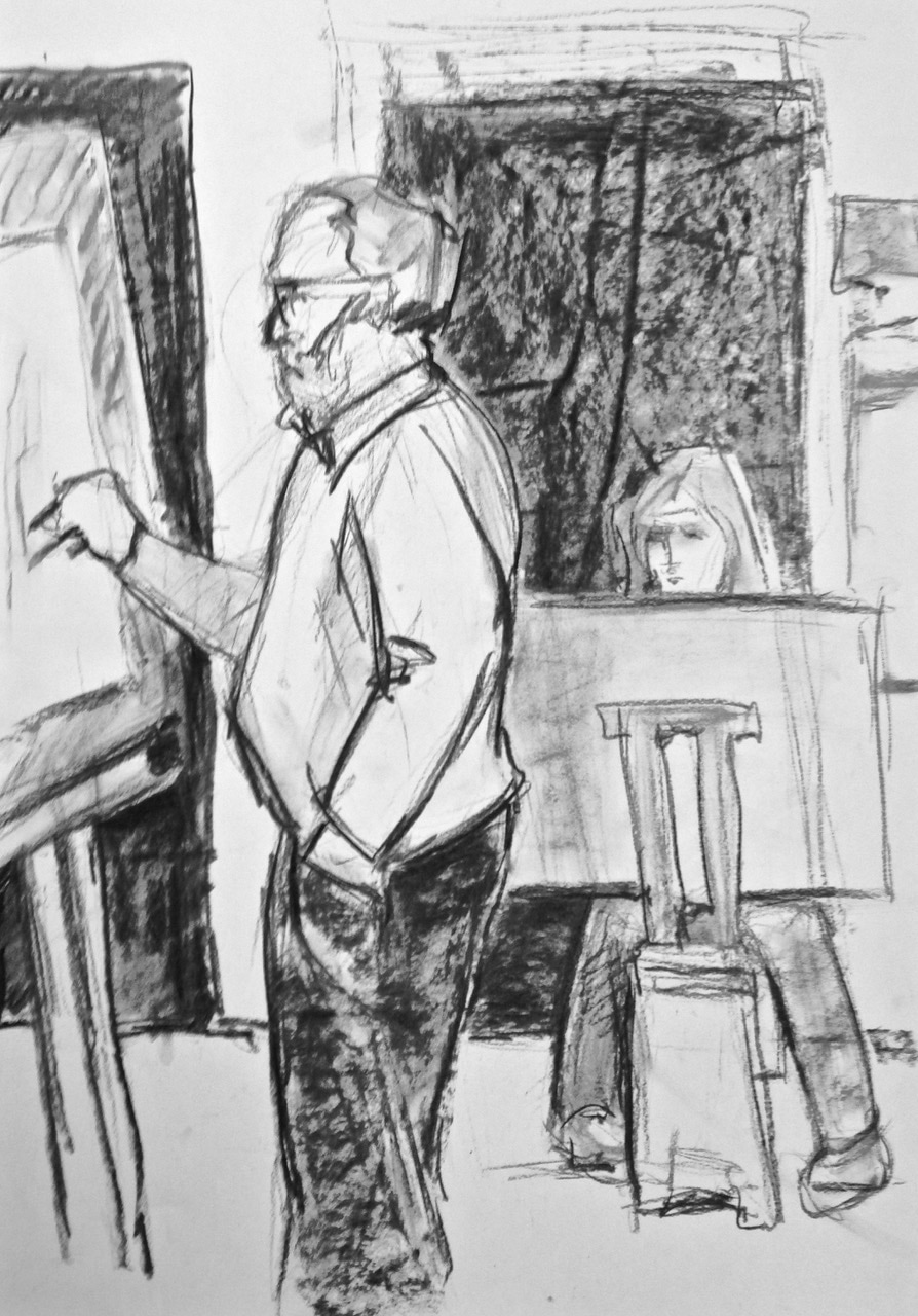
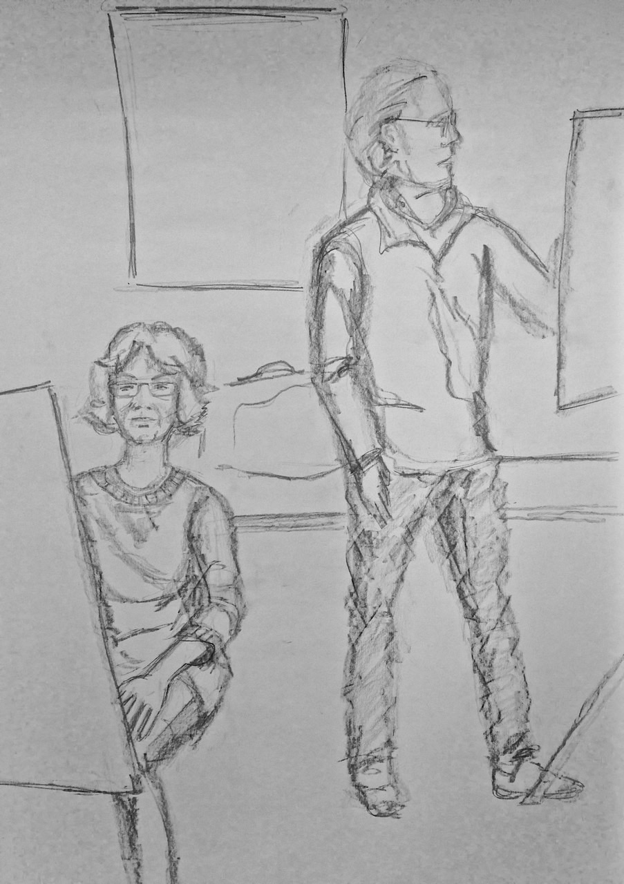
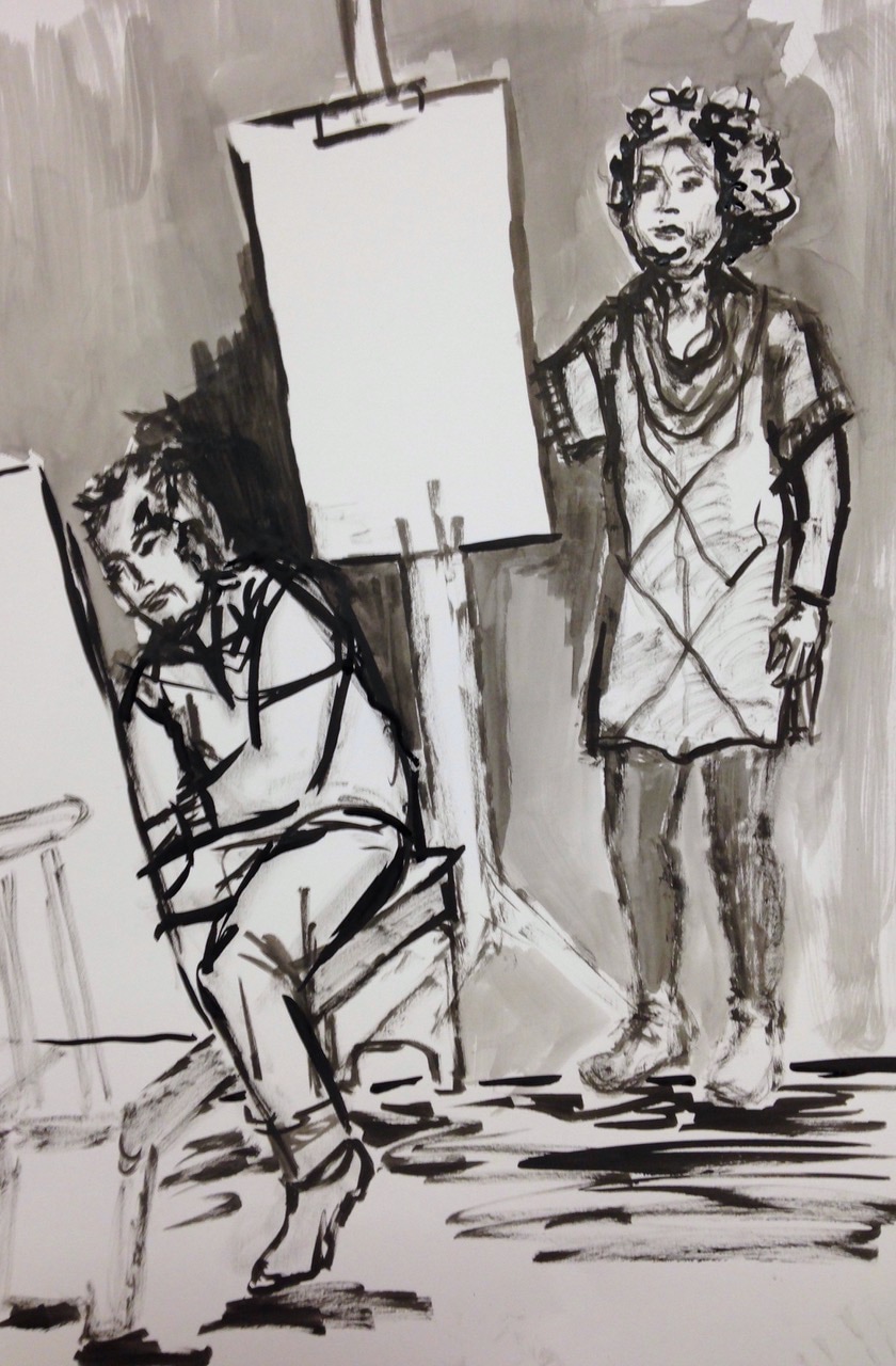
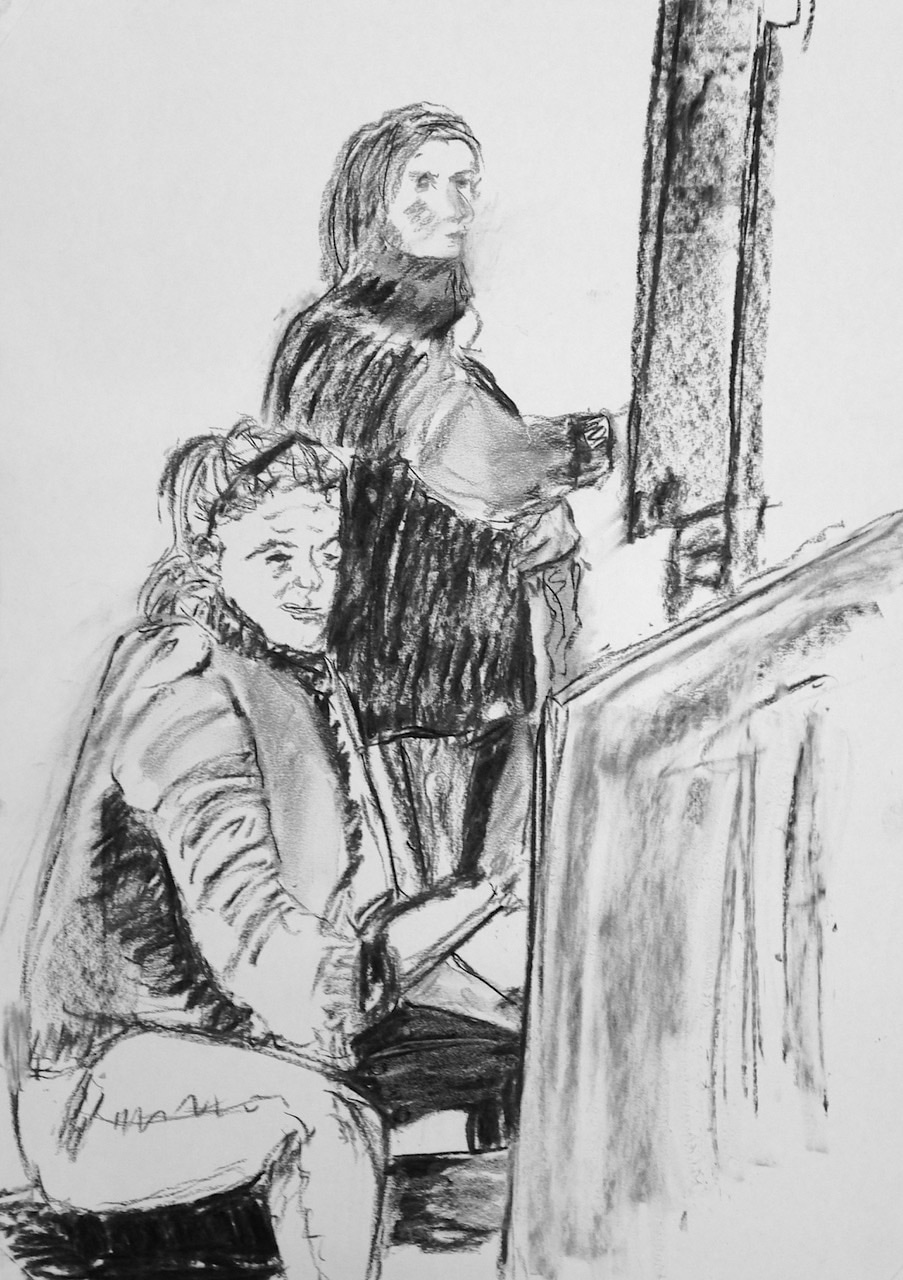
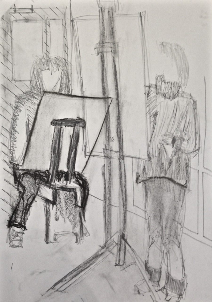
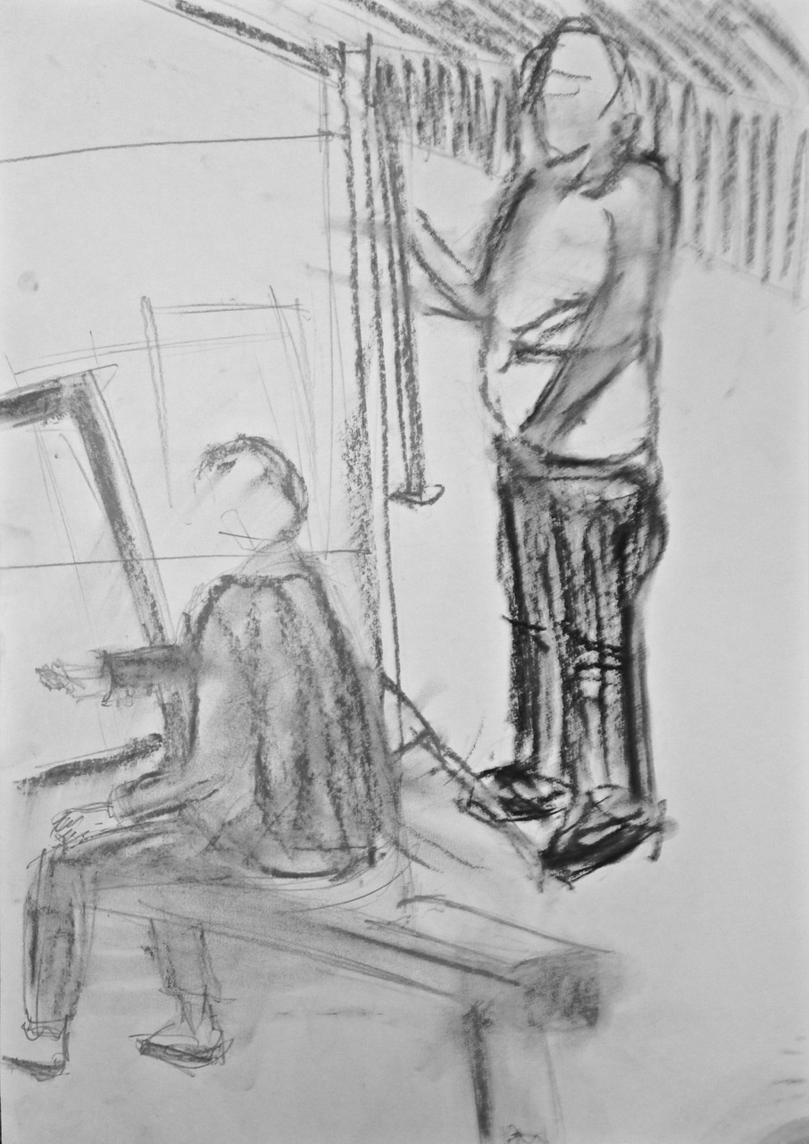
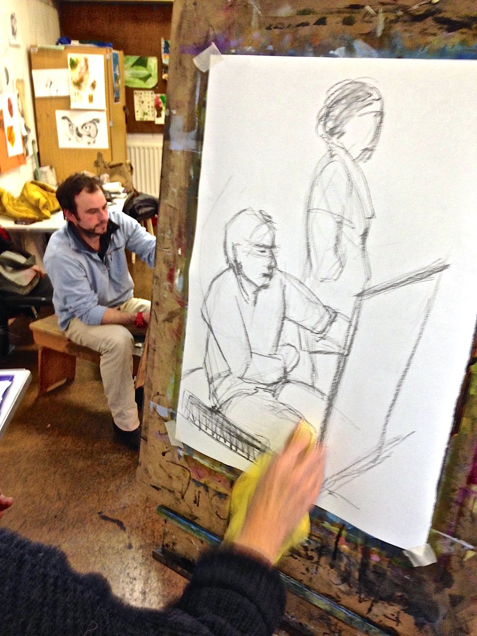
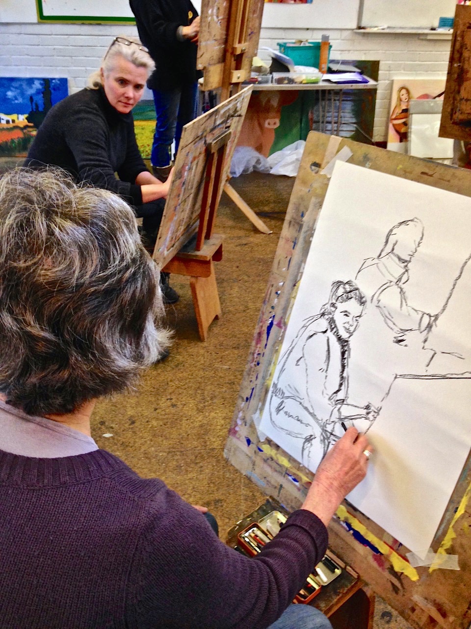
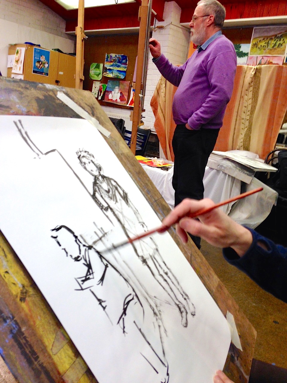
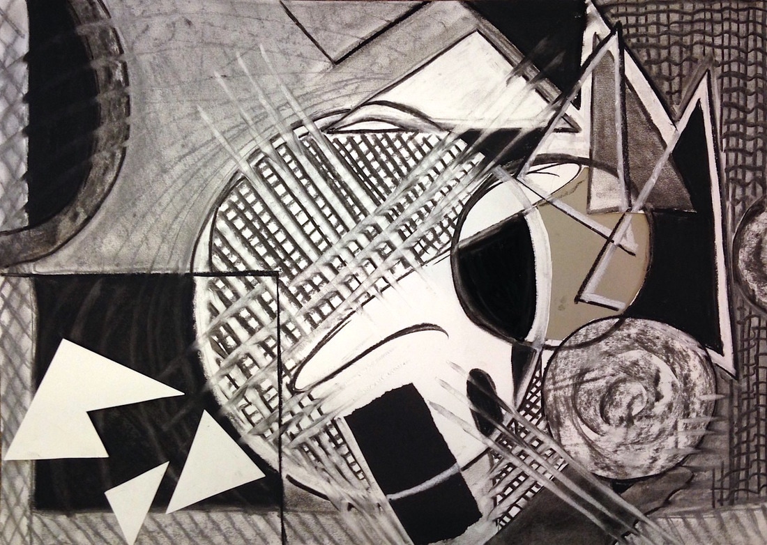
These are the drawings... Typefaces or fonts were the subject here, so we were drawing the most familiar shapes we see every day. We looked at a huge range of designed typefaces, experimented with our own versions using all the drawing skills we could think of and came up with some full sheets based on these ideas. Water was the medium here, looking at how it interacts with other substances. First we did lots of experiments with a wide range of materials from charcoal and pastel to ink, watercolour pencil and wax crayon onto wet paper, then the reverse using the same same materials and applying water to the paper. And then on different types of paper. Finally, drawings of some simple household objects using these ideas. We looked at Moore's drawings of figures in underground shelters, stones, bones and sheep, and saw how he progressed on to the final sculptures. Everyone then experimented with ways of creating tone, and therefore form, using line only: cross hatching, loose scribbling, contour lines around the form, rectangular connecting lines - some with wax resist. These were then used to create sculptural forms from a selection of stones and bones. The aim was to use these constructions as starting points that 'suggest' figures without being too literal. Two drawings each. The first drawing was responding to specific instructions like 'block in three shapes', 'draw with four bold lines of charcoal and smudge them', and 'sick on two bits of coloured paper shapes'... The second drawing was to respond to the structures in any way one wished... work in progress... Here's a selection of drawings done from each of the projects over the last 20 weeks. Have a look back at each project for plenty more examples. Everyone drew another figure at work, with a second alongside as contrast, for 30 minutes, followed by a similar 30 minute drawing - to give a sense of the whole studio at work. Click thumbnail to see whole image... 'Cornish Whispers' This short exercise was a visual version of the verbal Chinese Whispers. One person did a 3 minute copy of a painting on a postcard, then passed the drawing on to the next person who did a quick copy from that - and so on all round the group. At the end we tried to identify the original painting from the final drawing, and were able to see how the original had become distorted at each stage!
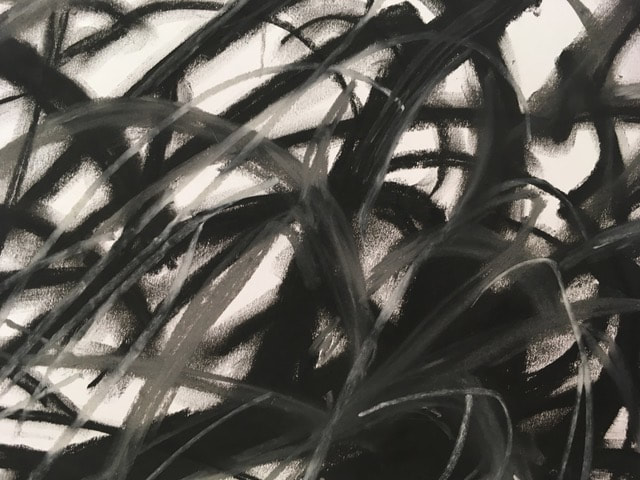
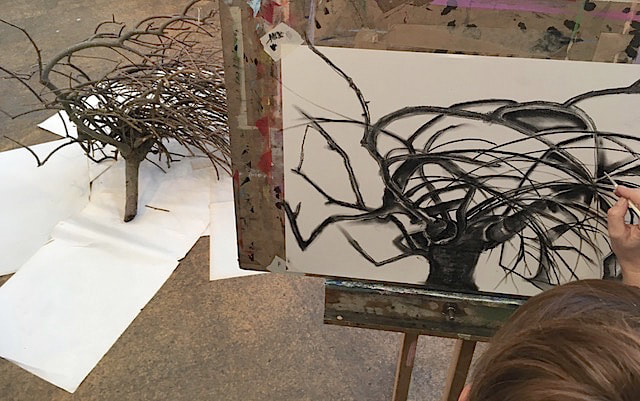
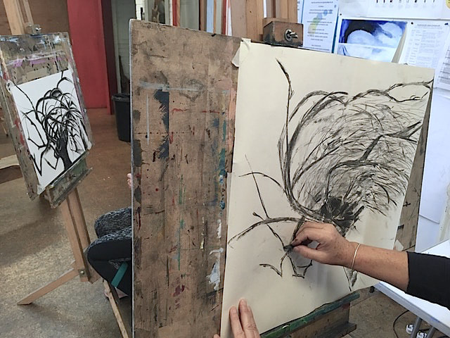
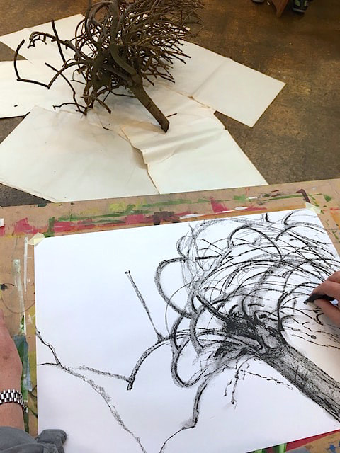
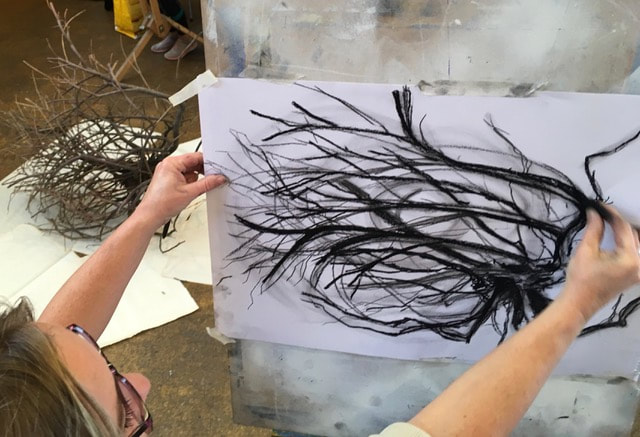
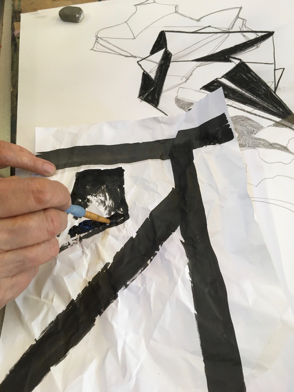
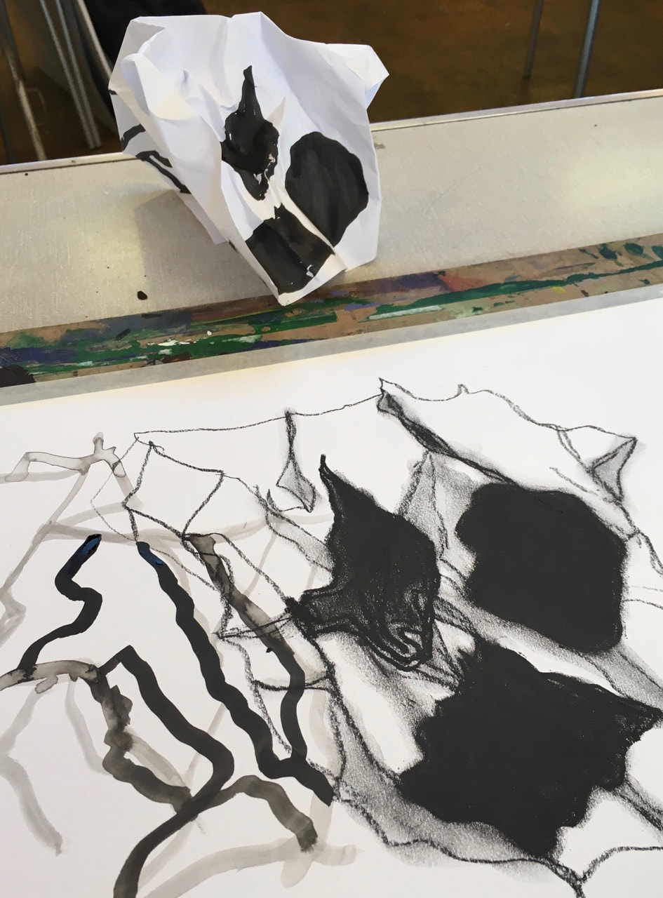
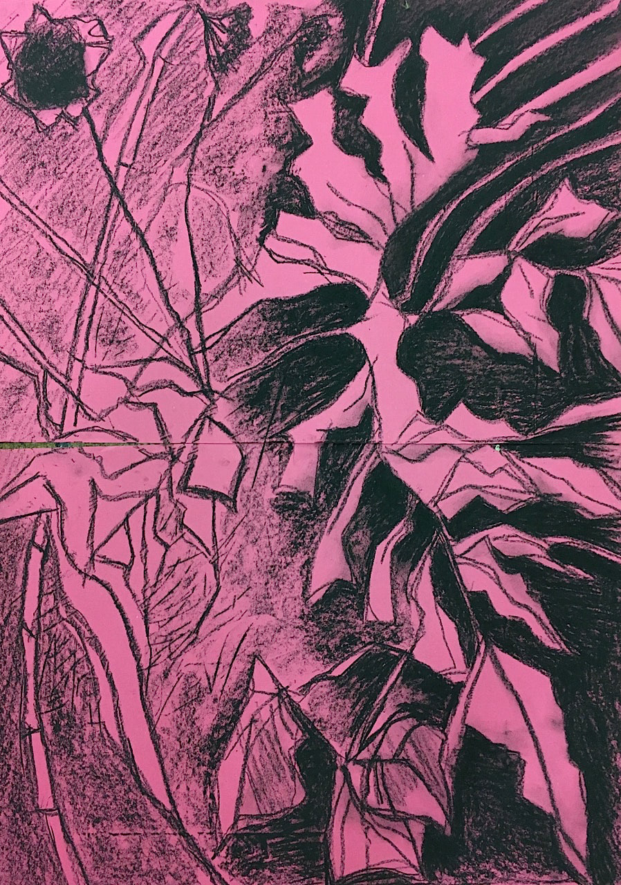
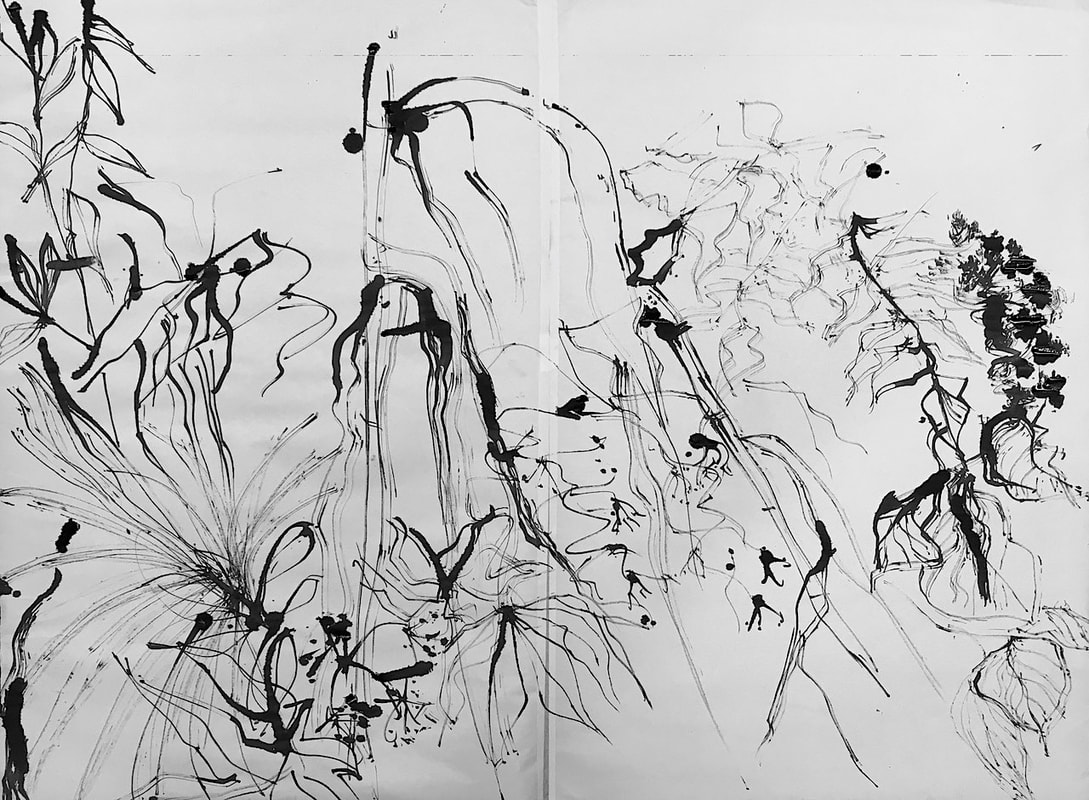
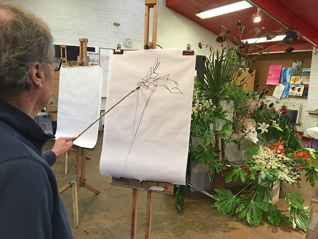
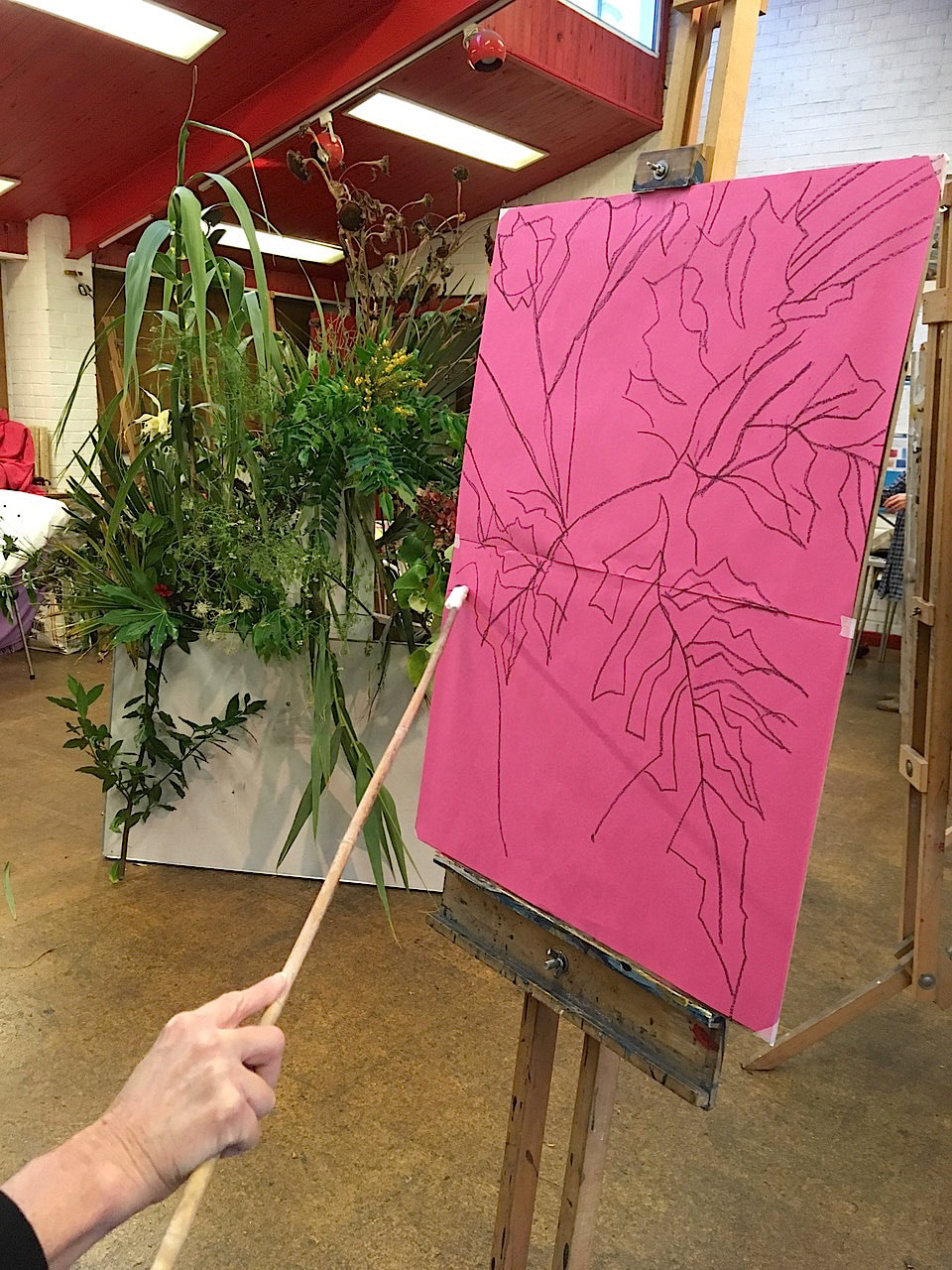
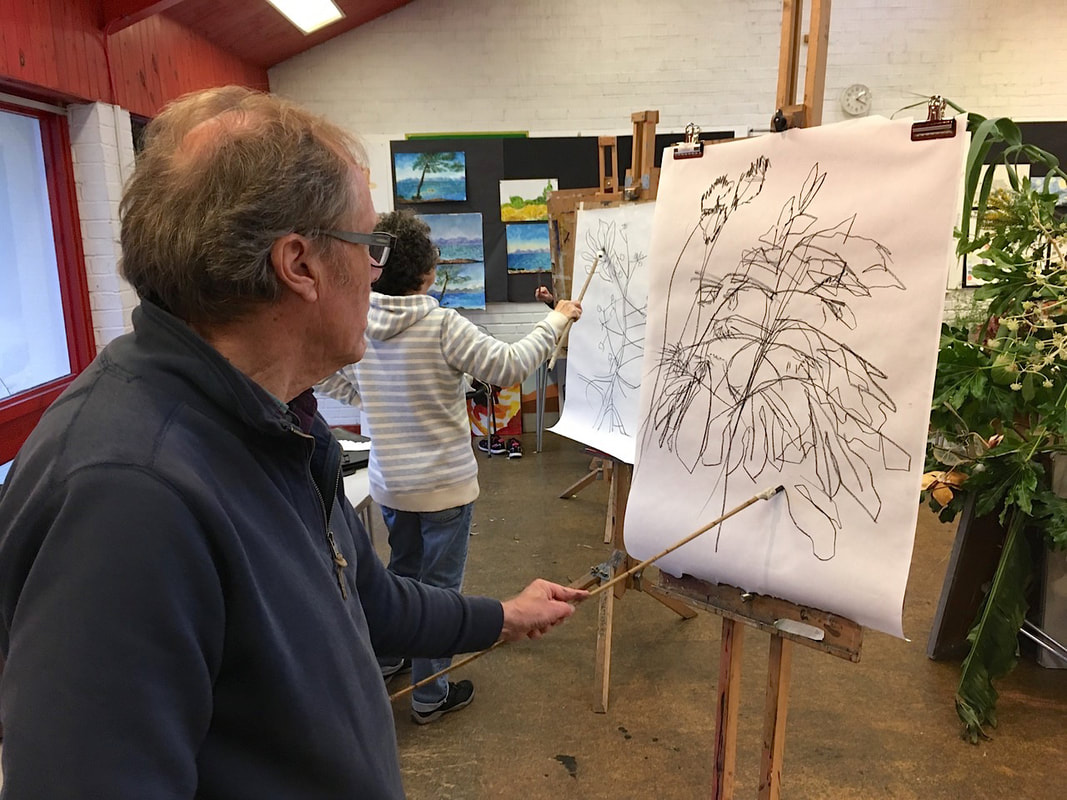
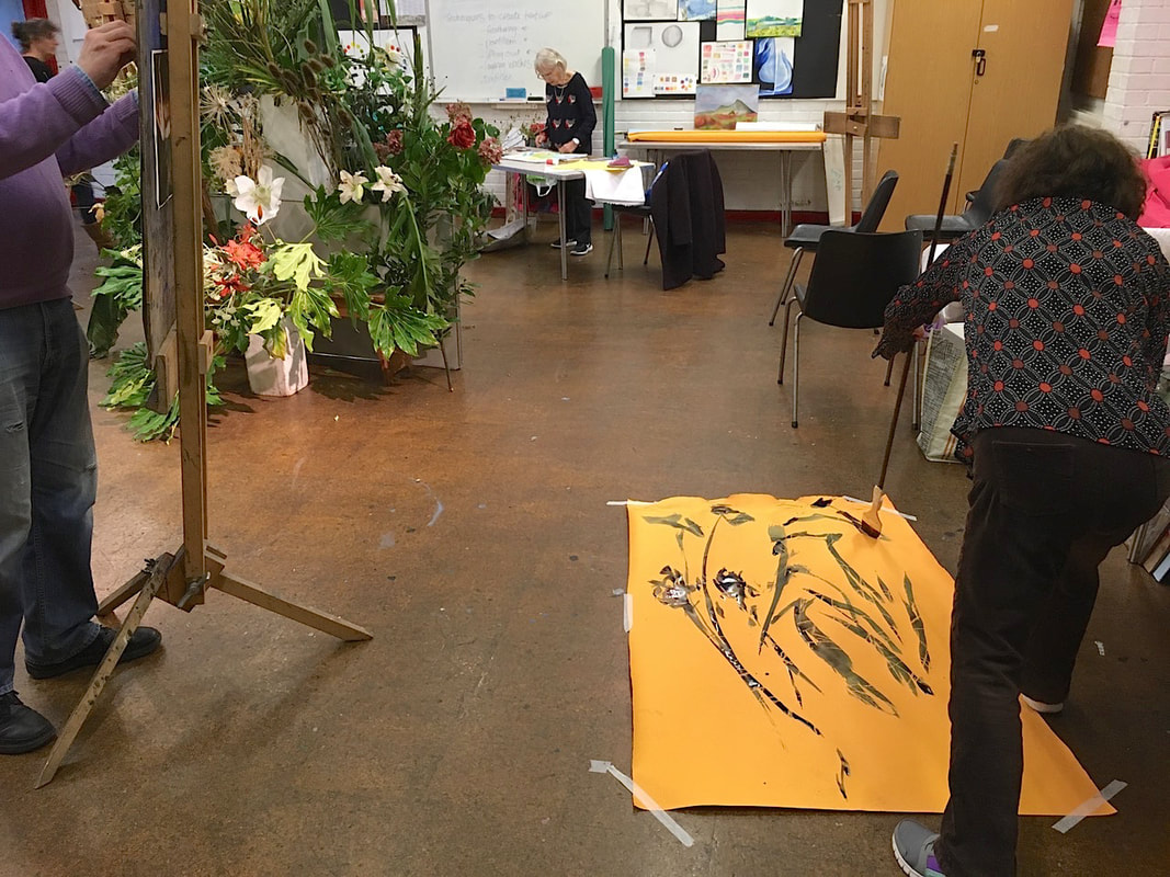
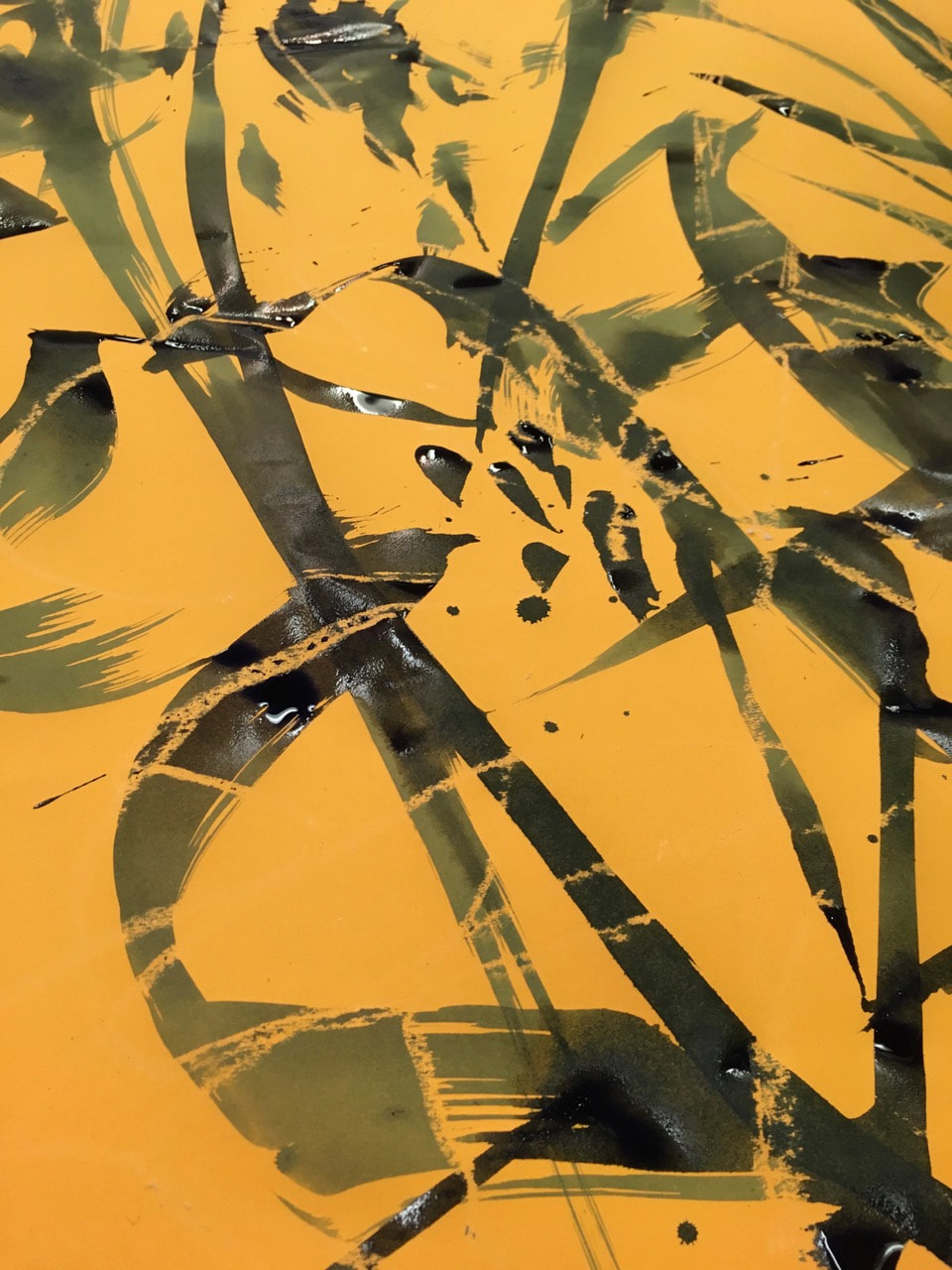
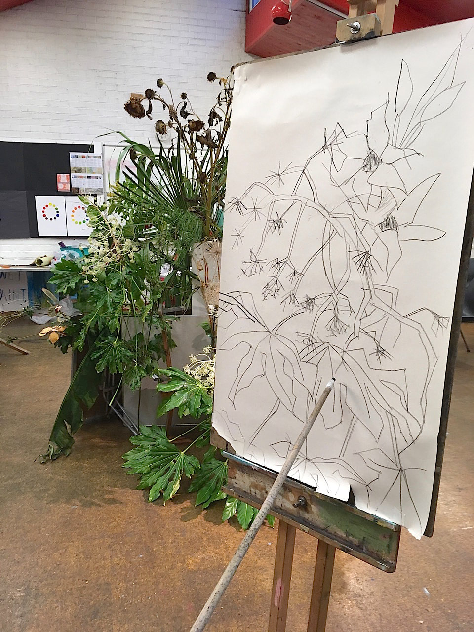
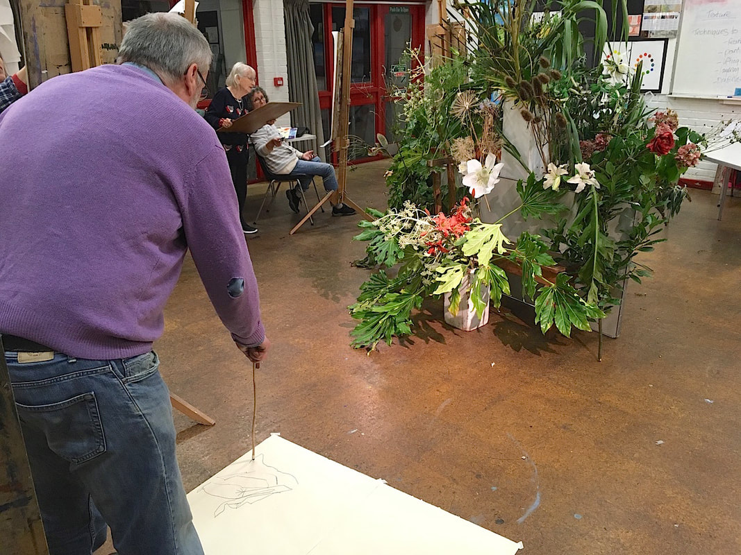
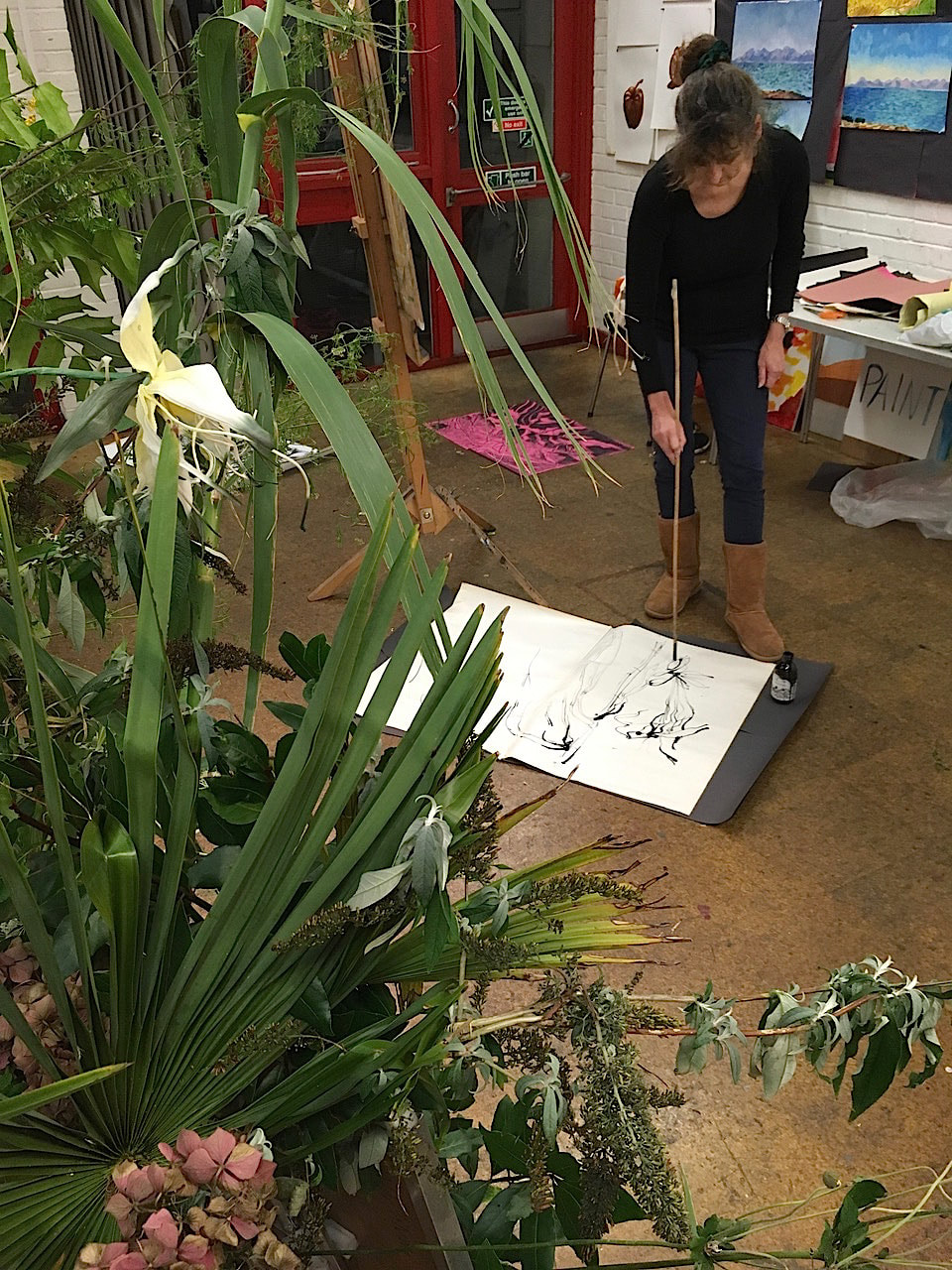
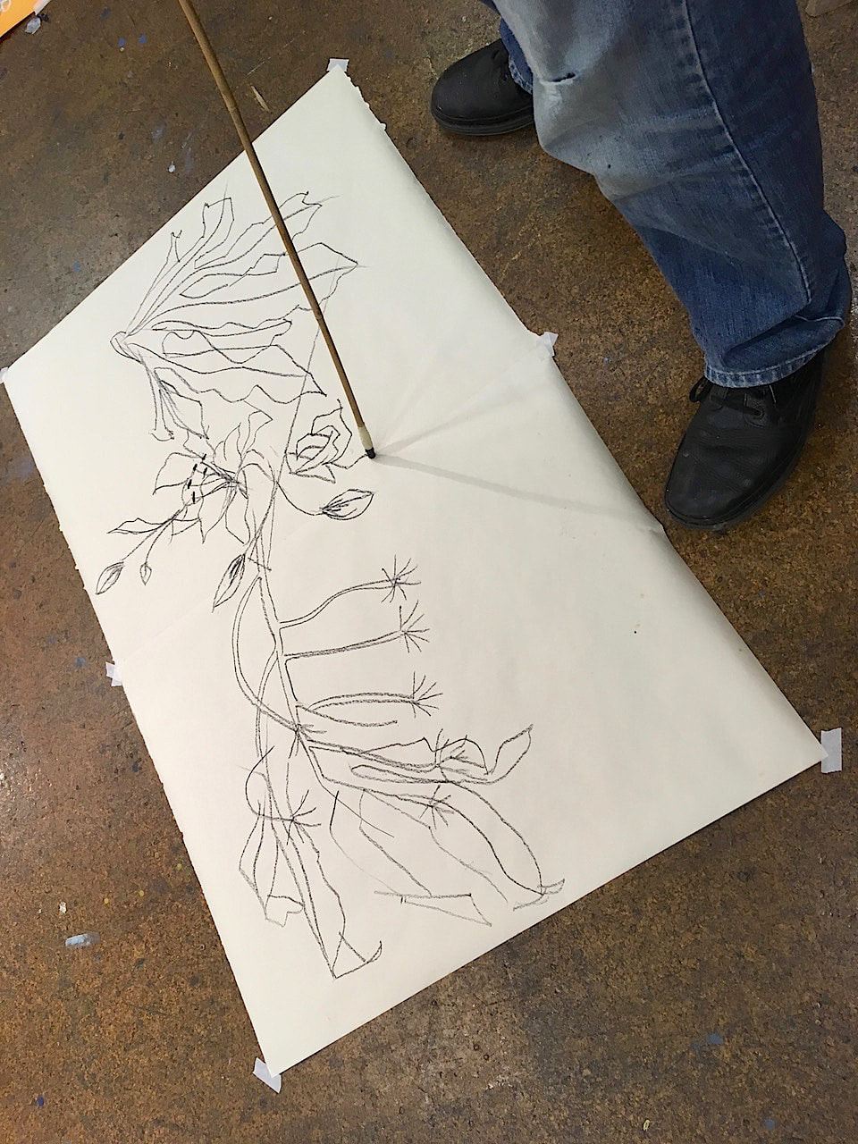
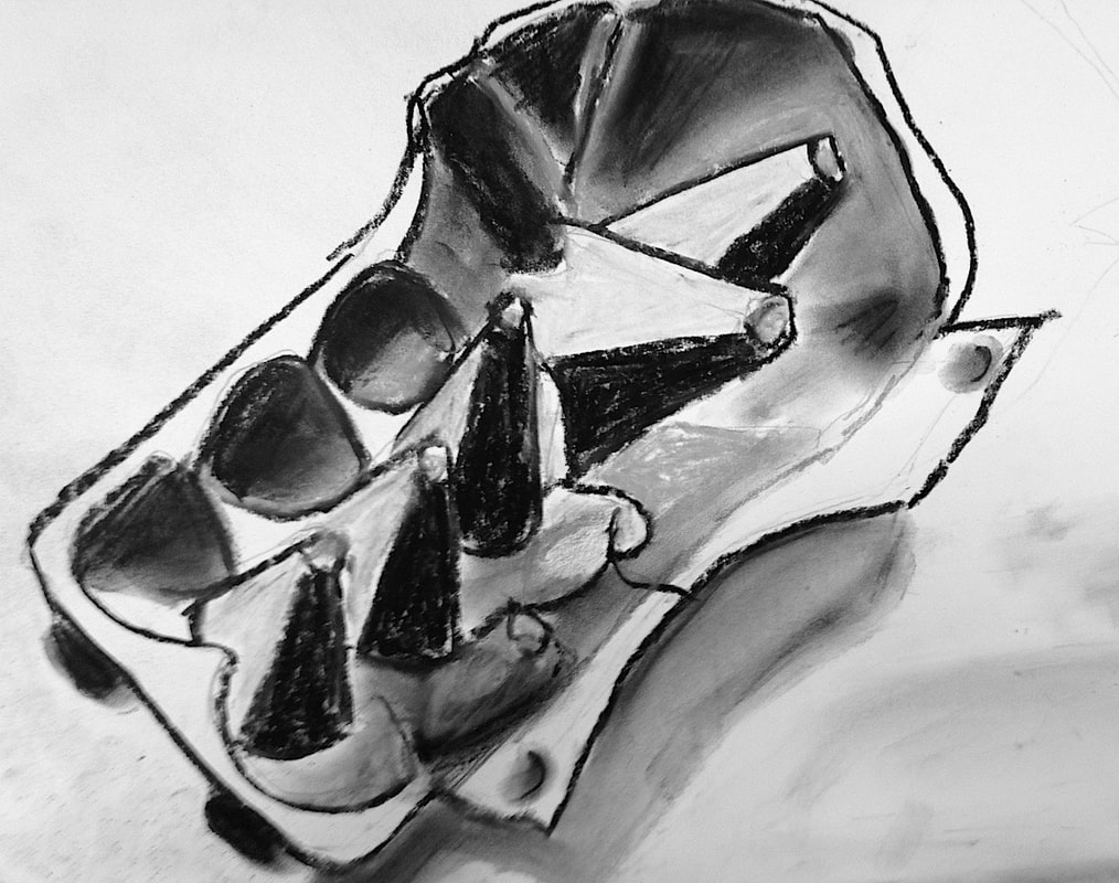
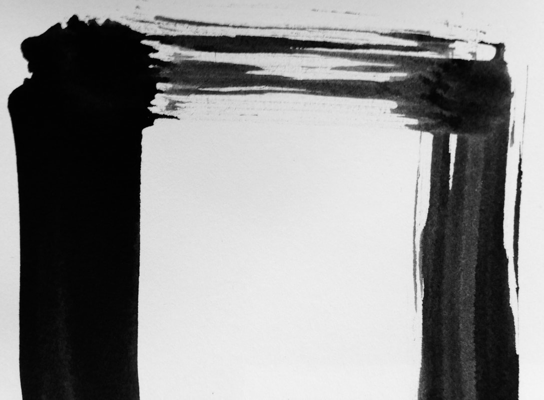
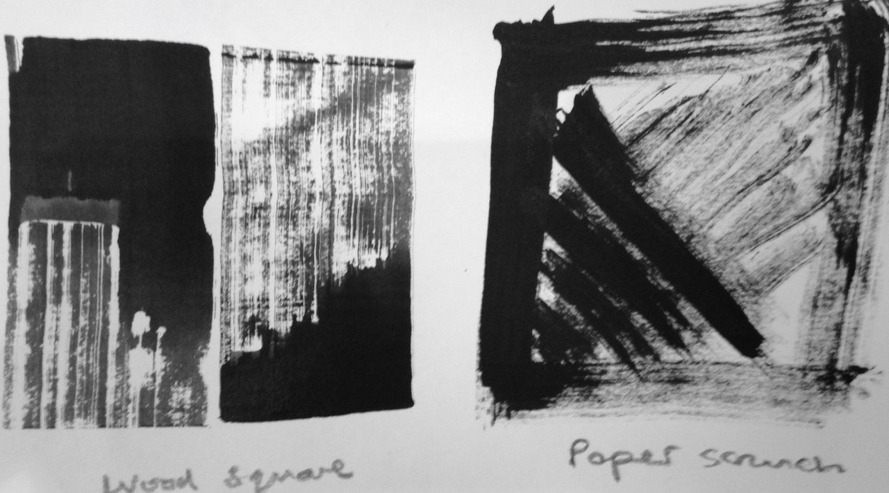
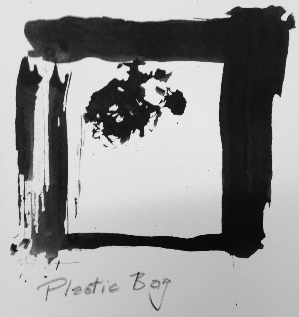
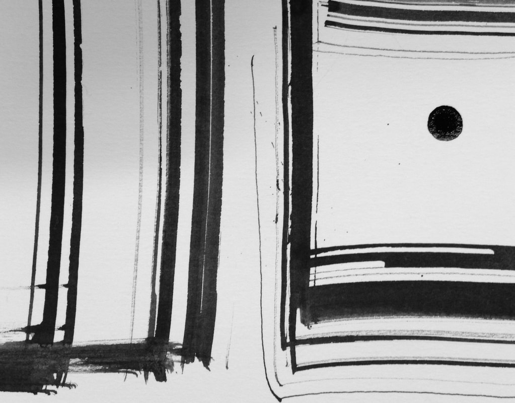
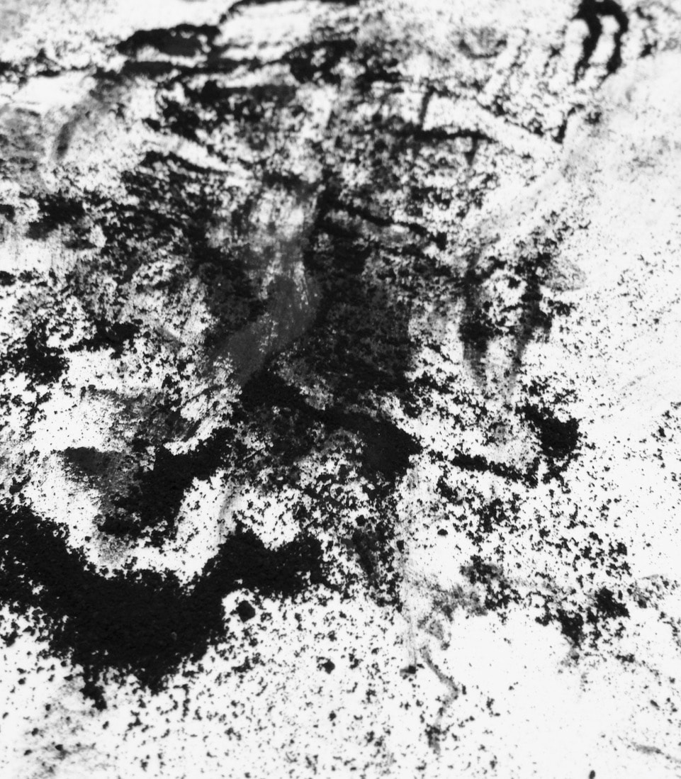
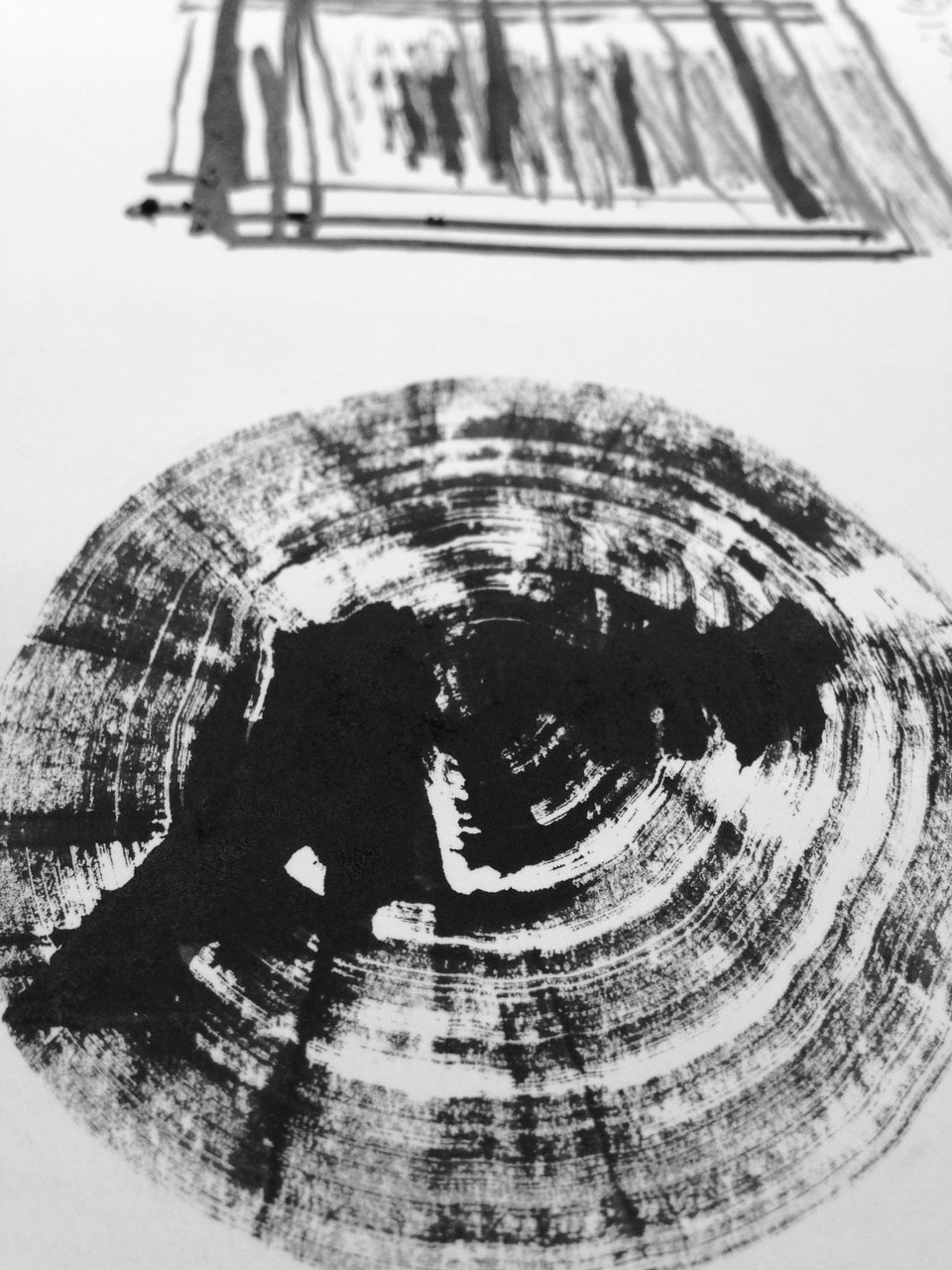
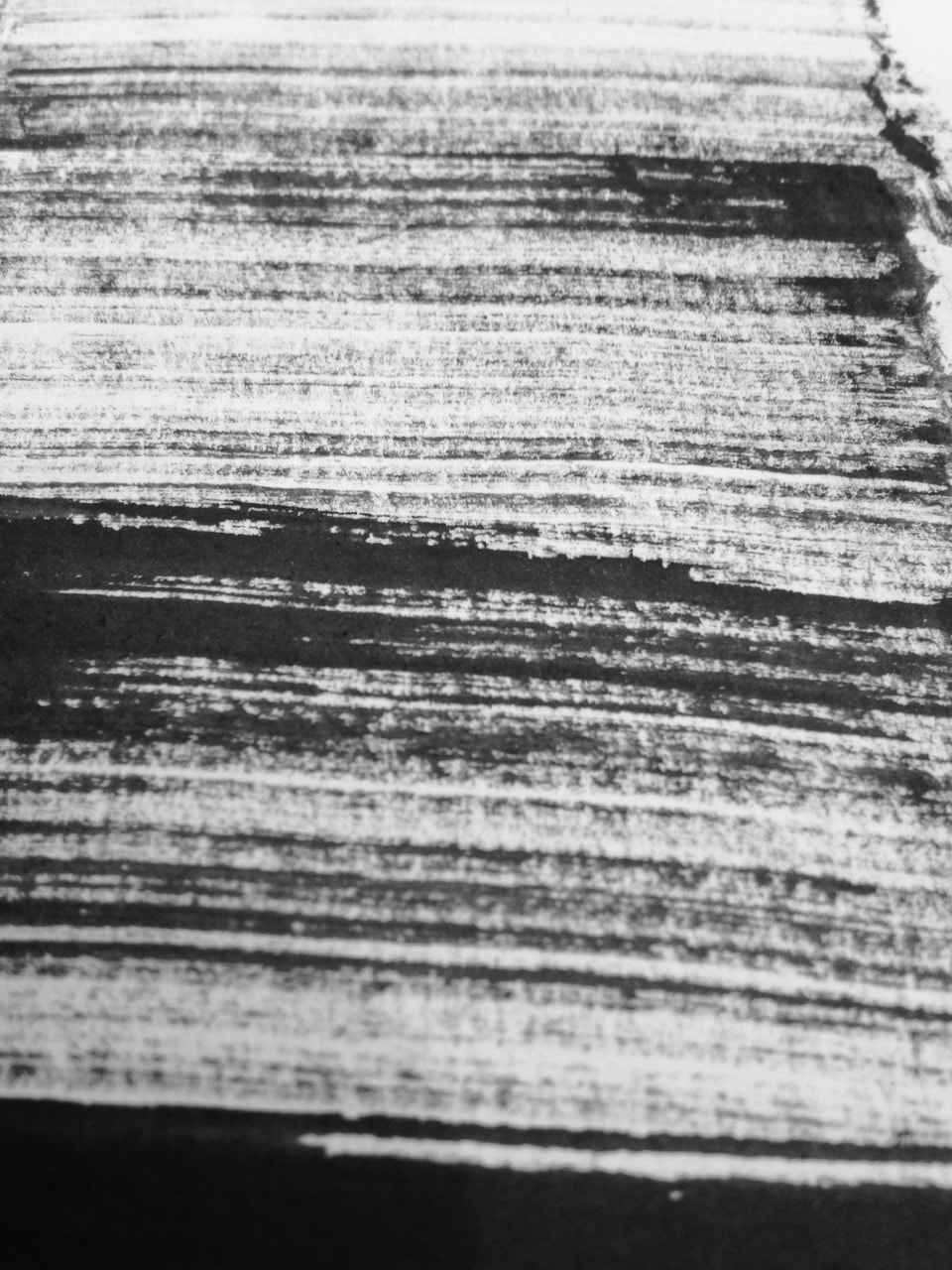
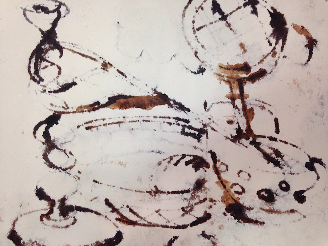
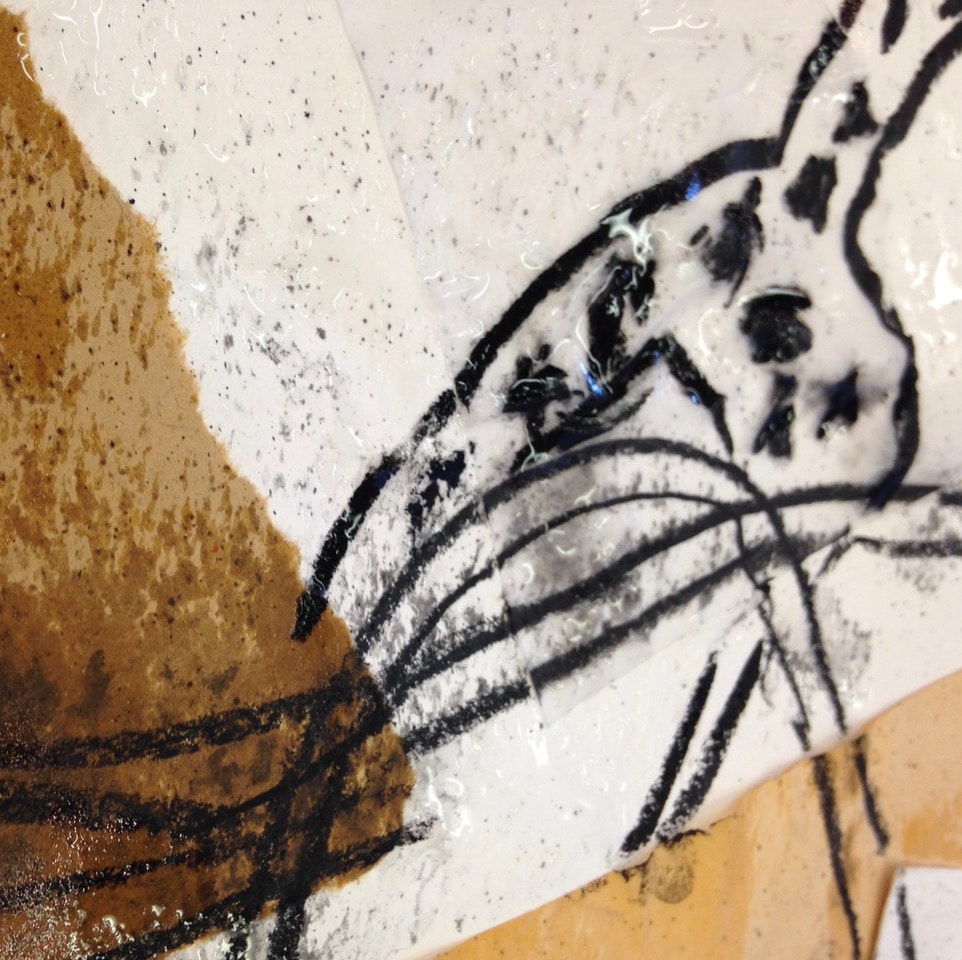
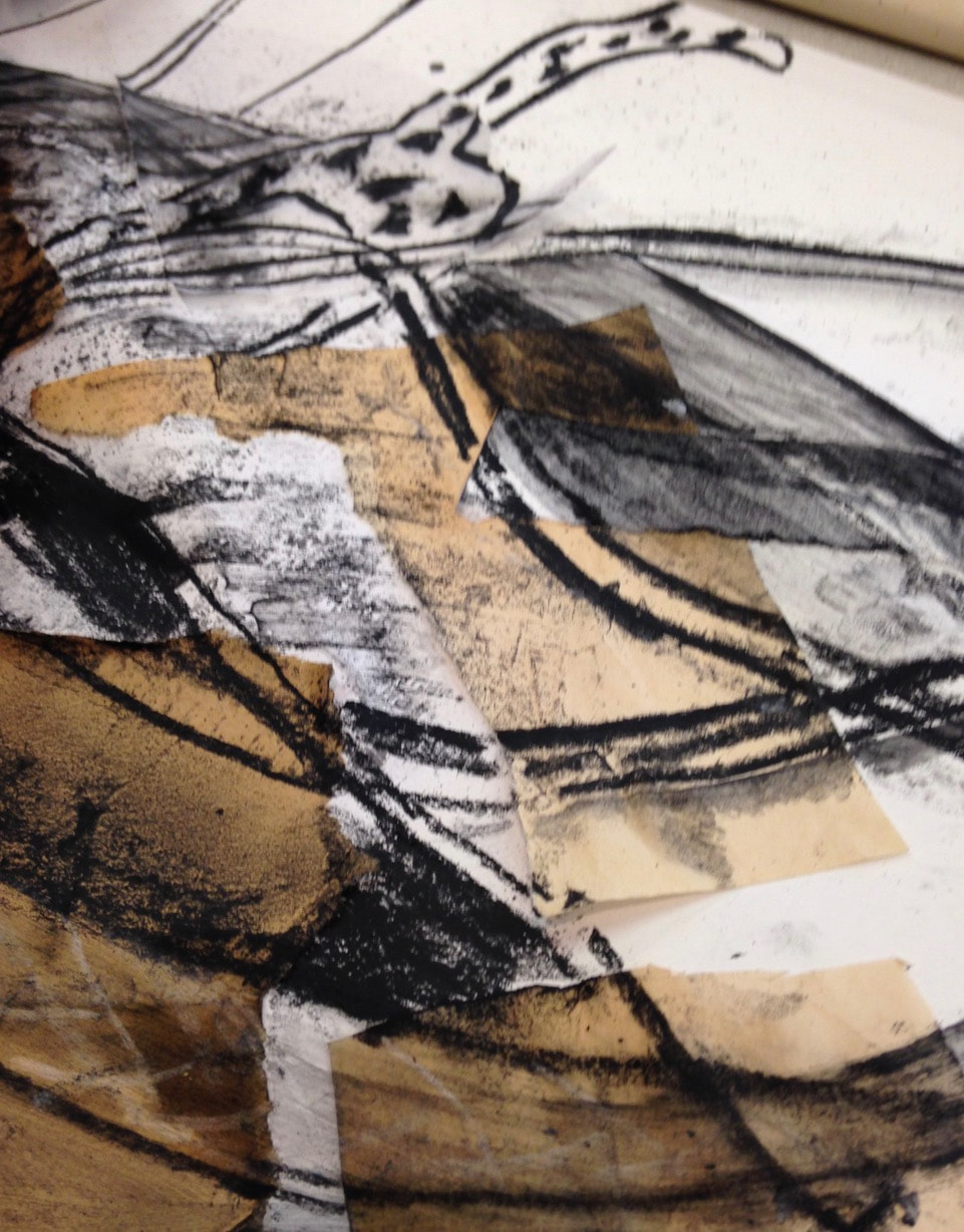
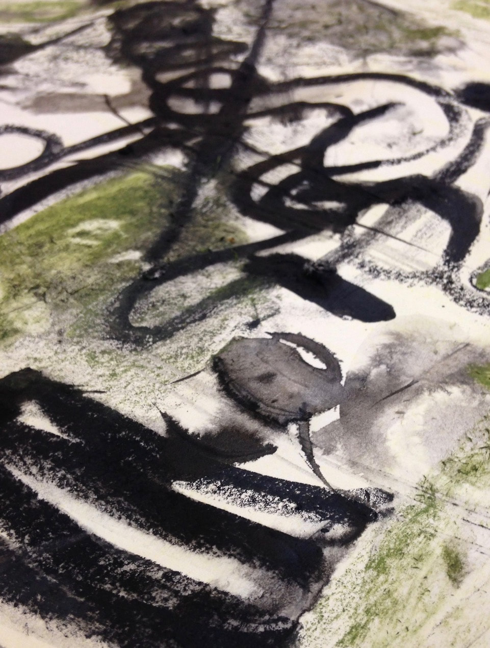
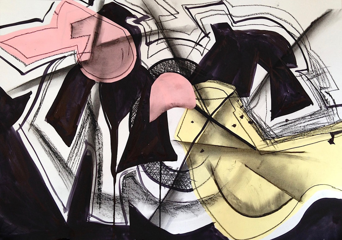
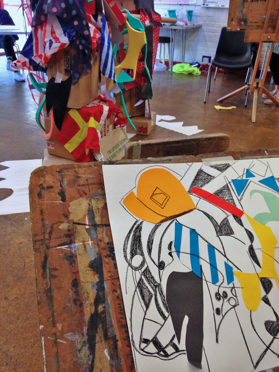
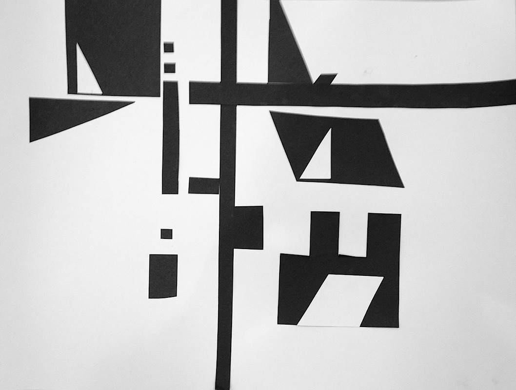
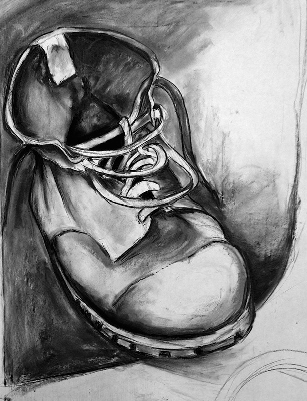
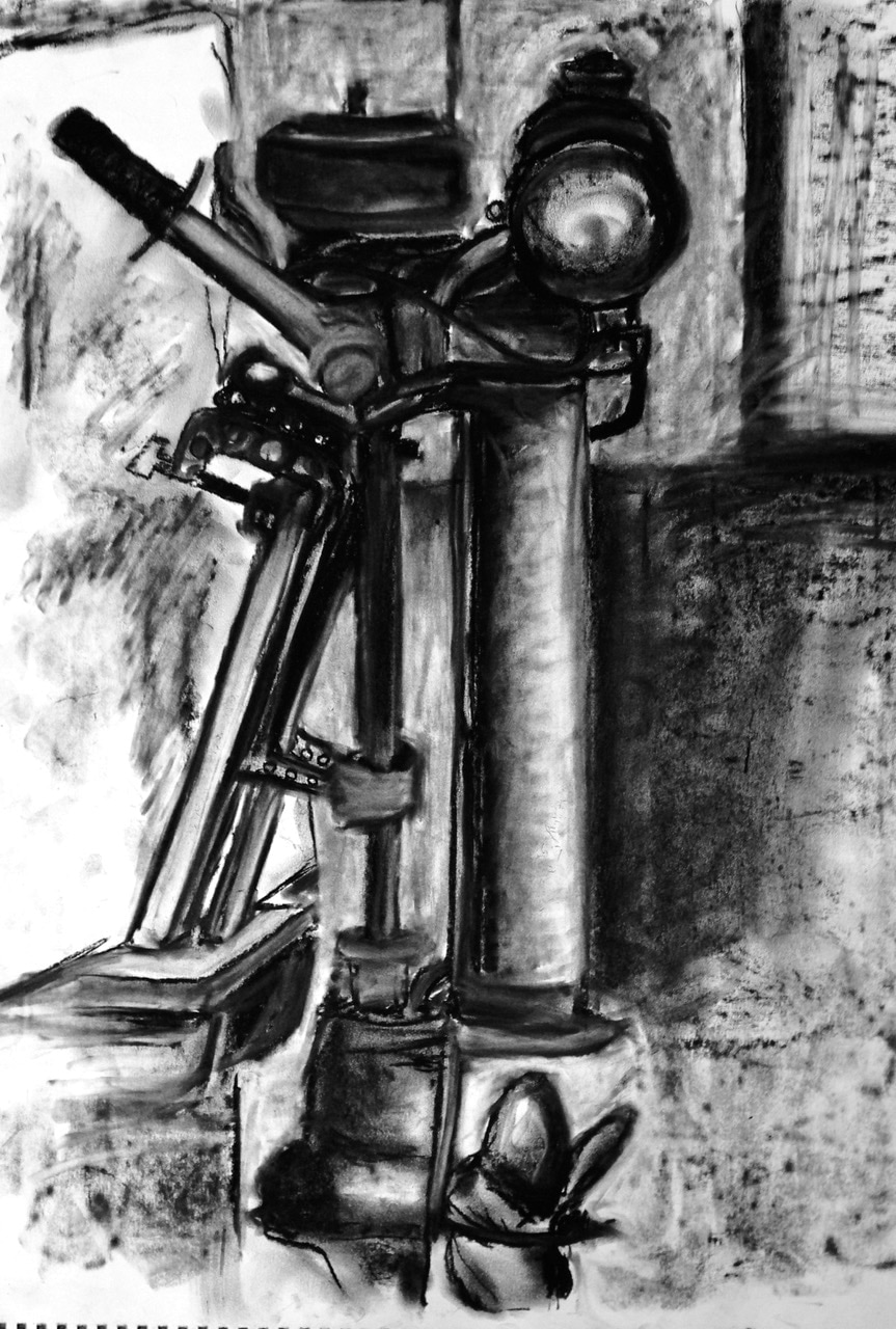
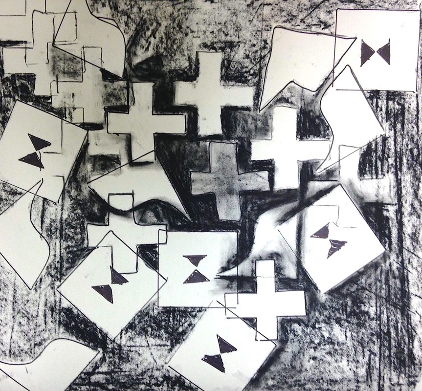
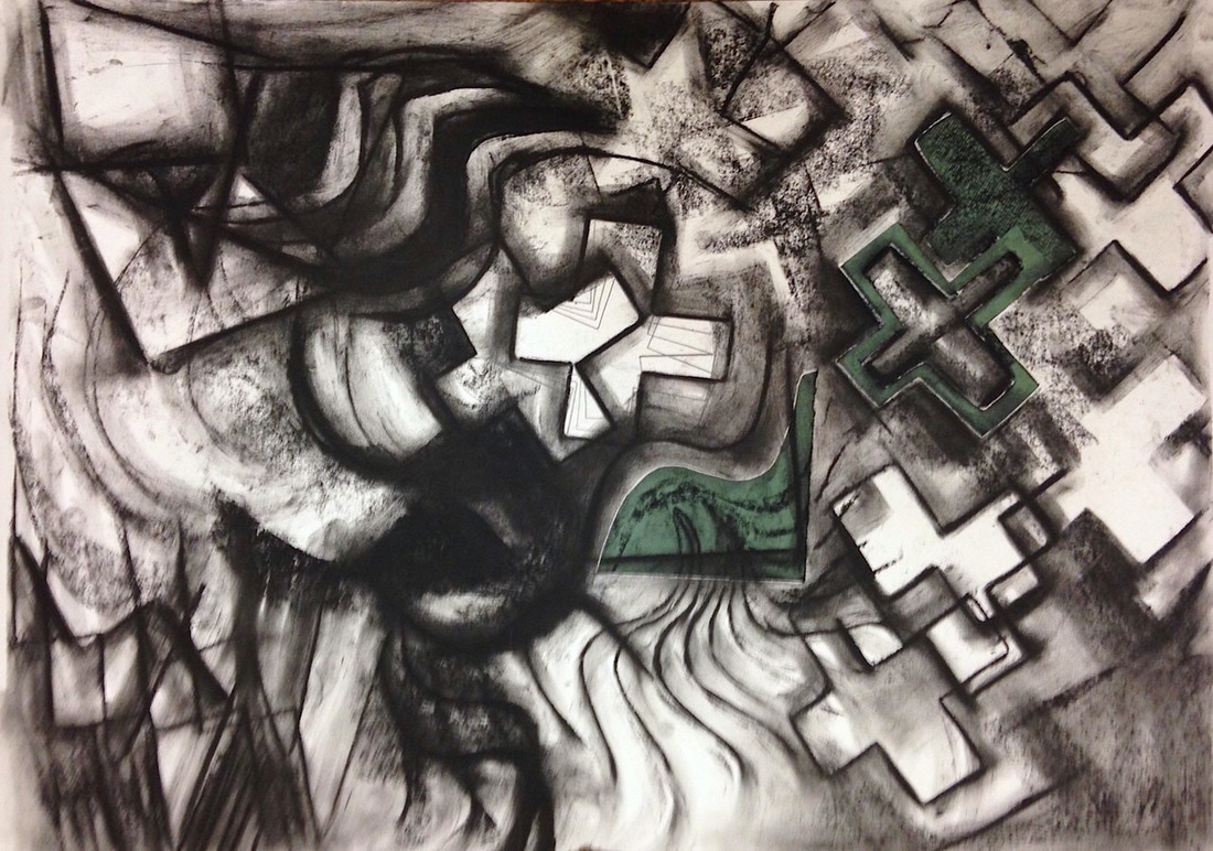
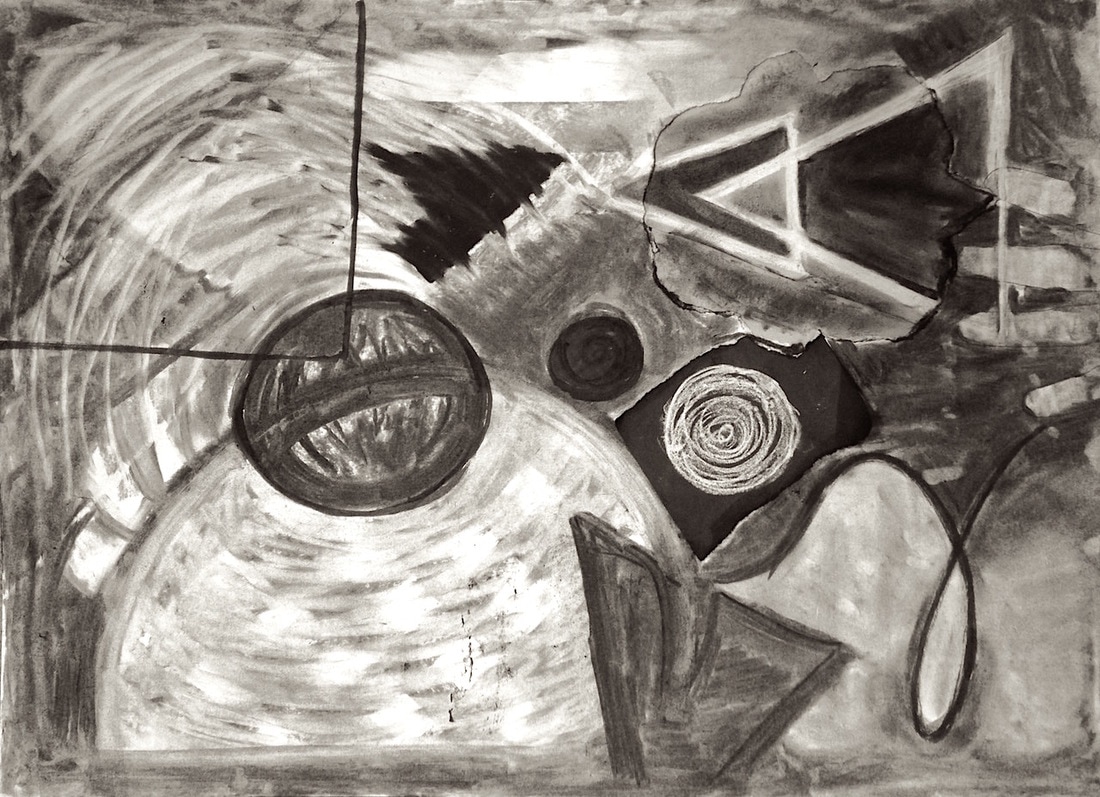
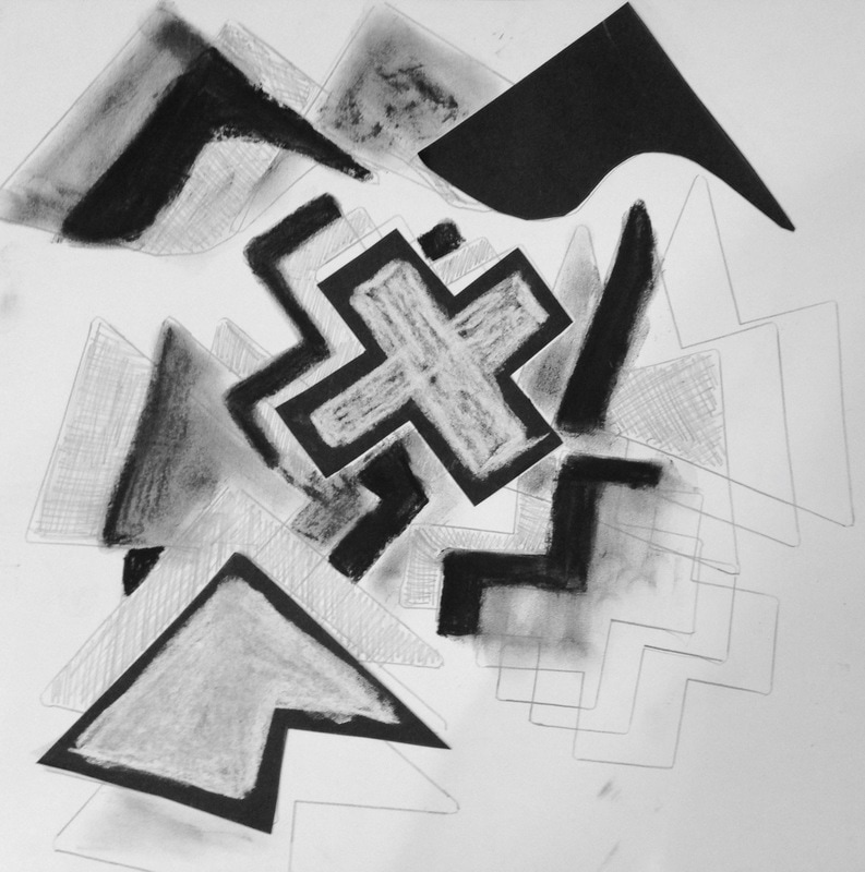
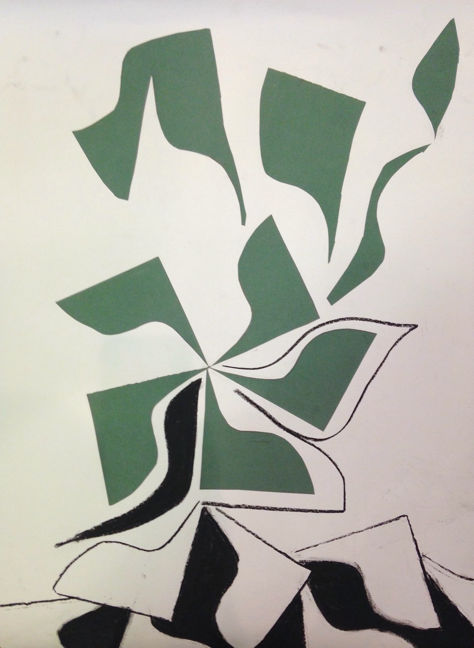
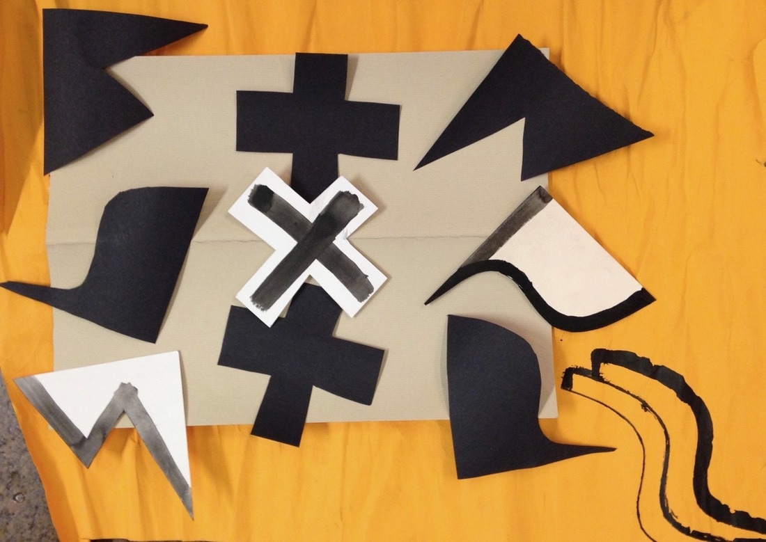
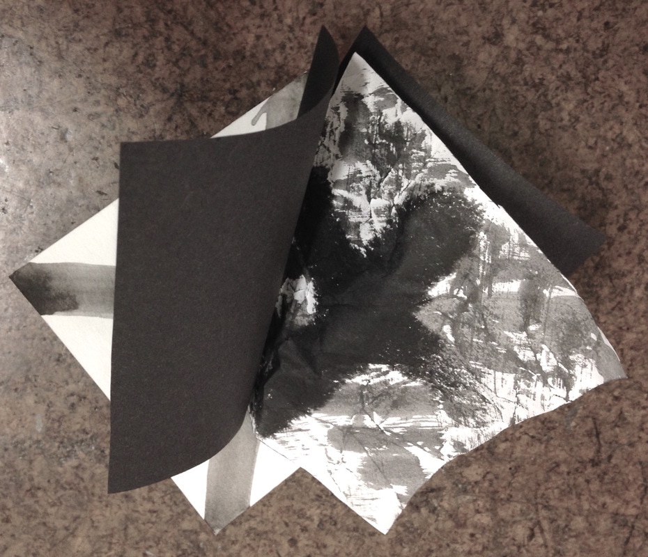
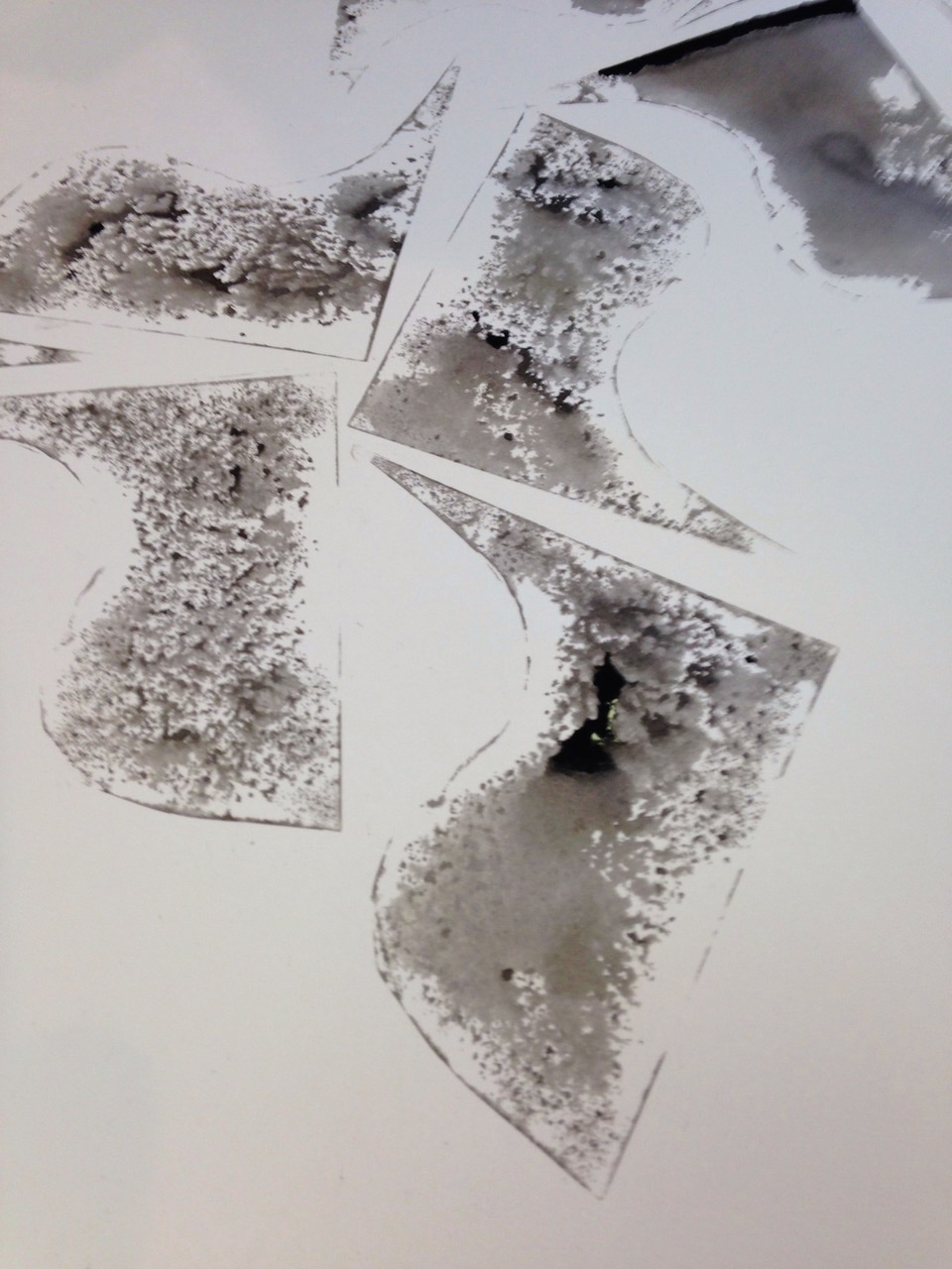
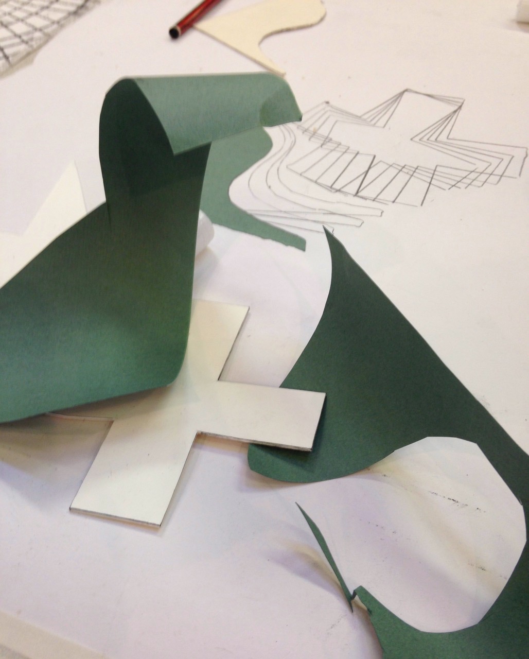
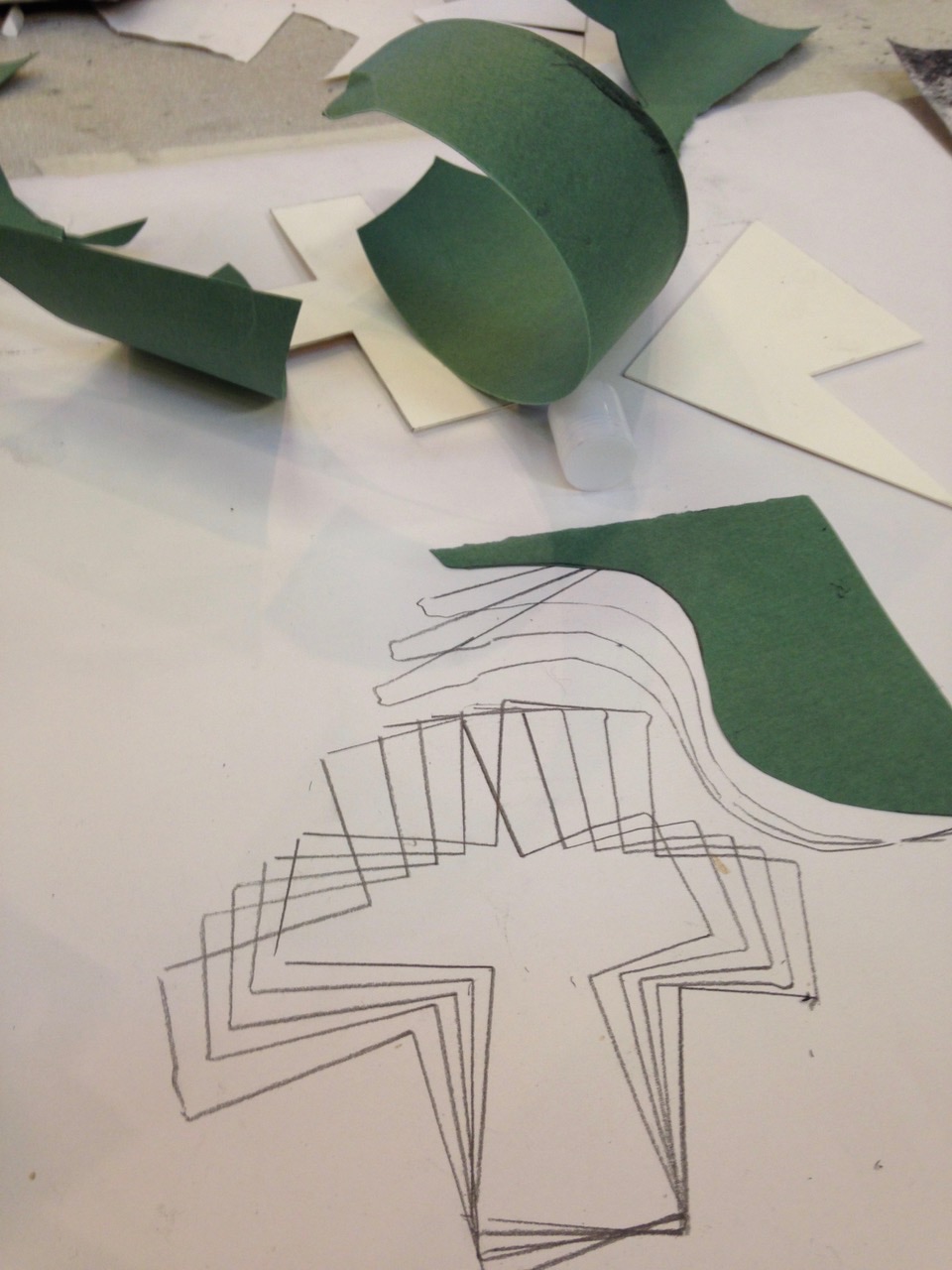
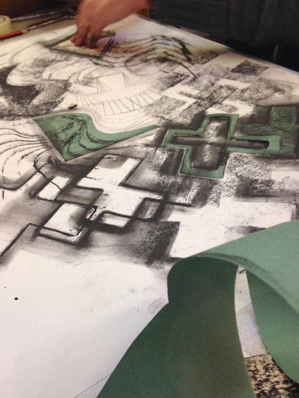
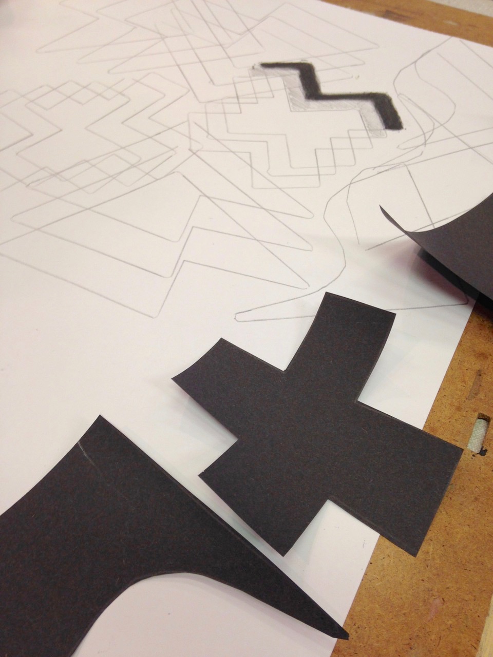
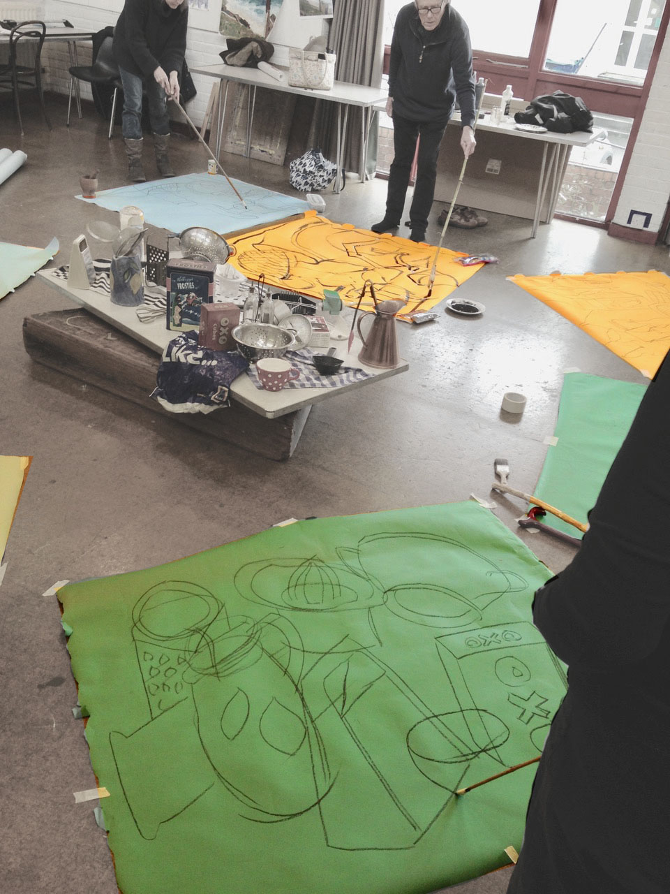
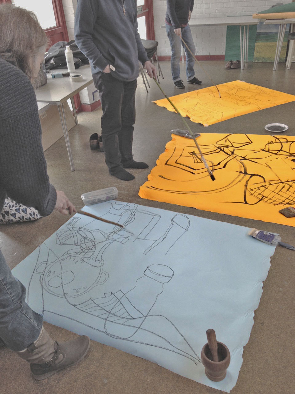
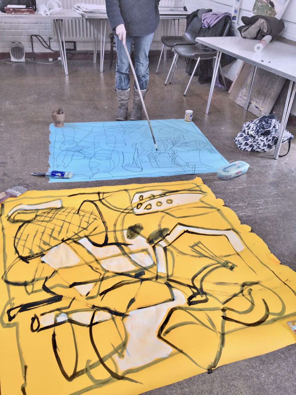
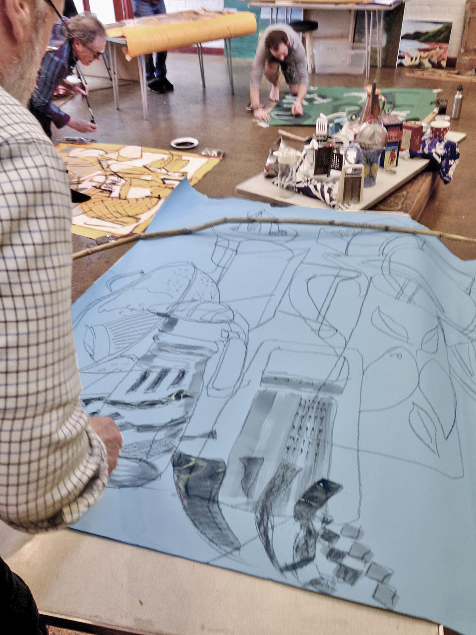
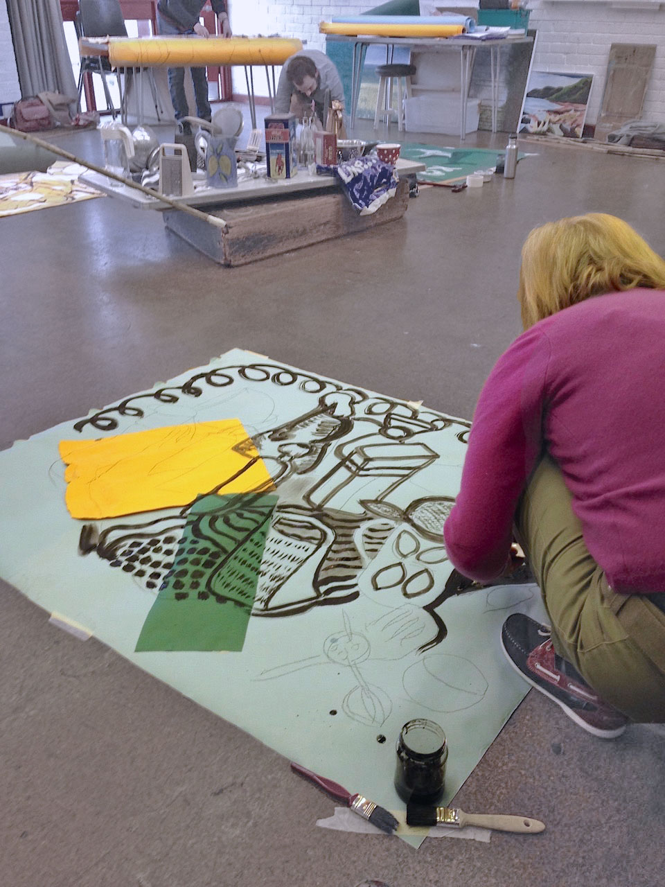
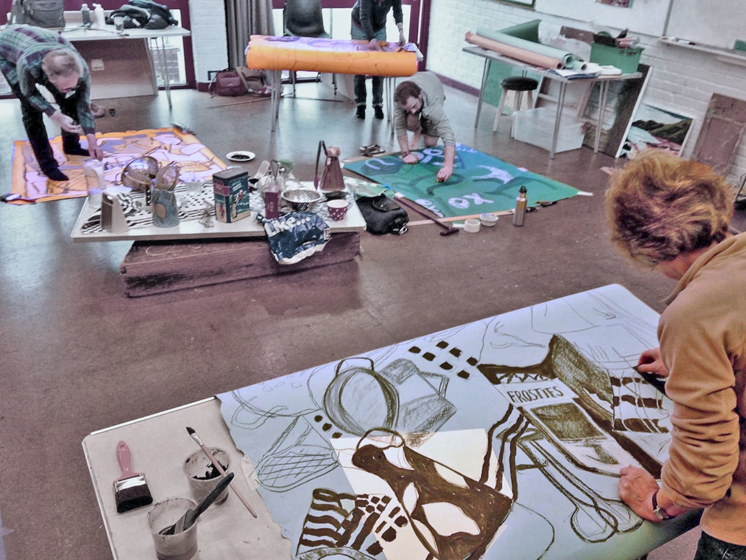
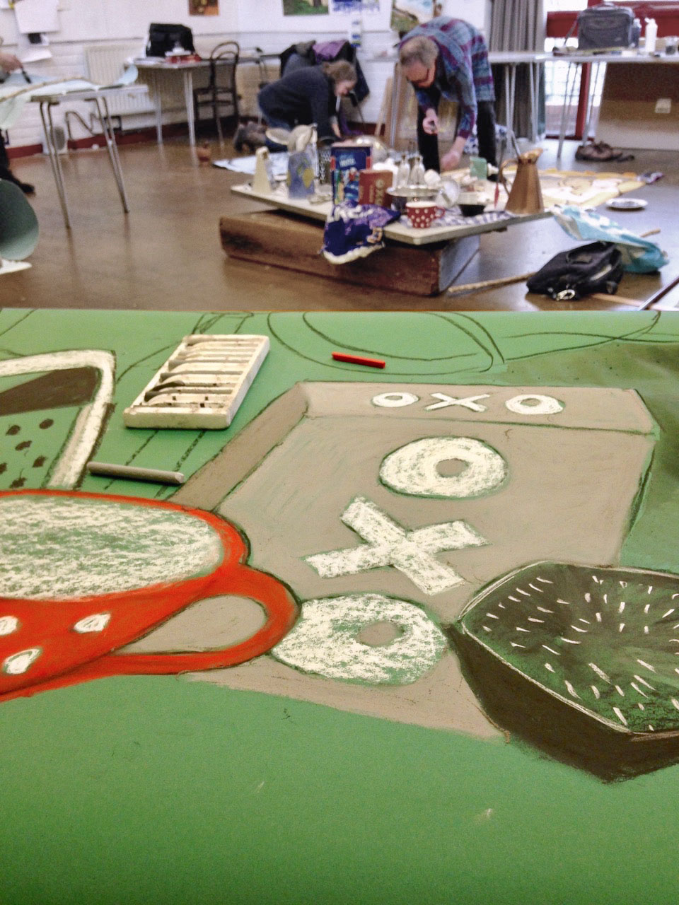
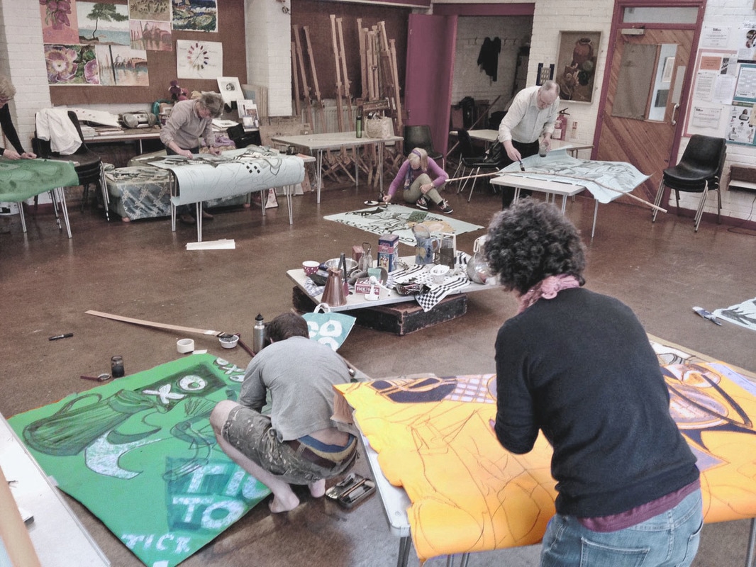
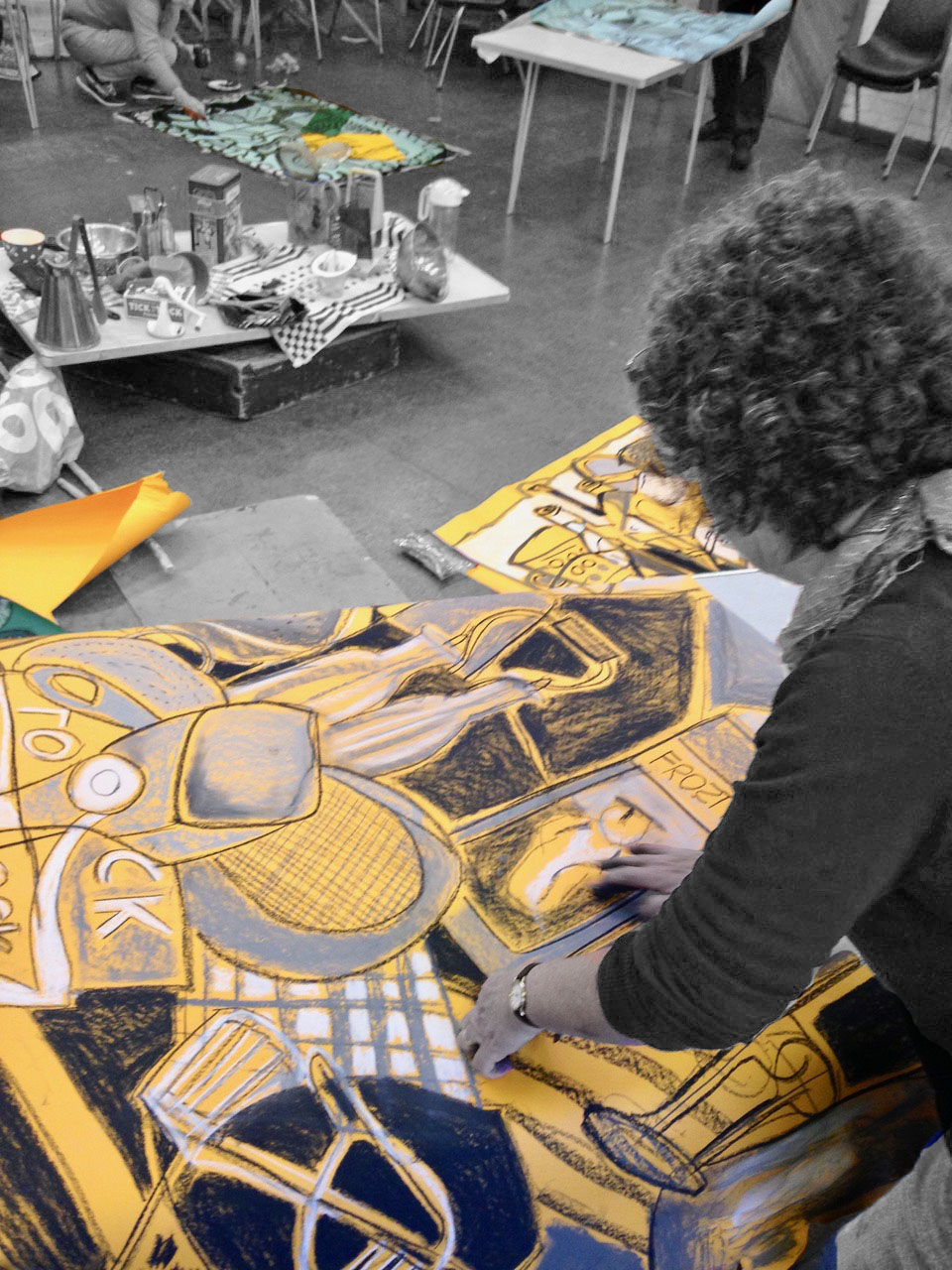
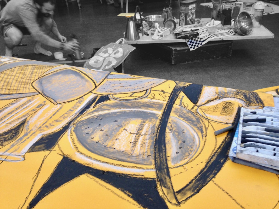
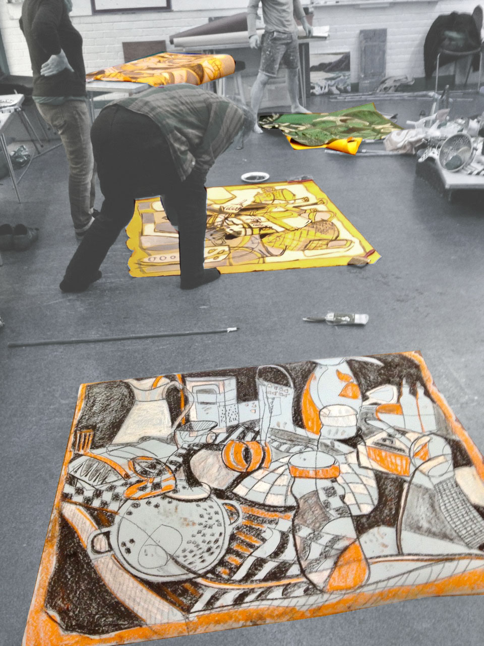
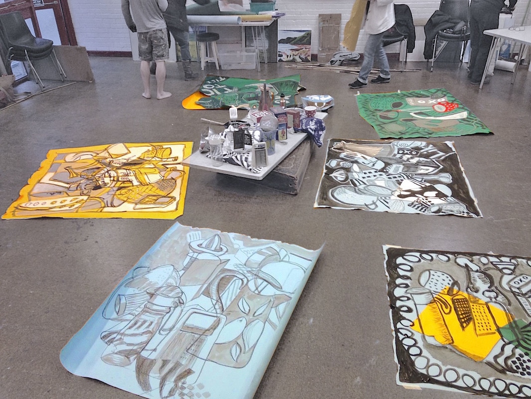
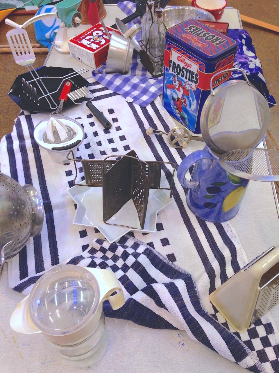
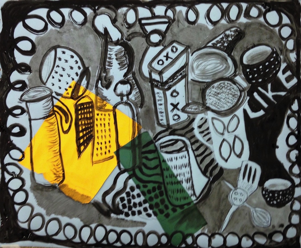
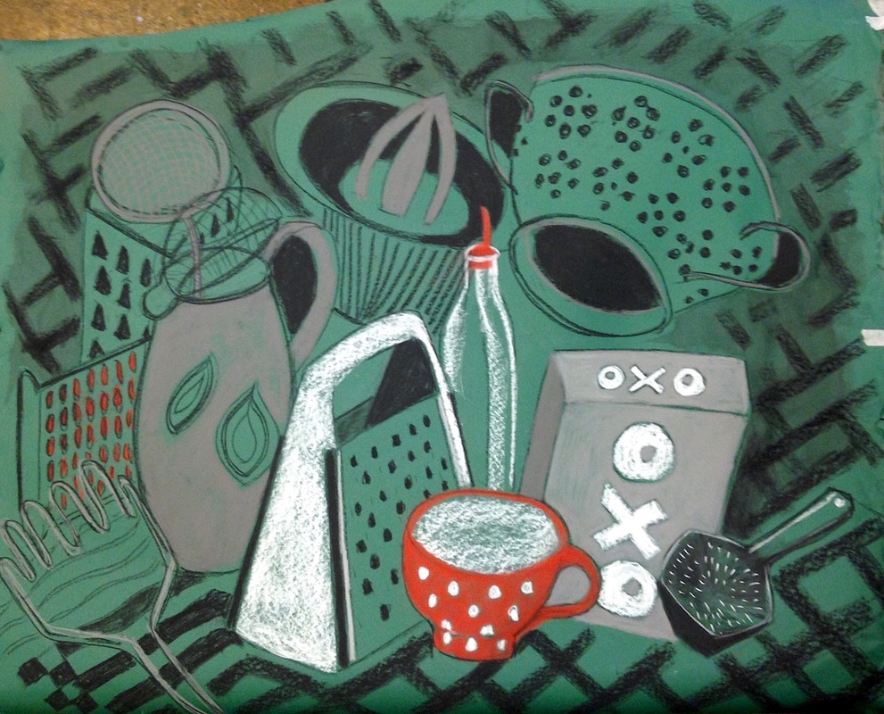
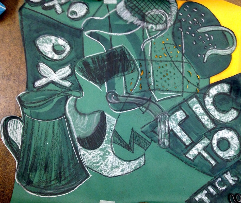
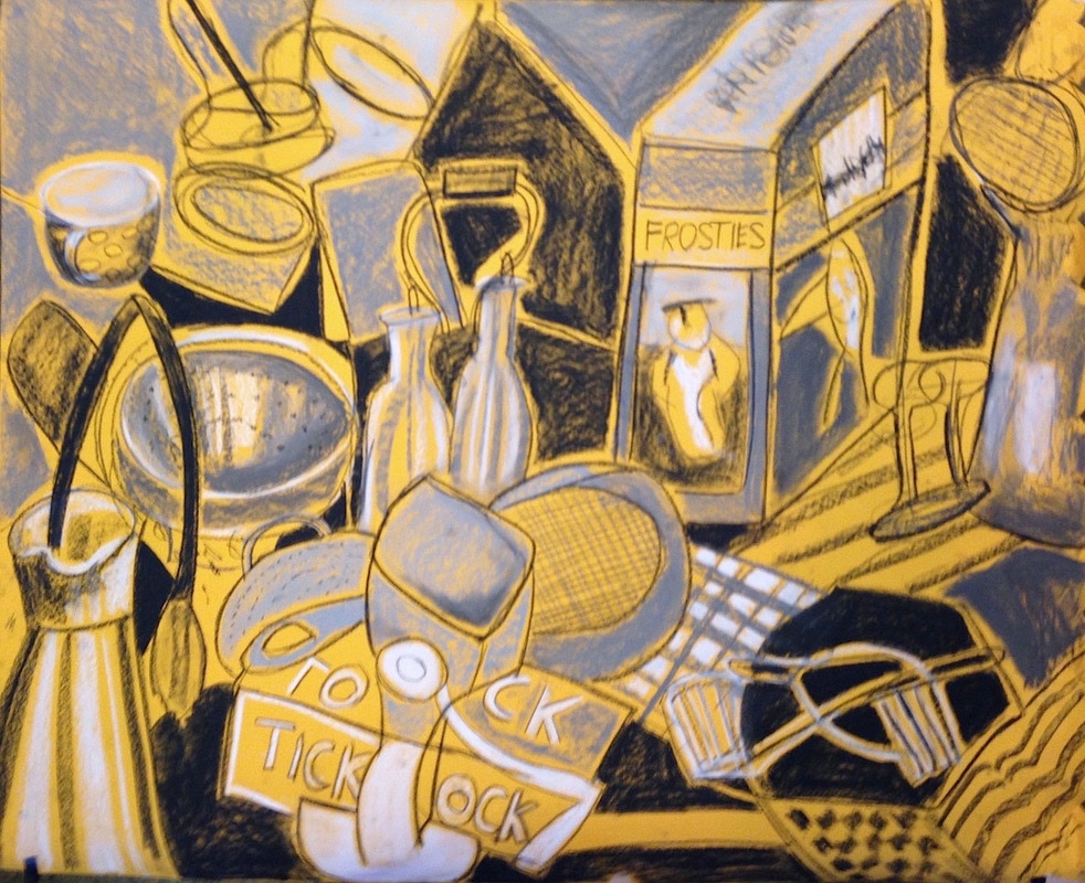
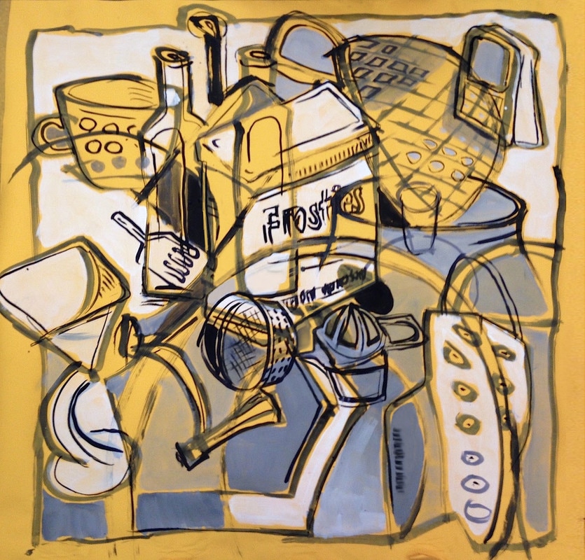
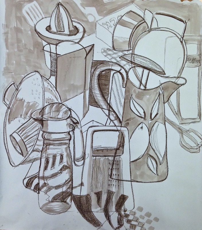
2 projects here, using creative inventiveness other than thinking about figurative illusion. The first was a series of simple instructions, to be interpreted individually - and finally resolving all these marks, textures and shapes into a finished drawing. Then everyone had the same 5 pieces of shaped paper to develop into images in any way they wished. The idea here was just a large scale drawing, loosely referring to a group of household objects but being mainly concerned with filling the paper! First, everyone drew with charcoal/paint attached to the end of a long stick (with the obvious lack of control but the need to design in big shapes and make different sorts of marks for this scale). Some then carried on working on the drawing on the floor, others used tables but had to move the drawings around as the tables were smaller! |